Letterforms are made through by putting together various shapes in specific ways to create a certain configuration. Each letterform has a specific configuration and regardless of the style or font used to show the configuration, you can identify which letterform it is. You can express the letterform in any set of dimensions and it will still communicate the same meaning.
First Glyph (W)
The first glyph I chose was the first letter of my last name, “W”. I find this letterform interesting because it is essentially a letter created out of doubling another letter, both visually and within it’s name. It is formed through taking two “V” shapes and connecting them together to create the “W” shape. It can also be written by doubling the letter “U”, just like it’s name.
Second Glyph (a)
For my second glyph I chose a letter that comes up in my name twice, the letter “a”. For my specific letterform I chose the lowercase style. I chose this leterform because I think it’s interesting all of the different ways it can be written. You can create this letterform by creating a hook and adding a circle to the bottom of the hook or you can add a circle to a simple line. I have also seen when it is written that you can draw a simple circle and just continue that circle until it has a tail, which turns it in the letter “a”.
Iterations
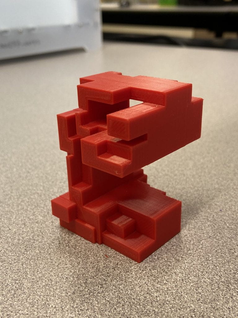
For my first letter, I decided to go with the block design that I drew out for my concept. I create each block individually and then stacked them on top of each other one by one to create the look of a lower case “a”.
When testing out different forms of the lowercase letter “a”, I was really set on stick with the block idea that I had come up with originally. The first letterform printed with supports on every side. At the time I did not realize that you could take these off, so I tried again using a different version of the letterform that I created in Tinkercad. I thought the bigger cubes would help with the sturdiness of the print. I still ran into issues with the print made of bigger cubes.
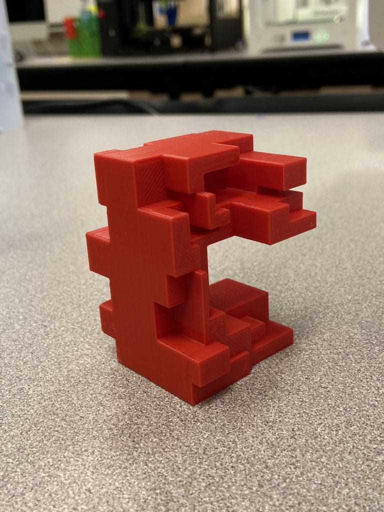
For my second letter, upper case “W”, I decided to try out two designs. One was the design with the stacked rectangles. I really like how this design turned out. I think it’s cool that when you first look it may be somewhat confusing, but when you place it right, it resembles a “W”. For my second design, I used the draw feature in Tinkercad in order to create a whimsical “W”. I’m also really pleased with this design as well, I think it would be a playful way to create a simple letter.
For my uppercase “W”, the first print I made came out exactly the way I wanted it to. I was realy happy with how this print turned out and had no difficulty in printing it. I assume that this is due to the simplicity of the form of the print.
Final Print
I was really happy with the final result of this project. I was able to learn so much through printing these two pieces. I did not run into any issues with the “W” letterform and I was so ecstatic about how it turned out, it was exactly what I had imagined. For my lowercase “a” I ran into quite a few issues. But, through printing this letterform a learned a lot about supports. I had not even needed to use supports before, so when I saw them I was initially confused. Eventually, I discussed with Professor Hooker and learned that what was on my first print was the supports and that you can take them off! To get my final print, I laid the print on its side in Cura and put supports on the bottom that was touching the surface of the printer. After printing, I took off the supports and the final product turned out exactly how I wanted it! I think overall, I was able to learn more about printing in the process of creating these.
The Roman alphabet is such an intriguing thing. These little shapes or forms carry so much meaning when standing alone or combined with one another. Letters form words, and words hold power. Every letter in the Roman alphabet has been engrained in our brains since the earliest years of our life. They are unmistakeable in any form. 2D, 3D, Script fonts, sans serif, doesn’t matter.
Below are my ideas for my letter prints and some inspiration I drew from for them.
First Letter- N
The letter N contains two legs and one stroke line. I think there is a lot of potential to develop this letter in both a 3D and 4D Space. For all of my concepts I toyed with making the letter appear infinite in a sense. The fist wrapping around itself as though it were ribbon. The second taking a more abstract, sculptural shape where I connected the legs and stroke line with two more connectors, running back and forth between the connector line- somewhat taking inspiration from an infinity cube sculpture and the Nintendo design.
Second Letter- E
The letter E has one leg and three arms, one shorter than the rest. For my exploration with the letter E I toyed with negatives and removing part of the leg in the E while still maintaining its basic form. I also toyed with the idea of printing the arms and legs separately and placing them on top one another like building blocks, however balance may be an issue here.
Iterations
Here you can see both of my concepts for my prints in Shapr3D and Tinker Cad. I think both went relatively smooth, and I will try to print these first before making any changes. If anything I may try to smooth some edges on my “N”.
Final
When printing my final, I attempted to reprint both of my letters after refining some of their edges. I never ran into an issue with my “E”, however my “N” refused to print and would turn into spaghetti each time. I didn’t change any of my print settings from my first time printing, and after reaching out to my instructor for further help I was still unable to properly print. With that being said, my first prints became my finals as I ran out of time. I tried to re-print three times, each failing for a reason that is unknown to me. The final prints are good, but the edges aren’t as clean as I would have liked them to be.
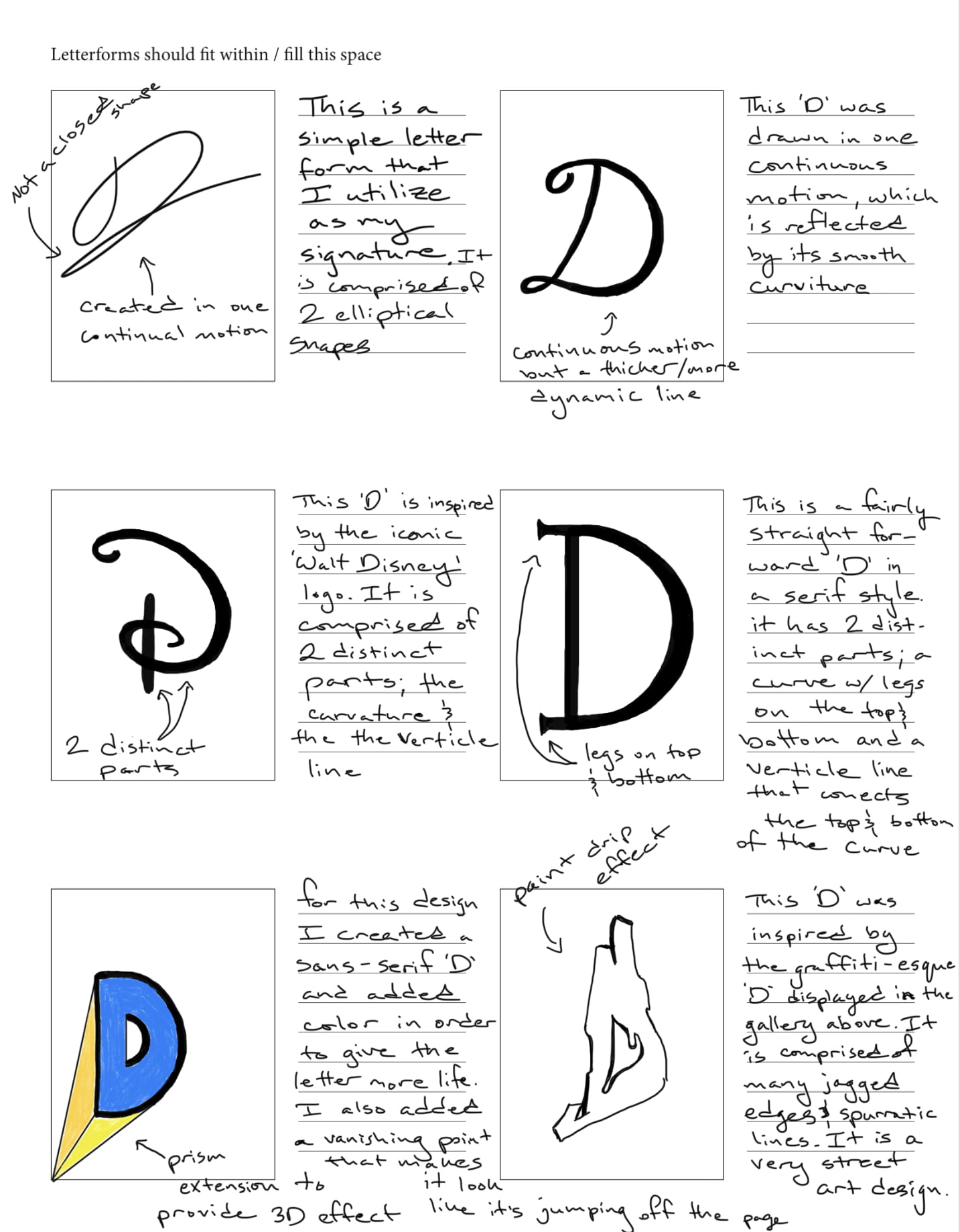
Letterforms and their various stylings possess just as much meaning as the words that they help form. They elicit varying moods while simultaneously setting the tone. Even though every letter in this collection, both ‘D’ and ‘V’, are written in a different style, one still immediately recognizes the familiar shape through association. One may even say that calligraphy is the art of type. Not only do letterforms allow us to communicate, but they also serve as creative outlets. Even though each letterform has its own distinct structure, designing them in various shapes, sizes, dimensions, and stylings can dramatically alter the message one wishes to convey.
First Glyph – ‘D’
The first glyph that I chose is the letter ‘D’, as it is the first letter of my initial. Interestingly, this letter has its roots in the Semitic alphabet, which spans back to the second millennium B.C. This letter is comprised of two unique strokes: a bar – the horizontal stroke in characters such as A, H, R, e, and f, and bowl – A curved stroke that creates an enclosed space within a character (the space is then called a counter). The capitalized version of the letter ‘D’ is very distinct from its lowercase ‘d’ counterpart. Most notably, the bowl stroke faces in the opposite direction compared to the capital letter. Pictured below are the sources of inspiration for three of my sketches.
Second Glyph – ‘V’
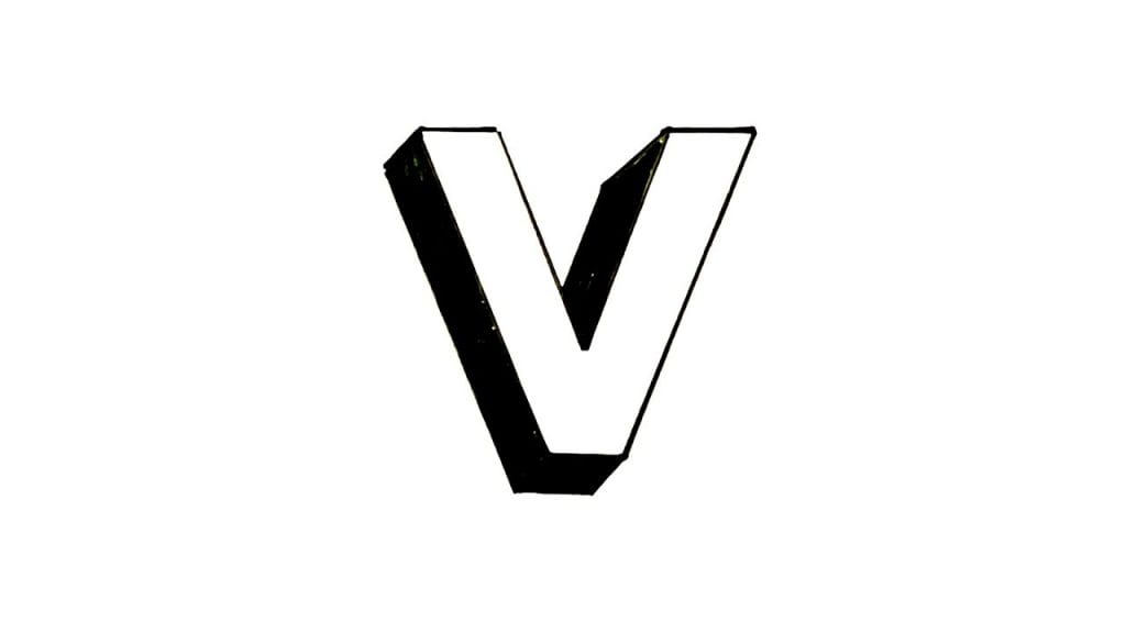
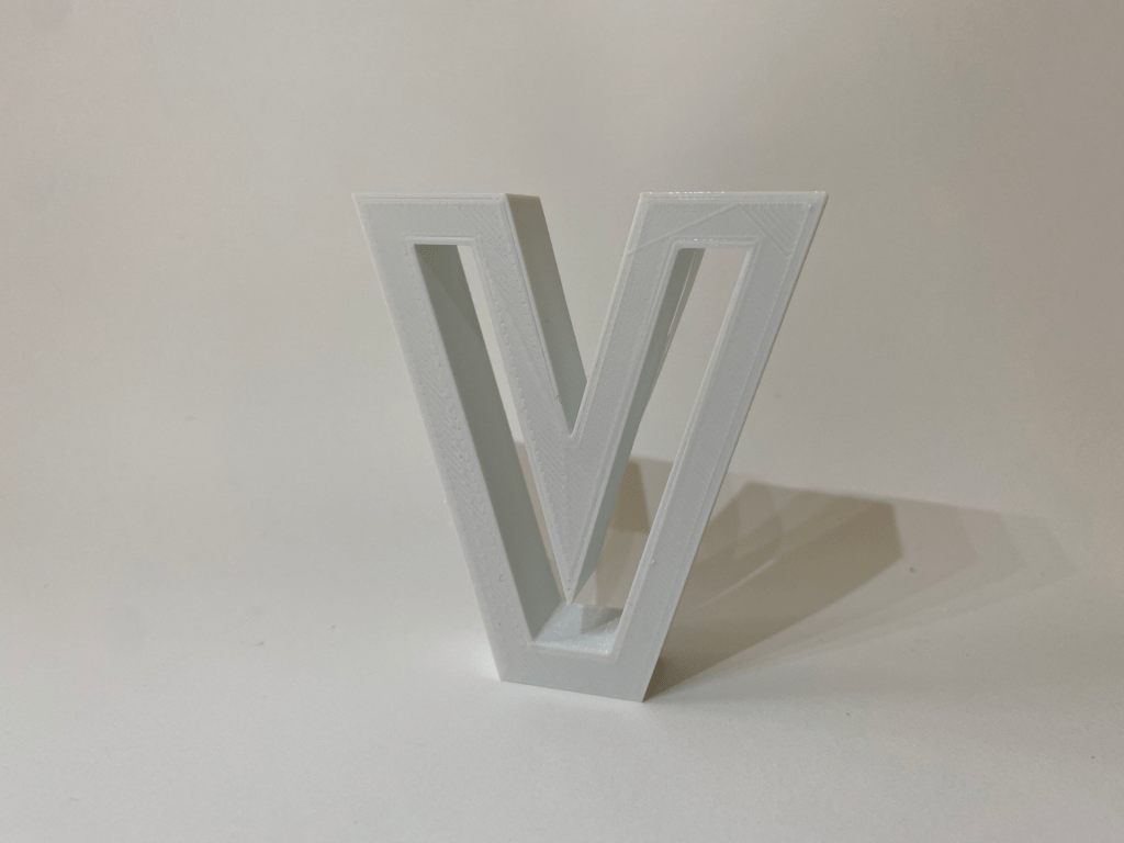
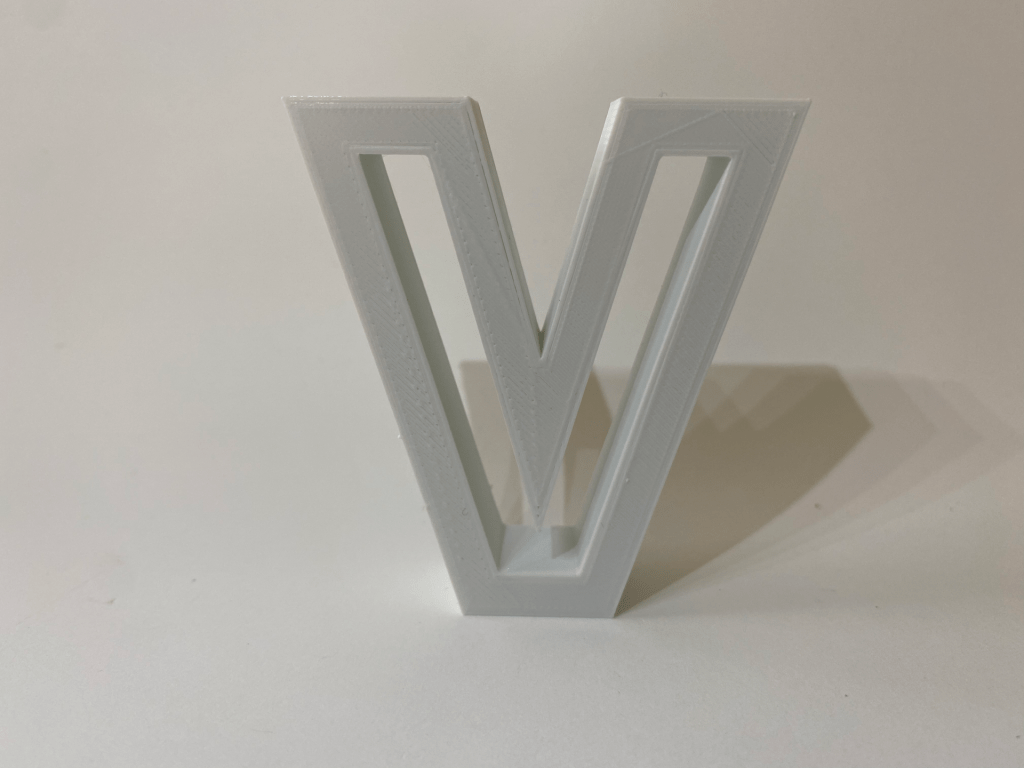
The second glyph that I chose is the letter ‘V’, as I like its simple symmetry in its most neutral form. This letter has its origins in the Semitic alphabet as well. It is generally comprised of two equidistant strokes that move away from each other from an origin point. It is not a very commonly utilized letter in the English language. There is not a lot of variation between its upper and lower-case forms, except for its height. Below are some pictures that inspired three of my designs. My last sketch in the series is a whimsical interpretation of the letter.
Iterations
For my first iteration of the ‘D’ glyph I decided to keep the design simple and familiar, in order to capture the true essence of the character. I hope to revisit Shapr3D in order to bring to life some of my other ideas. In the meantime, I definitely bit off more than I could chew in terms of my Shapr3D abilities. My end goal is to create a graffiti-style ‘D’ glyph. This iteration allowed me to gain more experience with the software, in order that I may explore different and more unique concepts in my upcoming iterations. I do really minimalistic design because the form of the object is very closely tied to its function. To create this glyph, I merely connected a series of lines and an arc, which I then offset from the edge, and drug 2mm towards the center. Finally, I extruded the 2D shape from the plane.
The second iteration of the ‘D’ glyph that I complete ended up being much more complex, although it does not directly correlate to any of the sketches that are pictured above. I decided to make this design more creative and add ‘wings’ to the top and bottom of the ‘D’. Not only does this make the design more dramatic, but it also resembles a ‘C’, which happens to be my last initial.
For my first iteration of the ‘V’ glyph I decided to use the first sketch in my ‘V’ letterform composite, but with a twist. I began by creating a standard ‘V’ shape by connecting multiple lines. I then offset the edges of the ‘V’ shape and drug them 1.5mm inwards. I then extruded the outside ‘V’ shape 3mm off the plane. Although this design does not leave much room for interpretation, I feel as though the hollow space on the inside of the ‘V’ draws the viewer in. I am hoping to create a few more iteration of the ‘V’ before conducting a final print.
Final Iterations & Prints
I was able to print out both the ‘D’ and ‘V’ letters with only one slight problem. Upon retrieving the second iteration of the letter ‘D’ from the printer, I realized that the three distinct parts that comprise the letter had not been unionized in Shapr3D. This meant that when I printed it out the two ‘wings’ were not grafted to the centerpiece. In order to overcome this challenge, I made the following iteration that is pictured below.
To achieve this shape, I merely used Shapr3D to decreased the extrusion height of the small ‘D’ and drug it backwards into the stem of the larger ‘D’. I then unionized the two shapes together and then exported the .STL file into Tinkercad.
Letterforms have the capability of being presented in countless ways, with variations to style, textures, and dimension. What I find to be the most intriguing characteristic of letterforms is that through all of these variations, the meaning of the letterform remains unchanged because each letterform is recognizable by its individual formations. Because of this fascinating asset, designers are able to manipulate many aspects of a letterform all while keeping its integrity.
First Glyph: “J”
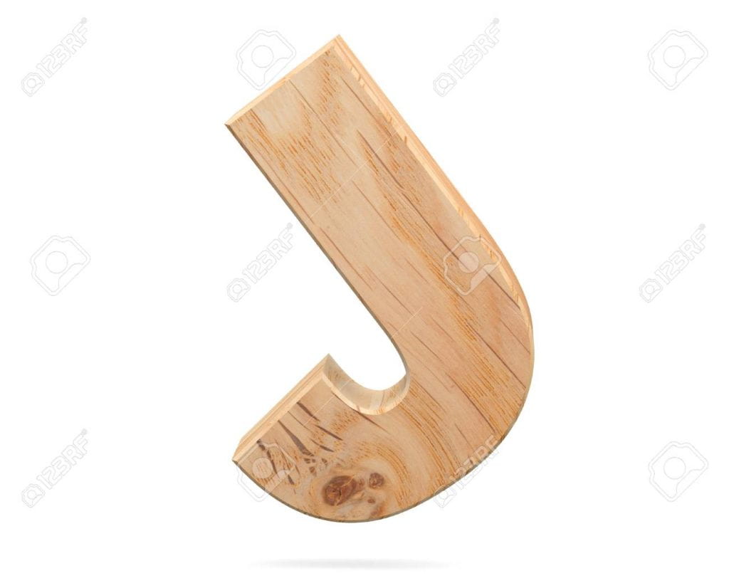
The first glyph I chose was the capital letter “J,” as that is the initial of my first and last name. This letterform has a long stem protruding from the top and a curved semi-circle at the bottom at its base. The letterform “J” also sometimes has a “hat” that sits horizontally atop of the long stem, although this does not appear on all forms of the capital letter “J.” This is an odd component of the letterform as this part is actually optional to have, so it is not necessarily considered a defining characteristic. This specific formation is what produces the full letter, “J.”
Inspiration
3D decorative wooden Alphabet, capital letter J
Sketches
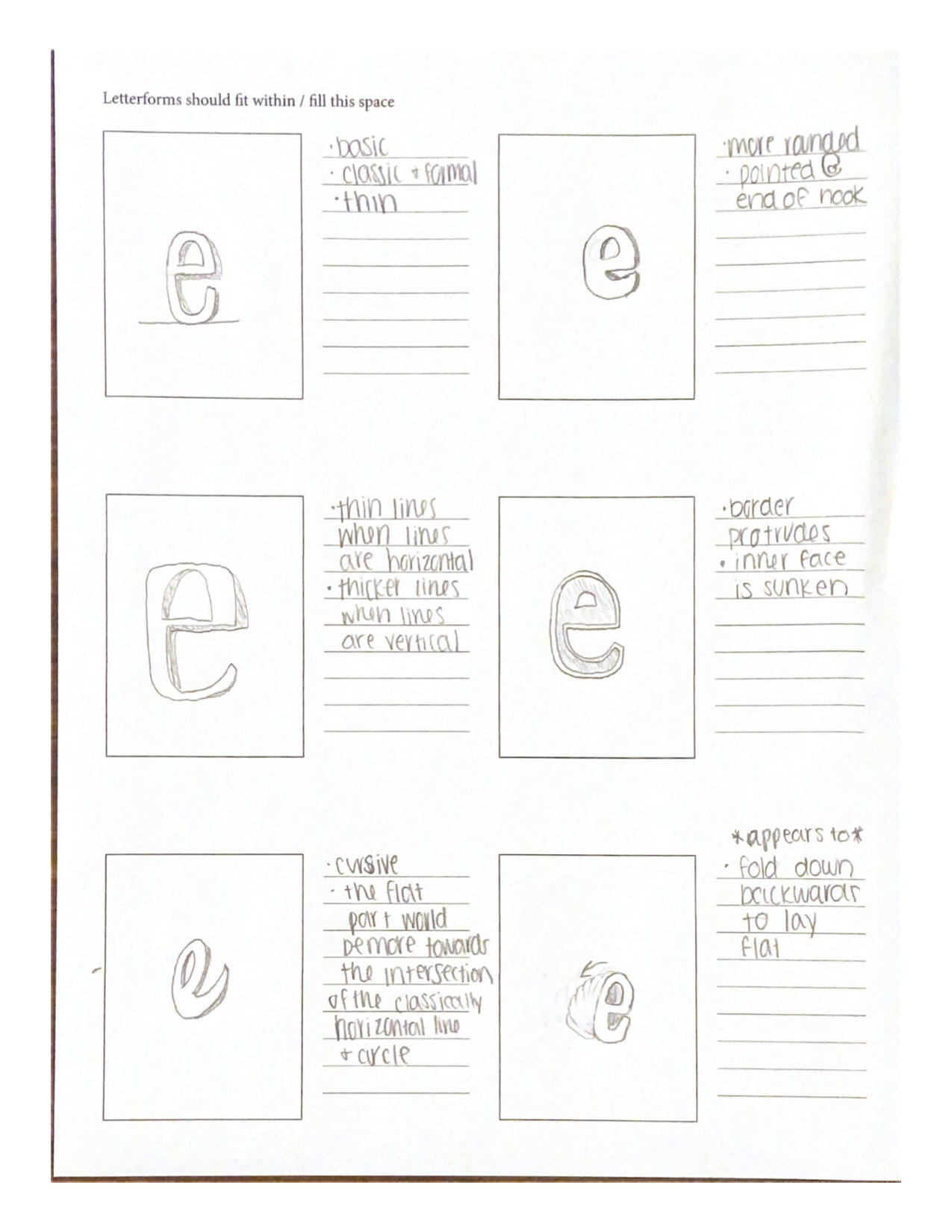
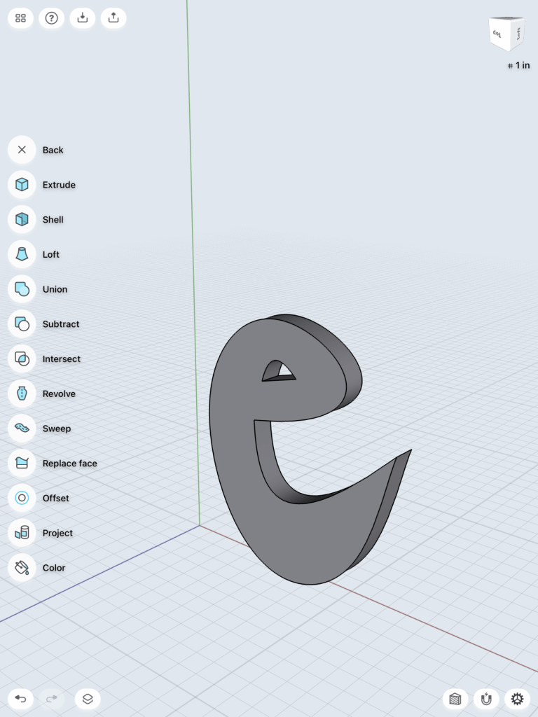
Second Glyph: “e”
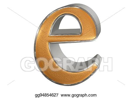
The lowercase letterform “e” is a bit more interesting than one may expect upon first glance. It is comprised of a long line that almost completes a circle, but does not ever tough the other end. This circle-like line extends up, to the left, down, to the right, and then up a little again. It also has a short horizontal line that appears in the middle of the letterform which connects the upper-end of the circular formation by extending leftwards to the middle of the circular formation. This letterform differs greatly from its capital counterpart.
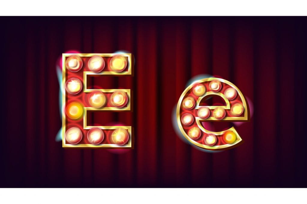
E Letter Vector. Capital, Lowercase. Font Marquee Light Sign. Retro Shine Lamp Bulb Alphabet. 3D Electric Glowing Digit. Vintage Gold Illuminated Light. Carnival, Casino Style. Illustration
Sketches
Iterations
Iterations for the glyph, “J”
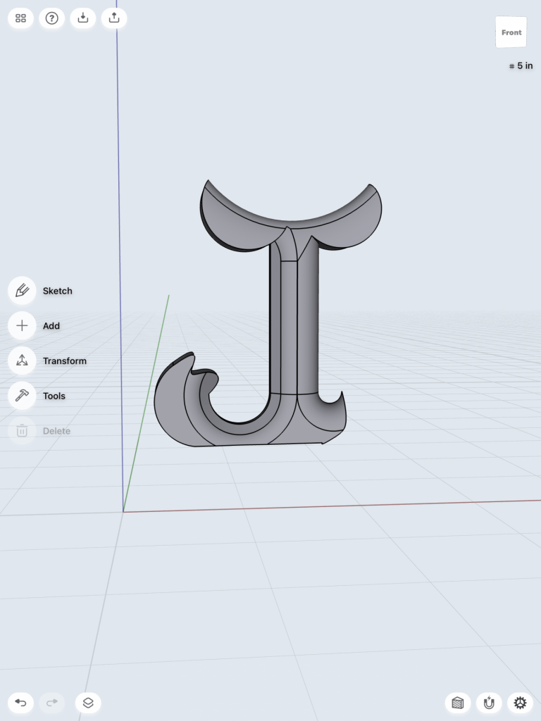
For my first glyph, the capitol letter “J,” I was excited to pursue my fancy-looking and unique interpretation that I thought of while sketching. Using the spline tool to create my sketch, it was difficult to get all of the points where I wanted them to be exactly, so this part was a little time consuming. Once I created a created a sketch I was happy with, I extended it to become a body. This design had a small, claw-like form as the “hat” of the capitol J, which I decided looked awkward and almost made the J difficult to recognize.
Below are pictures of my first design.
I then decided to extend the hat to be longer, making the hat more recognizable. I really liked the way this looked and it matched more of what I pictured in my head when designing this.
Pictured below is the first iteration I made to my glyph.
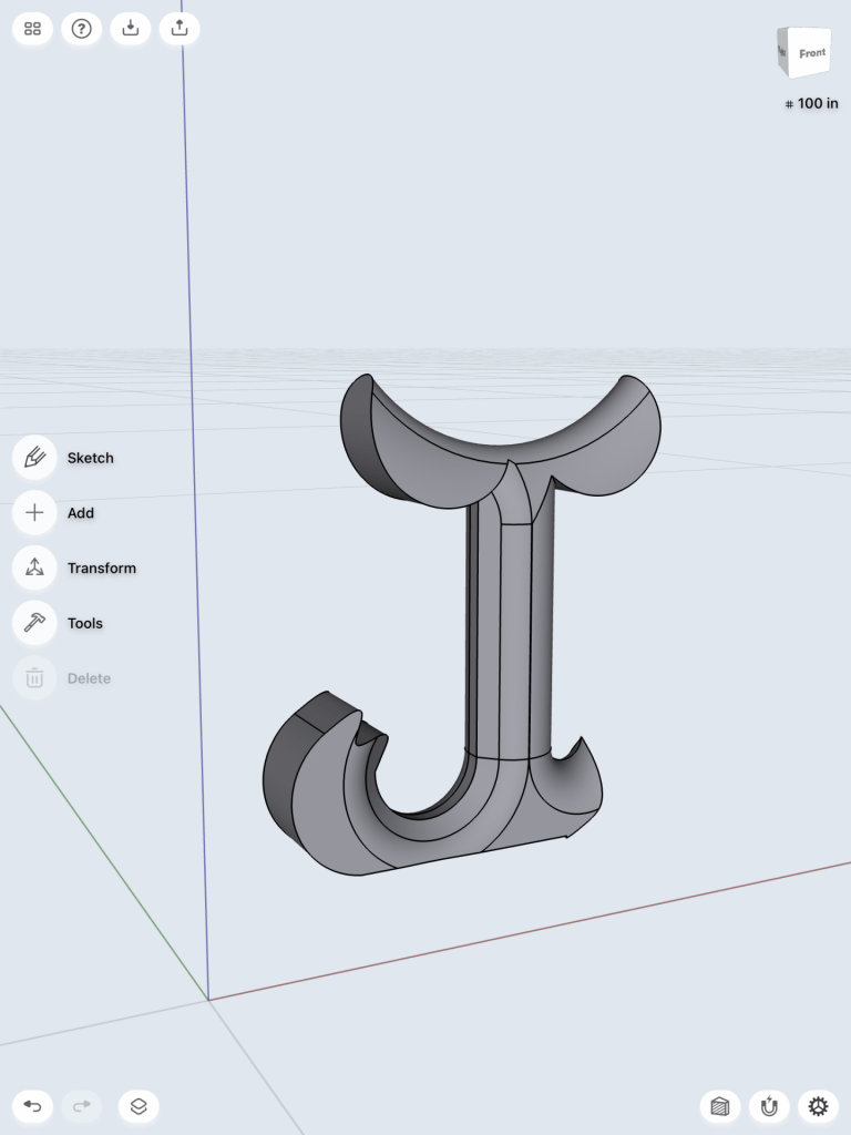
I did actually really like this design and almost stopped there, but as I was playing around with it more I found that blending some of the edges made me like the design even better. I think that blending the edges makes the design look more formal and aesthetically pleasing. This extra splash of detail does not take away from the integrity of the design nor the recognizability of the letter J.
Below are images of my second iteration and iframe.
Iterations for the glyph, “e”
My second glyph, the lowercase “e,” I found to be the most difficult design to come up with. Because of this, I wanted to explore multiple designs to brainstorm all of the ways that I can make this print unique. I began with a fairly simple e that had a pointed tail. I actually really didn’t like this design for a few reasons: firstly, it would not be able to stand alone because the bottom of the design is rounded. Secondly, it was just way too simple and I really wanted to push my boundaries with this assignment,
Below are pictures of my first sketch.
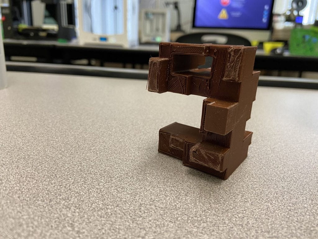
I quickly threw out this idea and pursued another, one in which was completely different from the first. I liked the idea of playing with blocks and giving this simple little letter “e” a touch of architectural playfulness. I created my first iteration keeping in mind how blocks can create this sort of odd structure.
Below are pictures of my first iteration.
I liked where this design was going more, however I still felt as though something was missing; this design still seemed to be too simple. I had this idea of blocks building upon one another, almost in a way where if they were actual singular blocks, they would tumble apart. What I decided this design needed was more of a chaotic feel to it, where the form almost just looks like a random array of blocks until you look at it from the front view.
Below is a picture and iframe of my second iteration.
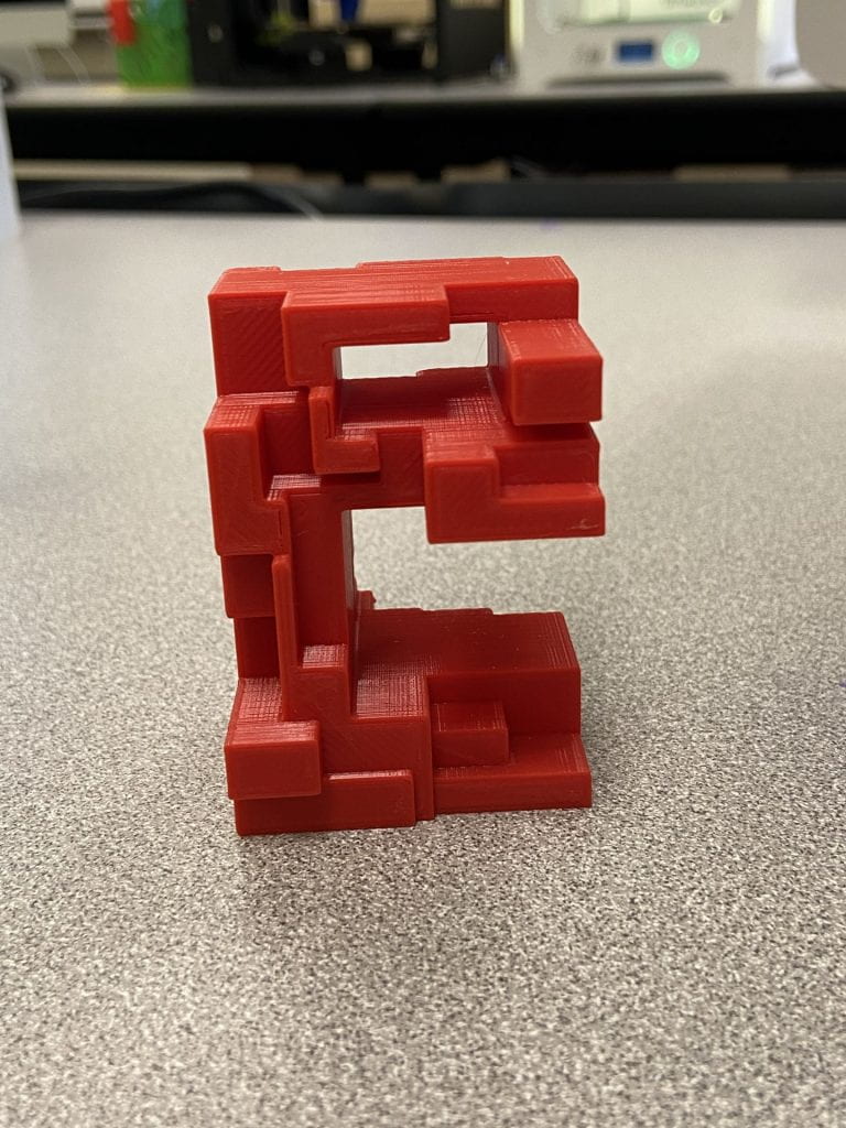
When I test printed my design for the first time, I was met with “spaghetti” from the printer. Upon investigating into this further, I looked to my design to see if anything had gone wrong in the original architecture. Lo and behold, I discovered that my squares in Shapr 3D were not united and in fact could not be united, as Shapr 3D does not allow shaped to connect to each other by one side as my design features. For this reason, I took back to the drawing board once again and created an entirely new model. This time, I created the basic outline of the lowercase letter “e,” raised the face of it to make a body, then drew lines throughout the letterform. With those lines, I created different sized shapes and took those individual faces and manipulated them to create the scattered architectural design I had originally thought of. This design worked phenomenally, and when printed, worked out well. I printed this design with a layer height of 0.3, though, which impacted the integrity of the design.
Below are images of my third iteration and its iframe.
Final Prints
First Glyph: J
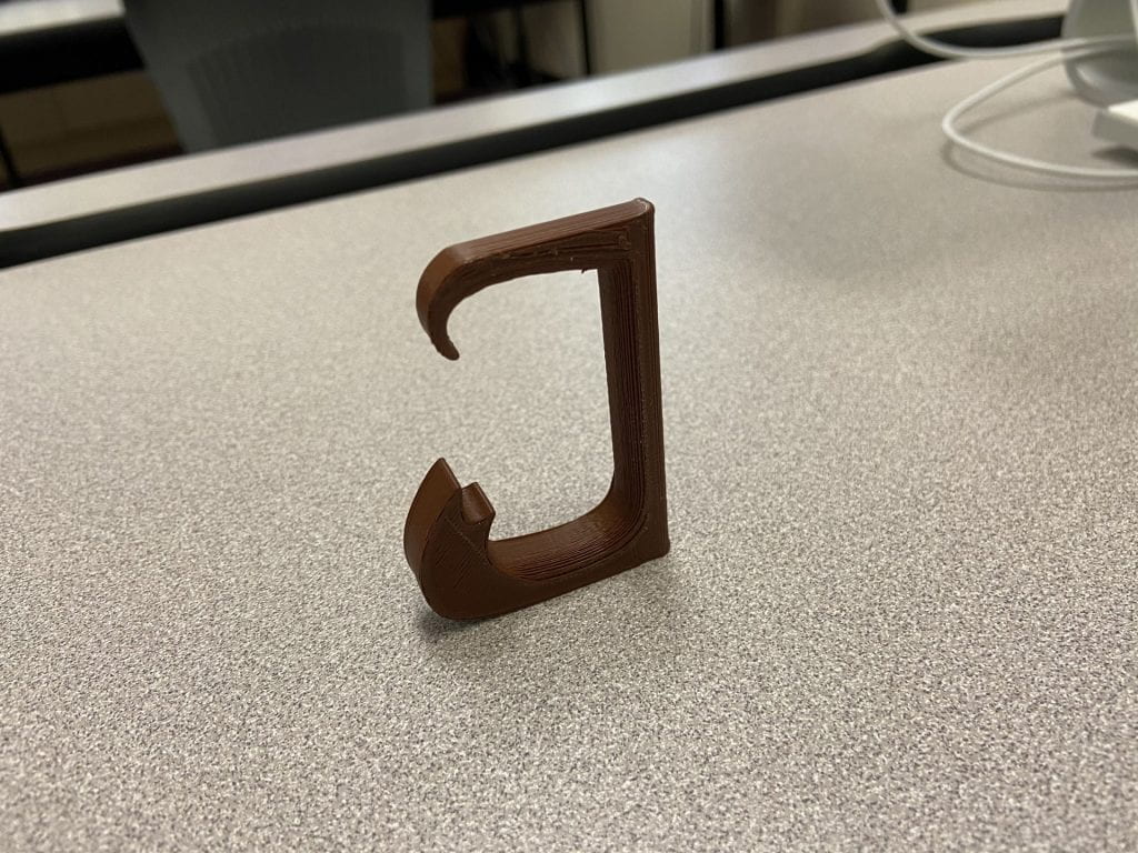
Something that I got as feedback for my design during our class time was that the “hat” of the capital J almost resembled an inappropriate figure, so with that new image in mind, I took back to the drawing board and reworked my design. I decided that the left-most half of the hat would work perfectly in terms of the print being understood as a “J” and take away the idea of it resembling something inappropriate. I also changed the shape of the half-hat to make it more fancy-looking, and this new design came to mind. It essentially has the same idea as my second iteration of the design on the bottom, but the top completely changed its aesthetic. I believe that the final design of my uppercase “J” glyph is perfect and resembles exactly the design that I had in mind even when brainstorming ideas at the beginning of this project. This is my final print because it is sleek, attractive, and well-constructed. It is able to stand on its own which completes one task I had for it, and it successfully portrayed the glyph, “J,” to be highly recognizable.
If I had the opportunity, I would enlarge the size, add a small hole in the back of it, and round the bottom to make it into a wall decoration for my room. Because I wanted to have this design stand upright and stay within the size constraints of the assignment, I could not pursue this, but I believe the final print works great for its intended purpose.
Second Glyph: e
After reworking my design in Shapr 3D, I was very pleased with how it turned out. Since I was just test printing it for my iteration, I had the layer height at 0.3 to save time and simply see if it would print correctly. I also did not add the appropriate supports, so I needed to adjust that as well to be suitable for a final submission. In my final print, I set the layer height at 0.15 and Infill density to 20% so that the print would come out as clean as possible. I added a skirt as the support in order to give it the appropriate formation integrity. These were the only changes needed in order to print a successful model of the glyph, “e.” I believe that my final print worked out tremendously; I am very pleased with the structure of the design itself and how it printed. I am very glad that I chose to start the design process over again from scratch after my third iteration came out as spaghetti; this allowed me to think creatively and solve the issue that I was having in the most effective way. Without that redesign, I am certain that I would not have a 3D print that turned out successfully. This is the final print because it is clean, the designs integrity is still intact, and it is a direct reflection of the concept I had originally created.
Overall, I am most proud of the creativity I encapsulated for this glyph. Primarily, I was concerned that I would not be able to think of a way to manipulate the letter “e” into something out of the box, but I believe just that. After researching letterforms as sculptures, I was inspired to make something that would have an interesting architectural aesthetic to it. If I ever had access to machinery that could accommodate this, I would enlarge this design into a much bigger print, so that it could act as an interactive sculpture. In addition, I would print other letters with the same design concept as my design of “e” and spell out a word. I am intrigued with the idea of seeing a structure and it looking random from most angles, but being legible from other angles.
Notice: This iframe for the letterform “e” is the same as the iframe from my third iteration, I simply changed printer settings in order to achieve my final print of this glyph.
Throughout letterform, typography, and graphology, we see letters the same way. We see these letters every single moment throughout our lives and even though they might be constructed in a different way, we still know the meaning behind it. We can see letterforms from 2D, 3D, and even 4D, and it still has the same meaning to us. Each letterform has its own unique structure and shape. Through those characteristics, each letter has its own letterform that is special in its own way.
First Glyph- “d”
The first letter glyph that I have chosen is the lowercase “d”. Both my first and last name starts with the letter “D”, and I think it would be interesting to find and model a way to change the structure of the letter “D” but keep it as its same letterform. The lowercase “d” can be written in many ways, but the most basic would be the initial tall stroke, while combining it with a semi-oval shape to finish the letter. Some people might add a slight arc to the bottom of the stroke of the letter “d” to give it more definition. Although it is a simple letter that can be written in one stroke, I wanted to see what I can do to this letterform. Below are my inspirations as well as my sketches.
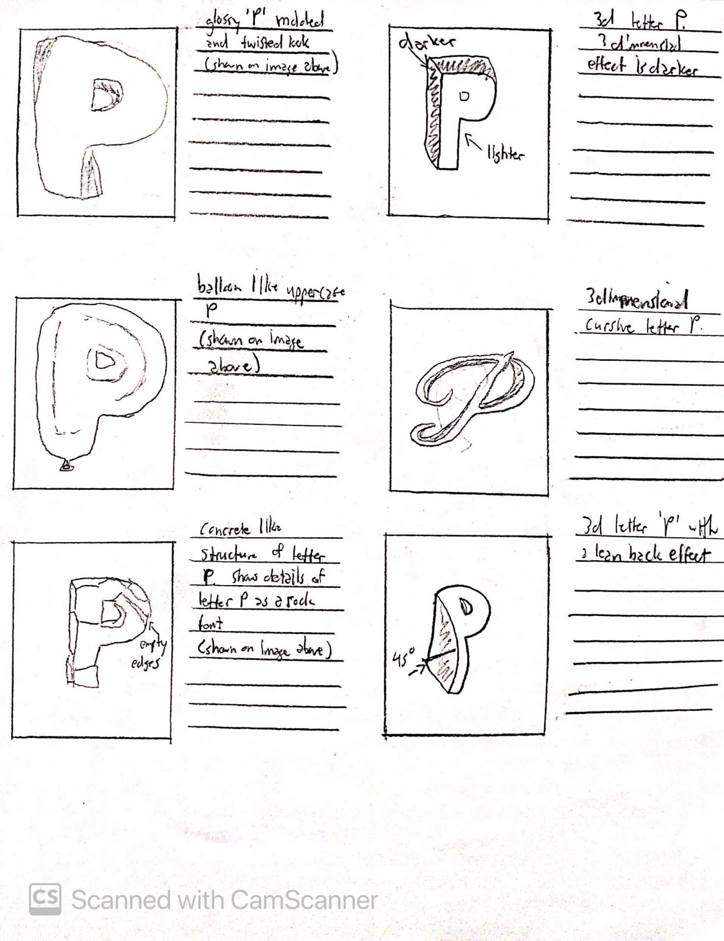
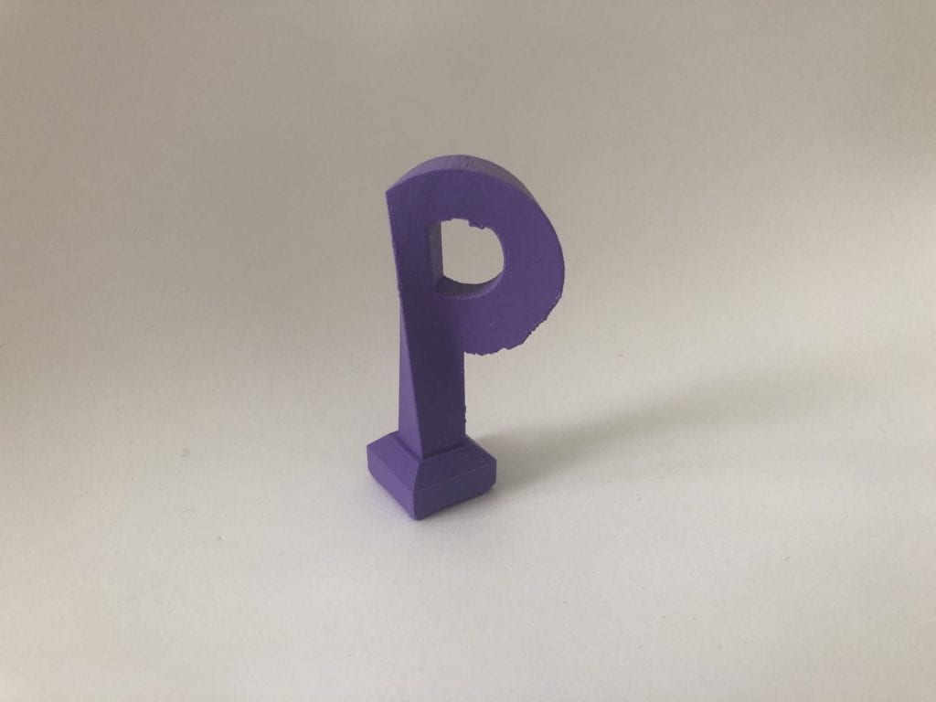
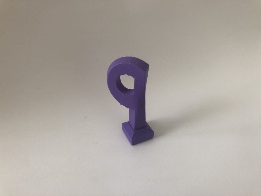
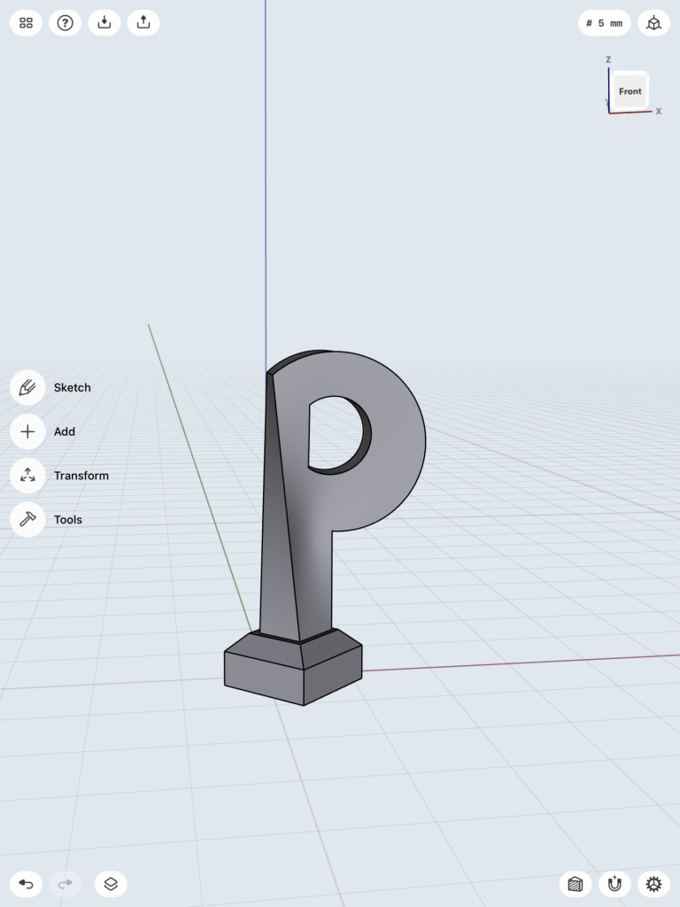
Second Glyph- “P”
The next letter that I have chosen is the uppercase “P”. I decided to choose this letterform because as you can see from the lower case “d”, they have a similar structure. The upper case “P” seems like a flipped and mirrored letterform of the lower case “d”. They both contain a long straight stroke, while having a semi-oval shape connecting it together. I wanted to see what type of differences I can make to this letterform compared to the letter “d”. Maybe I can create a model that could be similar to both letterforms to create some sort of connection between those two. Although both of these letterforms are simple, I wanted to see if I can create a model that could either connect the forms together or distinguish the differences between those two letterforms. Below are my inspirations as well as my sketches.
Iterations
First glyph: lower case “d”
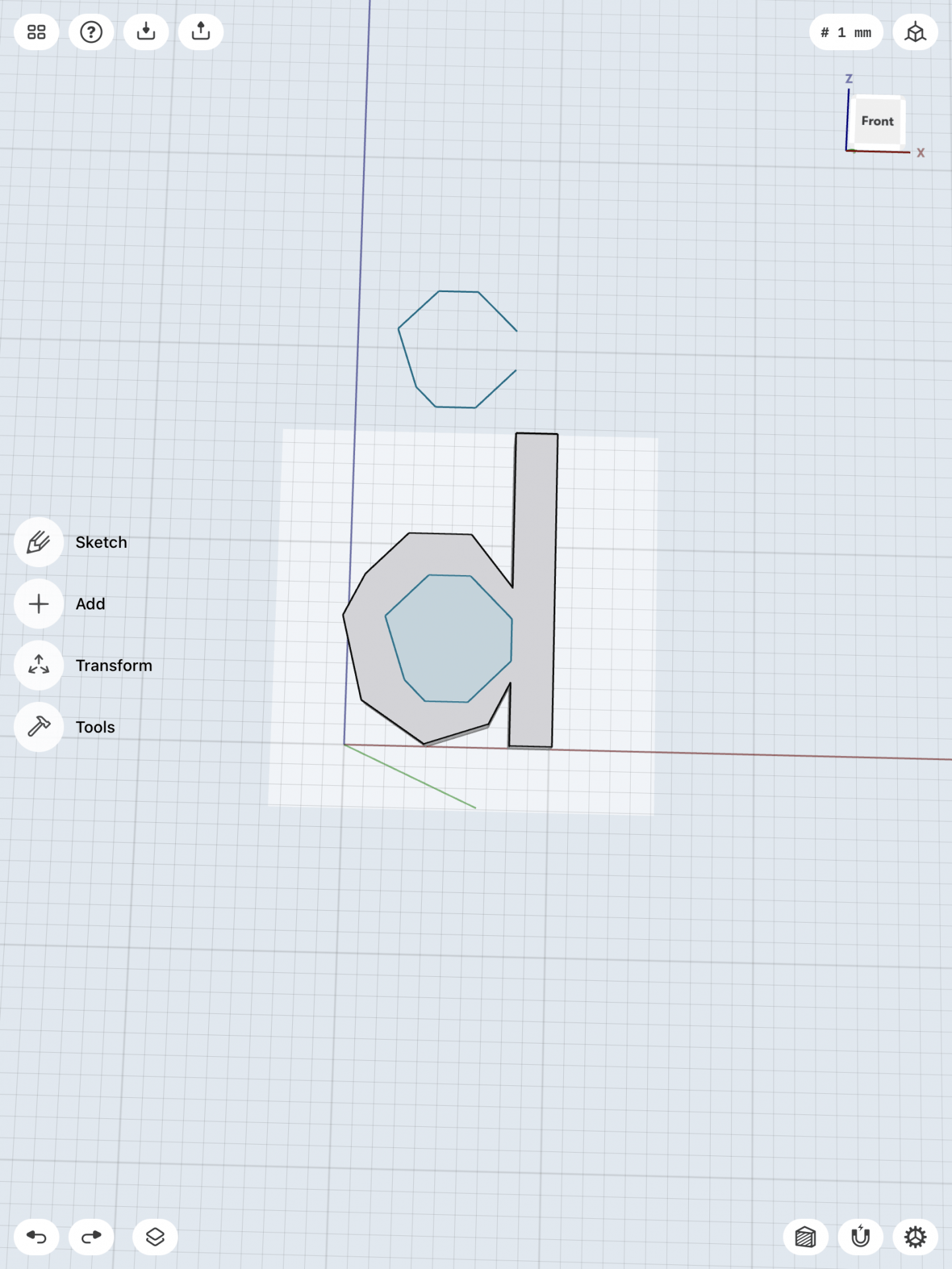
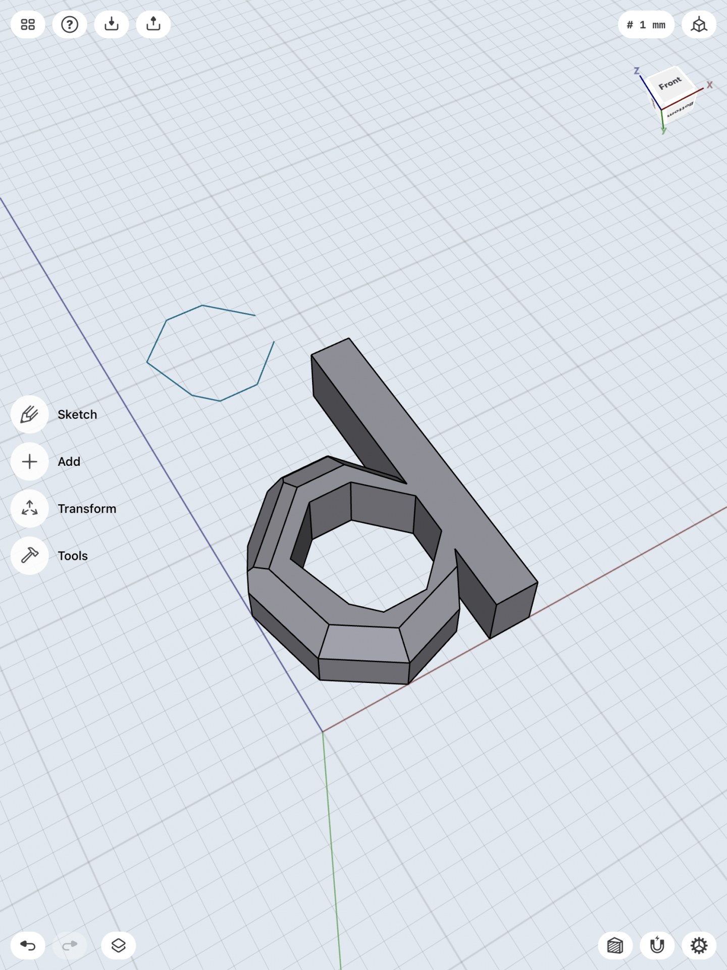
These models and iterations were all made in the Shapr3D app on the iPad. I first approached on working the lower case “d”. I started by first sketching the outline of the letter “d” with a height of 15mm, as you can see in the images below. I then went to the 3D view and changed the sketch into a 3D form. The next step I did was to add another work plane on top of the letter “d”. I then sketched the inside hole of the letter “d”. After creating the inside hole, I then lower the sketch through the first model so it may create a hole through the letter. For this letterform I wanted to add some textures to it, to give it more character. I highlighted each edges around the letter and increased their size to give it a more rugged detail. I wanted to make this letterform to have a abstract look with solid edges and make it look more “alive”.
Designing the letterform was both simple and difficult. I had a hard time finding the right dimensions to create this sort of shape. Since I had many sides to the semi-oval in the letter “d”, I wanted to make the sides in the hole of the letter similar but in smaller length. I realized that I only added details to the front face of the letter. I am planning to also add more details to the back side of the letterform. The plan I was aiming for was to make a messy but abstract letterform of the lower case “d”. I plan to make the model larger as well and add more details in the letterform. Since this is my first attempt of the model, I am still researching and possibly might change my plan in creating this letterform.
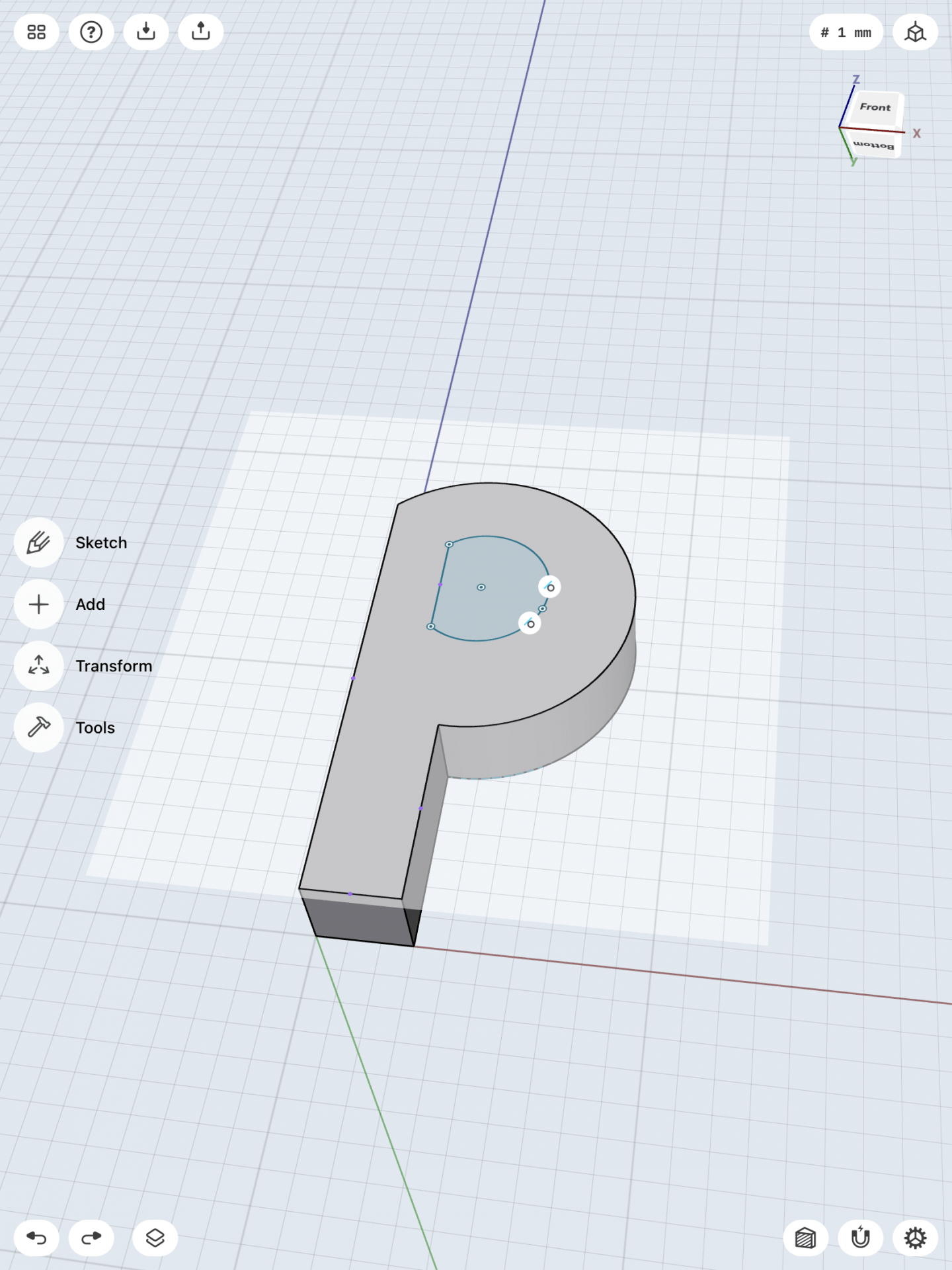
Second glyph: Upper case “P”
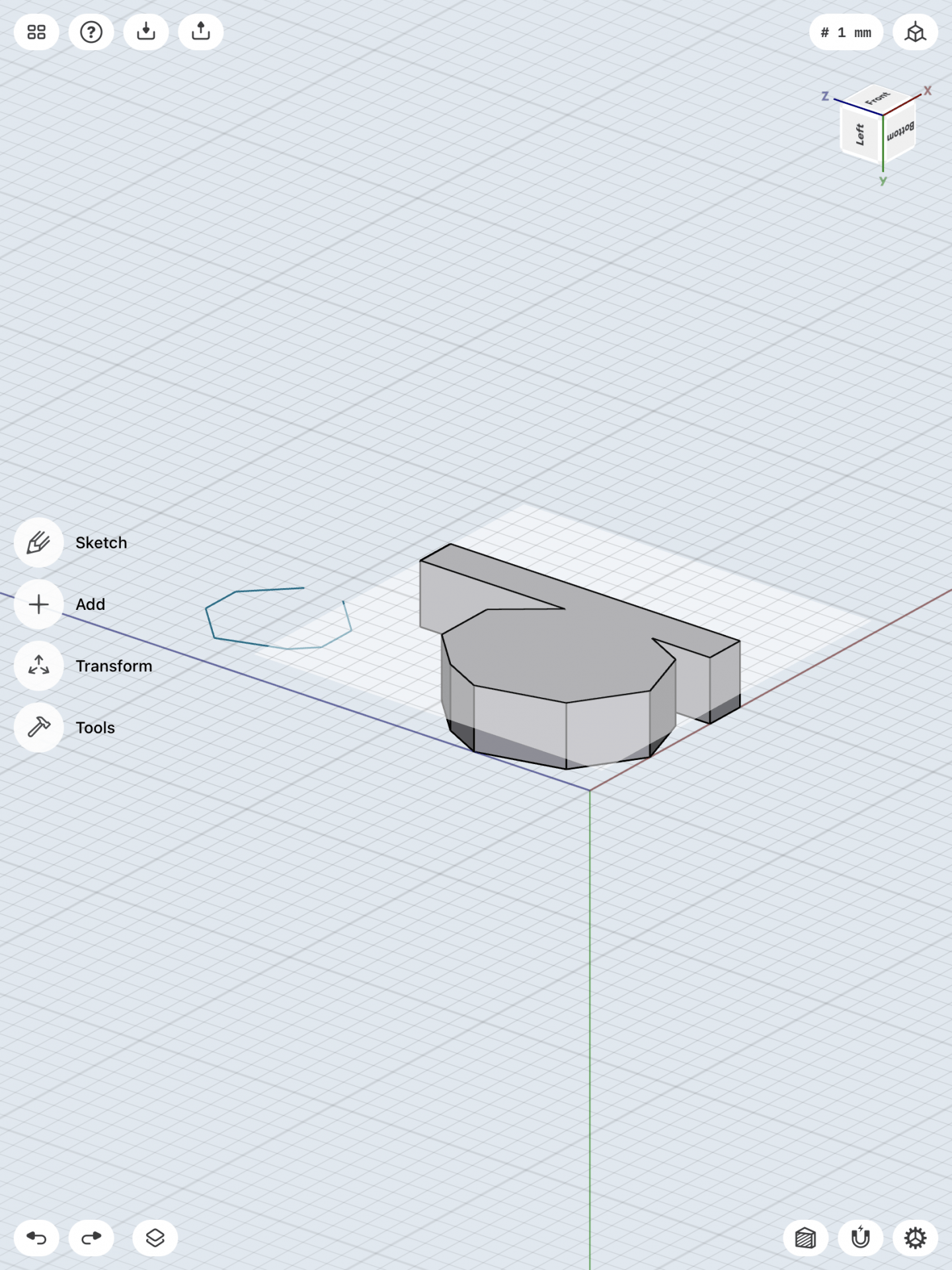
The next model I am creating is the upper case “P”. I first started on the model by sketching a simple model of the letter, with a height of 15mm. I then switched to the 3D view and increased the size of the model to a width of 3mm. I then added another work plane on top of the model so I could create the hole to go through the model to create the upper case “P”. On the second work plane I created the inner hole in the model and then lower the sketch through the first model to create the hole in the middle. Now was the time to add some details and characters to the upper case “P”.
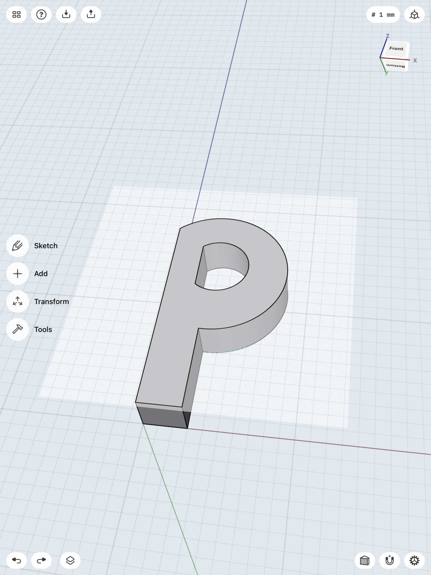
For this letterform I wanted to make it look more smooth than the lower case “d”. I decided that I wanted to curve and bend the upper case “P” to give it more character. I highlighted the edges of the bottom half of the leg of the upper case “P” and changed its direction and angle. That cause the shape of the letter to curve and mold into a bent looking letter “P”. With this detail I feel like it gives it much more of a character as a 3D model and more interesting to the eye. I still haven’t thought about how the final model would look, but I still want to add some sort of more detail to it. Although it looks simple, just molding the shape of it gave it that much more character. I also realized that the shape of the letterform should have more details. Most people who write a lower or upper case “P” has the long stroke poking at the top of the letter. I plan to iterate my shape to resemble more of a upper case “P” letterform.
Overall the first models looked great, but I still want to add more details and shape to the letterform in the future.
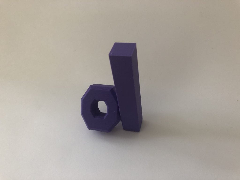
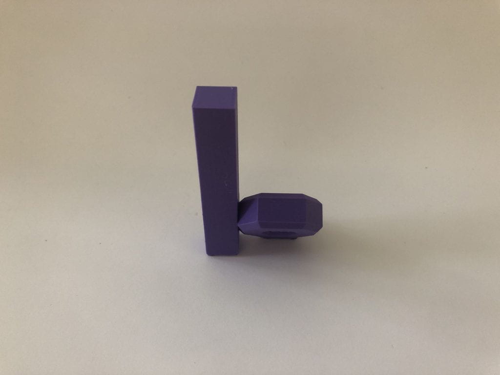
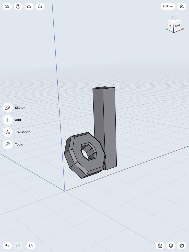
This is my final end result of creating a model of the letterform of the lower case “d”. In the end I wanted to make a simplistic but very detailed 3D model of the letterform. I have created this model on Shapr3D, as you can see at the images below. The octagon shape of the letter is slightly angled at 35 degrees to give it a more distinct look when looking from above. I have attached that part with the long stroke of the letter “d” to make it stand upright and hold its form. Overall this concept was challenging, since I had to go through many different iterations to see which ones I will be satisfied with. At the end this model turned out great and it represents well as the letterform of a lower case “d”. I am looking forward to many more projects that I can create and make with 3D printing and modeling. You can download and print my model here on Thingiverse. https://www.thingiverse.com/thing:4843870
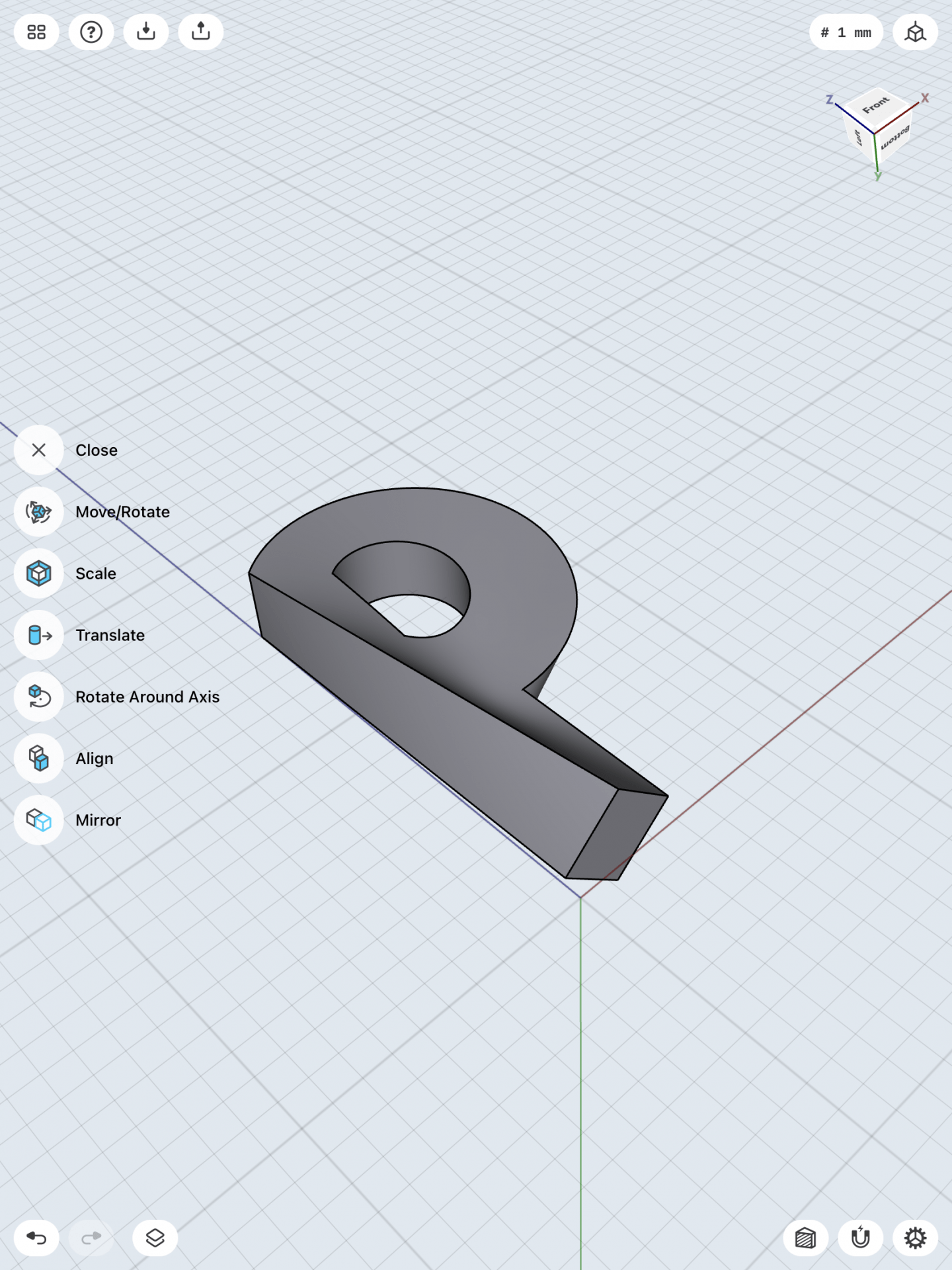
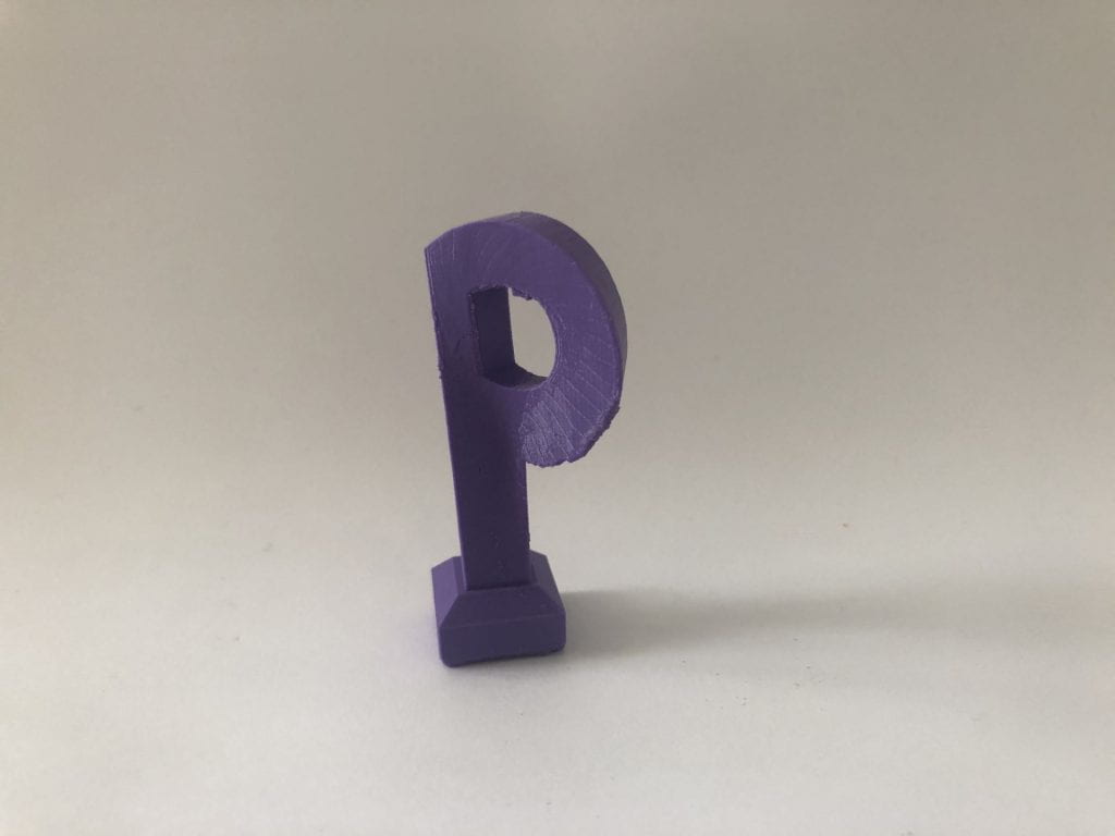
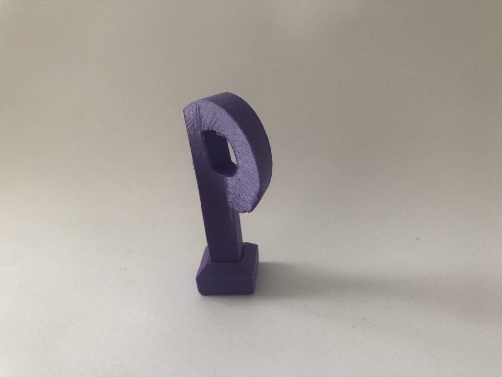
This is the final result of my concept of making a 3D model of the letterform of the upper case “P”. I have kept my iteration from before by twisting the letterform by adding some details to it. However when I first printed it, the letterform wouldn’t stay upright and would tip over. At the end I added a stand/mount below the letterform so it would stand upright, and it did. As you can see there are some rough edges around the letterform, this is because of the support that was printed with the letterform and I had a hard time removing them and smoothing out the letterform. I would most likely print the letterform in a different was towards the future. Overall, this print worked out great and it came out just as I expected. This concept was very fun to do, and I can’t wait to print other types of projects in the future. You can download this model here on Thingiverse
Letterforms have specific structures that always look the same no matter what style or typography it is written in. It can be written in either 3D, 2D, or even 4D and can still be identified as its letterform because of its structure. In other words, each letterform has their own structures and shapes that specifically characterize its specific letterform despite its font.
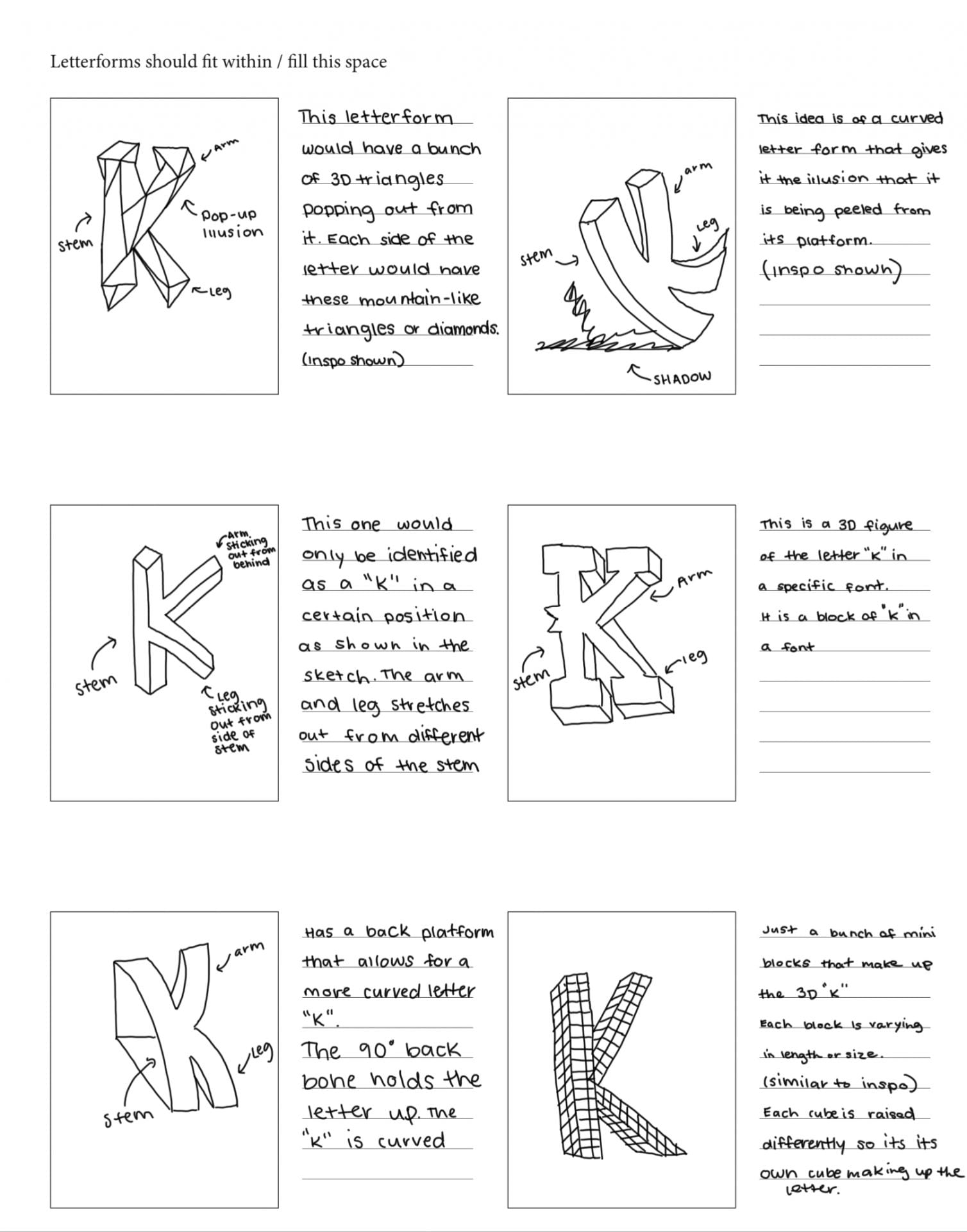
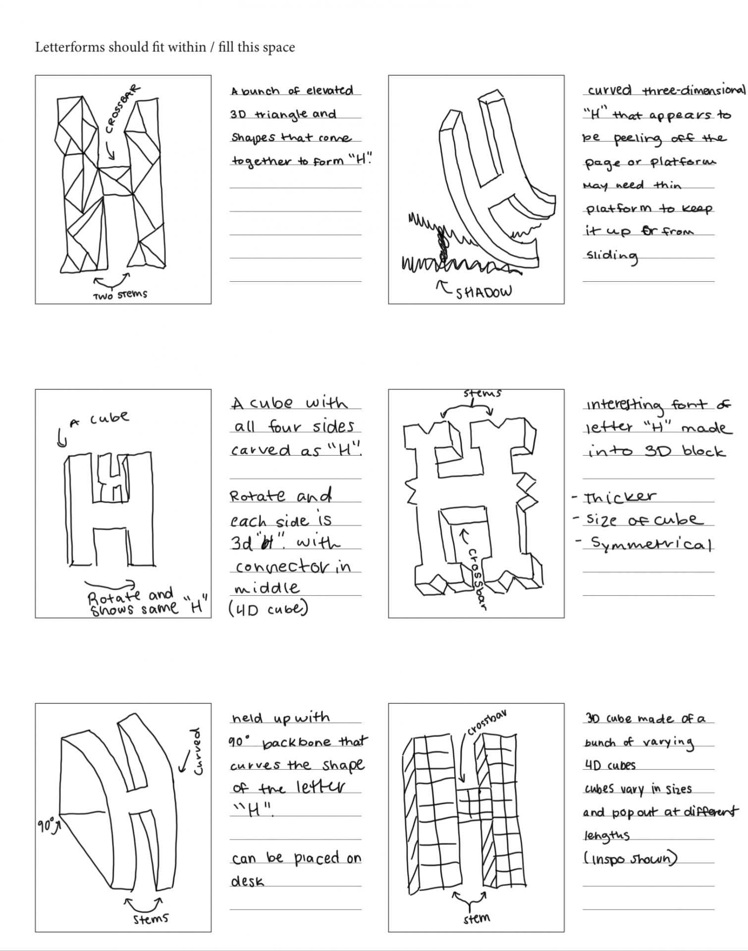
First Glyph- “K”
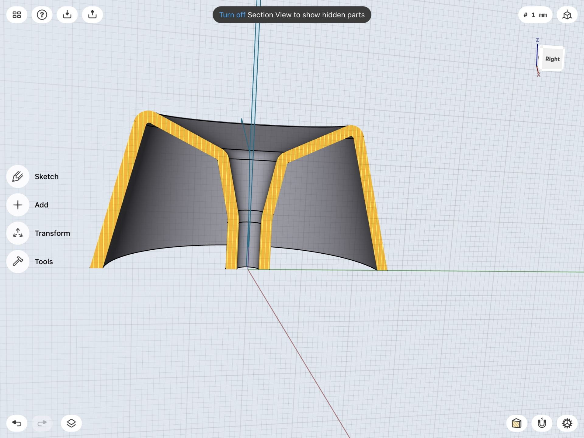
The first glyph I have chosen is the letter “K” because it is the first letter of my initial. This letterform has a tall stem that has one leg and one arm that stretch out in an angled manner. Legs, also known as tails, are the lower angled strokes that come from the stem of the letter. The letter “K” has one leg that is angled downward from the stem. Meanwhile, arms are the upper angled strokes that come from the stem. This glyph also has one arm that is above the leg and angled upward from the stem. These specific parts of the glyph identify it as the letter “K”. Below are some images of my inspiration and exploratory sketches.
Sketches of the letter “K”
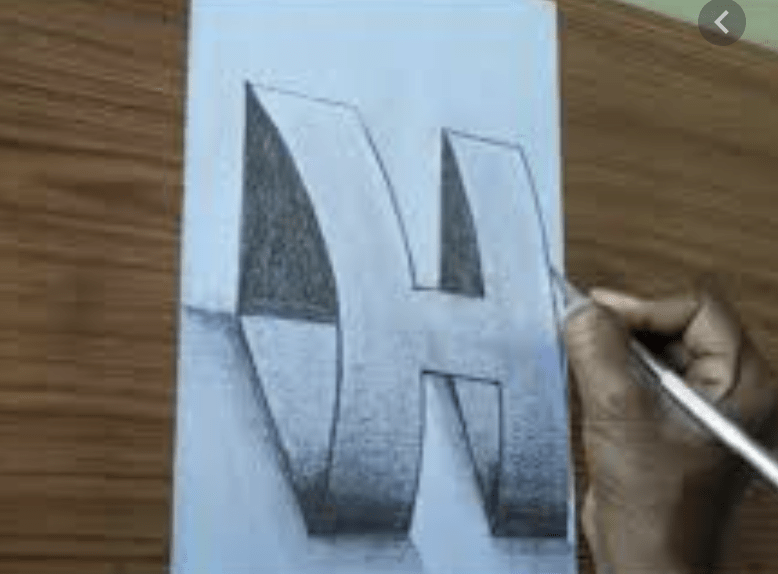
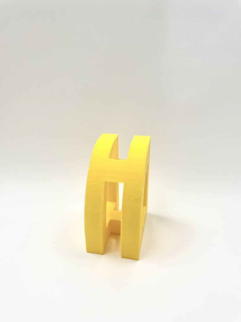
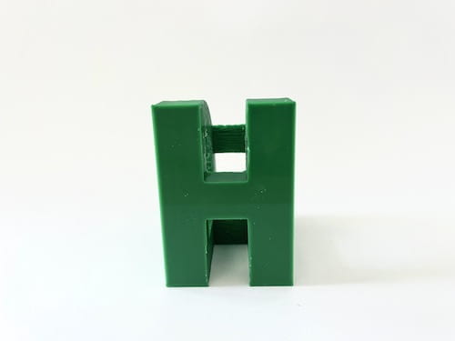
Second Glyph- “H”
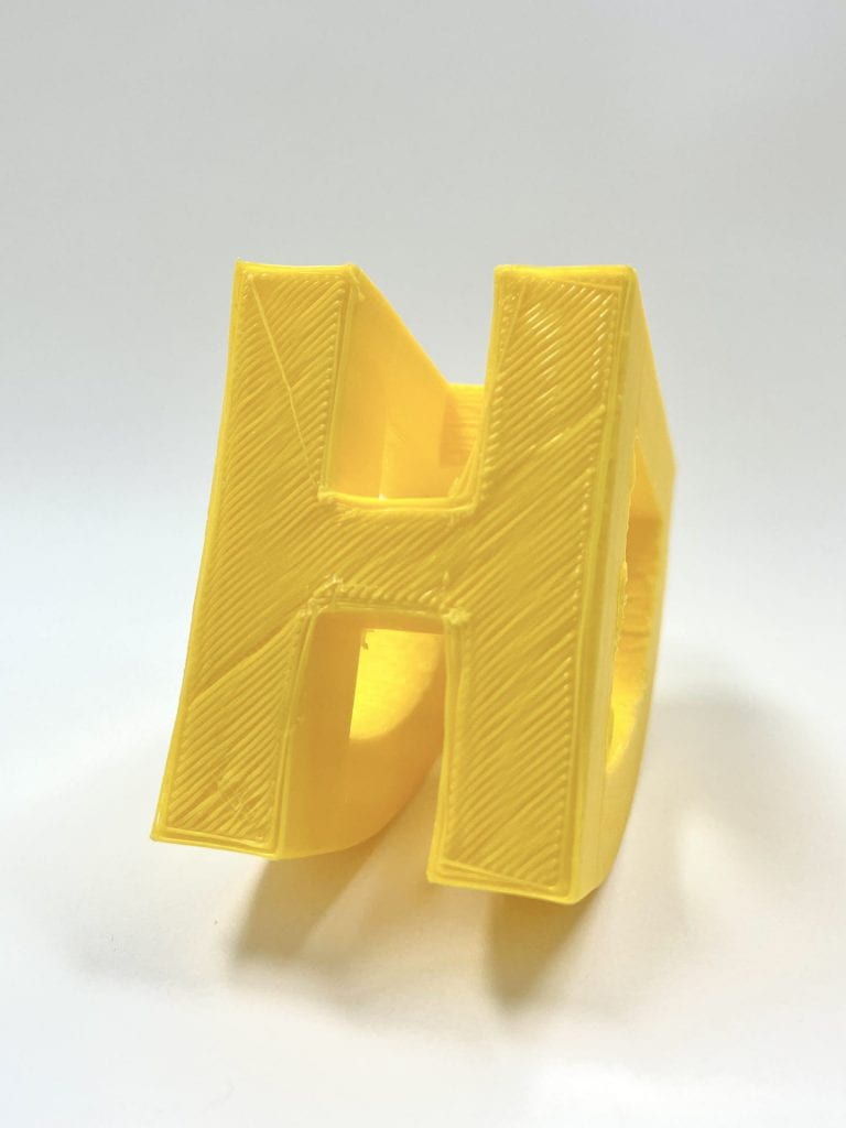
The second glyph I have chosen is the letter “H”. This letterform has two tall stems with a short connecter line in between. This connecter bar is also known as the crossbar, as it connects the two lines of this uppercase letter. This letter is symmetrical, meaning it could be cut in the middle horizontally or vertically and still mirror the other side. Because of this, I view the letter “H” as balanced. The upper case letterform of “H” differs from the lowercase letterform. I will be creating the uppercase letterform of “H” because of its more symmetrical and balanced look. Below are some images of my inspiration and exploratory sketches.
Sketches of the letter “H”
Iterations
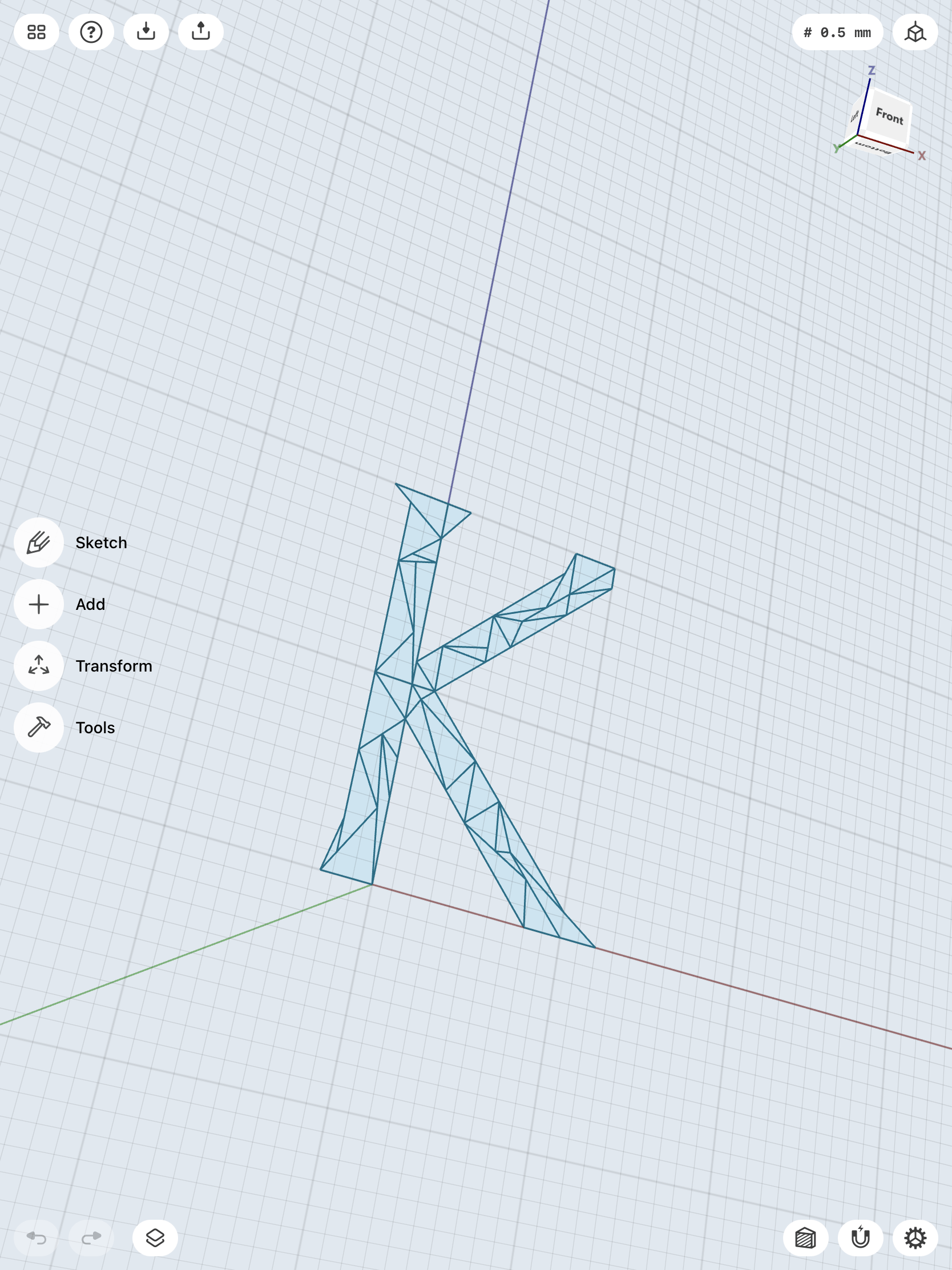
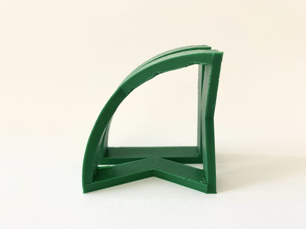
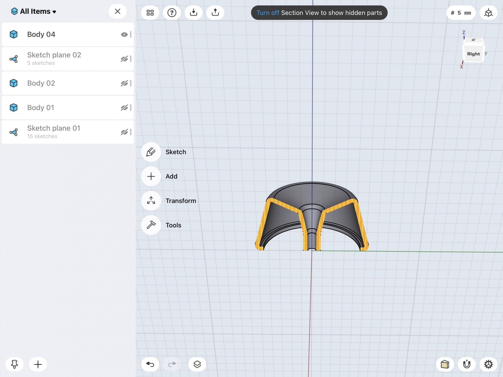
I first attempted the design with elevated triangles on “K”, but found it too difficult to continue. I thought I could just draw the triangles in the form of a “K” and then raise them into bodies. However, this was not the right way to go about it, so I learned how to create pyramids. These pyramids were very time consuming and difficult to make and the design was not turning out the way I wanted it too. Therefore, I went with my second design and added more to it.
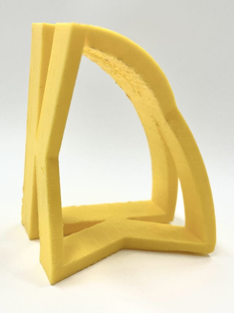
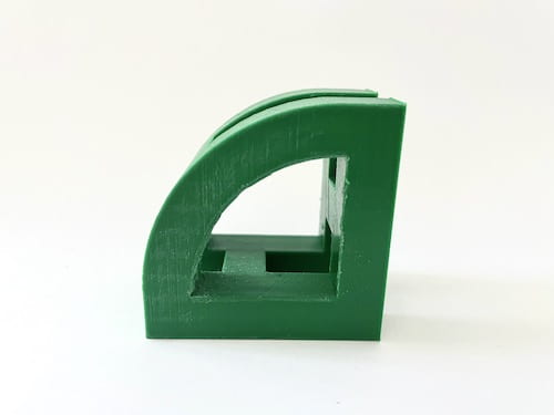
After this attempt, I was going to do the design with the 90 degree platform that held up the curved “K”. Then, I came up with the idea of making that platform into the letterform as well. This way the object has two 90 degree “K’s” holding up the curved “K”. The “K” can be placed down on either side and their will always be an identifiable letterform.
I overall really like how this iteration turned out and I don’t think there are many changes that I need to make. The only problem with the curved “K” is that it does not line up very well with the other “K’s”, so when I print this I am going to have to see if this is a problem. There are still some more things that need to be cleaned up in this design, but again, I will need to see if they are actual problems when printed.
I also decided to go with a theme for my two letterforms and created the same design for “H”. Since this letter is symmetrical, it made it very easy to create the letters and match them up. Again, I am really happy with how this design turned out and I am really excited to actually get this printed. I think once I print, I will be able to see if there are problems in the design. However, I do think the letter “H” came out cleaner and probably won’t need many fixes.
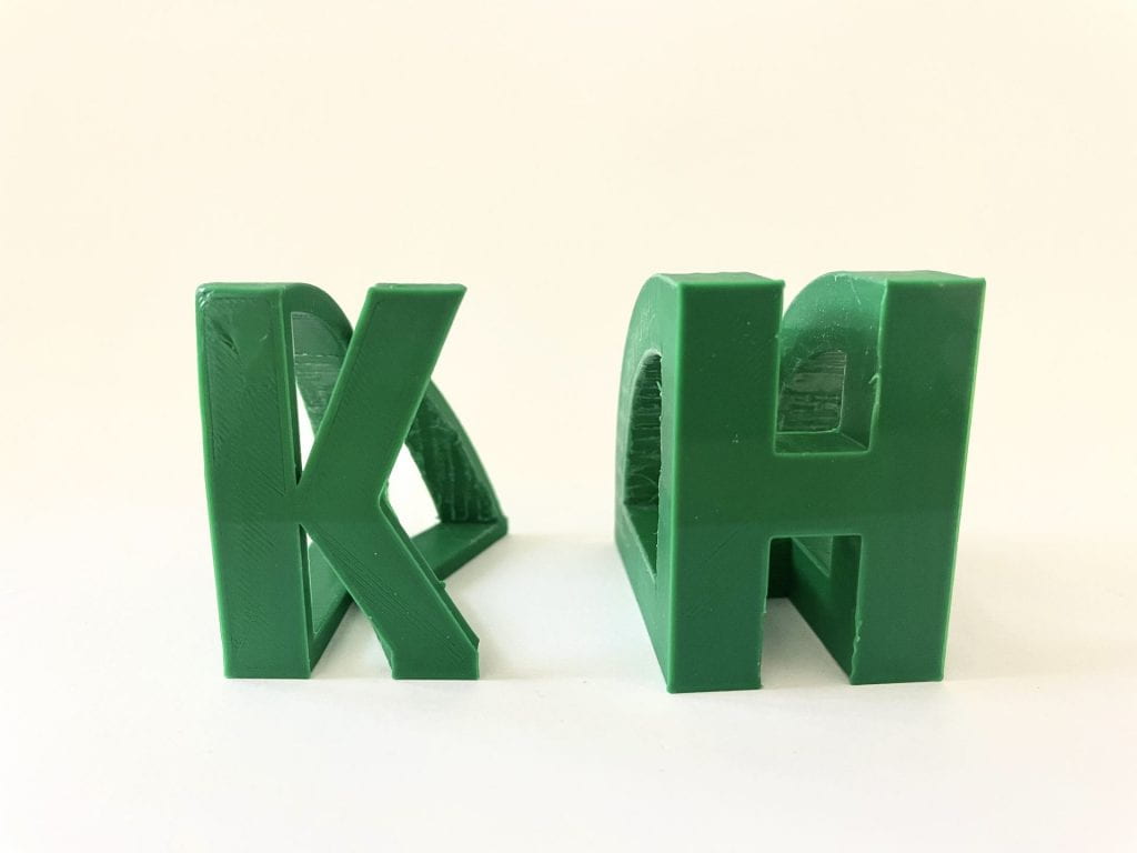
Both of these iterations came out good and only had two very fixable errors. The “K” print did not come out very clean especially once I removed the raft. Its first layer kept printing in a messed up and rough way. Therefore, my original solution was to print it without the raft. I thought this would allow for a much smoother base and platform. However, I found that what needed to be done was to rotate it slightly, so that the model would be flush on the bed. The second error for both of the prints were their size. I originally printed each with a dimension of 65mm and 50mm. However, this made the overall shape look uneven. Therefore, I made a simple fix and changed the dimensions to 50mm and 50mm, so it could be a cleaner and even print.
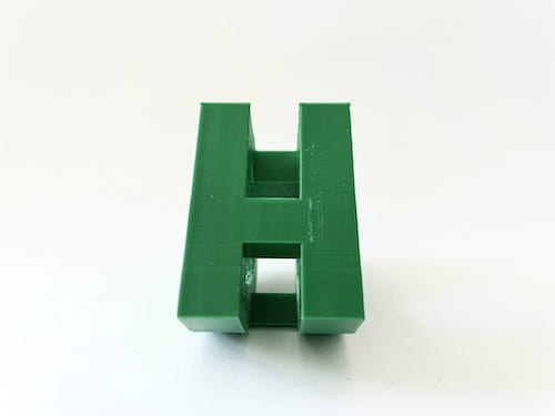
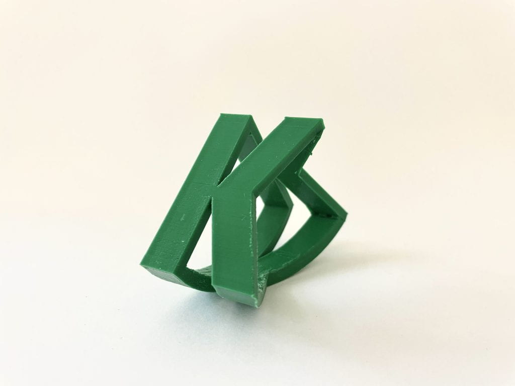
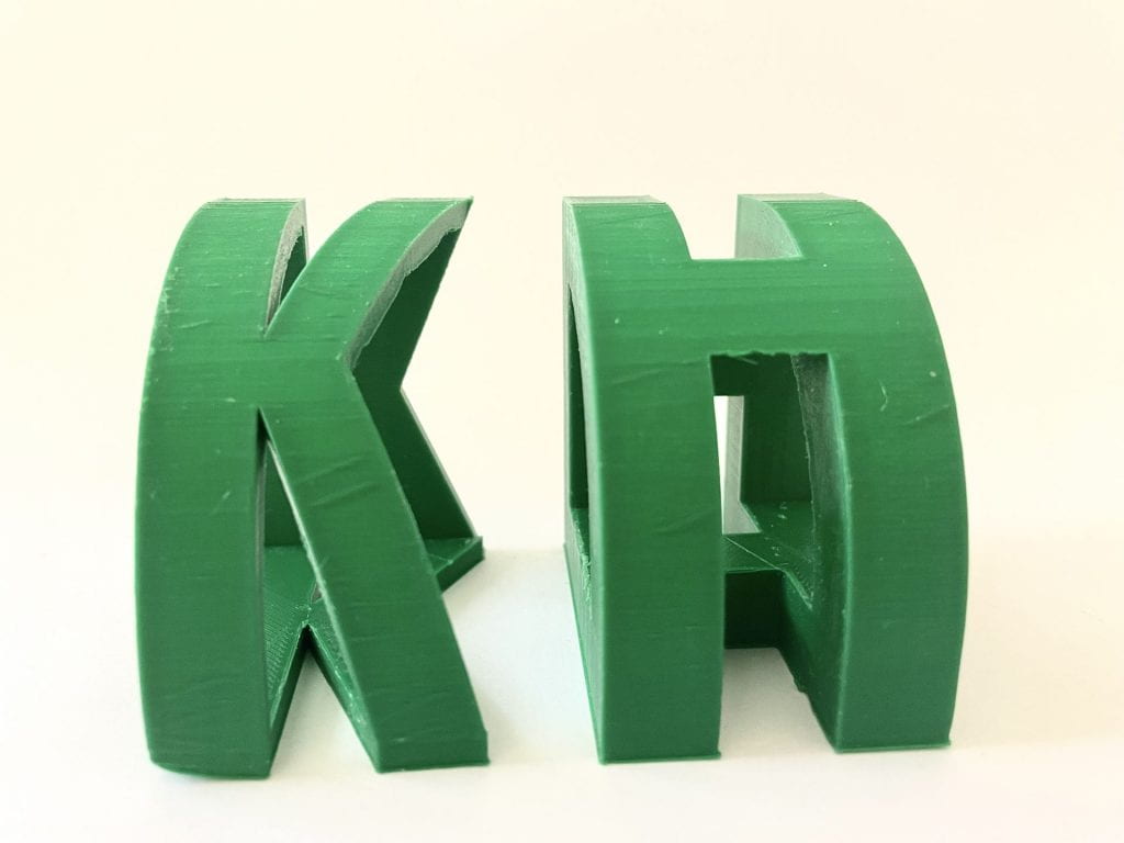
Final Print & Reflection
Above you can see both of my final prints for my Story project. On the left is my final print of the letter “H” and on the right is my final print of the letter “K”. I kept a theme for my two different glyphs because I really liked the idea and its design.
I am really happy with how the letter designs came out. As shown, each letter can be placed on either side and it will always show the same letter. Each side is also the same dimension of 50 mm, which gives the design an even and aesthetically pleasing look. One side is curved, which allows the entire object to rock back and forth when that becomes the platform.
The overall process to obtain these final prints was semi-difficult, but very fun. I really enjoyed doing this project and creating these letter designs. I encountered very little errors when designing the objects and printing them. The only difficulty I had while creating the letters, was finding the right dimensions and getting the object to print cleanly. After a couple prints, I was able to quickly solve this problem and get the right dimensions. These prints are small and do not take up much room, so they can be placed just about anywhere. These are my final prints because they came out the cleanest and exactly how I wanted them to. Therefore, I am really happy and proud of the final prints I have created. Shoutout to Professor Hooker for all the help in getting these prints!
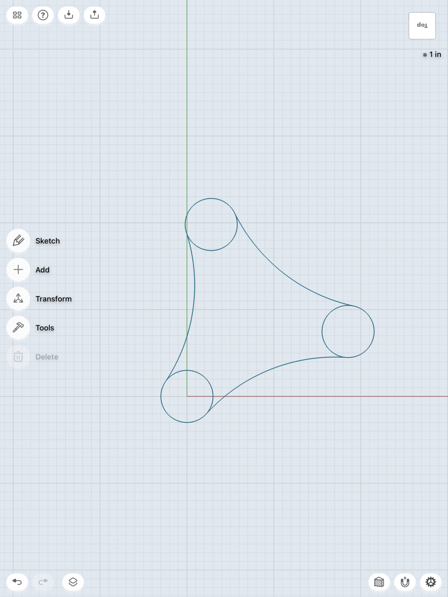
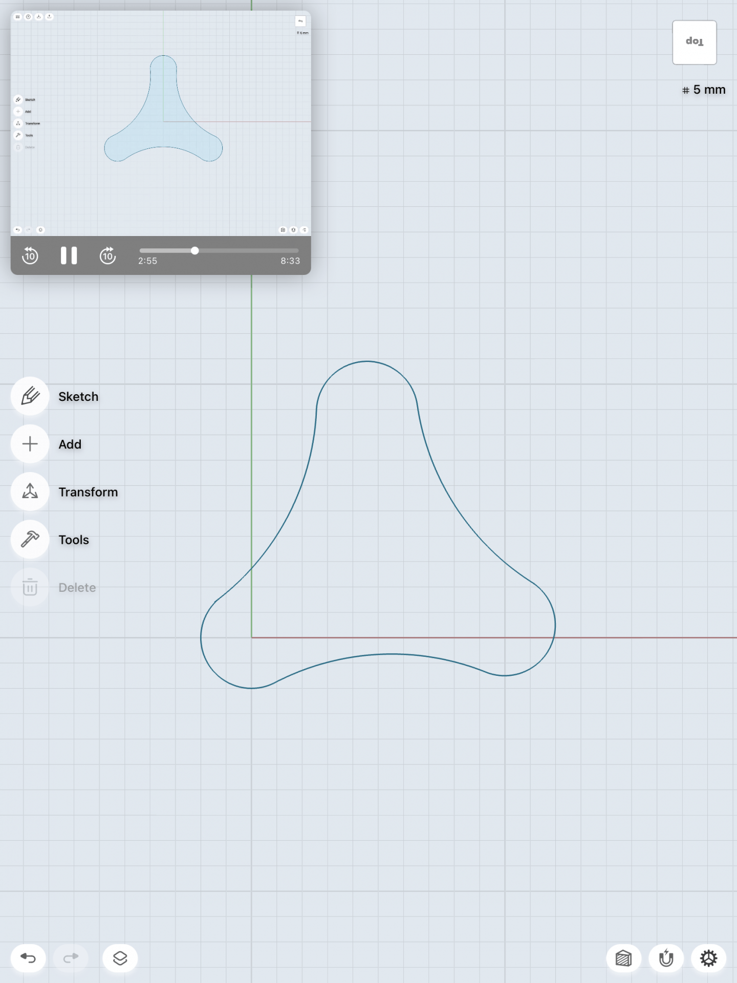
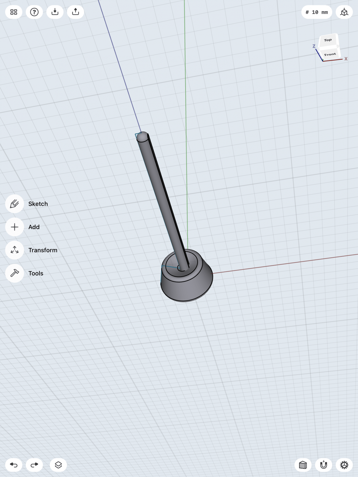
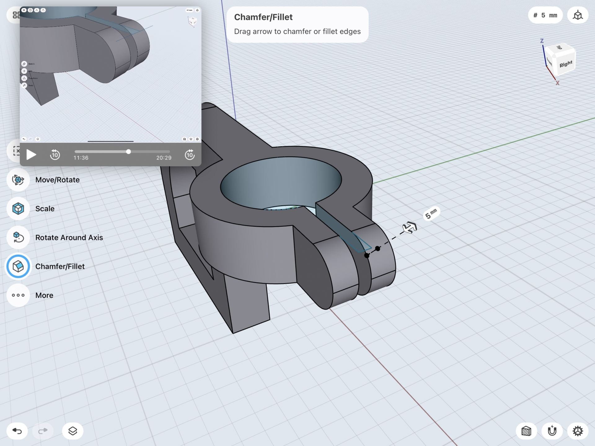
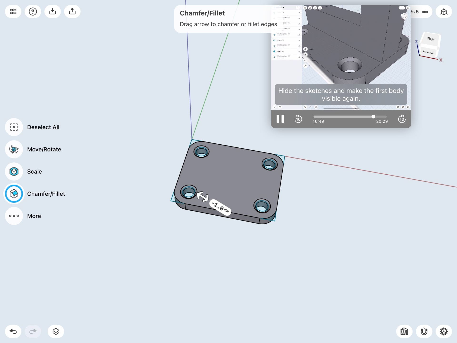
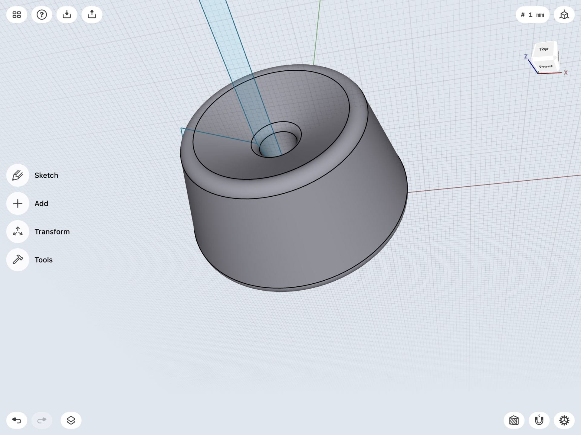
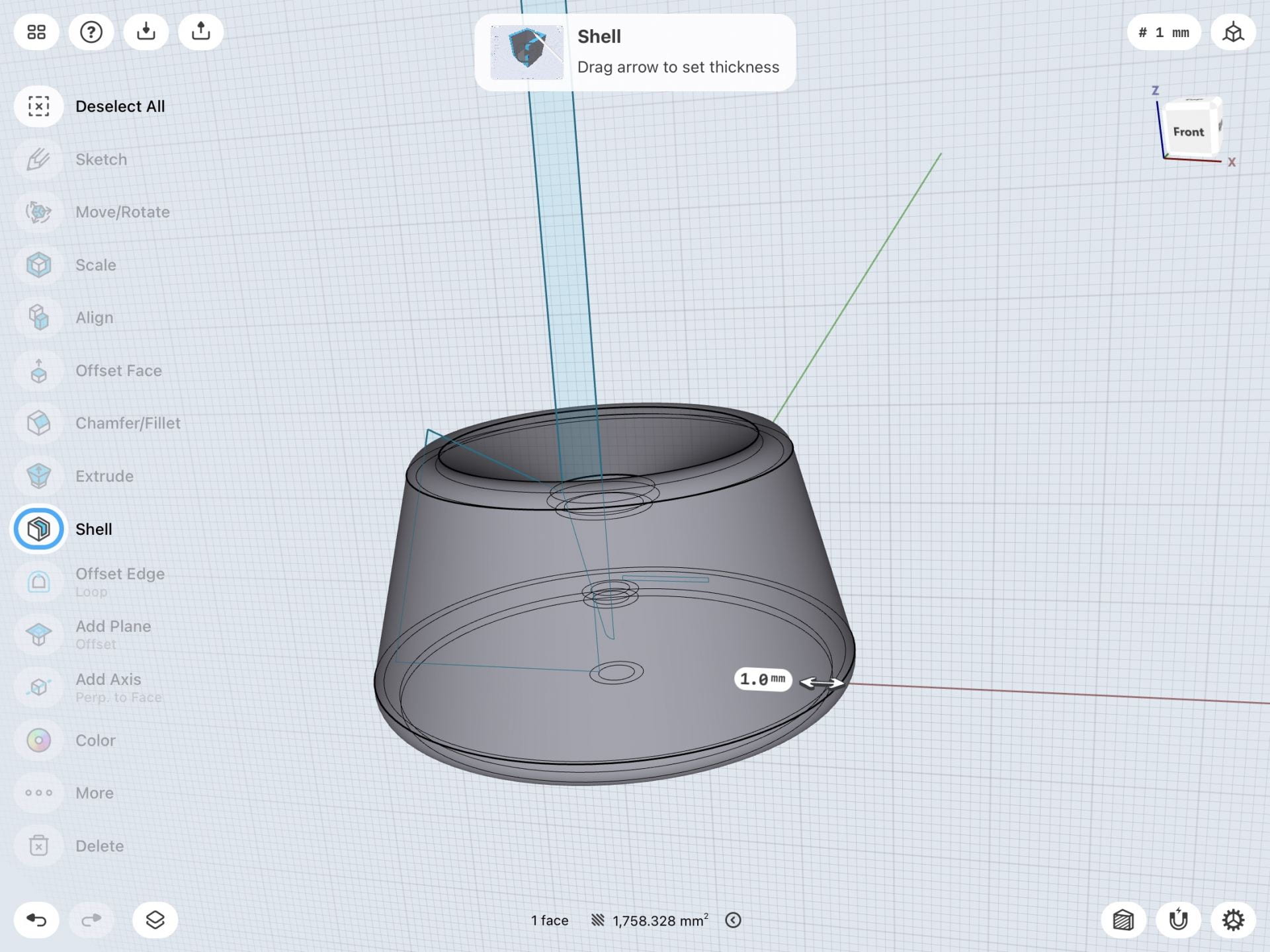
I had a lot of fun learning how to create this three hole bracket. First, I created three circles and made them all equal to each other so that the holes in in the bracket would be even. Next I had to create 3 arcs and create tangent relationships between the arcs and the circles so that they would come together as one whole unit. After removing the unnecessary lines I had the base sketch for my 3 hole bracket. I then took that base and extruded it upwards so that the 3d model would then be created. After doing that I created 3 more circles in each corner of the bracket and negatively extruded ( downwards) each one so that that I could create the holes that go within each corner of the bracket. After that I was done and all that remained was to round the edges of the 3d model to make it look nice and neat and my completed bracket was done! The images below are in chronological order.
Model a Triangle-Cap
Stylus and Base
Creating the stylus and base was challenging but I still enjoyed the process and learning how to create intricate details that add to the overall look of the object. Starting out with my sketch I had to draw a pencil like shape on a 2d plane. I had to remove a section of the sharp end and add a curve to it so that when I turned the sketch into a 3d model it would have a rounded tip. Using the revolve tool I turned the 2d sketch into a 3d shape. To create the divot between the tip of the stylus and the rest of the body I created a circle that indented into the stylus and then deleted it so that only the indented space was left. The next step was to remove one edge of the stylus. I did this by creating a flat surface on the 2d plane and then extruding it upwards through the stylus. After deleting it the side that I needed to be gone was gone. To create the base was a similar process as the stylus. I drew a 2d sketch and then used the revolve tool to make it 3d. I used section view to cut the 3d model in half so that I could properly adjust the stylus in the hole of the base. I had to adjust the placement of the stylus and round the edges of the base to make it look neat and proper but after these adjustments I was done. I rounded the edges of the base on the top and bottom and my final product was complete. The images below are in chronological order.
3D Modeling a Stylus & Base on iPad | Shapr3d Step-by-Step
The first model below was process of creating the bracket mount from the learning section in the Shapr3D app. It was fun learning from the tutorial of how the process of making a certain 3D model was made.
Step 1
Step 2
Step 3
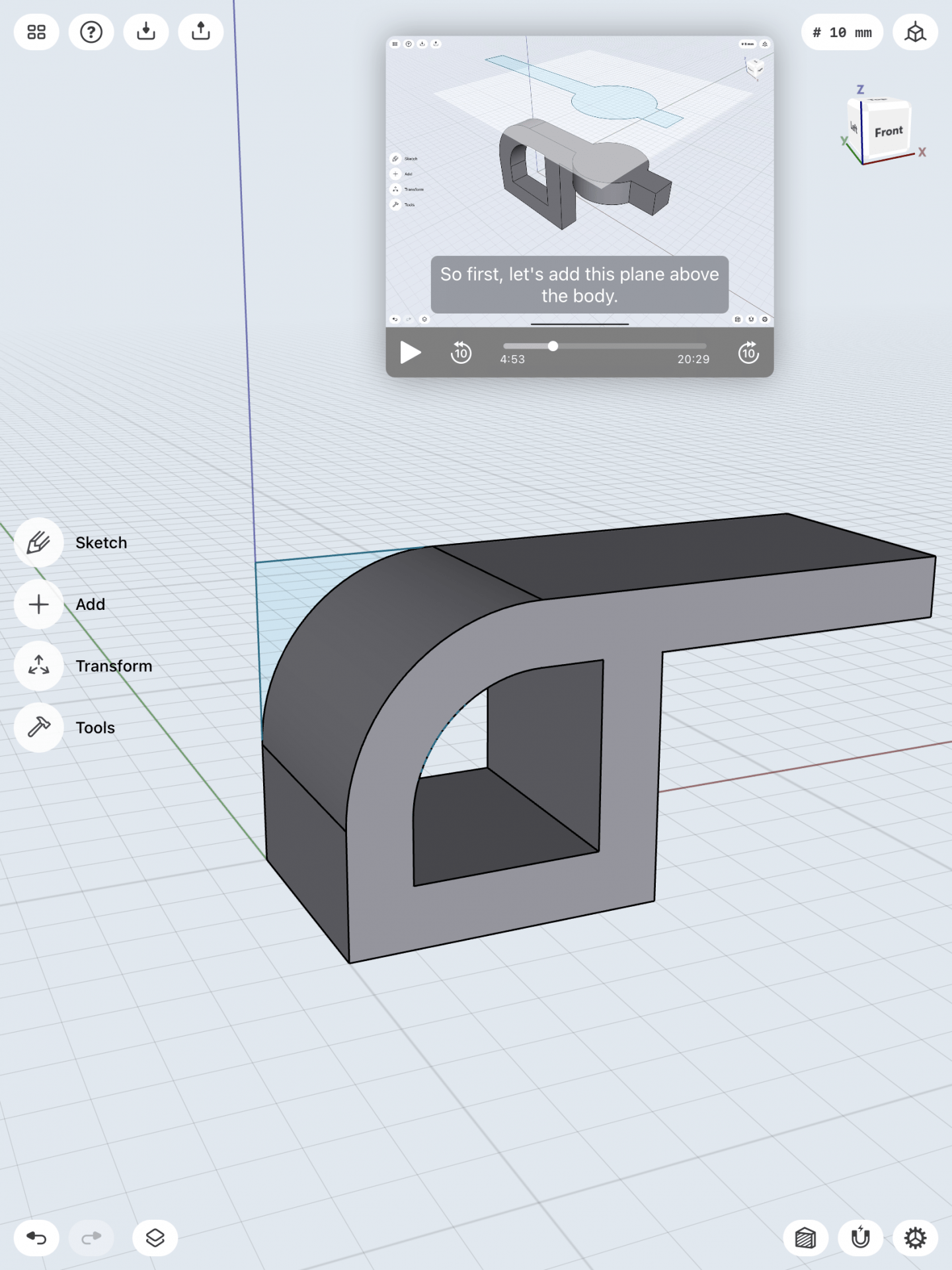
The first step was to make a sketch of the main component of the bracket mount. I first sketched of the dimensions of the sizing of the model, then on the next step, I stretched out the body by 30mm and made it into a 3D figure. I then used the offset tool to measure the inside of the model and incorporated a hole inside of the model. The next step was to add the hook and the rest of the top components. I added a work plane, hovering the model to begin the next step. The images below were the next steps I have approached.
Step 4
Step 5
Step 6
The next step was working with the work plane. I combined a circle and a long rectangle into one figure and then lowered that work plane figure onto the model, so it would cut through the model, making its shape. I then intersected the two separated models together into the image shown on step 5. I then used the concentric tool to group a circle within the model as well as two more circles at the lip of the model to make its opening. The final step was to make the base of the model.
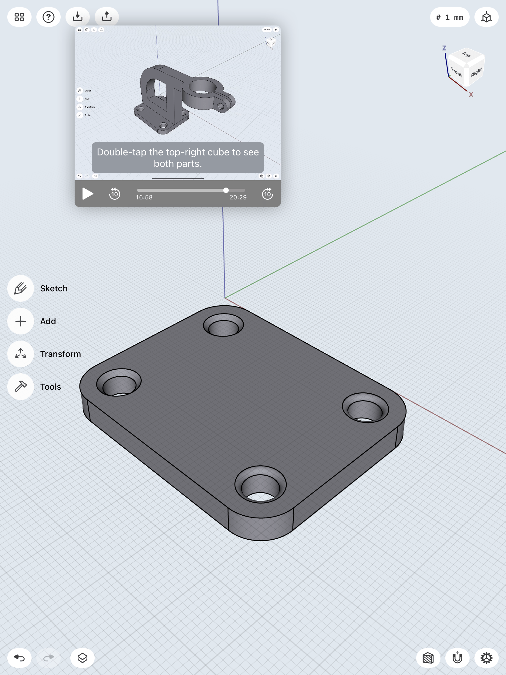
Step 7
Step 8
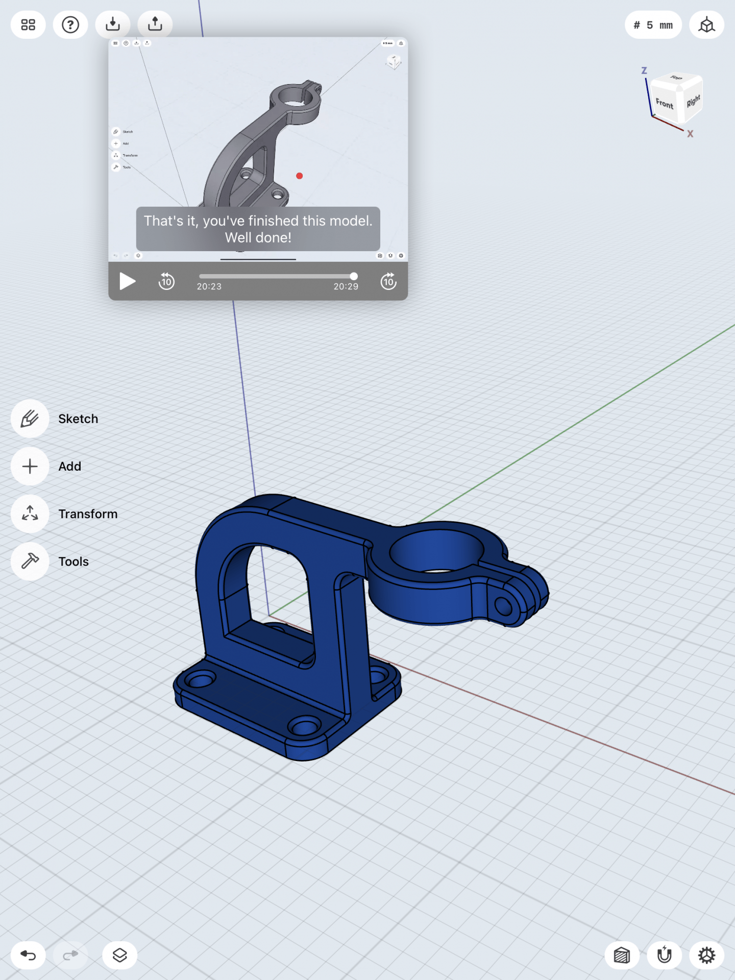
Final Product
I sketched out the base of the model then made it into a 3D item by making its base 50mm by 40mm in size. I then made 4 holes on the base plane and used the concentric trait to align them to each corner. I then smoothed out the edges around the 4 holes to make the function of the base more better. Now it was time to connect the two models together. I attached both of the models together and then smoothed out the edges around the model to give it a authentic look as well as changing the models color to give it a better look. In the end it turned out great, and looked exactly as the tutorial model.
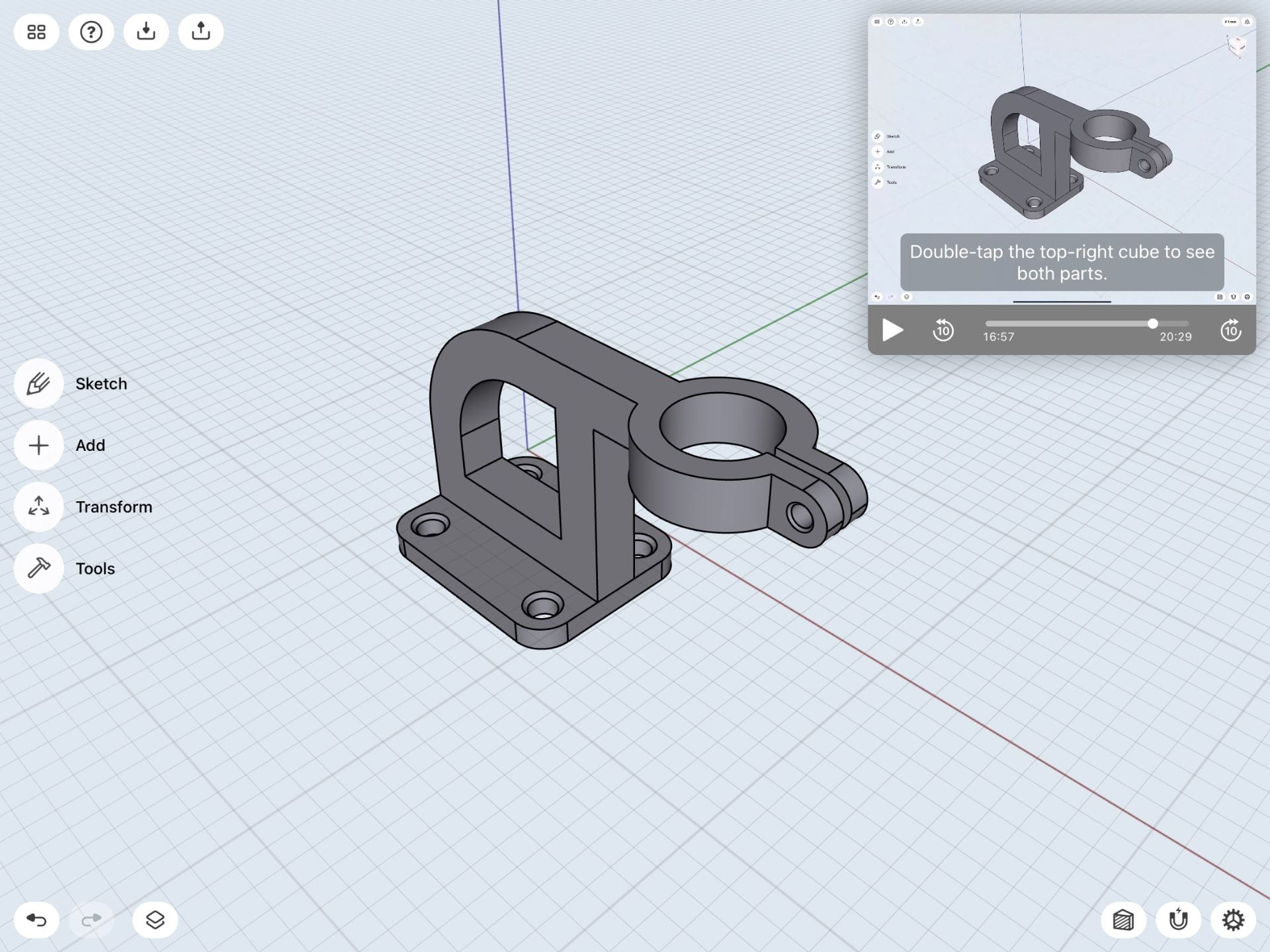
3D Modeling an iPad Stylus & Mount
This model was a big challenge for me. The process of creating this model was a lot more difficult than the bracket mount. It required more steps and details to achieve its dimensions as well as the whole model itself. The process took a lot longer than I thought it would be, but all in all I was able to achieve to create an iPad stylus with a mount in it. Below are the steps that I have taken to achieve the end product.
3D Modeling a Stylus & Base on iPad | Shapr3D Step-by-Step
Step 1
Step 2
Step 3
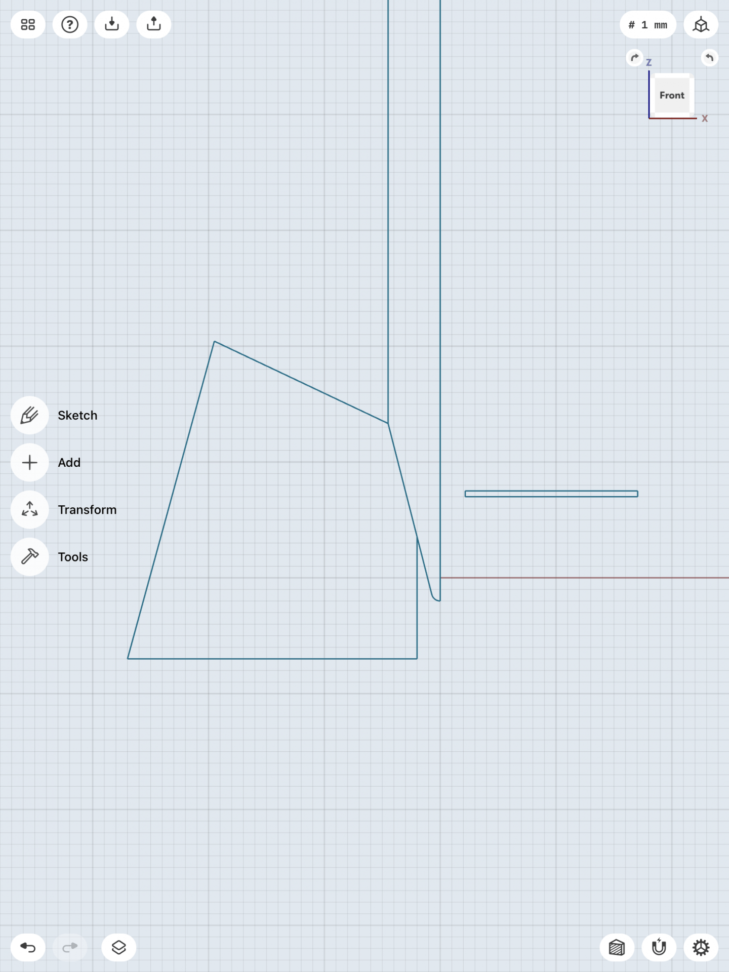
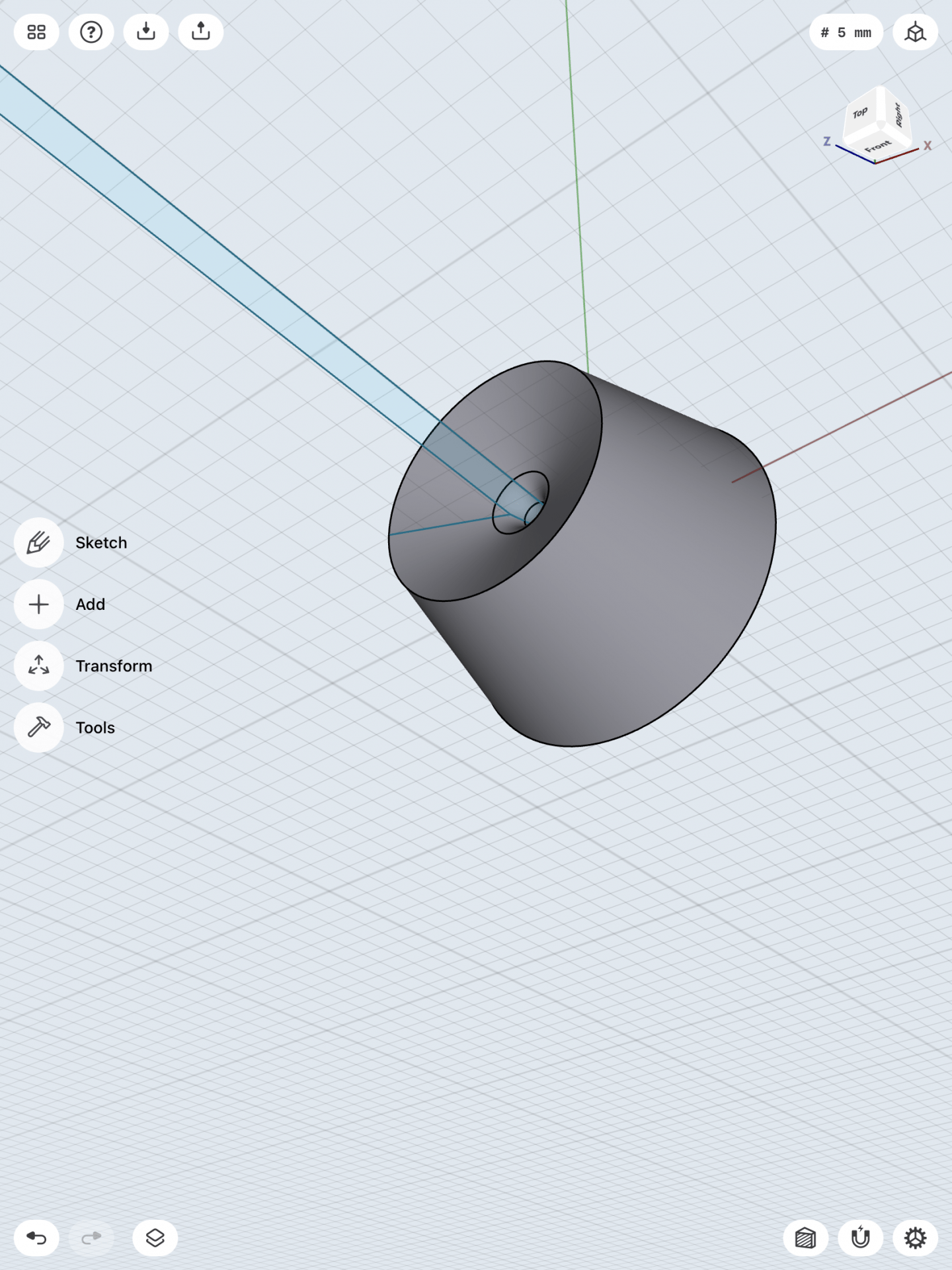
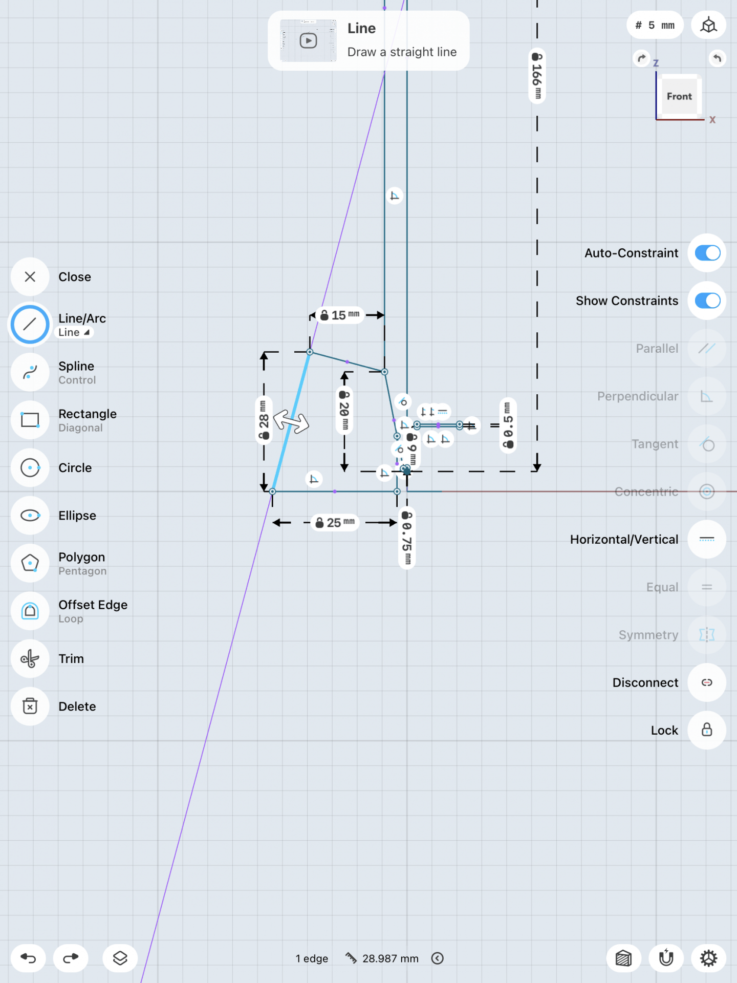
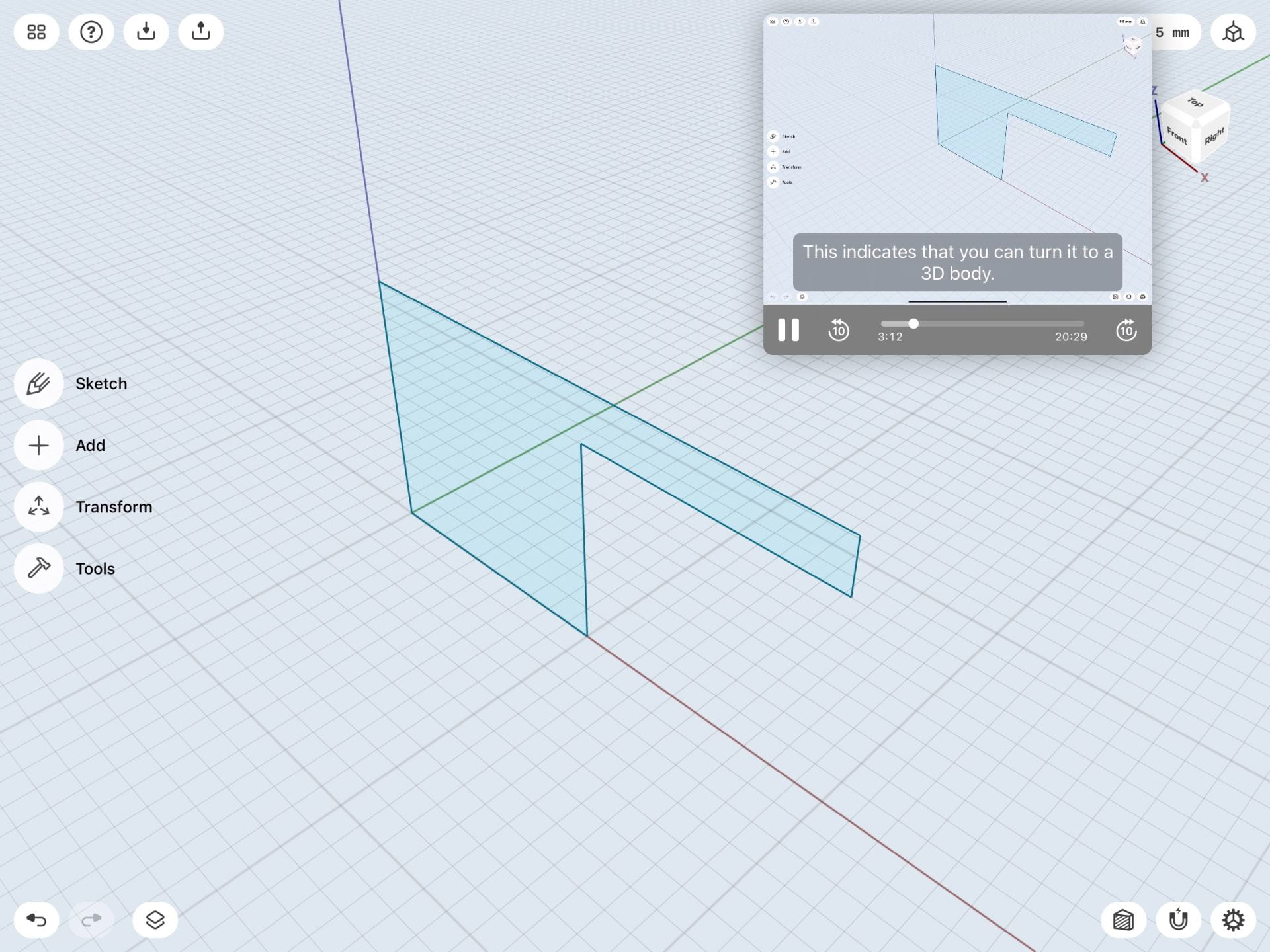
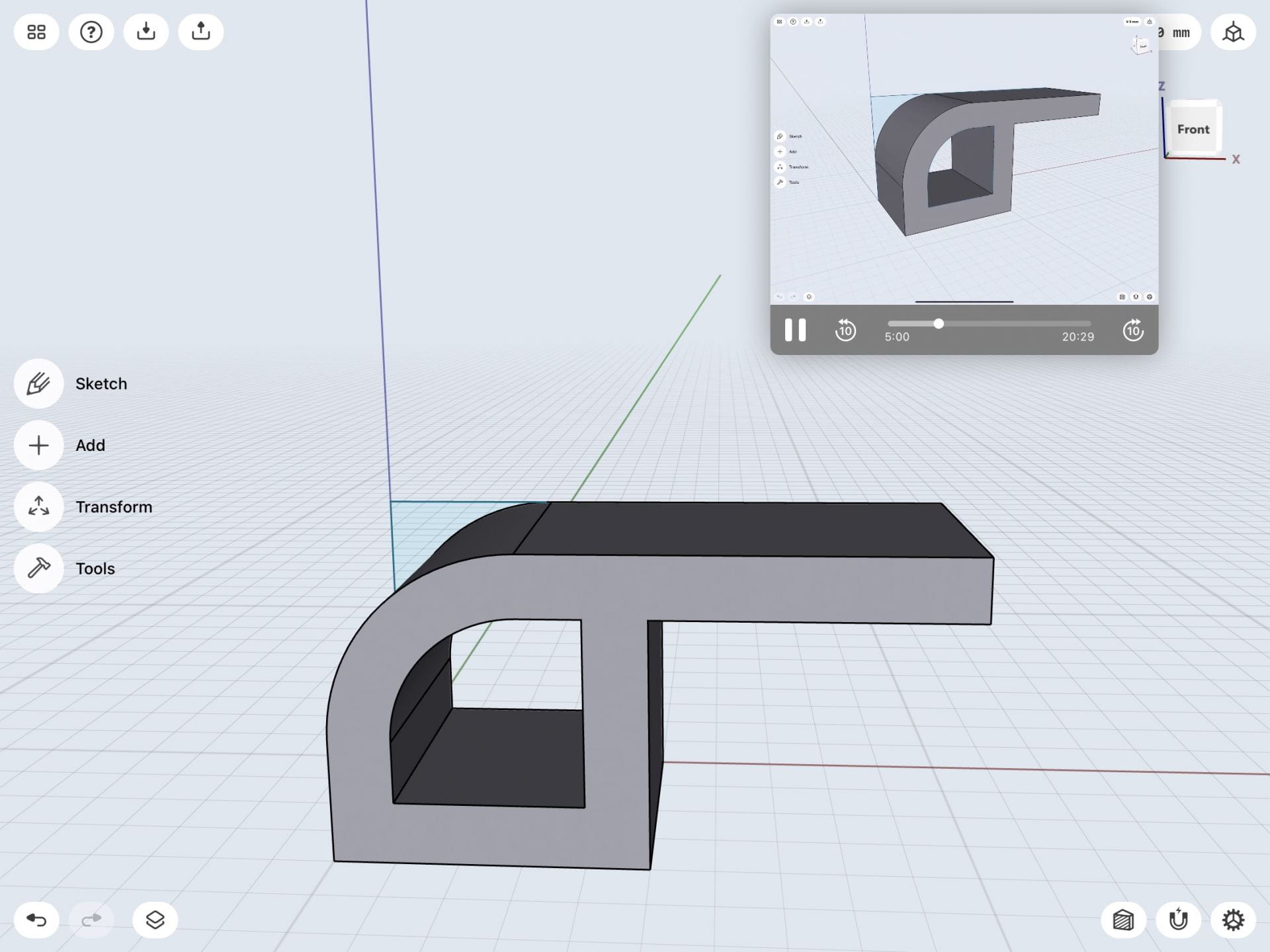
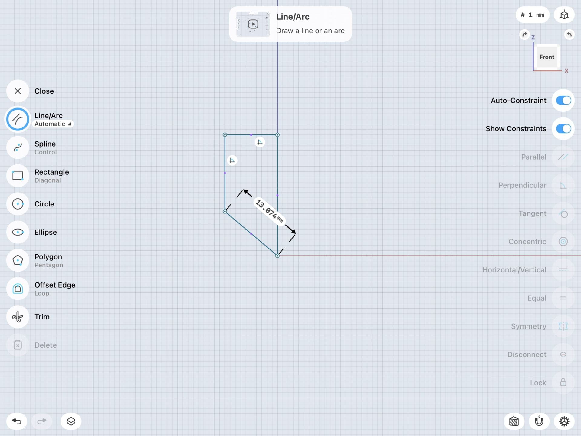
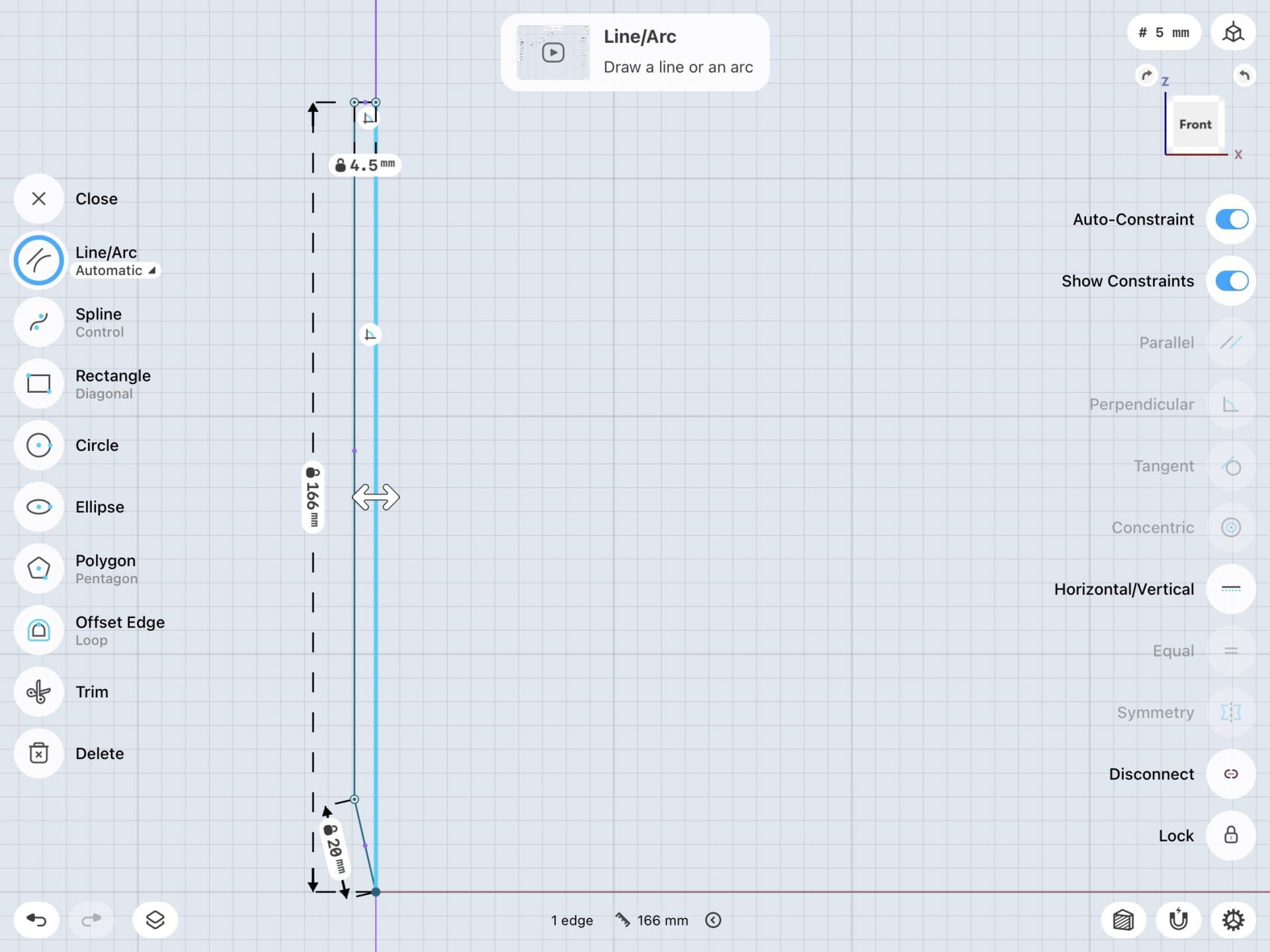
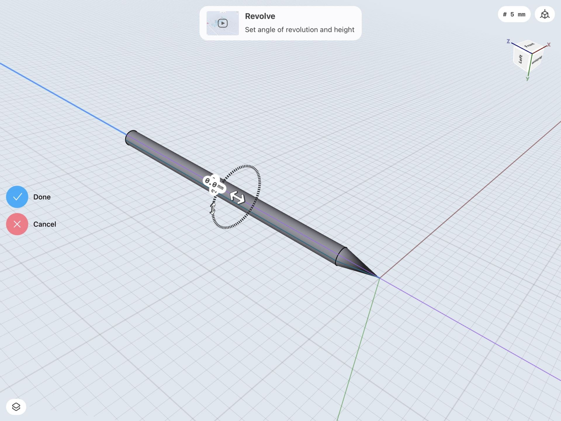
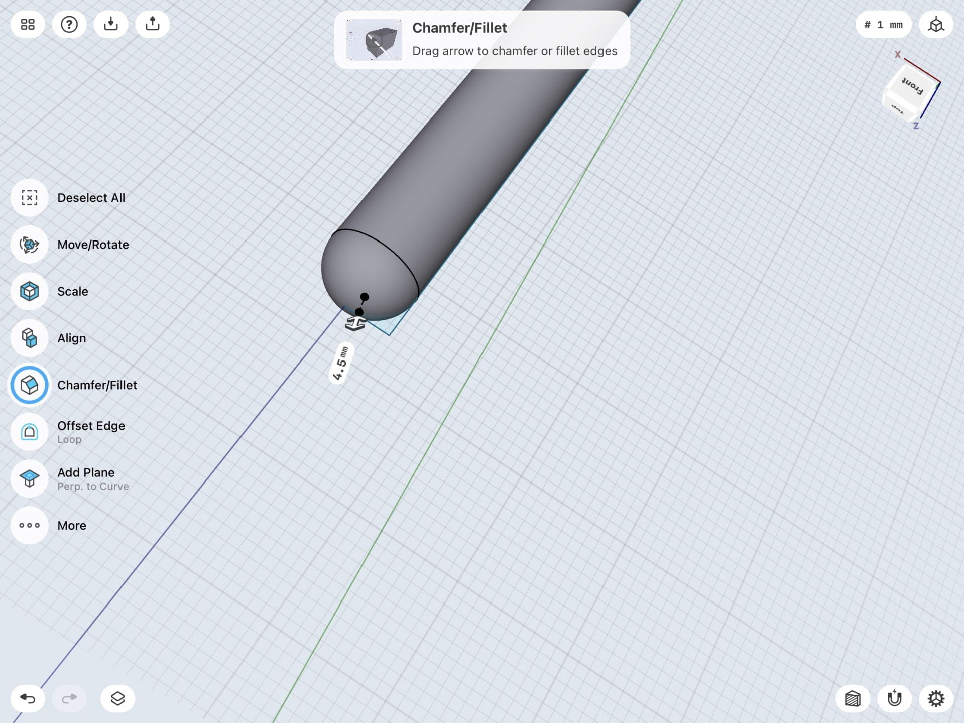
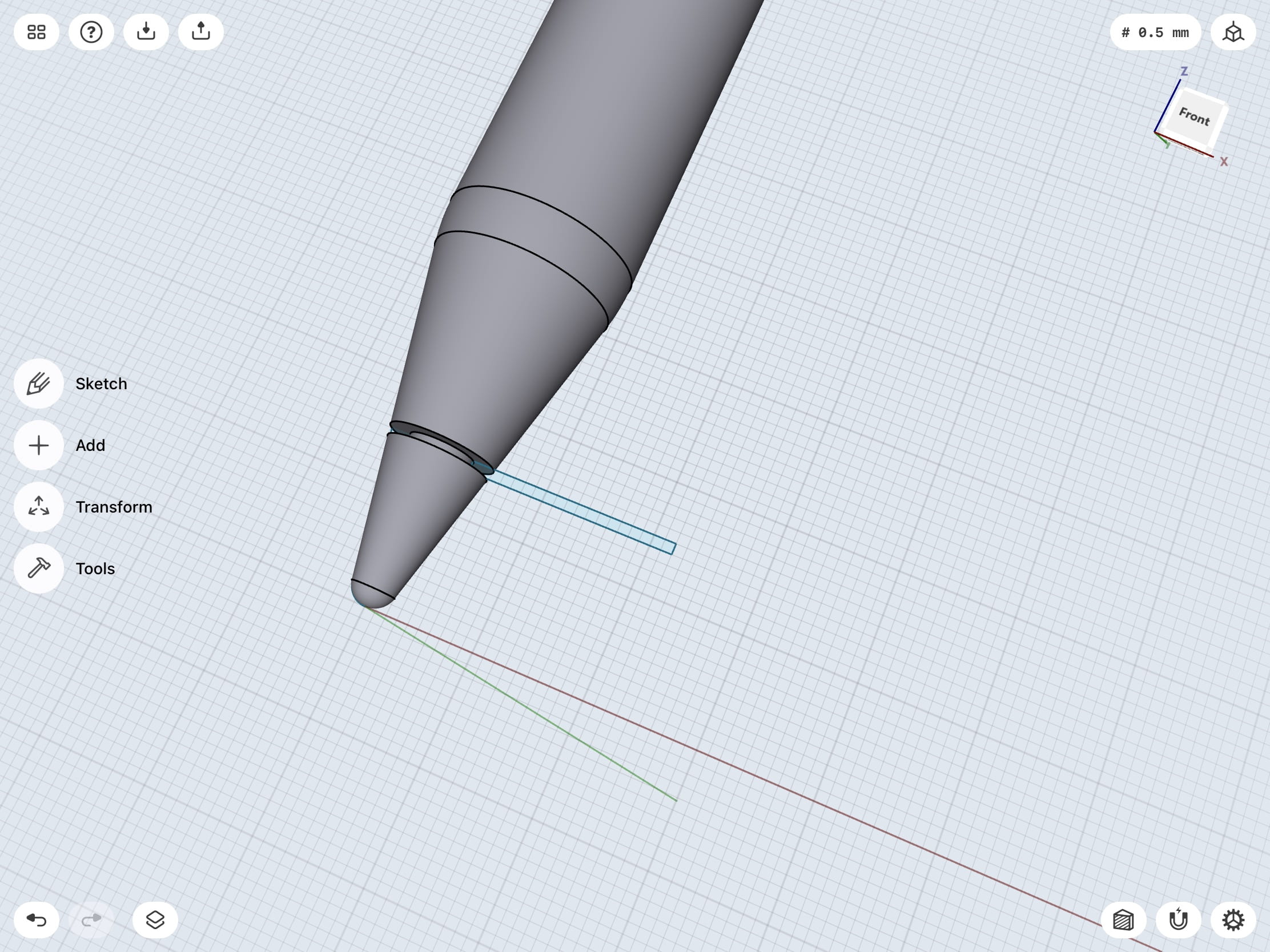
I first sketched out the overall sizing of the iPad stylus. The height was 166mm and I sharpened the arc at the tip of the pencil to give it a better look. I then highlighted the sketch, used the extrude tool, then selected the long side of the stylus, used the rotate around axis tool, then finally used the revolve tool to make it into a stylus shape. In step 3, I added some details by combining a skinny rectangle at the side of the stylus to give it more of an iPad stylus look. The next step was to make the stylus mount.
Step 4
Step 5
Step 6
Step 7
Final Product
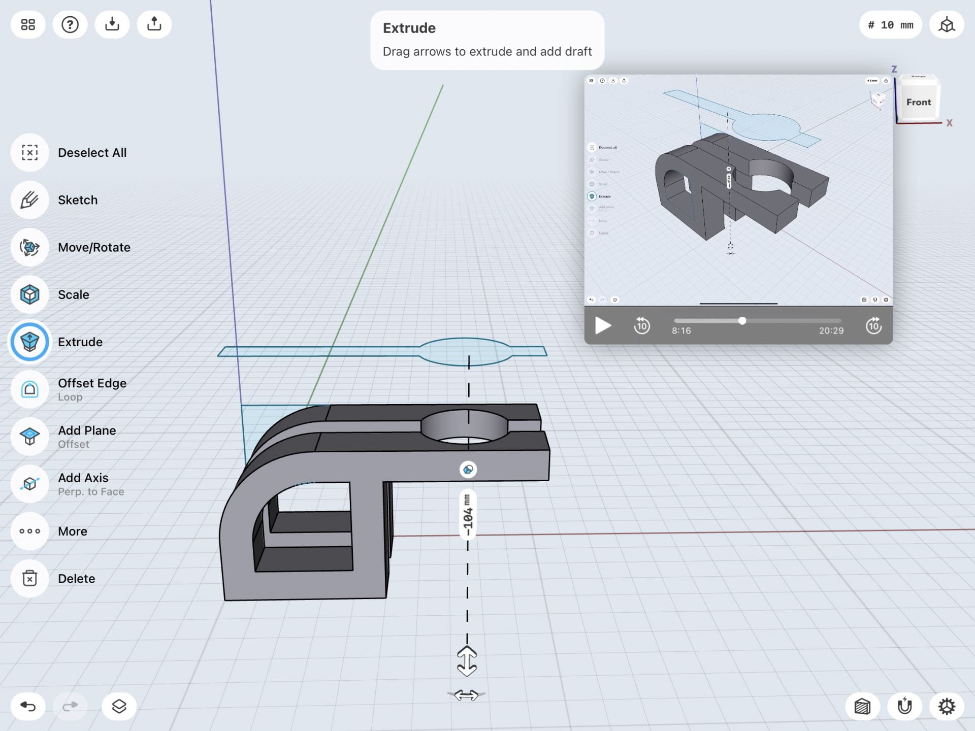
I went back to the 2D view of the model to create the mount for the stylus. I created the dimensions from the mount as seen above, and I then highlighted that shape, as well as highlighting the side of the long side of the pencil, and used the revolve tool to make the shape of the sketch go around the stylus. I had to make some adjustments since the pencil wasn’t completely inside of the mount, so I had to move the stylus around to fit into the mount. It fit perfectly and at the end, I curved the edges around the mount to give it a cleaner look, as well as changing the color of the stylus and the mount. This process was very challenging for me, I had to learn new types of tools that I haven’t learned before to create this model. However, I have learned a lot from these videos, and I look forward to what I will make with these skills that I have learned in Shapr3D.
To being learning Shapr3D more in-depth I followed the Bracket Mount tutorial in the app. Below are pictures from beginning to end showcasing the process of the design that I made by following the tutorial.
Personal model
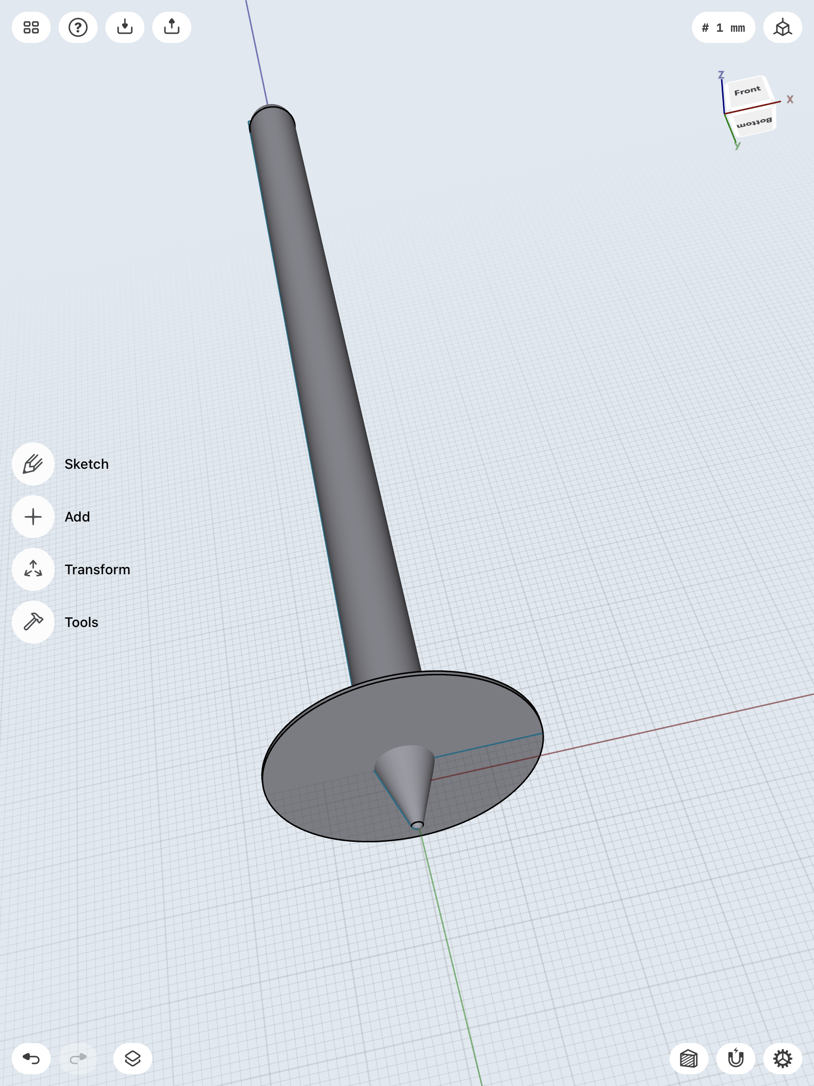
The tutorial I choose to follow from the Shapr3D step-by-step modeling guide to make this model was the 3D Modeling a Stylus & Base on iPad. Below are screenshots of the entire process of following the tutorial to create the design from beginning to end.
I created the bracket mount 3D model in Shapr3D by beginning with a 2D view of the grid and drawing the initial basic structure of the body of the bracket with the line tool. I then extended or stretched the flat outline to expand it into a 3D model. I added a second plane at the top of the structure and was able to sketch the top section of the structure, also using the line tool, on the additional plane using a 2D view again. I expanded the sketch into a 3D structure and combined it with the already constructed body. I created holes in the structure by drawing additional outlines on the structure, either with the line or circle tool, and pushed the shapes through the model with the shapr arrows to a hole in that shape in the bracket. Finally, I added the base of the bracket by using the rectangle tool to create a 3D rectangular base. I added holes in the base using the circle tool to create 4 even circles in each corner of the rectangular base. To make the final model appear more smooth and complete, I selected the straight edges of the bracket and curved them, giving the object a more rounded finish.
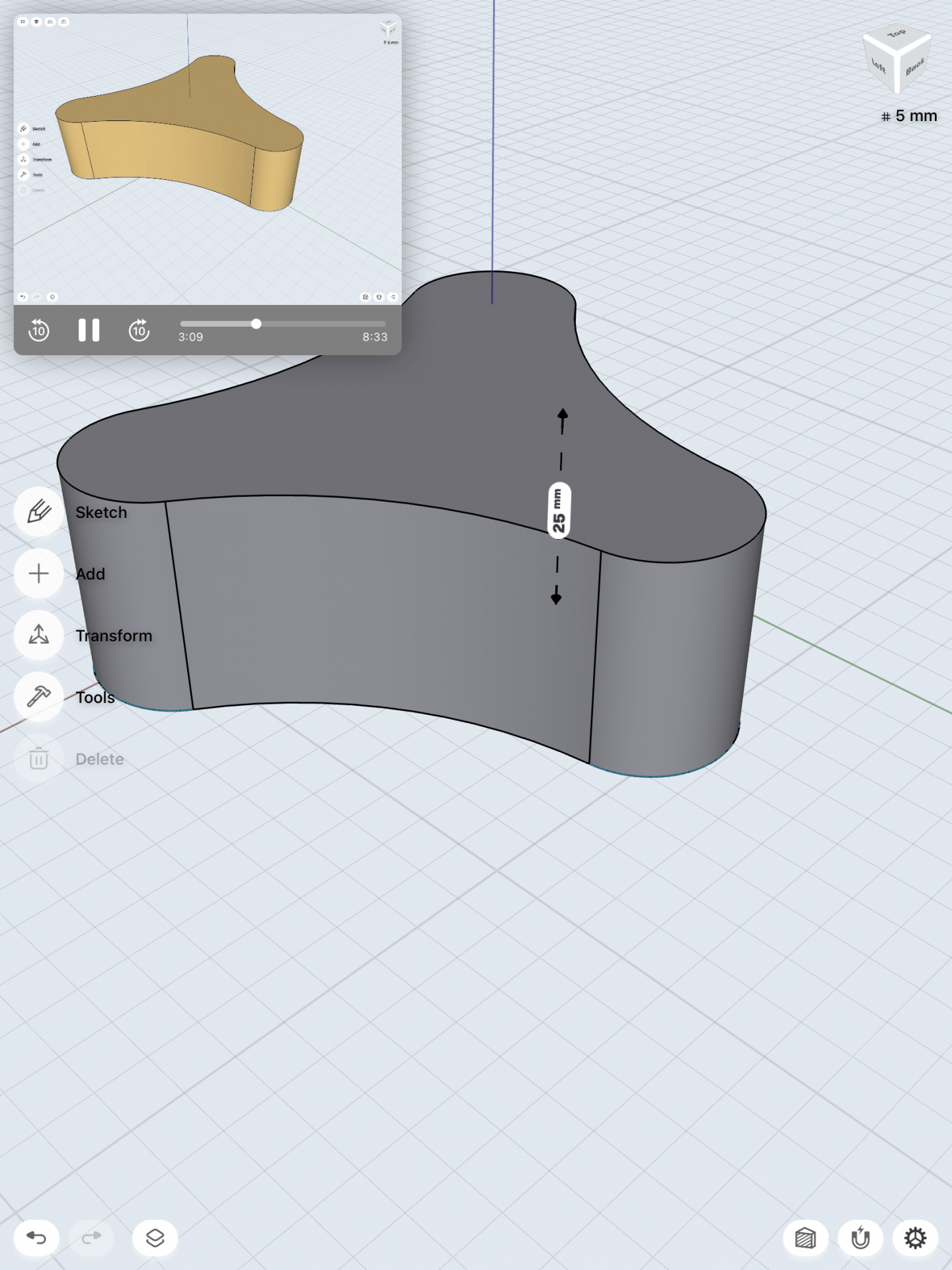
“3D Modeling a Bench on iPad”
Similar to the bracket model, I began the bench design with a 2D view of the grid to make it easier to sketch the initial outline of the bench. I used the line tool to sketch the shape and offset the edges to increase the thickness of the bench. I extended the sketch to make it a 3D model. I selected the outward face of each side of the bench and once again had a 2D view of the surface. I created the holes in the sides of the bench by using the rectangle tool. I selected the edges of the rectangle to create a curved surface rather than a straight edge and used the arrows to push the shape through the side to create the hole. Finally, I selected the bottom edges of the bench and gave them a curved finish for a completed appearance.
I used the “3D Modeling a Bench on an iPad | Shapr3D Step-by-Step” video tutorial to create my bench model in Shapr3D.