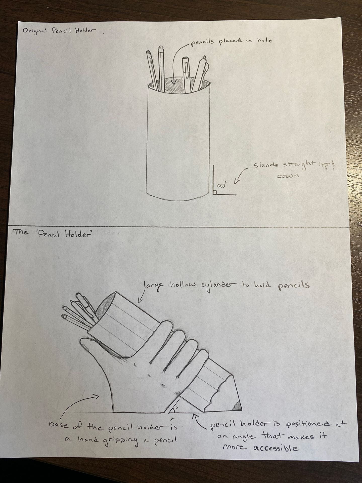
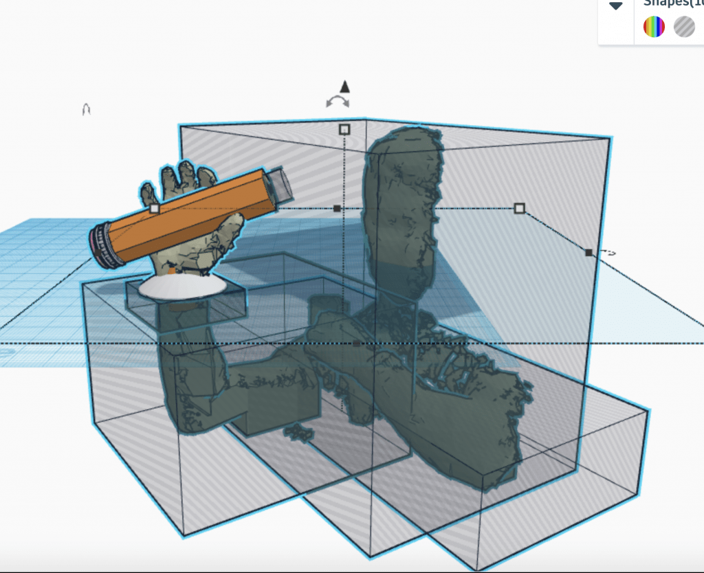
Daniel C’s Story

Research & Concept

Letterforms and their various stylings possess just as much meaning as the words that they help form. They elicit varying moods while simultaneously setting the tone. Even though every letter in this collection, both ‘D’ and ‘V’, are written in a different style, one still immediately recognizes the familiar shape through association. One may even say that calligraphy is the art of type. Not only do letterforms allow us to communicate, but they also serve as creative outlets. Even though each letterform has its own distinct structure, designing them in various shapes, sizes, dimensions, and stylings can dramatically alter the message one wishes to convey.

First Glyph – ‘D’

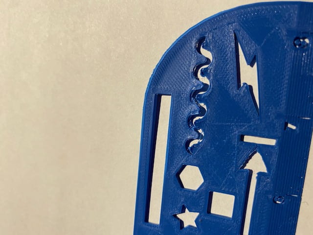
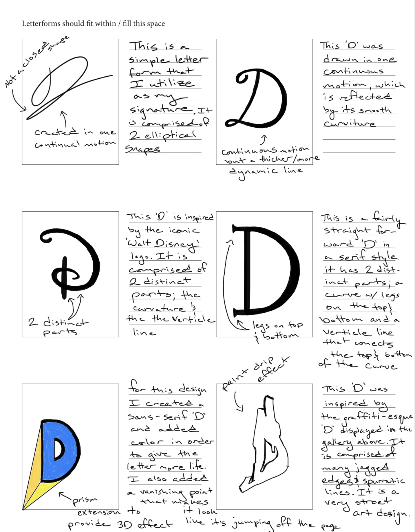
The first glyph that I chose is the letter ‘D’, as it is the first letter of my initial. Interestingly, this letter has its roots in the Semitic alphabet, which spans back to the second millennium B.C. This letter is comprised of two unique strokes: a bar – the horizontal stroke in characters such as A, H, R, e, and f, and bowl – A curved stroke that creates an enclosed space within a character (the space is then called a counter). The capitalized version of the letter ‘D’ is very distinct from its lowercase ‘d’ counterpart. Most notably, the bowl stroke faces in the opposite direction compared to the capital letter. Pictured below are the sources of inspiration for three of my sketches.


Second Glyph – ‘V’

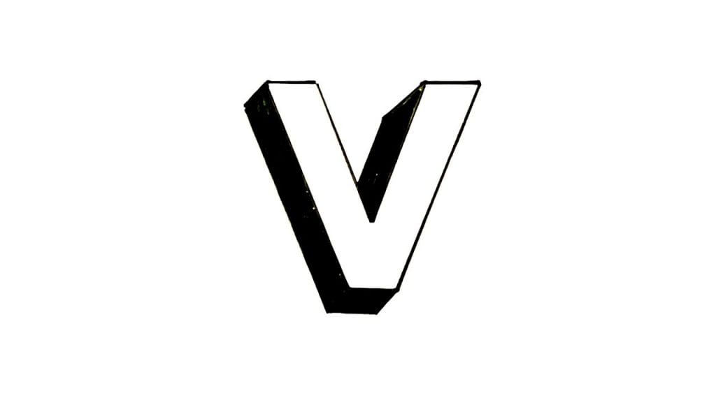
The second glyph that I chose is the letter ‘V’, as I like its simple symmetry in its most neutral form. This letter has its origins in the Semitic alphabet as well. It is generally comprised of two equidistant strokes that move away from each other from an origin point. It is not a very commonly utilized letter in the English language. There is not a lot of variation between its upper and lower-case forms, except for its height. Below are some pictures that inspired three of my designs. My last sketch in the series is a whimsical interpretation of the letter.


Iterations

For my first iteration of the ‘D’ glyph I decided to keep the design simple and familiar, in order to capture the true essence of the character. I hope to revisit Shapr3D in order to bring to life some of my other ideas. In the meantime, I definitely bit off more than I could chew in terms of my Shapr3D abilities. My end goal is to create a graffiti-style ‘D’ glyph. This iteration allowed me to gain more experience with the software, in order that I may explore different and more unique concepts in my upcoming iterations. I do really minimalistic design because the form of the object is very closely tied to its function. To create this glyph, I merely connected a series of lines and an arc, which I then offset from the edge, and drug 2mm towards the center. Finally, I extruded the 2D shape from the plane.

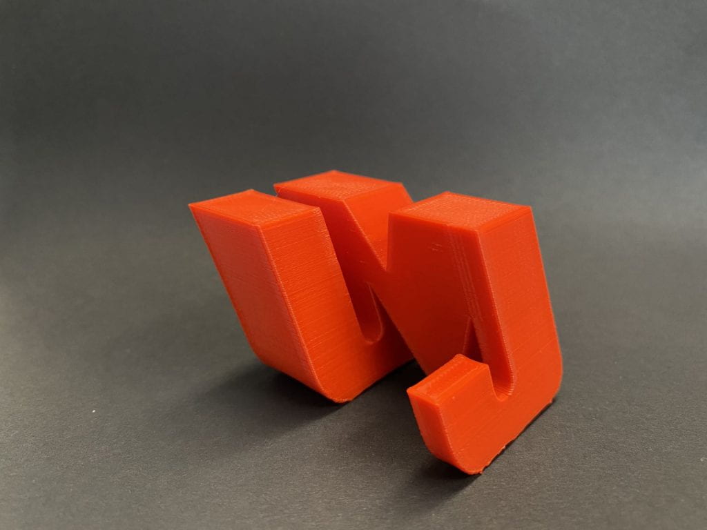
The second iteration of the ‘D’ glyph that I complete ended up being much more complex, although it does not directly correlate to any of the sketches that are pictured above. I decided to make this design more creative and add ‘wings’ to the top and bottom of the ‘D’. Not only does this make the design more dramatic, but it also resembles a ‘C’, which happens to be my last initial.

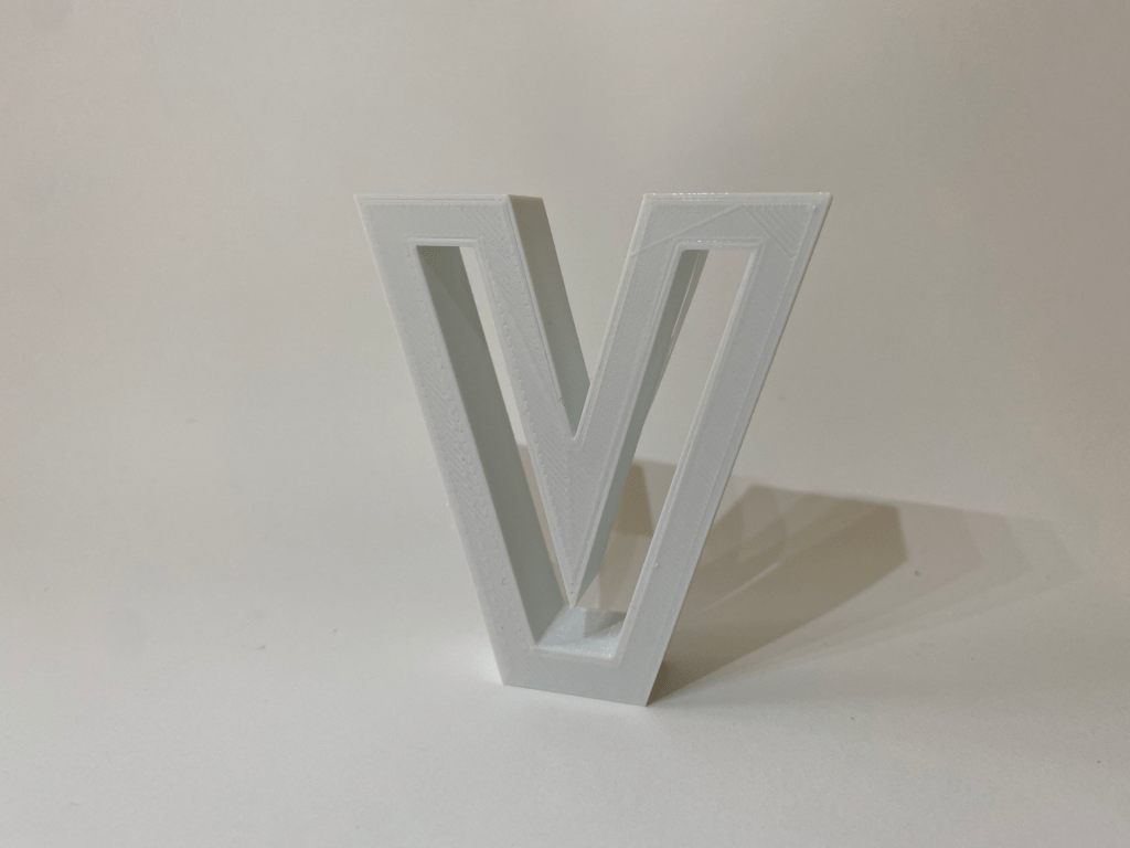
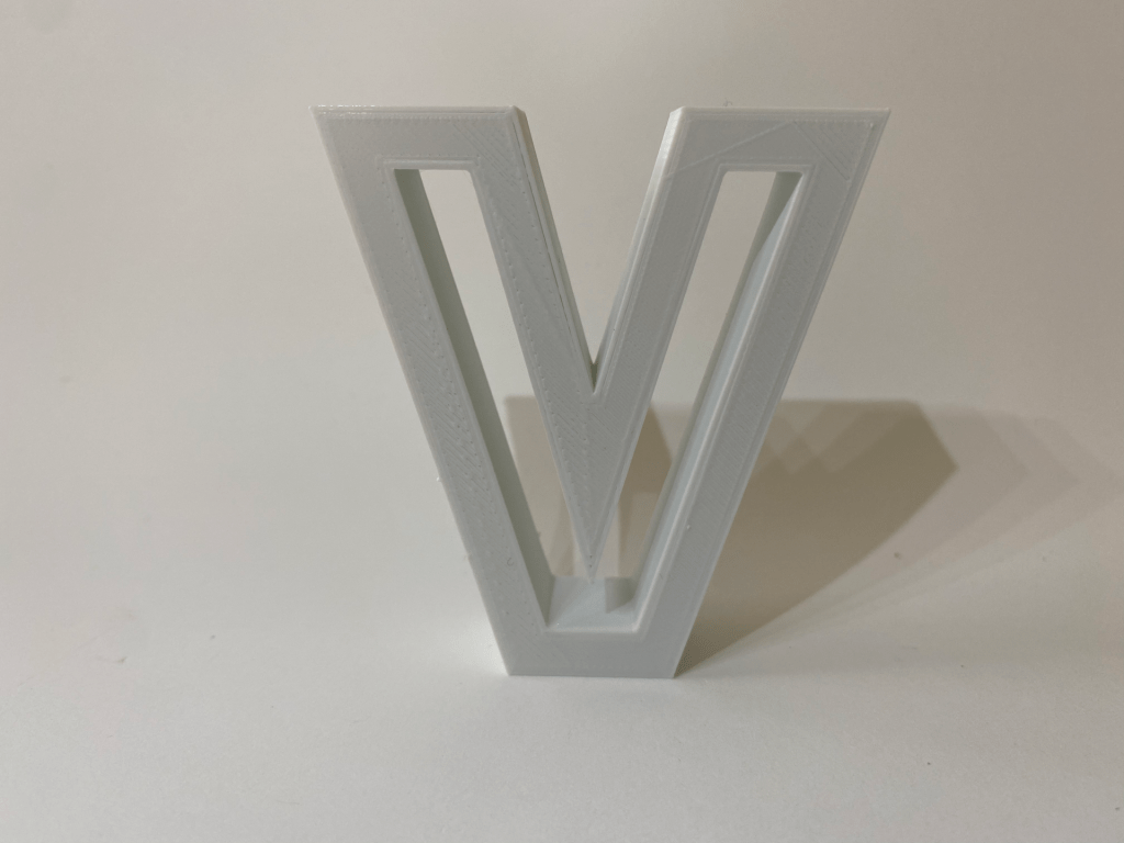
For my first iteration of the ‘V’ glyph I decided to use the first sketch in my ‘V’ letterform composite, but with a twist. I began by creating a standard ‘V’ shape by connecting multiple lines. I then offset the edges of the ‘V’ shape and drug them 1.5mm inwards. I then extruded the outside ‘V’ shape 3mm off the plane. Although this design does not leave much room for interpretation, I feel as though the hollow space on the inside of the ‘V’ draws the viewer in. I am hoping to create a few more iteration of the ‘V’ before conducting a final print.

Final Iterations & Prints

I was able to print out both the ‘D’ and ‘V’ letters with only one slight problem. Upon retrieving the second iteration of the letter ‘D’ from the printer, I realized that the three distinct parts that comprise the letter had not been unionized in Shapr3D. This meant that when I printed it out the two ‘wings’ were not grafted to the centerpiece. In order to overcome this challenge, I made the following iteration that is pictured below.

To achieve this shape, I merely used Shapr3D to decreased the extrusion height of the small ‘D’ and drug it backwards into the stem of the larger ‘D’. I then unionized the two shapes together and then exported the .STL file into Tinkercad.

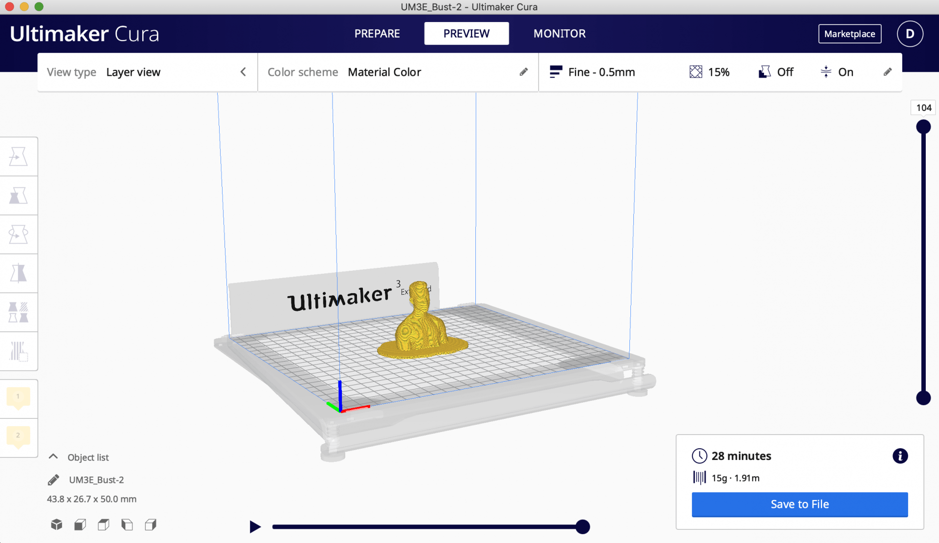
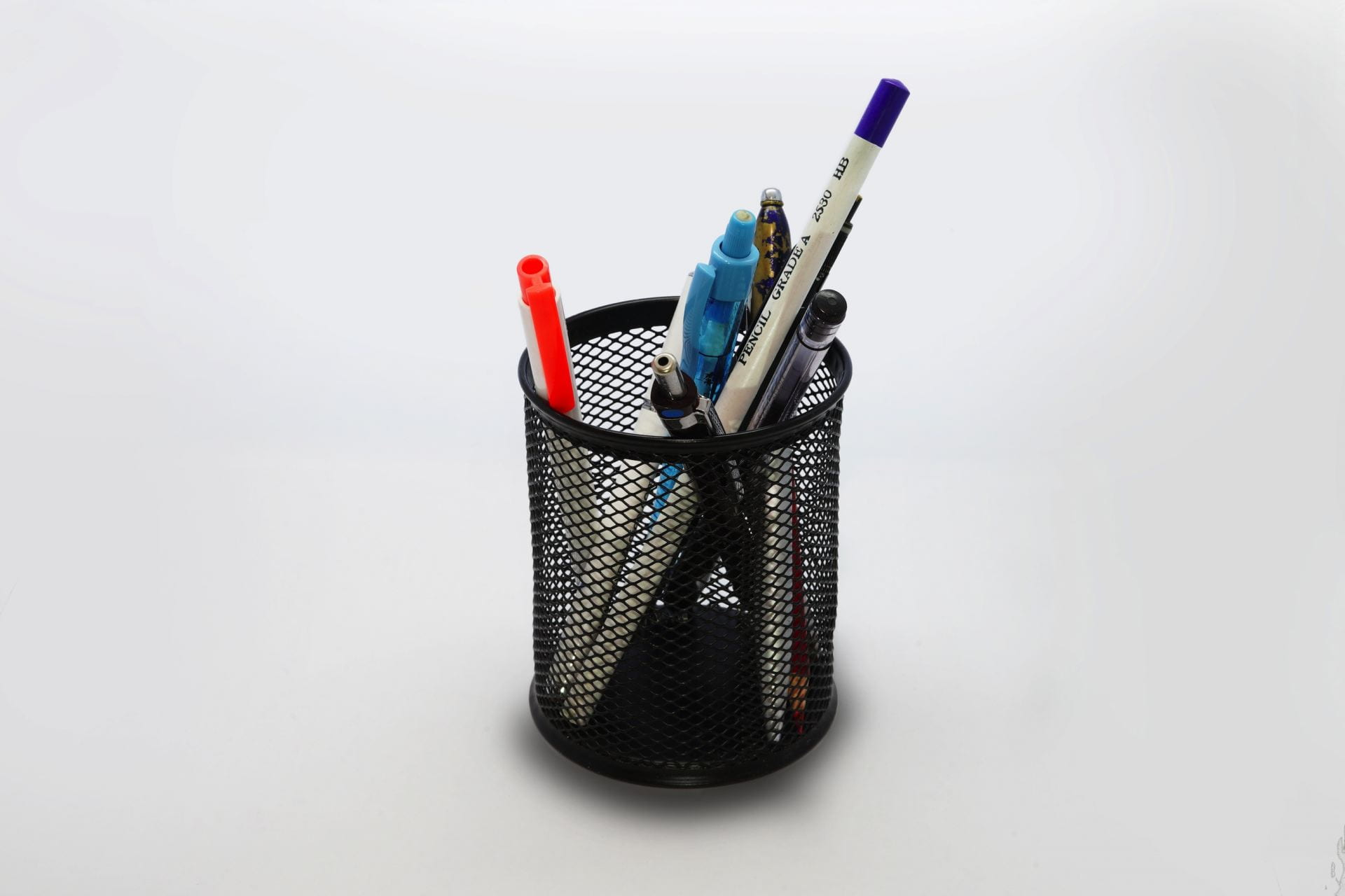
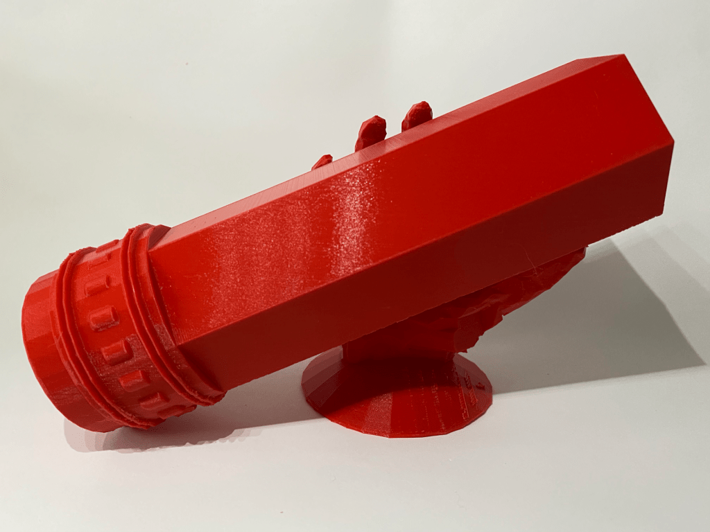
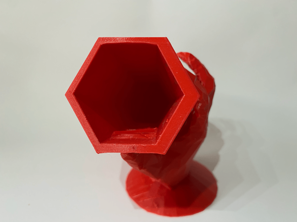
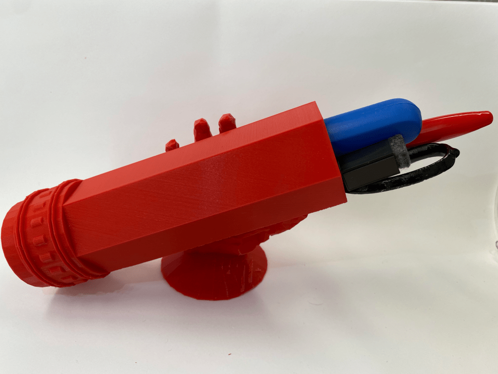
Below are pictures of the finished products!

Here are the links to Tinkercad models:

D:

https://www.tinkercad.com/things/k2rUtEnLQEX

V:

https://www.tinkercad.com/things/d1TLwJDiQUj

Sharpr3D First Models

Bracket

Upon completing this tutorial, I felt as though my understanding of Shapr3D and how the software functions were greatly deepened. It was really interesting to see how creative one can be with this software, as it offers a much wider range of design opportunities as opposed to Tinkercad. The tutorial itself was fairly easy to follow along with and provided me with certain tips and shortcuts that added ease to the entirety of the process. Just like with any new concept, it took me a little while to actually get comfortable with the software’s mechanics. The entire process made me realize that I could use Shapr3D to complete certain aspects of my ‘Self-expression’ piece that are too difficult to configure in Tinkercad.

Stylus & Base on iPad

Designing the stylus and base was much more difficult than I imagined it would be. Although the tutorial did not spare any details, it was very fast-paced and I definitely had to pause it and rewind it too many times. Despite its simplistic appearance, this design really tested my abilities and pushed me out of my comfort zone. I really feel like I have a much deeper understanding of Shapr3D after completing this tutorial. It is quite amazing that simple geometric shapes can be transformed into practical 3D objects. This tutorial definitely pushed my capabilities, but it also opened up new creative avenues as well!

3D Scan

The first part of this project required me to have a classmate take a 360-degree scan of my bust. A LiDAR camera on an iPad paired with the Monocle Structure Scanner application was used to complete this step. Although the scanning process required a few trials runs, professor Hooker’s comprehensive explanation and demonstration on how to use the software allowed us to complete this step without any major problems.

The Monocle Structure Scanner was able to created a 3D model by compiling multiple photos, which it transformed into an .OBJ file. Below is a picture of what the scanning software’s interface looked like. In the upper left hand corner are the dimensions of the scan. I then proceeded to airdrop the file onto my laptop from the iPad and then transformed it to an .STL file in Tinkercad, in order to make any necessary edits. Thankfully I did not need to make any major transformations to the file. I merely scaled down the bust and used the hole shape to remove extraneous pieces.

All in all, it was not a very complicated process. I was able to gain a much better understanding of how 3D scanned objects can be translated into 3D printing software. After I finished making the necessary edits to my .STL file in Tinkercad, I printed my model with little to no problems!

Daniel C’s Self Expression


Research

When considering what functional object that I wanted to inject whimsicality and playfulness into, I began brainstorming by considering the things around me which I most frequently use. This led me to my pencil holder. A pencil holder is a commonly owned household item, providing users with great organizational benefits. In order to save desk space, users can insert any type of pen, pencil, marker, or even scissors into it. This item is generally distributed in boring and uncreative shapes, such as cylinders or rectangles. They are fairly straightforward items, found in most department and office supply stores. In order to house writing utensils, the shapes are hollow and lid-less. My current pencil holder isn’t even designated for its job, as it is merely a cylindrical coffee mug with no sense of inspiration or playfulness.


Concept

To make this object more playful, I decided that I would ironically intertwine the object’s functionality and purpose with its literal name. I plan on designing the pencil holder in a way that emulates a hand holding a pencil. To do so, I will couple a pencil container, representing a pencil itself, and a base––the hand. The hand will position the holder at a slight angle, allowing the stored writing utensils to be more accessible to the user. Instead of an eraser at the end of the ‘pencil’, there will be a hollow opening into which users can drop their pens and pencils into. This tongue-in-cheek design is a good representation of my humor, and it will also serve me very well, as I lack adequate storage for my writing utensils. Although one can hold their pencils in almost anything that is hollow and has a hole on the top, I am seeking to add a touch of my creativity into this simple yet functional object.


Iterations

After completing my research and created a concept sketch, I was ready to start designing the object in Tinkercad. There was only one problem: how was I going to design a hand with the available software? The answer to this problem came about while I using an iPad mounted LiDAR camera, paired with the Monocle Structure Scanner application while working on the 3D Bust Scan project. During the process, I realized that I could use the camera and scanning software to create a 3D scan of my hand, which I could import to Tinkercad. With the help of Professor Hooker, I held my hand in a manner that emulated the position of the hand-drawn in the concept sketch in the previous section. After transferring the .OBJ file of my scanned hand onto my computer, I converted it into a .STL file in Tinkercad.

Below are a series of pictures that document the transformation process.

As seen in the pictures above, I had to utilize numerous ‘holes’ in order to isolate my hand. Besides that, the design was pretty straightforward. Thankfully, in Tinkercad’s ‘Making At Home’ list there was a readily available 3D model of a pencil. I merely inserted a cylindrical hole into the pencil to make it hollow, grouped them together, and then positioned the pencil in a way that allowed for the hand to grip it. Finally, I added a saucer where the wrist meets the palm, in order to create a wider and more stable base for the holder.

Due to time constraints, I have only been able to print out one iteration. In order to save time and resources, I printed a scaled-down version of the model, to make sure there were no glaring issues regarding its printability. There are a few edits I need to make in Tinkercad and Mesh-mixer, but other than that, I am quite satisfied with how my 3D model turned out. Upon viewing the iframe, one may notice that part of the hand intrudes into the hollow part of the pencil. I tried to address this issue with no success, but am certain this design flaw will be solved by the time I make my final print. I also plan on using Mesh-mixer to better conform the hand’s grip to the pencil.

The current model is roughly 4cm in height and 6cm in width. In order to function properly, I will have to print the model on a much larger scale. The only problem that arose during the print was on the printer’s end. As evident in the pictures above, the printer’s under extrusion resulted in the deformation of the pencil’s base and left an unwanted hole as well. In conclusion, this iteration has helped to point me in the direction I need to take, in order to achieve the results I am looking for.


Final Print & Reflection

For my final print, I decided to make the ‘pencil’ that the hand is holding much larger, and changed the hole from a cylinder to a hexagon in order to maximize storage space. By widening and lengthening the ‘pencil’ part of the pencil holder, I hoped to ensure that there was enough counterbalance present. This would allow me to house an adequate amount of pencils, without worrying about it tipping over. I also modified the ‘pencil’ part of the pencil holder by making sure that its base would be level with the base of the hand. Although I tried my hand at Meshmixer, I was unable to smooth out the hand or change up the grip to make it conform to the pencil more tightly. I spent the better part of an hour and a half trying to rescan my hand with professor Hooker, but it was to no avail.

After multiple printing attempts, I still remain unsuccessful in obtaining a finished product. Below is a screen capture of the print settings I used and the estimated printing time. Currently, I am in the process of making my third print. I will have to post an update regarding its outcome. So far, it seems as if the problems stem from over-extrusion and lack of printer cooperation. Unfortunately, this process has garnered more pain than pleasure, but I guess that is all a part of the learning experience. I have been able to avoid any major problems in my previous prints, but that success has not carried over to this project. I am really hopeful that I will be able to obtain a good print by the end of this process.

Below are a couple of pictures that capture the various issues I have faced throughout this process.

Upon closer inspection, and two failed prints, I realized that the reason for the misprints was due to my incorrect calibration of the print settings. Professor Hooker brought it to my attention that I might have forgotten to add supports to the print settings, which was in fact the case. Upon making this correction, I was able to obtain a successful print of the pencil holder. Below are a few pictures that showcase the successful print.

I purposely made the sides of the holder that come into contact with the hand thicker, in order to ensure that none of the hand bled into the hollow space of the holder. Overall I am pretty satisfied with how the print turned out. Although the third picture makes it seem like objects placed into the pencil holder are easily accessible, thus fulfilling its function, the holder is actually longer than all the mechanical pencils, pens, and highlighters that I own. Unfortunately, this negatively affects its usability to a degree. Other then that

Link to the design:

https://www.tinkercad.com/things/3KWh80n6pTj

3D SVG

When creating this vector image, my goal was to keep it simple to develop my proficiency in both Tinkercad and Adobe Illustrator. My first few steps consisted of drawing 3-inch line segments, which I grouped to create two equilateral triangles. I then used the join tool to generate pointed edges on all sides of the triangle. Next, I used the rotate and align tools to develop the Star of David. I then made two line segments, positioned them in a cross formation, and aligned them with the center of the star. Finally, I created ellipses, which I positioned at the top of the star to serve as a bail in the chance that I use my design as a pendant.

I decided to design this ‘star-cross’ for a few reasons. Firstly, It is comprised of fairly simple geometric shapes/symbols that tested my abilities in Illustrator and helped me get more familiar with the program. This vector image is also a symbol of my heritage and spiritual beliefs, which I am very passionate about.

Daniel Cymes’s Form|Function Research & Concept


Original Thingiverse object:

https://www.thingiverse.com/thing:3586659/files

The image above is a model of an engineering stencil ruler designed by @JojodaHobo. It allows individuals to plot straight lines on paper and trace other precise geometric shapes. It is an essential tool for engineers, architects, and individuals who simply want to add precision to their sketches. There is a multitude of shapes cut out of the filament, allowing creators to make a perfect circle or right triangle, among other designs. It is a simple and common object that is extremely useful to designers of all different backgrounds.

Personalizations and Improvements:

The image above represents how I envision modifying the existing object. Although I want the height and the length to stay the same, I would like to increase the ruler’s width from 1mm to 2mm. This would make the object much more sturdy and durable. I also would like to remove some of the original geometric stencil shapes, and replace them with shapes that are more tailored to my design tendencies. Overall, I was pleased with the majority of the original design elements, but my desired modifications will make this an even more practical tool.


Form|Function Iterations

Original Thingiverse Object:

Pictured below is a 3D print of the original Thingiverse object, attributed to @JojodaHobo. This print contains no personal alterations or modifications. Because the ruler only has a thickness of 1mm, it is very flimsy.

Iteration Process:

At first, I was quite intimidated by the thought of adding my own modifications to this ruler. I was uncertain on how I would go about filling the stencil shapes that exist in the original design, in order to implement my personalized stencil shapes. Below is a time-lapse video that demonstrates how I designed my Tinkercad remix. The entirety of the process took roughly 45 minutes.

Posted below is a 3D view of my completed Tinkercad remix.

The pictures below are of Tinkercad designs that I incorporated into my iteration. The lightning bolt was designed by @blaise-miranda and the high contrast squiggles were designed by @Annie-Sullivan. I transferred both of the shapes into my workplace and then transformed them into holes, in order to create two separate stencils on the ruler.

Functionality:

In the video below, I demonstrate the functionality of the object that I remixed.

Overall I was very pleased with how my iteration turned out. By increasing the original ruler’s thickness from 1mm to 2mm, the durability was clearly improved. I also increased its personal functionality by adding personalized stencils that will provide me with greater design benefits.

I only ran into a few slight problems. When removing the base filament from the ruler, it made the primary straight edge a little jagged. Normally this would not be a problem, but because one of the sole benefits of using a ruler is having a smooth straight edge, it created a slight drawback. In order to overcome this inconvenience, I merely had to sand it down. The only other issue that I had was that the numbers and marks on the ruler showed up very faintly.

Iteration #2:

After spending a few days using the first iteration I created, I realized that the problems that I initially identified upon the completion of the print were going to require me to complete a second iteration. The two primary problems I had were these: it was a little too thick, which prevented me from using some of the stencils with a pen, and the straight edge was jagged because of the raft that was printed with it.

To solve these problems, I decided to decrease the height of the ruler from 2mm to 1.5mm and remove the raft from the print settings in Ultimaker Cura.

I also wanted to address the comments and critiques that I received from my classmates, which mainly emphasized the lack of numerical markers and measurement lines.

In the slideshow above, I demonstrate the modifications I made to my initial iteration. As stated above, the most significant changes I made include the addition of number shapes provided in Tinkercad, measurement lines made from rectangle blocks, and a decrease in height.

Although the height change made all of the stencils usable, while simultaneously maintaining its durability, I created a completely new problem in this iteration. Upon closer look, one can see that the rectangle boxes that I converted to holes, in order to create measurement lines, ended up creating divots in the ruler’s straight edge.

Final Iteration

These pictures are of my final ruler iteration. Although I was able to eliminate the divots that were previously present, I ran into a new problem. As pictured below, the squiggle stencil did not print properly due to a printer malfunction.

Conclusion

After completing 3 different iterations of the ruler, I was still not able to make the perfect print. This was in part due to time constraints out of my control and printer inadequacies.

Overall I am not disappointed, as I was able to sand down the rugged edges of the first ruler that I printed to optimize its functionality. Although I cannot easily use all of its stencils and it has very faint measurement markings, it serves its main goal perfectly–allowing me to draw a straight line!

If my final iteration had not been messed up by the printer malfunction, it definitely would have been the best of all three iterations. Not only was the straight edge smooth, but it also had clear numerical markings and measurement lines. Below is a picture of the printer settings I used to print the ruler. Hopefully I can find time to fully ‘straighten’ any remains problems out.

My First Print – Daniel Cymes

Not only was this my first time completing a 3D print, but it was also the first time that I had stepped into a 3D printing lab. Learning how to use the Ultimaker 3 printer inspired me and made me eager to explore the numerous design opportunities that are now at my fingertips. By far, my favorite part of this experience was being able to watch the 3D printer do its job. Its precision, intricate detail, and uniform movements were mesmerizing to watch. Before this lab, I held the notion that the printer and the accompanying Ultimaker Cura were going to be extremely confusing and intimidating to use. To my surprise, it happened to be quite user-friendly. Now I am confident that through regular usage of the printers, I will develop a new skill and potential hobby.

Not only does this print serve a functional purpose, but it also displays my school spirit. I am already looking forward to my next print!

Hi, I’m Daniel Cymes

I am a junior Creative Advertising Major and Entrepreneurship Minor. I am a health and fitness nut, which lead me to get involved in the JMU Fitness Club and secure a job as a Personal Trainer at UREC. I am also apart of CRU, where I play drums and percussion for their worship band and lead a men’s small group. In my free time, you can find me working-out at UREC, making art, or hanging with friends. I greatly value self-expression, and I live out that value through music, art, fashion, and writing.  

The Vitruvian Man‘ – Leonardo da Vinci, 1490

I chose this image because it represents the idea of the Renaissance man, an individual who strives for excellence and intellect in numerous aspects of their life. For as long as I can remember, I have desired to develop proficiency and knowledge in multiple areas of my life. My hunger to experience new things and learn about life inspires me to put my best foot forward in everything I do. 

My creative type is the producer

You can find me in these places: