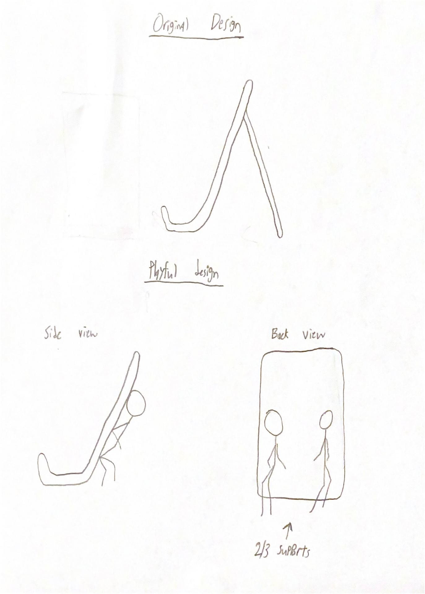
Research & Concept
Letters are unique in that they can be designed in so many uniquely different ways while still maintaining the same meaning. While many letters can vary, some can be written with entire elements included or excluded, and our brains are still able to read them as the same letter. For my letter sketches, I experimented with how different parts of the letters interact to create a cohesive glyph.
First letter: G
The first letter that I chose is the uppercase “G”. I thought this letter would be interesting to experiment with due to the different ways that it can be written. The letter always curves around from the top to bottom, and then moves inward to the left. It is unique because it may or may not have a spur protruding downwards from the right side. The angles and shape of the curves may also vary widely.
Inspiration and sketches


Second letter: Q/q
For my second letter, I decided to design the letter “Q”. This is a fairly simple letter, as most of the letterform is just a round shape. The uppercase version has a tail that touches or bisects the bowl. The lowercase version, however, rather than having a tail, includes a descender moving deeper below the letter. For my ideas, I tried to focus on different ways that the tail/descender can interact with the rest of the letter.
Inspiration and sketches


Iterations
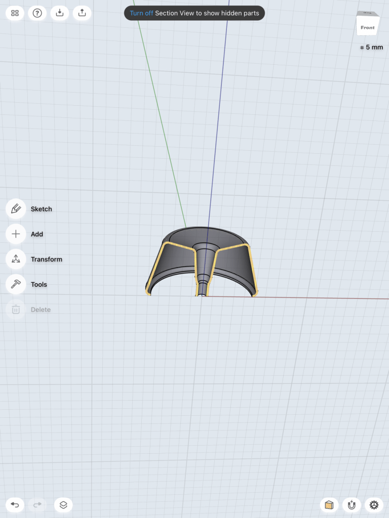
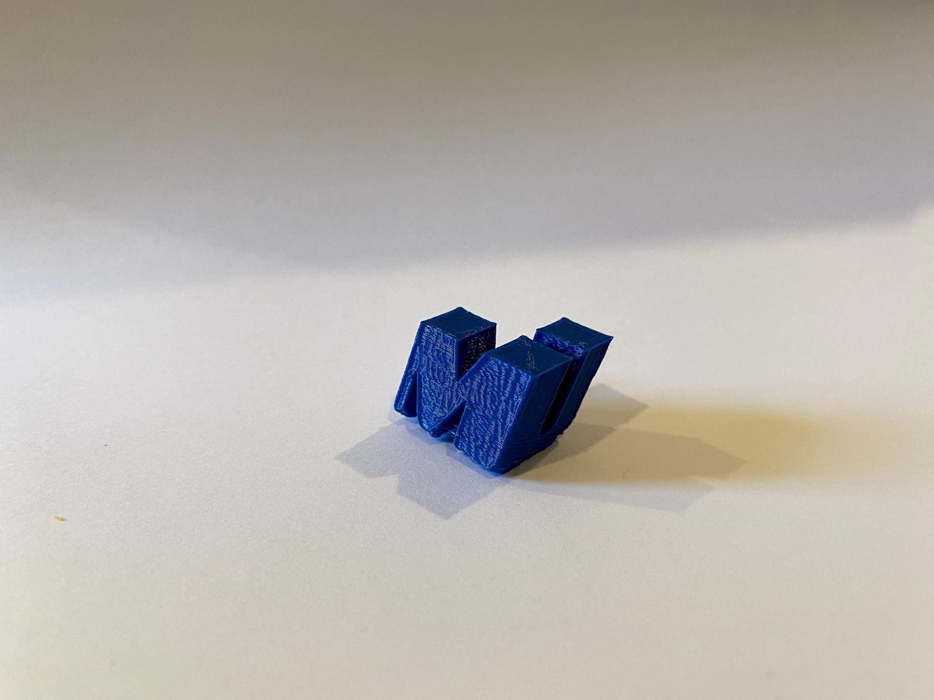
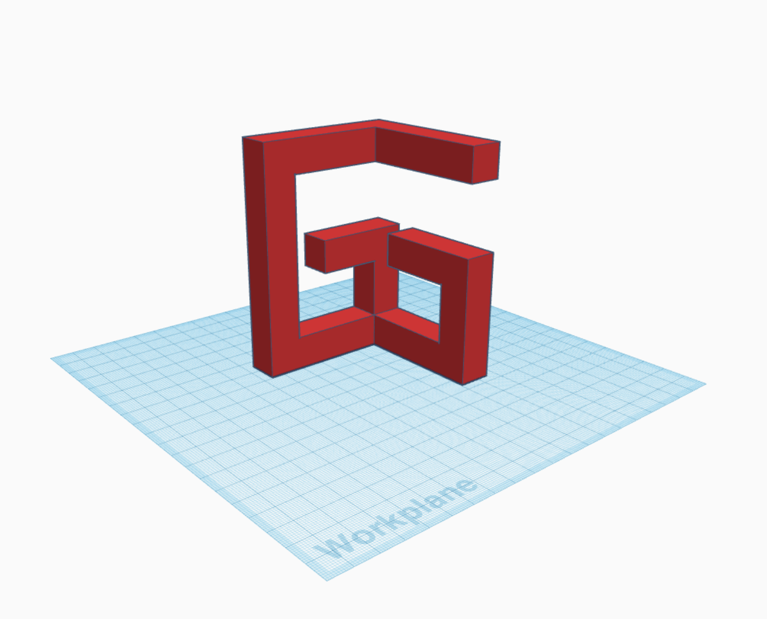
G
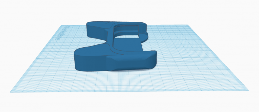
For my first letter, G, I decided to model the letter based off of the cube-shaped form that I sketched. I began by drawing out the base shapes that I needed, and then I simply extruded the sketches and arranged them to create the cube letter.


After I imported the model into Tinkercad to generate the preview, I also had the idea of changing the model so that it can be read from 2 angles. However, it isn’t as readable when viewed diagonally, so I’m not sure if I will go with this iteration.
Q
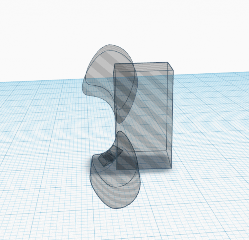
For my next letter, Q, I was originally going to model the flat, blocky version from my sketches. I started to draw the angular outline of the letter, but Shapr3D misinterpreted my stroke and created a curved line. I actually liked the way it looked and thought it looked more interesting, so I continued to model the rest of the letter using curves instead of only straight lines.


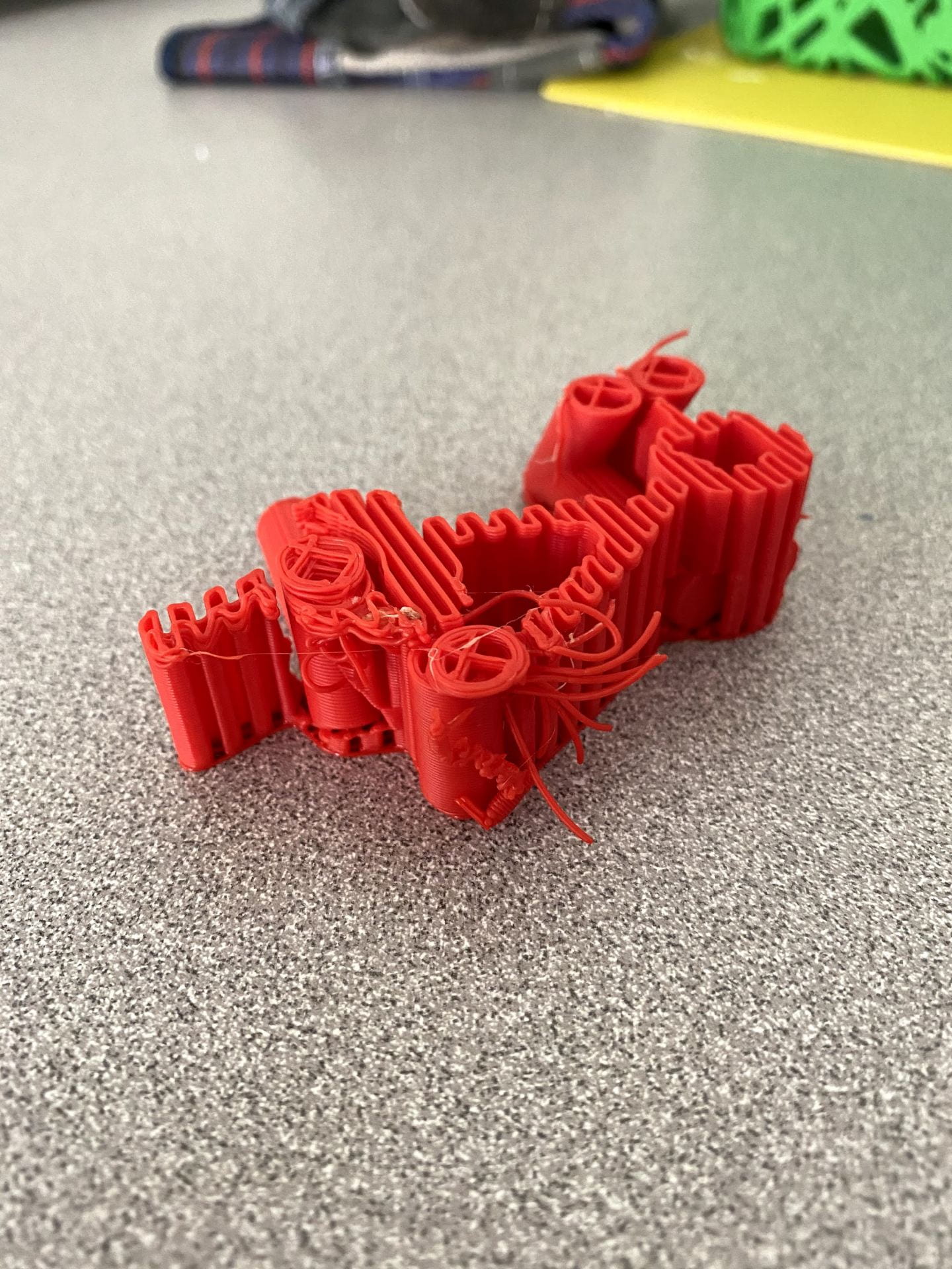
Test Prints
To test my prints, I printed both of my G iterations and my Q at low detail. Everything came out as expected.


Final Prints
G
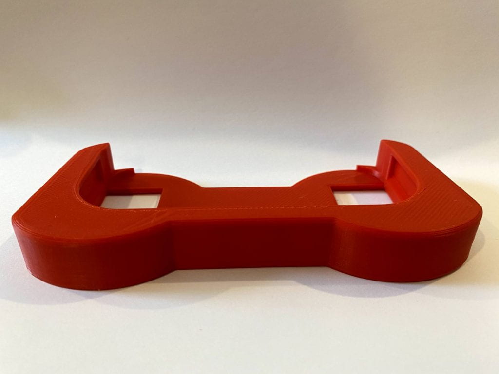
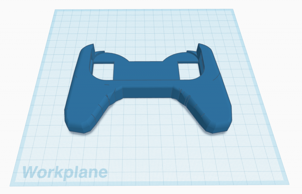
After seeing my test prints in the physical world, I thought that my original G model had too much empty space on the left side, and I liked the “double G” design better. There wasn’t anything that I really wanted to change with that model, so for my final I just printed it once again but at normal detail.


I am really happy with the way this letter turned out, and I like the way the depth of the model helps it to be readable from multiple angles in a 3D space.
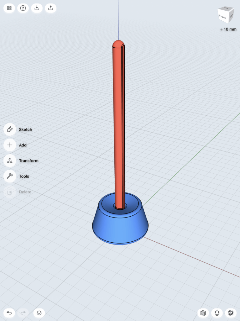
Q
For my Q, I wanted to make sure that the thickness was the same on each side. I went back into Shapr3D and made some adjustments to a few measurements and curves. I then printed it at normal detail, this time laying flat on the plate instead of standing up with supports.


I found it a bit harder to use depth for this letter in the same way I did with my G, but I am still pleased with the way the curved shape came out. I like how the “macaroni” shape of the tail connects to the curvature of the rest of the letterform, and also creates a flat surface for the shape to stand on without sticking downward.