Chance’s Story

Research and Concept:

For my story, I chose the letters “Tt” and “Yy.” I chose these because I feel as though there’s quite a bit of structure in them, but also room for creativity and room for change. For the “T” I think that the stems at the top are something I can’t ignore so for the most part I stuck with designing around what I could do and change while also preserving the integrity of the letterform. The largest part about letters and letterforms is what is communicated and while I want to create something cool and exciting, I also want to keep the original integrity in tact. Both T and Y are very similar so I want to keep the designs separate as the two deserve their own spotlight.

“T”-Inspiration:

“T”-Exploratory Sketches:

For the letter “Y” I wanted to do the same as far as preserving integrity, but I chose to be a lot more playful in these sketches. I feel like pushing and changing dimensions is something I will strive for in the finished product.
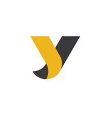
“Y”-Inspiration:

“Y”-Exploratory Sketches:

Iterations:

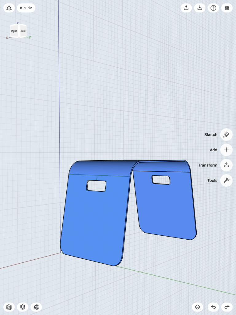
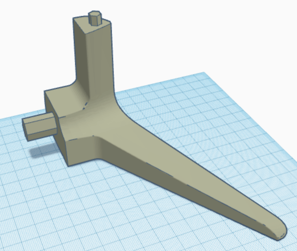
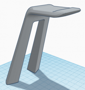
For my “T” design, I wanted to play around with the view from each side. I found this to be more difficult than I initially thought. My plan was to create the bottom right design from my sketches, however my dimensions were not working for what I wanted. At first I couldn’t get the angle right in order to fit all four sides. So then I moved to creating more of a platform to allow for more space (see image1). I ended up leaving what I had because it looked as though the T was getting too bulky. Which brings the project to what the viewer sees in the tinkercad iframe. I want to ideally create something that brings design to all four sides, not just the two it has now. Feedback is the next step in my process. Another design I tried can be viewed in image 2, this design was an effort to incorporate a lowercase t. If I did move forward with that design I would hollow out the lowercase t and make the same on all four side. Again, not entirely sure the direction I want to go yet!

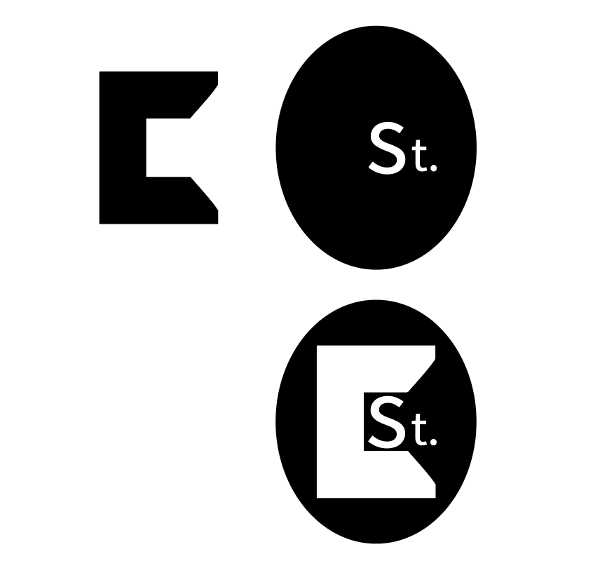
For my “Y” design, I had hoped to incorporate both and upper and lowercase Y, but ultimately I chose to go with the puzzle design that is in my sketches. I’m not set on this design (reference iframe), I more or less just chose one to draw out. I feel like this is nice, but some of my other designs might be a better fit for the assignment. For more inspiration, I drew out a lowercase y, just to see if I’d like to incorporate it into a different way. The puzzle is nice, but I would Ideally like to push the concept further.

Lower case Y, playing around with designs

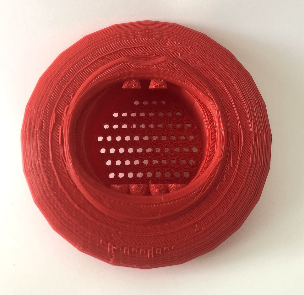
For my T print, I changed the design as I didn’t know exactly what direction I wanted to go in. This print turned out decent, I printed it multiple times during the iteration process. Each time I couldn’t get the gaps exactly right. Pictures show that by the wonky structure. I will be adjusting that for the final.

For my Y print, it went better than expected, but I printed with a raft which caused the back to be raised on each piece. As a result, the Y was wonky as well. For the final I will take that off and see how it works then!

Final:

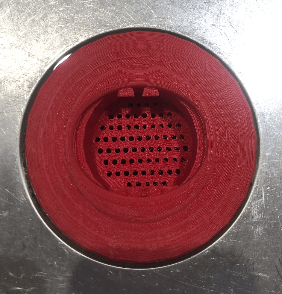
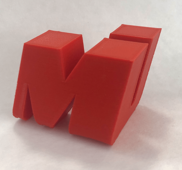
For my final on my T letterform, I fixed the gaps so that it created enough room for them to be flush with one another. In addition, I scaled it to 65mm to follow project requirements. This print worked the best using a raft. Overall, I’m happy with how this turned out. I wasn’t too sure of what direction I wanted to go with it, just that I wanted to incorporate both an uppercase and lowercase T.

My final Y letterform stayed fairly consistent start to finish. The only complications I had were in iterations with a raft causing a lip that pushed the pieces forward when stacked. I made the simple decision to not use a raft and it worked like a charm. I also scaled this letter to 65mm. I’m also content with how this turned out!

Sharpr3d First Models

Bracket:

For my first model, we were instructed to create a bracket mount. This was very easy as the 2d sketch started simple and added components at a slow pace. To start, the 2d sketching was easy to do, simply apply a front facing view and draw the elbow like shape. From there, I extruded to a 3d model and added a work-plane to then add the top piece. The biggest factor that I took away is that you need to add slowly and confidently as sometimes it can get confusing. I enjoyed learning about the how the holes were added and adjusted using certain tools within shapr3d. In addition to that, the use of workplane to create the top piece of the bracket is something that I’ll make use of for future projects. As a whole, this model taught me a lot more about the program and I think the finishing touches like rounding edges and smoothing harsh points is something everyone should be knowledgeable about.

Bench:

For this model, I had a much more difficult time following the tutorial. I don’t think that this model was necessarily more difficult, but I was definitely working with a much larger piece. This model used inches as a form of measurement which worked well for the purpose. The largest issue was the curves and angle adjustments. Some tools that I learned to user were “tangent” and “horizontal.” With those, It made it to where I could adjust angles of the curves to match and move accordingly with the rest of the model. Other than those tools, the rest of the modeling process was smooth. I sketched the initial model and extruded it to be a 3d item. After applying the target and horizontal tools to the curves, I focused on the handles and followed the same process. Coloring the model was also very simple, just use the tool and double tap to add it to all or individually select.

*I’d like to note that for this model, the two shared a commonality in the tools stated above. With the tools, It made it to where I could move and change height and width, without altering the entire piece. The main piece was the bench one, but the second I chose to include as practice.

Tutorial followed: https://youtu.be/qiIV9sE1J9w

Chance’s 3D Scan

3D scanning is far more complex than I initially perceived. Professor H, made it look very easy during our demonstration which threw me off after my first failed attempt. What I learned it that technology is amazing, but going slow to help it out is necessary. When scanning it’s also easy to miss tiny parts of the scan which result in odd deformations in the final product. For my scan I did multiple tries in an effort to get the best result and I feel as though that’s the best method. To scan we used a LiDAR camera attachment on an iPad. After the scan, I took the product into tinkercad to upscale it. This was very easy as it is familiar software. To export it from the 3D scanning software I had to export as an OBJ which I airdropped to my Mac and then imported through tinkercad. After I scaled the scan up (to about an inch and 1/2) I exported as an STL file and printed in the lab. Print time only took about 4-5 hours, but honestly I’m pretty surprised at the detail it captured. I have very wavy/curly hair and it did a good job of picking it up still. Overall, I enjoyed the experience and would like to explore the technology more in the future.

Initial 3D Scan Using “ScandyPro”

Tinkercad Mockup

Final Print

Chance’s Self Expression

Research & Concept:

When deciding on what I wanted to choose for this project, I tried to think of things that I found most boring in my day to day life. The one I find most boring is doing the dishes, more specifically the strainer that sits in the sink. This object has so much room for creativity and playfulness as most of the time, it’s staring right back at you as the dishes are being washed. When thinking of this idea and how to add playfulness I started to think of what the purpose of the object is and how I can twist that concept. The strainer is meant to catch any food that was not disposed of prior to doing the dishes. It catches the food that never made it to our mouths. I decided to play with that idea in my concepts. In addition, I’ve noticed that sometimes people purchase strainers that sit on the side of the sink for various reasons (see image below). It’s the same concept of catching food, but with that one I wanted to continue the human anatomy theme I had going.

For my concepts, I touched on it earlier, I wanted to “humanize” the strainers. It’s a play on the purpose as well as just adds a little fun. For the regular “mainstream” design I chose to alter it into a mouth. This makes it playful, but also keeps the original purpose in tact. In addition, I created concept two with a nose design for the modern unique example. It made sense to follow the purpose of fitting the strainer into the corner of the sink as well as following the humanization factor.

Iterations:

For my iteration process, I did not have as many issues with the strainer design but more so the mouth that is incorporated on top. However, not to overlook the time invested, the strainer design as the base proved to be a little complicated in the sense that Tinkercad is not great with sphere’s or circle’s. I ran into many issues with sizing and proportions. As you can see in the images below, I had a fairly easy first print, however the strainer had incorrect proportions. As a result, the strainer did not fit into the sink seamlessly. I’m not quite sure if this is because of the dimensions I found online, or Tinkercad just being difficult.

Moving forward, I printed a second time adding the mouth decoration that I had initially intended to. When working in Tinkercad, I ran into so many issues trying to implement curvature that I ultimately decided to just make a print with comical looking teeth as the sole feature. I also adjusted the opening in the middle to be perceived as more of a mouth and not a perfect circle. Some issues with the print were the strings that were much more prevalent in the second print as opposed to the first. I had to do a lot more work cleaning the print up the second time, but I’m fairly positive that is because something I added in between to make the second print slimmer. Otherwise, the teeth printed good and actually, I like the strings that occurred in the mouth, so I kept them. Besides the strings being an issue, the strainer now fits into the sink and could actually be sized up a little more.

For the future, I have quite a bit to go in designing a more complete mouth, but I am interested to see if this is plausible in Tinkercad or if I should pivot toward another program. If lips do not work more to my advantage, I feel as though I could add other features that would still give the same playful experience. Unless something changes, I would like to focus on other features of the mouth, rather than add more curvature with lips.

Final Print and Reflection:

My final print went much better than expected thanks to professor H. The changes I made from iterations to the final were a changed base design to fit easier into the sink, a rework of the top to adjust for lips, a lip/mouth design extruding from the top, and finally, alterations to the teeth. Some of these things were minor with the lips design being the main feature I addressed in the final product. I modeled a mouth/lips in Shapr3d. This process was MUCH easier than in Tinkercad. Again, with the guidance of professor H, this went very smooth. After creating that, I went back into Tinkercad to put the top lips piece to the modified base. This also went smoothly as the dimensions were already set. I will list the exact dimensions below. Other than connecting the pieces, I separated the teeth to add a more whimsical effect. As far as printing, I had issues printing right side up so I flipped the design and added a raft and supports to make the final print look much better. Overall, I am very happy with how this project turned out. I furthered my knowledge of 3D printing and got to use shapr3d for the first time.

Find this on Thingiverse.

Dimensions:

-Top Piece= 4 1/4in. LW

-Bottom Piece= 3.4in. LW

Print:

-Infill= 20

3D SVG

In creating my 3D SVG, I wanted to experiment as much as possible. After seeing the house example in the LinkedIn video, the task seemed pretty daunting. I actually spent longer than I expected playing around in Illustrator/Tinkercad figuring out what looked good and what didn’t. I already had a logo designed prior, but I wanted to start from scratch for this project to really get a feel for it. So for starters I drew a “C’ for the first letter of my name (Image 1, TOP). After that, I experimented with thickness of letters and background shapes. I then worked with figure/ground with the initial letter with the background shape. And from there, I created the rest: The background oval, added the large “C,” and also the first two of my last name (Image 1, BOTTOM). One thing to note, is after importing into Tinkercad initially, I noticed gaps and weird spaces just like the video. So I went back into illustrator, converting the “C” to a shape, make compound paths, and watching the fill component as well. After finishing all of that, I imported to Tinkercad and added to the initial concept (Image 2) to create something more usable than an oval logo. I added to the initial concept by creating a podium for the oval to rest on (Image 3), and I also added a background color oval to add contrast for the lettering (Image 4). Ideally, this was created in mind for something that sits on a desk that you could change the backing color. The largest factor that I got out of designing and re-designing is that I would design, upload to Tinkercad, and repeat. I fixed dimensions within Illustrator so that it would automatically fit in Tinkercad, and I experimented to get to my end result.

Overall, I enjoyed working with SVG’s a lot. I drafted multiple designs (I know It may not look like amazing, but I learned a lot by doing so. I think this is a very cool aspect with a lot of potential!

Chance’s Form|Function

F|F Research and Concept:

The original concept is made for a simple headphone stand. The legs are meant to balance out the weight from the arching top point that hovers over the center of the piece. The piece is meant to serve as a stand for gamers or anyone that requires headphones in general. A stand is essential for tidying up a desk space. This particular stand creates a balance from the top to the bottom so that it does not tip over, this will be challenge to uphold in changing the original design.

As you can see, the model does not fit within the boundaries of the plane, so I will need to downsize it slightly.

Potential Personalizations/Improvements

The overall size needs to be smaller. In addition, the divot at the top where the headphones rest needs work. I look to improve that by creating a much more definitive arch that would prevent the headphones from coming off the stand as easily. Something that I would also like to include is an optional piece that allows for cord management if users had cords to deal with. The piece could be a clip that is easy access on the side. The major challenges with each of the improvements will be curvature. I will need to learn what will be acceptable for printing and what will ultimately need to change so the overall design will work.

F|F Iterations:

For my initial approach to this print, I chose to print the original that I first saw on Thingiverse by @makerbot. The original unfortunately was meant for a larger printer than we have access to in the labs. So I ultimately had to scale the size down a bit. If scaling down wasn’t a factor, this piece turned out really well.

Moving forward from the initial design, I chose to print a remix by @N3D_printing. In this remix there are three parts to the design and each one snaps into the other. In the pictures above you can see the three initial pieces along with different views of the top piece.

In addition to trying the new print, I tried different variations of the top piece with my alterations. All pieces were full scale, printed to specifications of the creator, besides my alterations for a deeper headphone rest and a cord management clip.

The largest factor in the most recent print was the height requirement being tall enough for the headphones. In print 1, I downsized for a difference in printers. In print two, I tried to attempt a different remix that made it so I would be able to piece the components together. The main points that went wrong were the sizing on the pieces compared to the hole In which the piece is supposed to connect to. None of them would snap in correctly. As a result, I ended up sanding the snap in pieces down to just super glue it together for now. One thing that did work was the more definitive arch in the top. It printed differently than anticipated, but still stayed balanced. The other modification technically worked, but not as planned. The original had the issue of size, but the remix had many more issues with structure. I will be changing and reworking ideas to maybe mesh the two together for the final. As far as my specific iterations, I now understand what will work and what isn’t plausible.

F|F Final Print and Reflection:

For my final I chose to return to the original Thingiverse creation by @makerbot . I chose to do this because the remix had a great idea, however the amount of modifications took too much time for my situation.

My modifications stayed relatively the same, the arch had no change. The clip however, I moved down and around toward the back. I did this because the cords for headphones are usually placed on the bottom of headphones so with the chosen placement, it pulls the cord up and out of the way; Far more accessible than the last iteration.

I’m a firm believer in nothing is perfect and there is always room for improvement. So, this is my final I will be going with, but there is definitely room for improvement if given the chance in the future. I learned a lot from start to finish!

My Remix

Notable Print Settings:

  • Infill: 30
  • Layer height: 0.2

Chance’s First Print

Prior to taking SMAD 305, I had very little 3D experience. I of course knew how the process worked, but there are many factors that come into play in which users should be aware of. Time is one of them that really came into play during my first print. My piece did not finish within the class timeframe so that will definitely be something that I pay much closer attention to in the future. While this project was very set and structured, I’m excited to see what innovation I can conjure up. Some other things that I will be looking to evaluate are structures alongside curvature in designs. Overall, I am looking forward to creating designs in the future.

Hi, I’m Chance St Clair.


I’m a Junior SMAD major at JMU with an Interactive Design Concentration. I also have a minor in Integrated Science and Technology. My interests contain quite a bit of contrast, but I enjoy them nonetheless. I’m a big fan of technology, I love the challenge of figuring out new programs or whatever is new at the moment. Within that realm, I like playing video games with friends. It’s been a great way to connect during the pandemic. Other than that, I’m a huge advocate for the environment and environmental policy. So I go hiking a lot as well.

An object that I think describes me well is a dictionary. I most definitely do not claim to have anywhere near the knowledge of a dictionary, but rather I strive to gain more knowledge everyday. Knowledge is power, and I enjoy attacking/finishing projects that I otherwise was ignorant to prior. Also, my name is in the dictionary so I might be bias lol.

My Creative Type is The Dreamer

All My Links: