Karina’s Story

Research & Concept

Letterforms have specific structures that always look the same no matter what style or typography it is written in. It can be written in either 3D, 2D, or even 4D and can still be identified as its letterform because of its structure. In other words, each letterform has their own structures and shapes that specifically characterize its specific letterform despite its font.
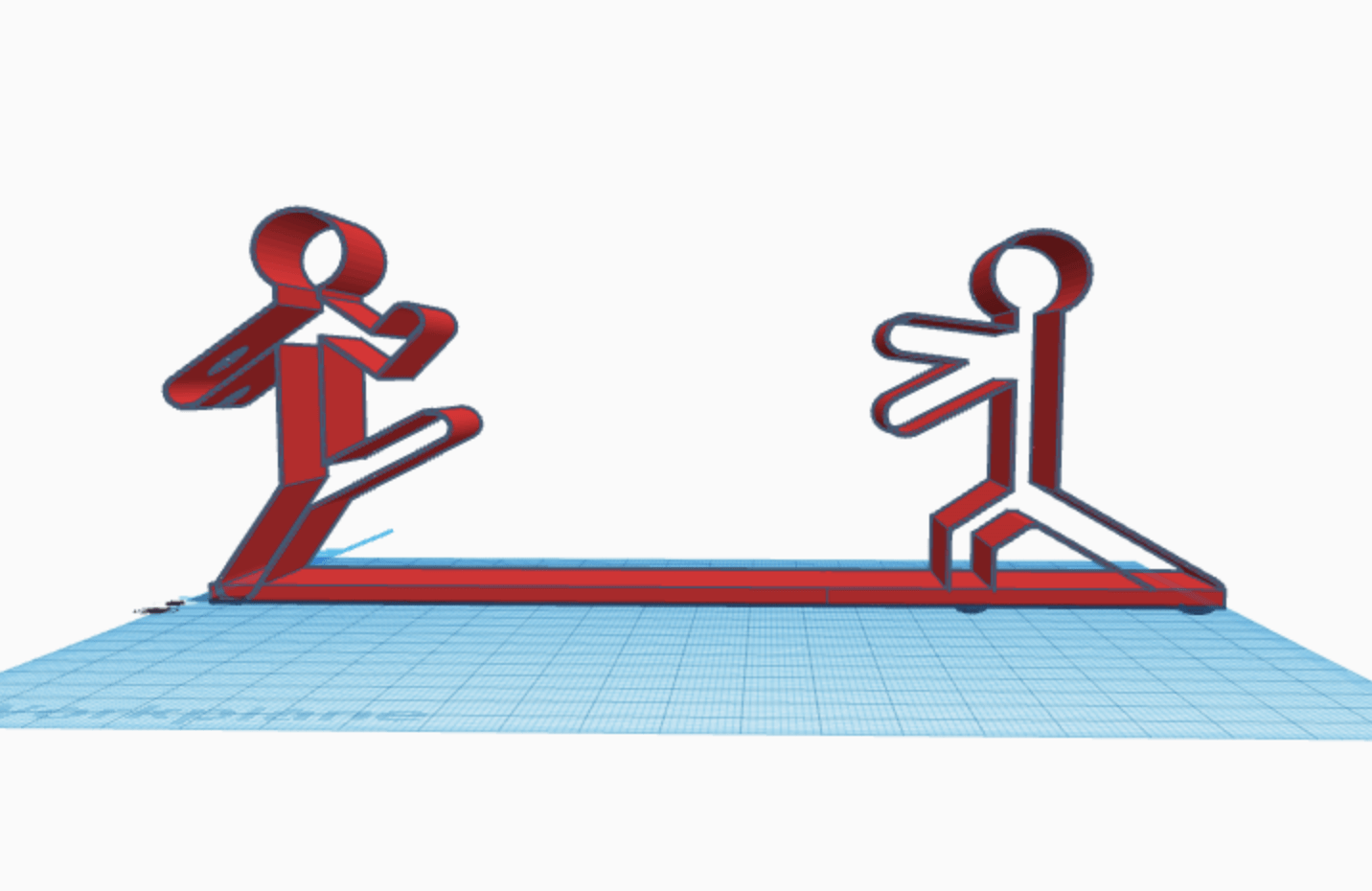
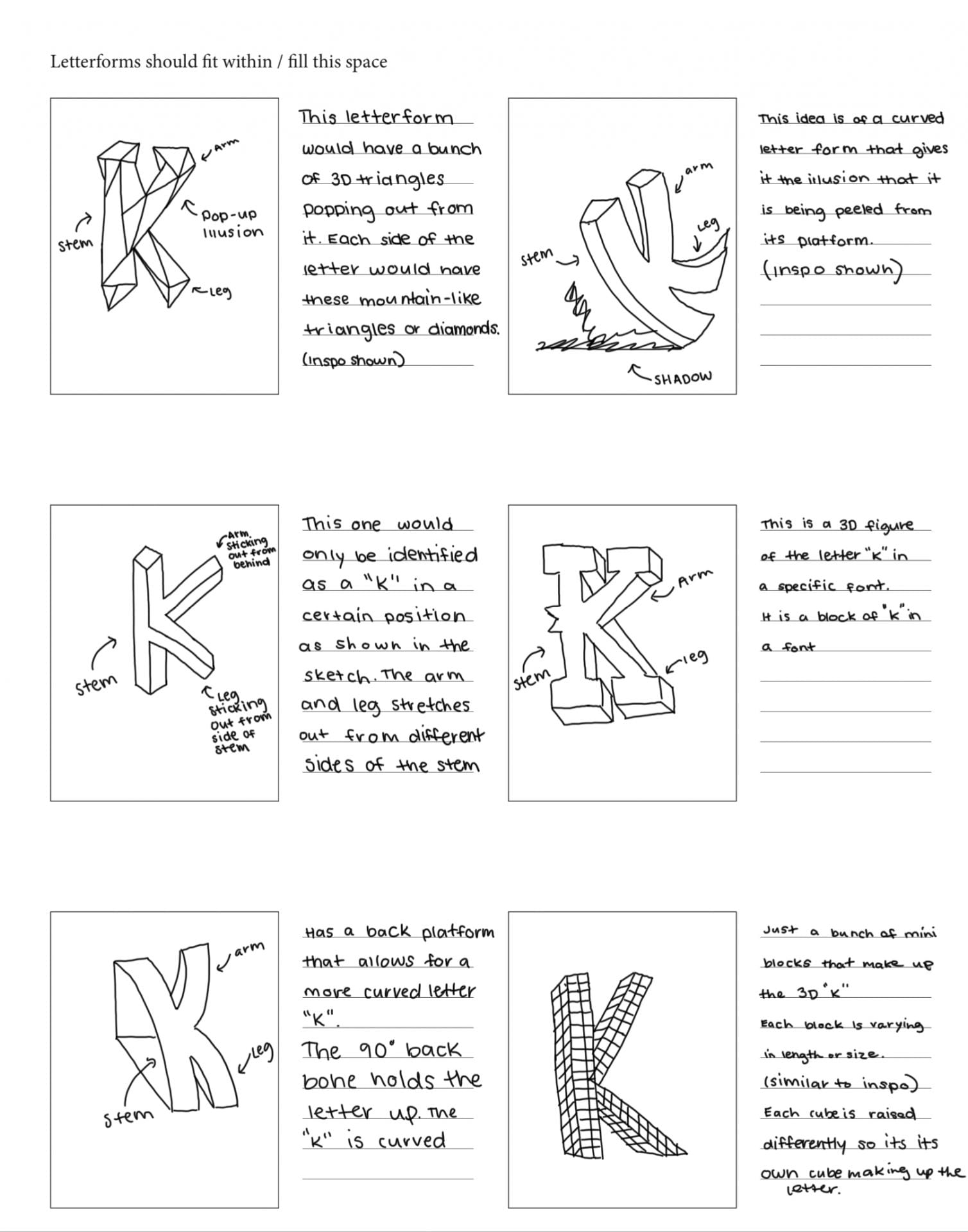
First Glyph- “K”

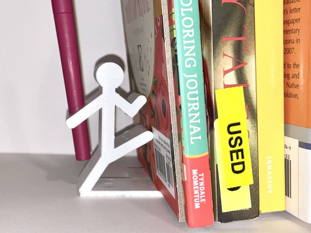
The first glyph I have chosen is the letter “K” because it is the first letter of my initial. This letterform has a tall stem that has one leg and one arm that stretch out in an angled manner. Legs, also known as tails, are the lower angled strokes that come from the stem of the letter. The letter “K” has one leg that is angled downward from the stem. Meanwhile, arms are the upper angled strokes that come from the stem. This glyph also has one arm that is above the leg and angled upward from the stem. These specific parts of the glyph identify it as the letter “K”. Below are some images of my inspiration and exploratory sketches.
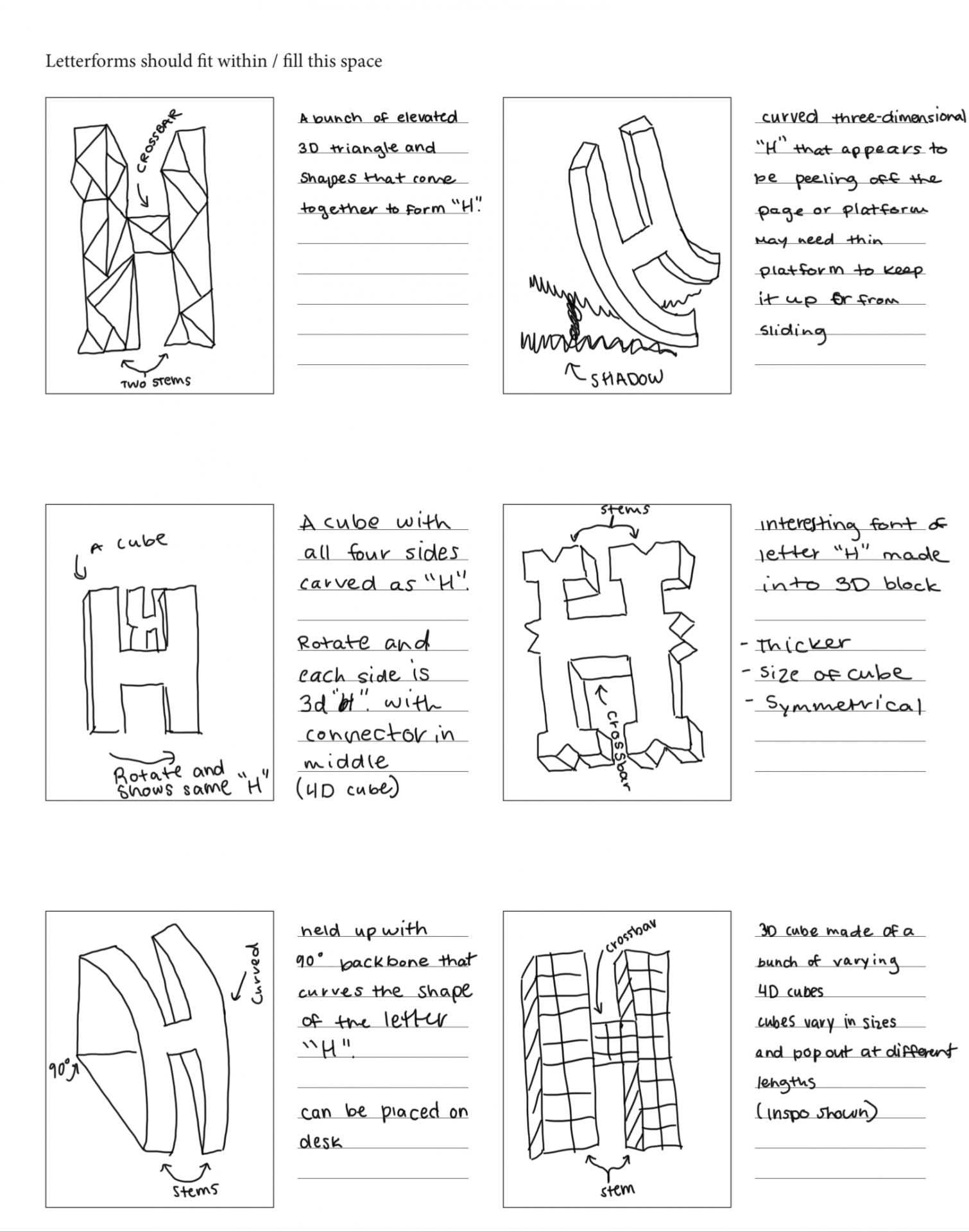
Sketches of the letter “K”
Second Glyph- “H”

The second glyph I have chosen is the letter “H”. This letterform has two tall stems with a short connecter line in between. This connecter bar is also known as the crossbar, as it connects the two lines of this uppercase letter. This letter is symmetrical, meaning it could be cut in the middle horizontally or vertically and still mirror the other side. Because of this, I view the letter “H” as balanced. The upper case letterform of “H” differs from the lowercase letterform. I will be creating the uppercase letterform of “H” because of its more symmetrical and balanced look. Below are some images of my inspiration and exploratory sketches.

Sketches of the letter “H”

Iterations

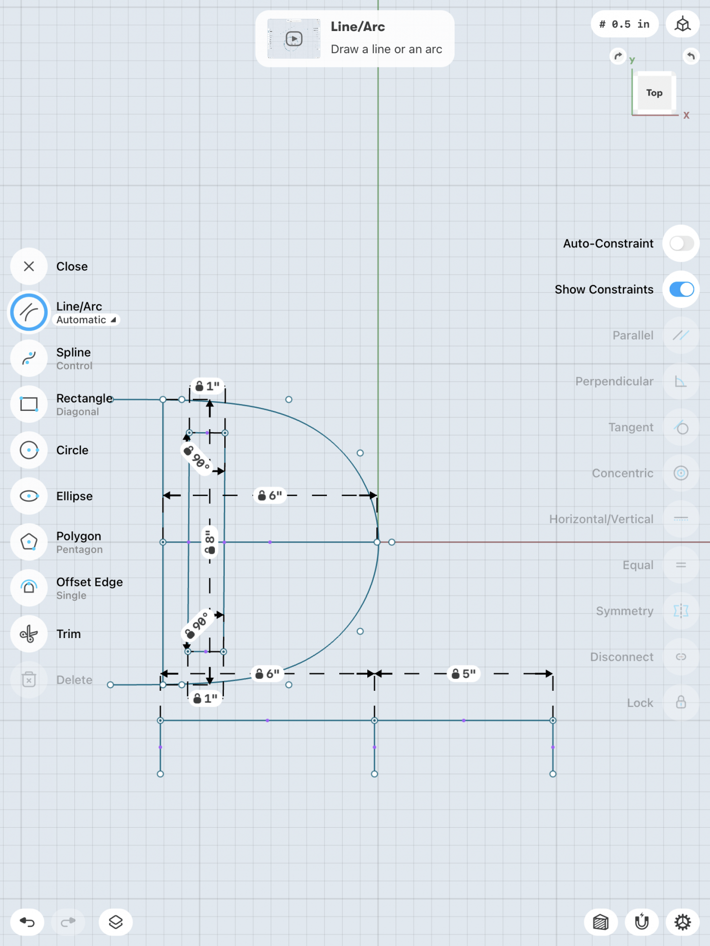
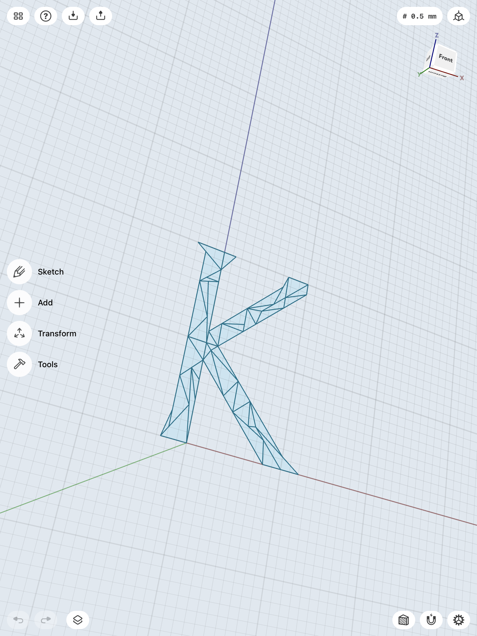
I first attempted the design with elevated triangles on “K”, but found it too difficult to continue. I thought I could just draw the triangles in the form of a “K” and then raise them into bodies. However, this was not the right way to go about it, so I learned how to create pyramids. These pyramids were very time consuming and difficult to make and the design was not turning out the way I wanted it too. Therefore, I went with my second design and added more to it.

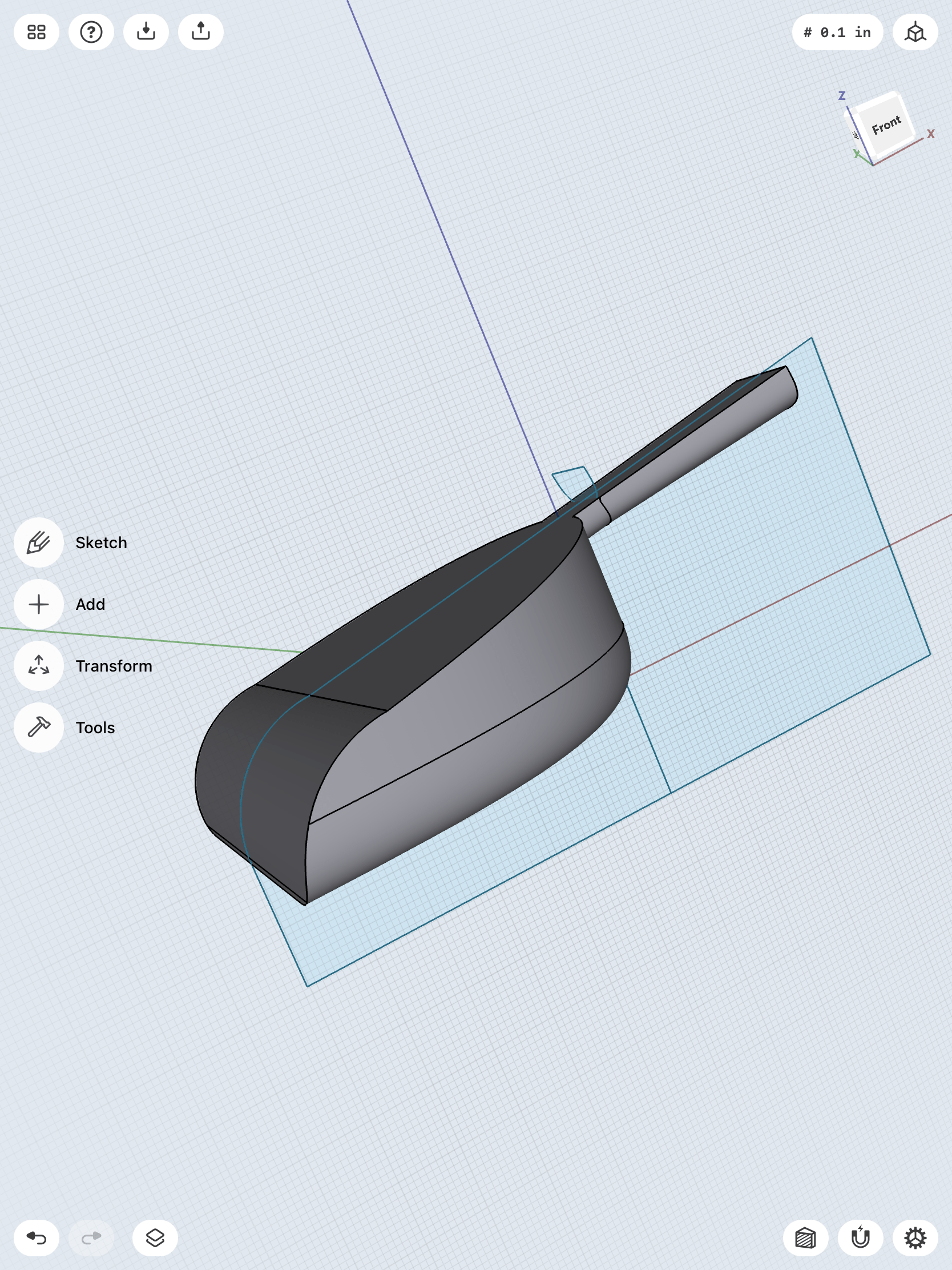
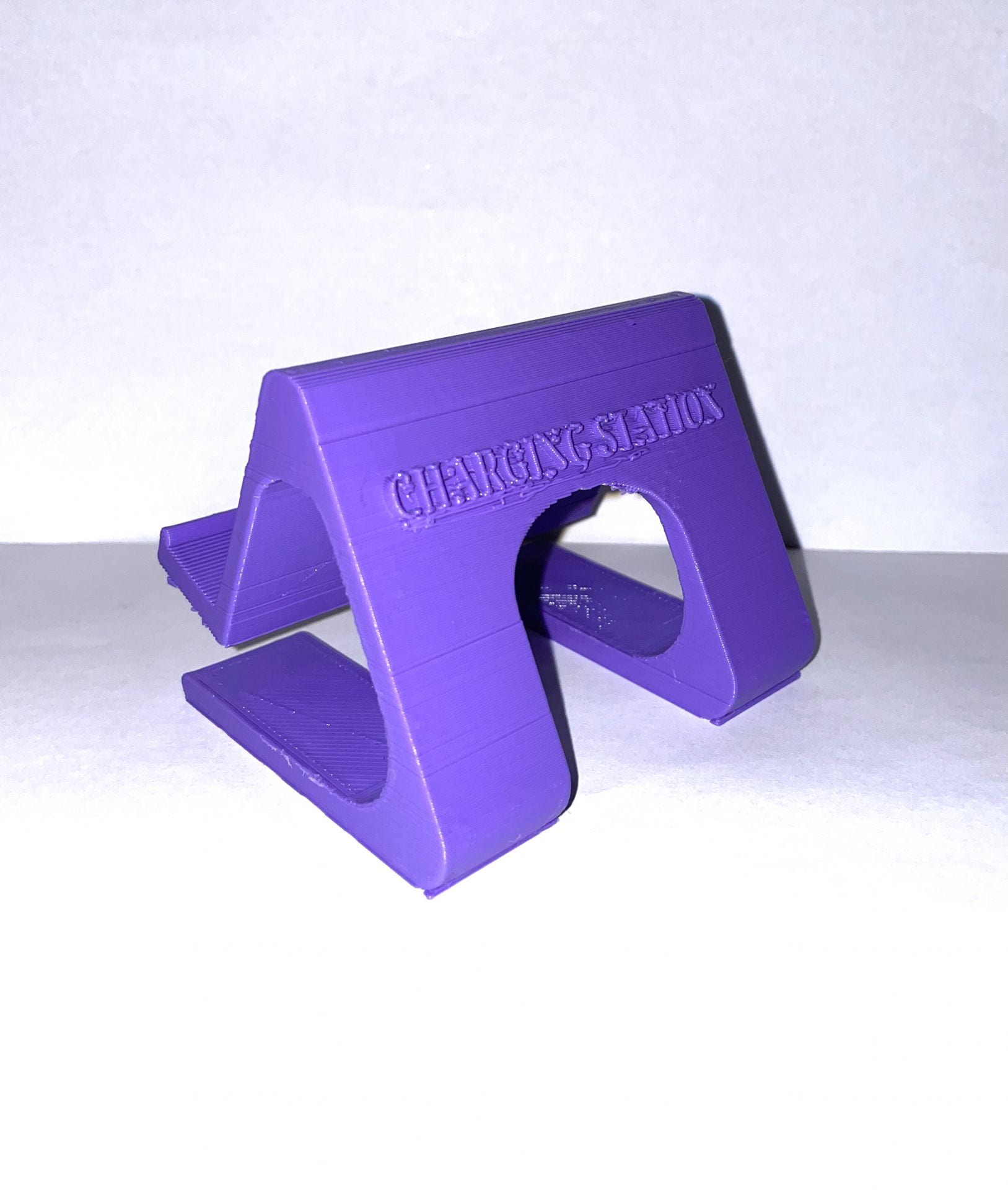
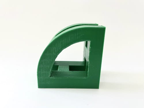
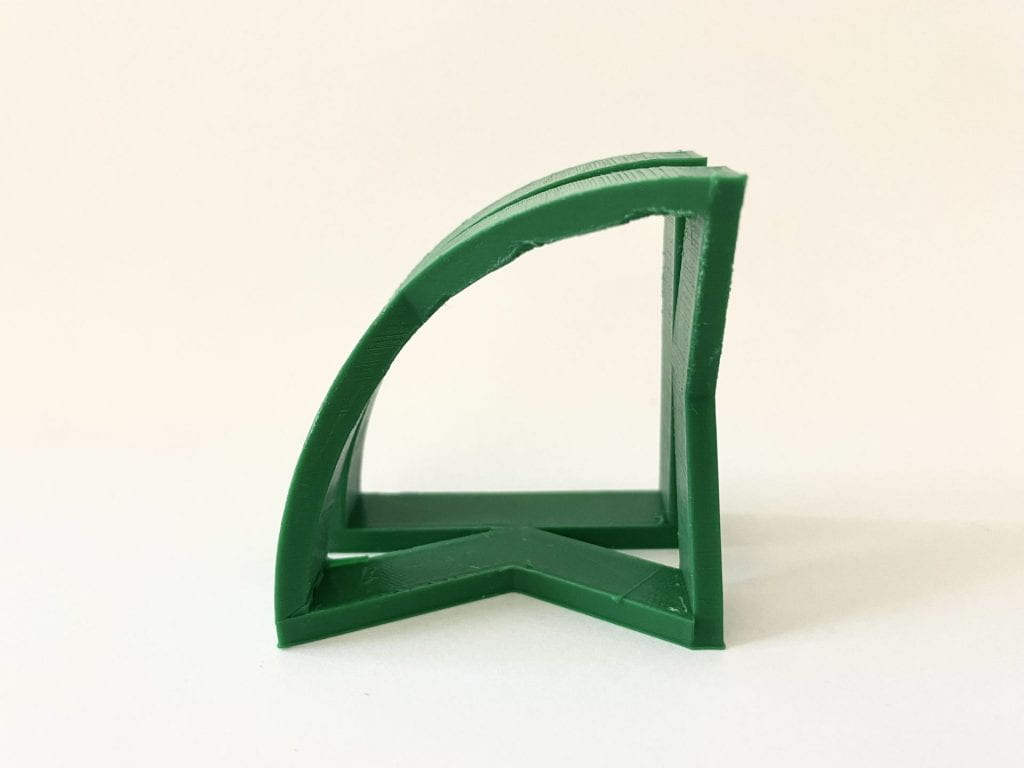
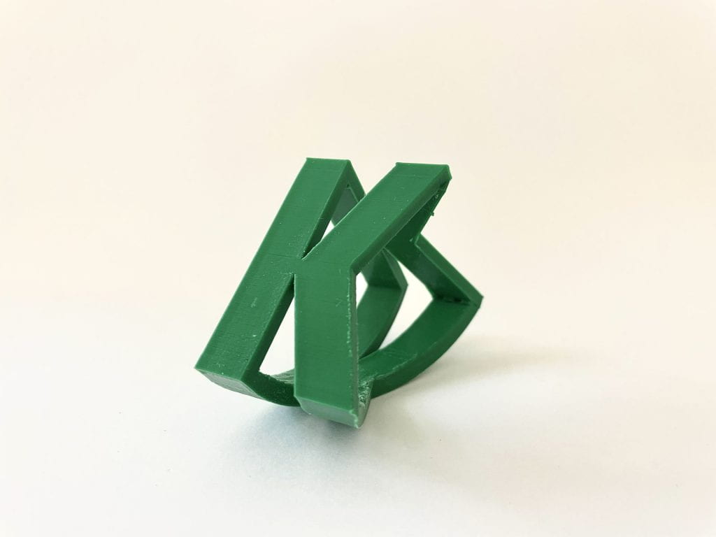
After this attempt, I was going to do the design with the 90 degree platform that held up the curved “K”. Then, I came up with the idea of making that platform into the letterform as well. This way the object has two 90 degree “K’s” holding up the curved “K”. The “K” can be placed down on either side and their will always be an identifiable letterform.

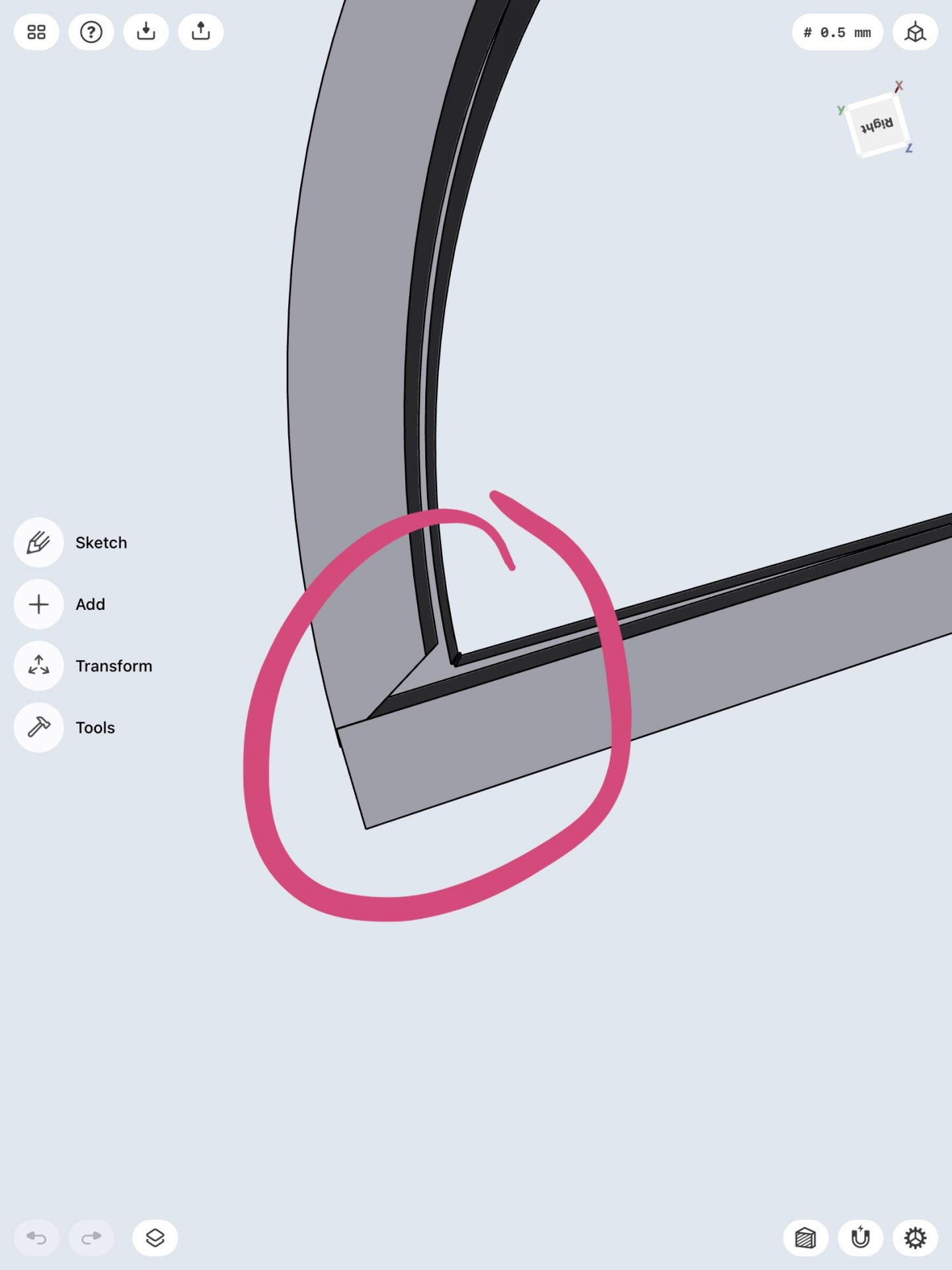
I overall really like how this iteration turned out and I don’t think there are many changes that I need to make. The only problem with the curved “K” is that it does not line up very well with the other “K’s”, so when I print this I am going to have to see if this is a problem. There are still some more things that need to be cleaned up in this design, but again, I will need to see if they are actual problems when printed.

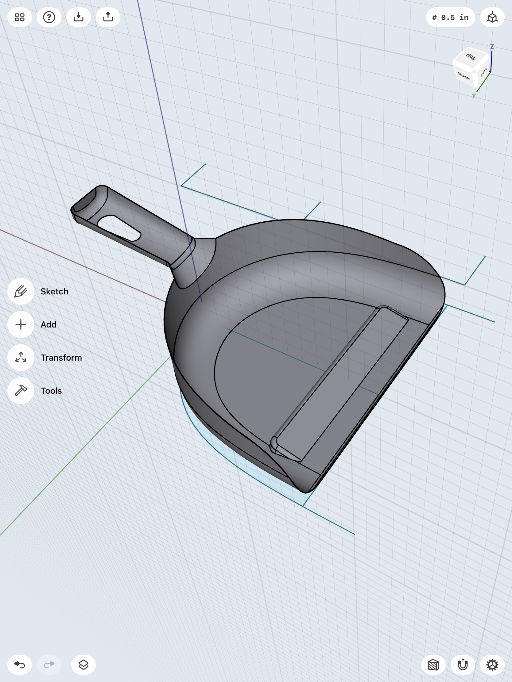
I also decided to go with a theme for my two letterforms and created the same design for “H”. Since this letter is symmetrical, it made it very easy to create the letters and match them up. Again, I am really happy with how this design turned out and I am really excited to actually get this printed. I think once I print, I will be able to see if there are problems in the design. However, I do think the letter “H” came out cleaner and probably won’t need many fixes.

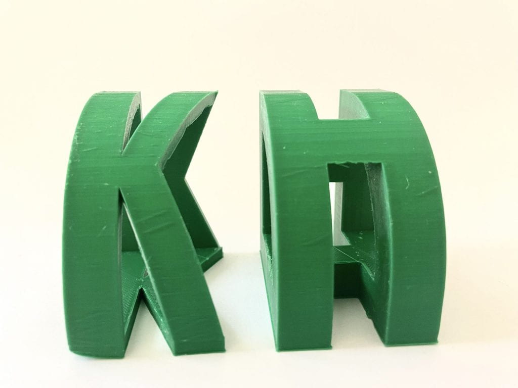
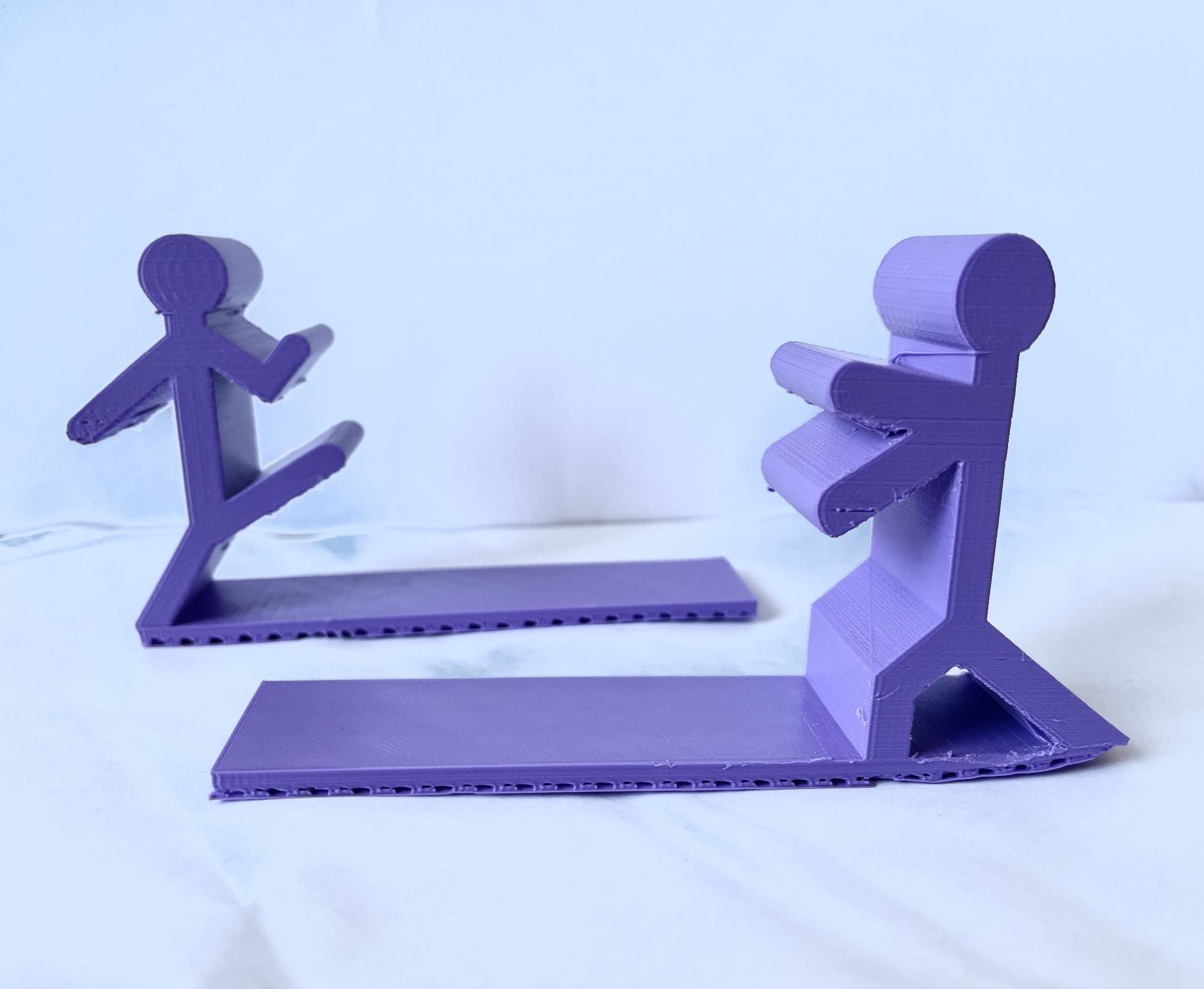
Both of these iterations came out good and only had two very fixable errors. The “K” print did not come out very clean especially once I removed the raft. Its first layer kept printing in a messed up and rough way. Therefore, my original solution was to print it without the raft. I thought this would allow for a much smoother base and platform. However, I found that what needed to be done was to rotate it slightly, so that the model would be flush on the bed. The second error for both of the prints were their size. I originally printed each with a dimension of 65mm and 50mm. However, this made the overall shape look uneven. Therefore, I made a simple fix and changed the dimensions to 50mm and 50mm, so it could be a cleaner and even print.

Final Print & Reflection

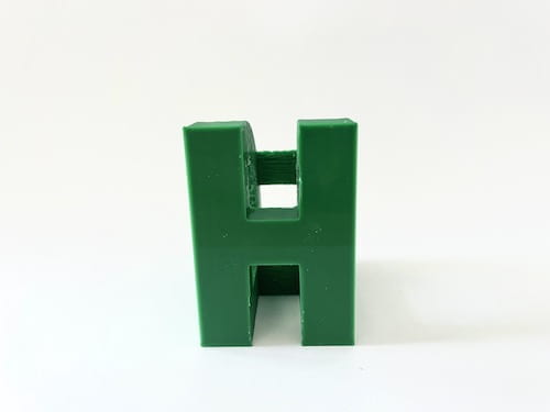
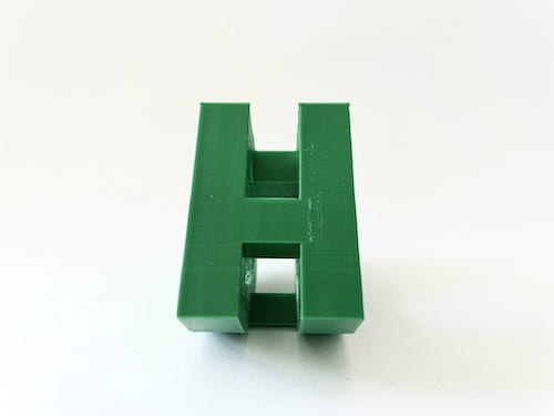
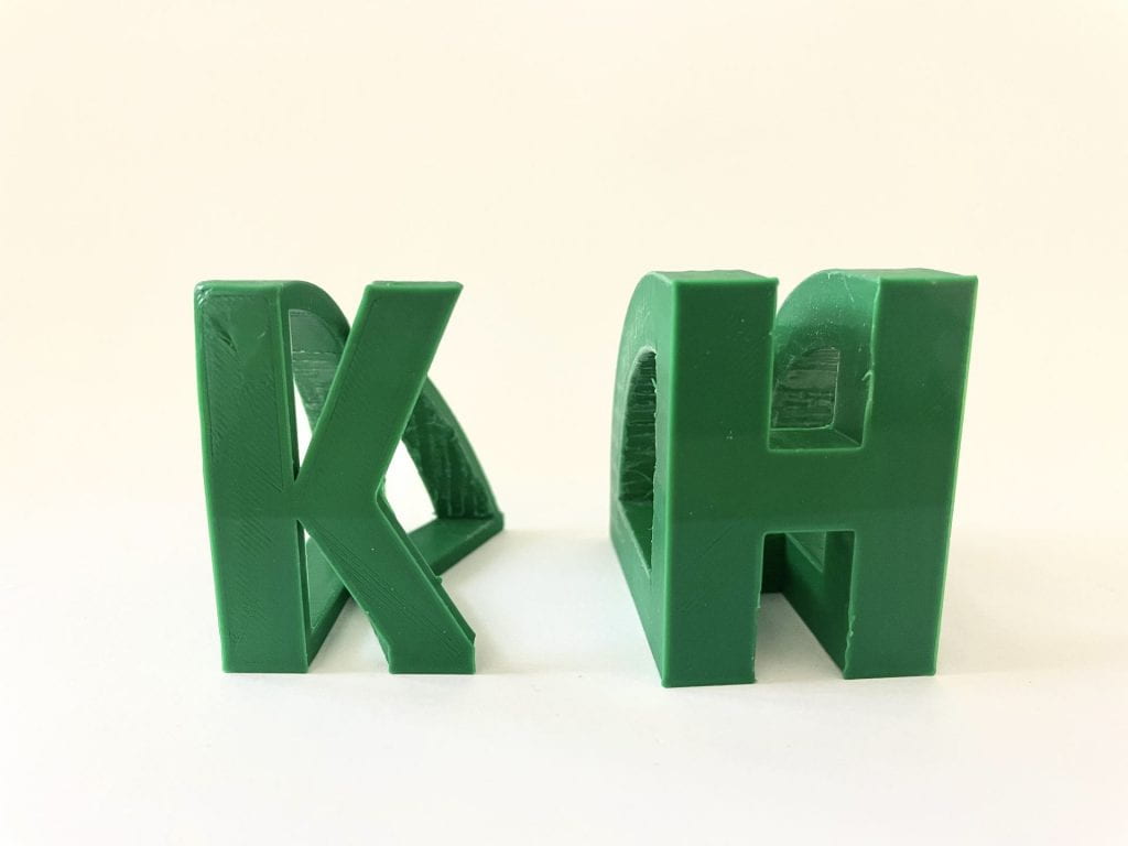
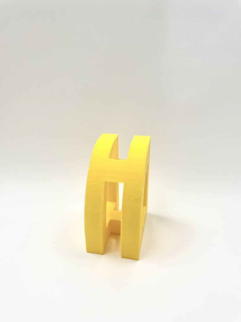
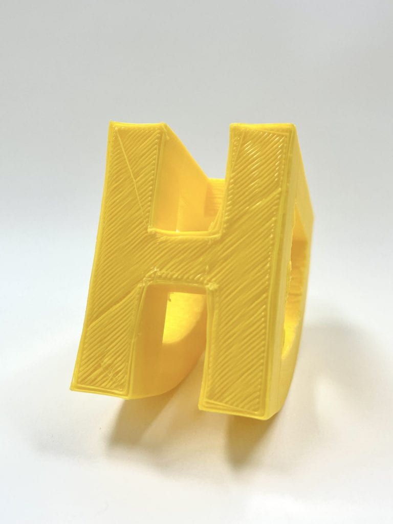
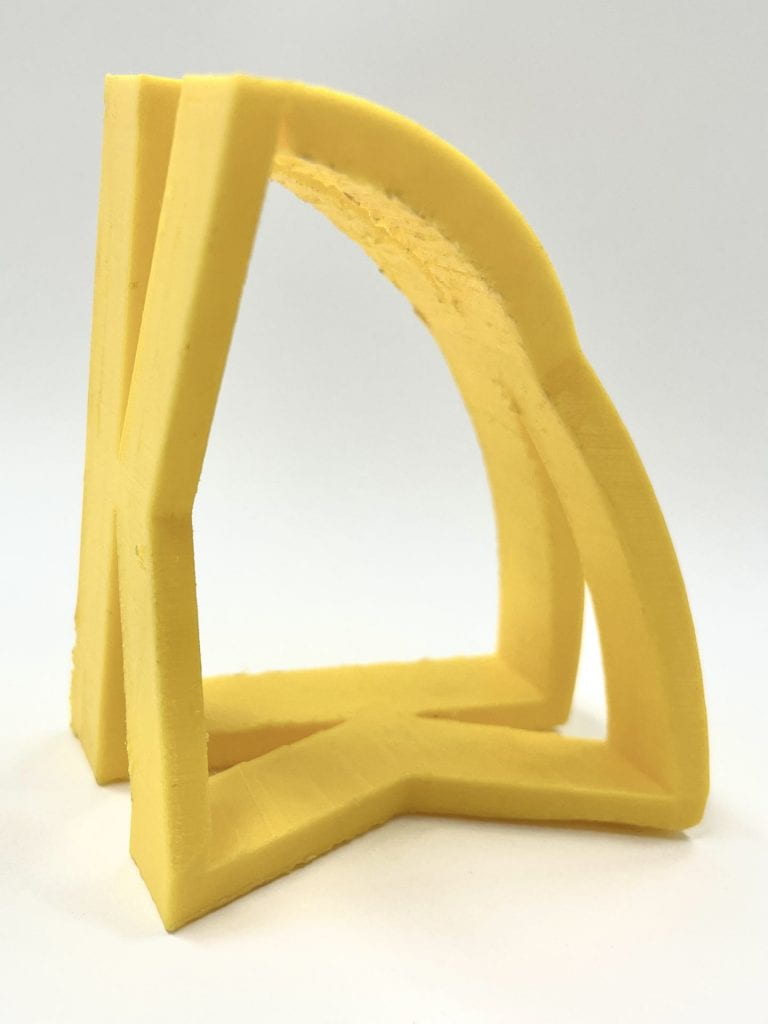
Above you can see both of my final prints for my Story project. On the left is my final print of the letter “H” and on the right is my final print of the letter “K”. I kept a theme for my two different glyphs because I really liked the idea and its design.

I am really happy with how the letter designs came out. As shown, each letter can be placed on either side and it will always show the same letter. Each side is also the same dimension of 50 mm, which gives the design an even and aesthetically pleasing look. One side is curved, which allows the entire object to rock back and forth when that becomes the platform.

The overall process to obtain these final prints was semi-difficult, but very fun. I really enjoyed doing this project and creating these letter designs. I encountered very little errors when designing the objects and printing them. The only difficulty I had while creating the letters, was finding the right dimensions and getting the object to print cleanly. After a couple prints, I was able to quickly solve this problem and get the right dimensions. These prints are small and do not take up much room, so they can be placed just about anywhere. These are my final prints because they came out the cleanest and exactly how I wanted them to. Therefore, I am really happy and proud of the final prints I have created. Shoutout to Professor Hooker for all the help in getting these prints!

Shapr3d First Models

Bracket

To create this bracket mount, I first needed to sketch out the very simple 2D figure. After the simple sketch was completed, I could select the sketch filling and pull it to create the body. I made the proper adjustments to the body, such as blending the edges and cutting a sketched out hole from the side.

Step 1
Step 2
Step 3

Then, I created a second sketch that would help cut out parts from the body below. I used a white plane to create this sketch on top of the body and then pushed it all they way down to cut out the middle part of the body. However, I needed to get the intersection of the body.

Step 4
Step 5
Step 6

After I intersected the these, I created another drawing of a circle on top that would eventually be cut down the body as well. Whatever circles drawn during this step were centered by hitting the concentric tool.

Step 7
Step 8
Step 9

Now I needed to create the bottom portion of the bracket mount. I began by drawing a rectangle first and pulling it out to create the base body. The edges were blended and circle holes were cut out of all four corners of the rounded rectangle. I chamfered each edge of these four circles to make it look cleaner. After I was done with the two separate bodies, they needed to be united, so I created a union between these two bodies.

Step 10
Step 11
Step 12

Lastly, now that I have one whole united body, I blended some more of its edges and then changed its final color.

Step 13
Step 14

3D Modeling a Dust Pan

This bust pan model was much more challenging and I had difficulty getting the exact measurements of the tutorial, but it was all fairly close. I first needed to sketch out the overall dimensions of the dust pan and its handle. I was able to use the grid to create clean dimensions, and create clean arcs and splines. Once these complicated sketches were made, I could extrude everything up to create the first body of the dust pan. However to round the corner of the body in a nicer way, I needed to draw more arcs and make them tangent. I made a sweep body and performed a boolean subtract demand, which allowed for a more natural rounding.

Step 1
Step 2
Step 3

Once the main body was basically done, I could begin working on the handle by using a construction plane and splines to create the handles sketch.

Step 4
Step 5

After the handle sketch was pulled out to create a body, it needed to be attached to the other body I created by getting dragged into it. I joined these two bodies and then, rounded some of its edges on the handle. I created an outer shelling into the now conjoined body, which made the overall dust pan. I sketched out another shape that was subtracted from the other body in order to add a better function to the dust pan (shown in step 8).

Step 6
Step 7
Step 8

Lastly, I sketched out a hole for the handle by using a construction plane that was viewed at an angle. Finally, I completed my dust pan and changed the entire color of it to yellow!

Step 9
Step 10

Karina’s 3D Scan

The process of getting this 3D scan took a lot of trial and error and it was actually quite challenging to get the hang of the 3D scanner. At first, I downloaded the Scandy app to my phone, but quickly realized it was not my best option present. As a class, we all decided that the iPad Monocle Structure Scanner was much more efficient in getting a good enough scan to print. While scanning, the object (my classmate or myself) had to stay still as we moved the scanner around it to get all our angles. I was able to get a lot of decent scans of my classmate, but thought the one done of me was best and should be the one to get printed. For some reason the scanner was having trouble fully scanning the back of my classmates head, so it would always leave a big opening. Even the scan of me had some openings on my head, but I was able to fill them in on Tinkercad.

After I got the scan of myself that I wanted, I saved it and sent the files to my Mac laptop via airdrop. The files were obj. so in order to convert to stl. and to fix the openings on my head, I had to import it into Tinkercad. I used my Tinkercad knowledge and skills to do such adjustments. I even added a little ring to the top of my head to make it into a fun keychain of myself. Once I made the adjustments to my 3D scan, I was finally able to print it!

Karina’s Self Expression

Research & Concept

As I was trying to come up with an object that I could inject a sense of playfulness into, I came up with the idea of creating a whimsical bookend. The function of a bookend is in its name, it is designed to be placed at the end of books to hold them upright. Bookends are sturdy and tall enough that they are able to support and hold books up. They usually have a platform at the bottom, so that way the object itself is more sturdy and capable of holding the books up. The weight of the books on the platform keep the bookend from slipping and moving away from the books. Overall, a bookend allows for easy access of any books and a better display of such books as they are held upright. When I was gathering inspiration, I came up with a great whimsical and playful design to add to the bookend so that it wasn’t just plain and boring.

I plan to make this bookend whimsical by making two separate pieces in which each end is a stick figure doing an action that appears to be holding books up. The people stick figures will appear as if they are doing such actions to keep the books from falling on them. One end will be of someone pushing the books upright, while the other end is of someone kicking at the books so they don’t fall on it. I will also be adding a hole into the arm of one of the stick figure ends, so that it serves the function of holding my favorite pen and appears as if the stick figure human is holding a sword or something. Below you will find my sketches of what I am envisioning.

Iterations

To design my object, I created individual stick figures on Illustrator and downloaded the SVG file to Tinkercad to create what is shown on the left.

However, I made a mistake while creating the figures on Illustrator. I had forgotten to make each shape on the Illustrator drawing into one. To do so, I had to create a path that combined each shape. That is why, in the images above, the stick figures are not filled in. At first, I thought I wanted this design, but then quickly realized that it would cause problems when printing. If I were to print the non-filled in version, then the walls would be way too thin and not print correctly. In the image above on the right you can see where I started to begin filling in the shape to fix this problem. However, I realized it would be extremely difficult to do so using only Tinkercad. Therefore, I went back into Illustrator and added the path to the overall tick figure shapes that I could later import into Tinkercad and have the full filled-in version of stick figures. The prints of these iterations are shown and explained below.

I first printed these iterations shown above with different settings. I had scaled down both iterations to 80% just for the purpose of it being an iteration and saving time. The purple one had a layer height of .2 and an infill density of 20%, and it took a total of 6 hours to print. This one’s platform also printed differently as it came out more curved. In the middle image of the purple prints, you can kind of see the curve I am talking about; however, this error is not that noticeable nor does it cause a problem.

The red print printed out perfectly and just how I wanted. I simply changed the settings of the printer so that it could come out stronger and sturdier. Considering that these bookends will be holding up books, it needs to be sturdy and strong. Therefore, for this print I made the setting as .1 for layer height and 30% infill density, with a printing time of 10 hours. The only thing I am realizing that I need to change, is the hole made for the pencil on the hand of the stick figure. Although these iterations were scaled down for the sake of fast printing time, I still think I need to adjust the hole size so that it is actually capable of holding a pen or pencil. Therefore, below you will see this adjustment via Tinkercad 3D view.

The two images below are supposed to show the different hole sizes. The left image is the initial, smaller hole size. Meanwhile, the right image is of the adjusted, bigger size.

Final Print & Reflection

This is my Self Expression final print of a playful two-piece bookend. The two human stick figures shown kicking and pushing at the books add a playful design to a simple bookend.

The entire design works really well with the function of the object. It is sturdy and strong enough to hold any size books. The platform of the bookend keeps the object from slipping and sliding because the weight of the books hold it in place. The way each figure is “pushing” at the books allows for a good hold of them. Having two separate pieces to the bookend permits for an adjustment in-between space size. In other words, the two separated bookends could be closer or further apart depending on how many books need to be held up. The hole placed on one of the pieces, can hold my favorite journaling pen and it still adds to the playful design. Now my pen and whatever book I wish to grab, can easily be accessed. The bookend pieces are small and take up very little room on my desk.

The overall process to obtain this final print was very easy and fun. I encountered very little errors when designing the object and printing it. The only difficulty I had while creating this bookend, was finding the right size for the hole that would hold the pen. After a couple prints, I was able to quickly solve this problem and create the right hole size. I was a little nervous about the size of my bookends, but they turned out to be perfect. They do not take up much room on my desk nor do they slip and slide all over the place. This is my final print because it came out clean and exactly how I wanted it to. Therefore, I am really happy and proud of the final print I have created and I know this is an object I will definitely use. I hope others can find this design helpful (and playful!), and will wish to print it as well!

3D SVG

When assigned this assignment, I had a little difficulty deciding what I wanted to make into a 3D model. To gain some inspiration, I looked into my past Adobe creations and found the perfect 2D SVG I had previously created of my puppy. As a Christmas gift, I made a digital illustration of my puppy and decided that it would be a perfect piece of artwork to turn into a 3D key chain as well. To create such key chain, I first placed the PNG of my previous creation into Adobe Illustrator. Then, I traced the image and expanded it to get the vector image. From there, I was able to create a compound path and upload such SVG into Tinkercad.

In Tinkercad, I needed to design a platform where the overall design and all its pieces could lay. If I did not do this then the design would print unattached. Therefore, I chose a circle platform and added a hole in it to make it into a keychain. I needed to resize the SVG design so that it could properly fit onto the keychain.

Steps taken on Adobe:

Karina’s Form|Function


F|F Research & Concept

Original Object:
3D Printed Phone Stand

The image above is of an original and simple 3D printed cellphone stand found on Thingiverse. It is designed to be placed on a flat surface to hold up a cellphone in an angled manner. There is a hole in the back of the object and on the bottom of the actual phone holder section, so when the phone is held up vertically, a cable or charger may run through the object. The object also allows for a phone to be set up horizontally as well. This original object on Thingiverse, is designed to fit an iPhone 6; therefore, it must be adjusted to be suitable for other phones.

Potential Personalizations/Improvements:

One personalization or improvement I wish to make is a thicker notch that can fit an iPhone 12 rather than just an iPhone 6. The original object contains a notch that is about 7mm, but the change I would make is a notch of about 9.5mm. This notch also is adjusted to fit my iPhone with its otter box case which is about 2mm. Another slight customization I plan to make is curving the point at the top a little. Rather than having a strong point, it would be curved. Overall, the two big improvements I’d make are change the notch size and round the edge of the top.

Another idea is widening the entire object so that it can have a better grip of my phone when it is placed horizontally. I also read some comments on the original Thingiverse object saying how it slips a lot and moves around easily. Therefore, maybe I can find a way to 3D print an anti-slip feature at the bottom of the phone stand. In addition to this, I read a lot of comments about the platform not being high enough, so I can make some altercations heightening it a bit.

F|F Iterations

Phone Stand designed by GoAftens
,

This is the print I made of the original phone stand designed by GoAftens. To print this object, I used an Ultimaker 2 Extended+ printer. To cut the printing time, I changed the layer height to 0.3 and changed the infill percentage to 10. I was able to cut the printing time from 7 hours to just 2 hours and 25 minutes.

I think the original object would be even better if I lifted the platform just a little more so that the charger does not hit the table. Therefore, I will be attempting this fix in my remixes.

First Remix

In attempt to make the notch size wider, I accidentally removed the notch all together and did not realize until after it was printed and tested. In this remix attempt, I made a hole at the bottom, widened the overall object, and curved the top.

Second Remix

In this remix attempt, I created a different style for the platform, but realized I need to make the hole bigger to allow for the charger to go through. I also added a fun little 3D text on the back that states “CHARGING STATION”, which I like. I kept the wider look and the curved top from the past remix and fixed the notch on this one! I think overall this is my better print and that I simply need to add the bigger hole into the platform and raise the platform a little.

Third Remix

I have not been able to print this remix attempt quite yet (due to the snow and campus closings), but according to my calculations from my past remixes, I think this one will work out best. I fixed the hole on the platform and adjusted the height of the object.


F|F Final Print & Reflection

This is my F|F Final print of the remix of GoAftens original phone stand. My remix includes changes to the overall height and width, notch size, platform design, notch design, and back design. More details about my remix can be found on Thingiverse.

Original VS Remix
Original VS Remix
Reflection:

The overall process to obtain this final print was relatively easy, but very time consuming. I encountered very little errors, but was still able to find ways to improve the overall design of the object. Although the original object was really good and sturdy, I still found it important to create subtle changes to overall improve the function of the object.

I immediately knew I needed to adjust the notch size of the original object so that it could fit my iPhone 12 with its thick case on. After some more trial and error with this, I discovered I also needed to raise the height of the object because the original height was too low that a phone charger could not properly fit into the design. I also made a big hole in the notch for a phone charger to run through as well as one in the platform that helped with the issue of the charger. Originally, a phone charger would hit the bottom of the table or the platform and not properly work with the design. However, the changes I made allow for the charger to fit without an issue. This gave me the idea of naming the object the ‘Charging Station’, which I wrote on the back because it is, indeed, a charging station for my cellular device.

I really enjoyed printing this phone stand and creating personalizations and changes to the original object. It was very exciting to find an object that I could potentially use then adjusting it to my specific wants and desires. I was super proud of my final print and was really excited to show it to all my roommates. I learned a lot throughout this entire project process including how to use Tinkercad and how to 3D print. After a few trial and errors, I learned what the necessary printer settings needed to be in order to print a sturdy and more durable phone stand. This was a challenge because print time was an important aspect, but I was able to work around this issue. Overall, I cannot wait to use my new and improved Phone Stand- Charging Station that I 3D printed!

Karina’s First 3D Print

I have never 3D printed before, so I was super excited classes didn’t get cancelled and I was able to come in to do my first print ever! I decided to just do the JMU Cube as my first print to get a feel of how the printers and programs work. To my surprise, it was a very simple process. I was expecting it to be way more difficult, but now I know it is actually super easy and really fascinating to watch. The only real complication I had was with getting my computer to start, but other than that, everything went well. Overall, I had a great first experience with 3D printing and I love how my print turned out. Now, I am really looking forward to creating my next print!

Hi I am Karina

Hi everyone, my name is Karina Arzubiaga. I am a junior Creative Advertising concentration with no minor because I could not think of one to choose from. I am a part of Tri Delta sorority at JMU and sometimes play volleyball in my free time. My favorite things to do are travel, play with puppies, and eat McDonald French fries:) I have always been super creative and love doing arts and crafts or really any hands-on work. That is why I am really looking forward to this 3D printing class!

The object that I choose to represent me is a plane because as I said before, I love to travel. I am a super adventurous person and have made it a goal of mine to travel to at least one new country each year. Shoutout to COVID for making that extremely difficult this past year! Any recommendations where I should go next?

After taking the creative type quiz I discovered that I am the Visionary type who imagines the impossible and lives in a world of infinite possibilities. 

You can find my work on:

Tinkercad

Thingiverse

Instagram

WordPress