Research and Concept
Letterforms
Letterforms have the capability of being presented in countless ways, with variations to style, textures, and dimension. What I find to be the most intriguing characteristic of letterforms is that through all of these variations, the meaning of the letterform remains unchanged because each letterform is recognizable by its individual formations. Because of this fascinating asset, designers are able to manipulate many aspects of a letterform all while keeping its integrity.
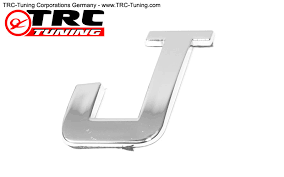
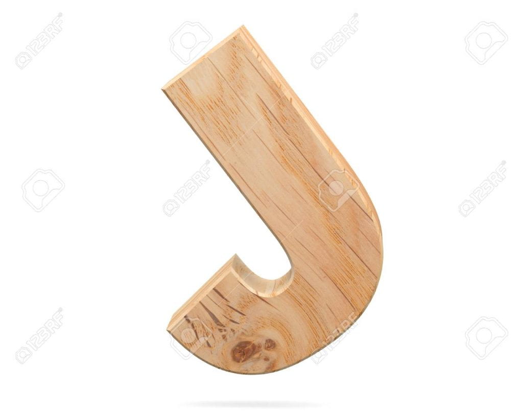
First Glyph: “J”
The first glyph I chose was the capital letter “J,” as that is the initial of my first and last name. This letterform has a long stem protruding from the top and a curved semi-circle at the bottom at its base. The letterform “J” also sometimes has a “hat” that sits horizontally atop of the long stem, although this does not appear on all forms of the capital letter “J.” This is an odd component of the letterform as this part is actually optional to have, so it is not necessarily considered a defining characteristic. This specific formation is what produces the full letter, “J.”
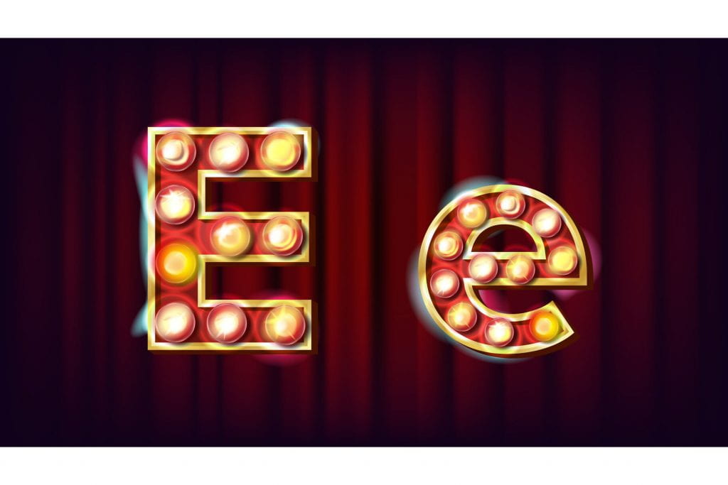
Inspiration


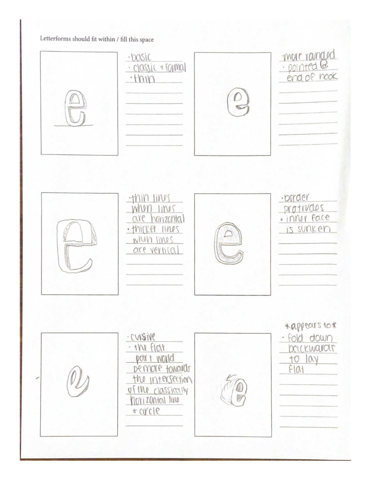
Sketches

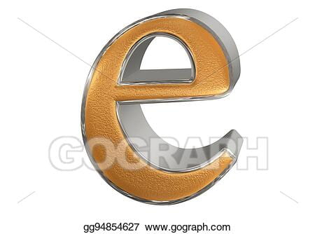
Second Glyph: “e”
The lowercase letterform “e” is a bit more interesting than one may expect upon first glance. It is comprised of a long line that almost completes a circle, but does not ever tough the other end. This circle-like line extends up, to the left, down, to the right, and then up a little again. It also has a short horizontal line that appears in the middle of the letterform which connects the upper-end of the circular formation by extending leftwards to the middle of the circular formation. This letterform differs greatly from its capital counterpart.


Sketches
Iterations
Iterations for the glyph, “J”
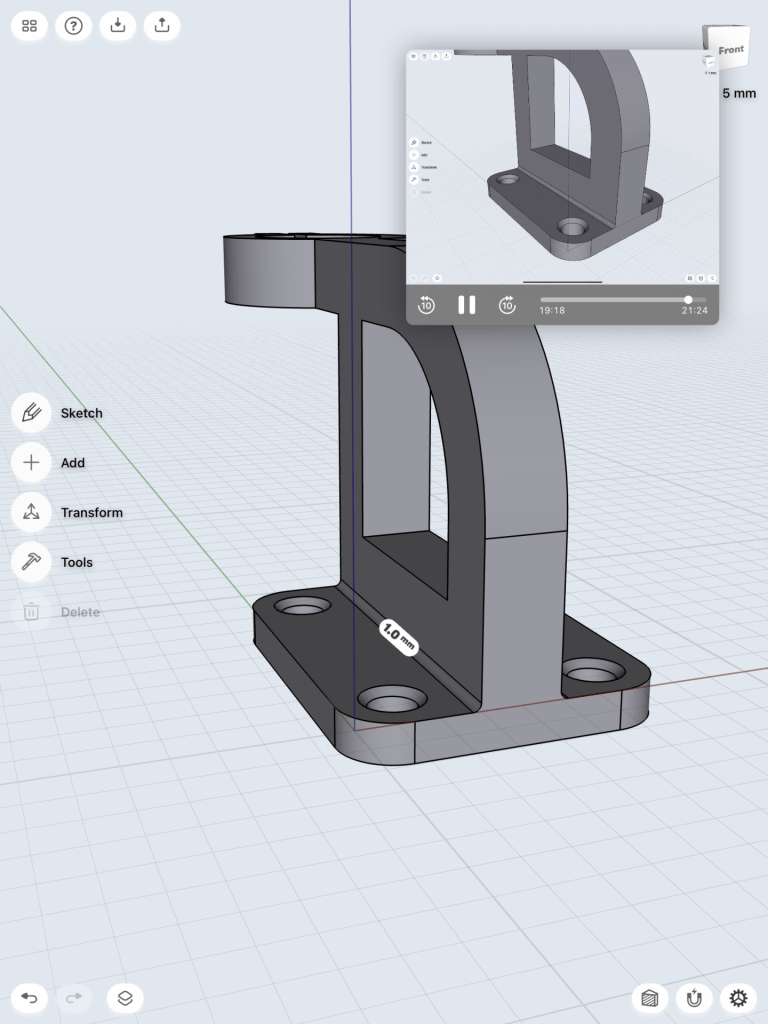
For my first glyph, the capitol letter “J,” I was excited to pursue my fancy-looking and unique interpretation that I thought of while sketching. Using the spline tool to create my sketch, it was difficult to get all of the points where I wanted them to be exactly, so this part was a little time consuming. Once I created a created a sketch I was happy with, I extended it to become a body. This design had a small, claw-like form as the “hat” of the capitol J, which I decided looked awkward and almost made the J difficult to recognize.
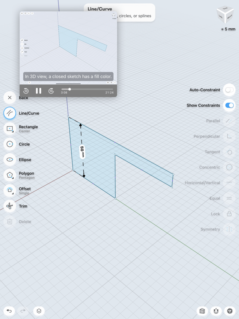
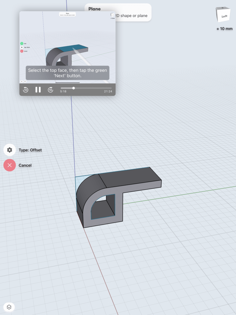
Below are pictures of my first design.


I then decided to extend the hat to be longer, making the hat more recognizable. I really liked the way this looked and it matched more of what I pictured in my head when designing this.
Pictured below is the first iteration I made to my glyph.

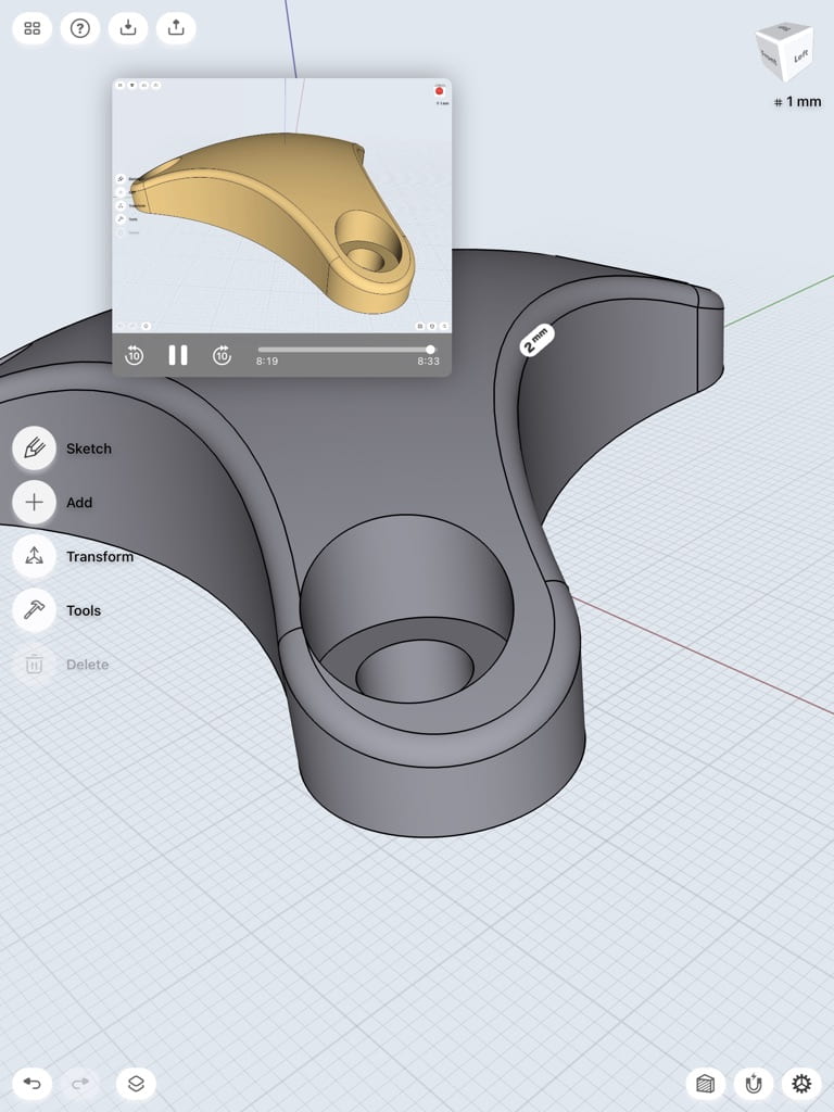
I did actually really like this design and almost stopped there, but as I was playing around with it more I found that blending some of the edges made me like the design even better. I think that blending the edges makes the design look more formal and aesthetically pleasing. This extra splash of detail does not take away from the integrity of the design nor the recognizability of the letter J.
Below are images of my second iteration and iframe.


Iterations for the glyph, “e”
My second glyph, the lowercase “e,” I found to be the most difficult design to come up with. Because of this, I wanted to explore multiple designs to brainstorm all of the ways that I can make this print unique. I began with a fairly simple e that had a pointed tail. I actually really didn’t like this design for a few reasons: firstly, it would not be able to stand alone because the bottom of the design is rounded. Secondly, it was just way too simple and I really wanted to push my boundaries with this assignment,
Below are pictures of my first sketch.

I quickly threw out this idea and pursued another, one in which was completely different from the first. I liked the idea of playing with blocks and giving this simple little letter “e” a touch of architectural playfulness. I created my first iteration keeping in mind how blocks can create this sort of odd structure.
Below are pictures of my first iteration.


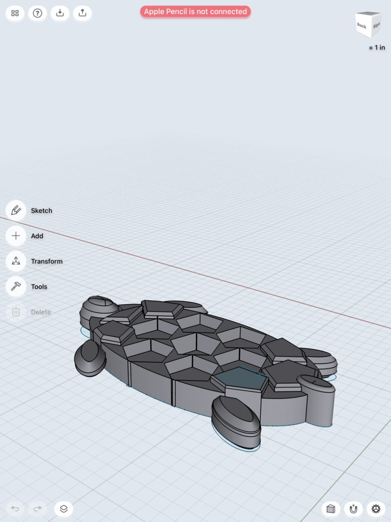
I liked where this design was going more, however I still felt as though something was missing; this design still seemed to be too simple. I had this idea of blocks building upon one another, almost in a way where if they were actual singular blocks, they would tumble apart. What I decided this design needed was more of a chaotic feel to it, where the form almost just looks like a random array of blocks until you look at it from the front view.
Below is a picture and iframe of my second iteration.
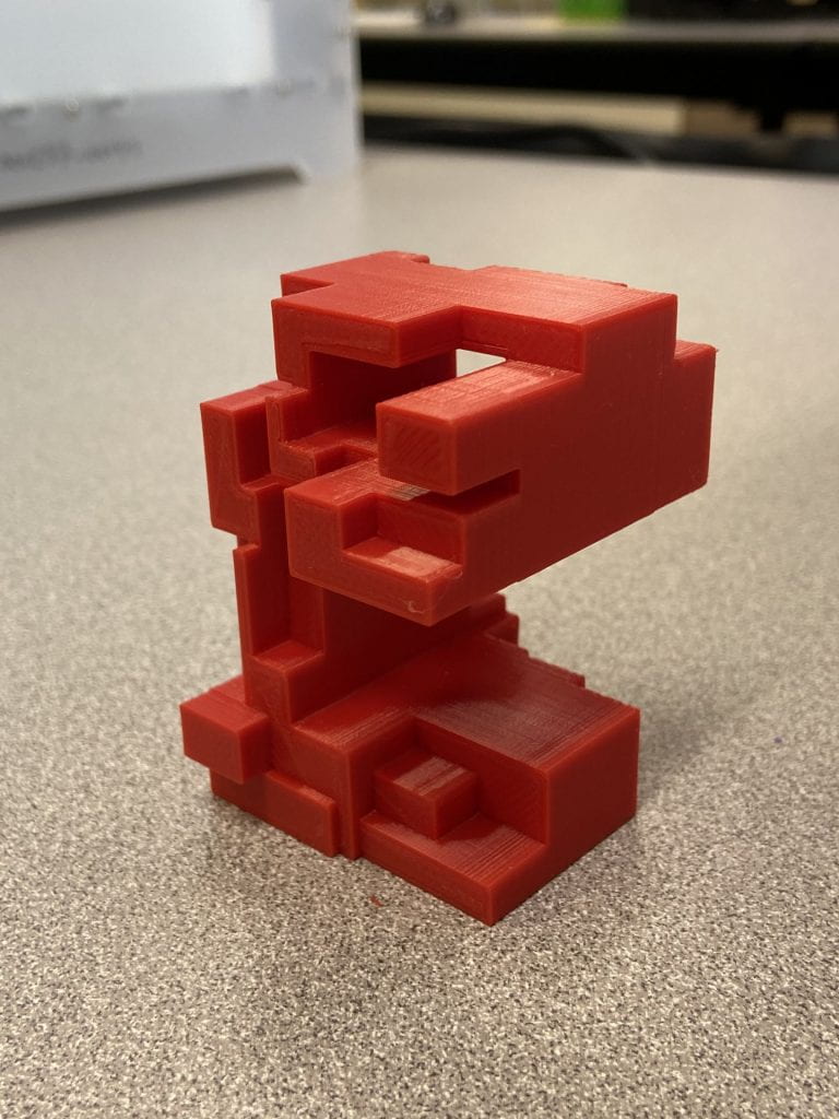
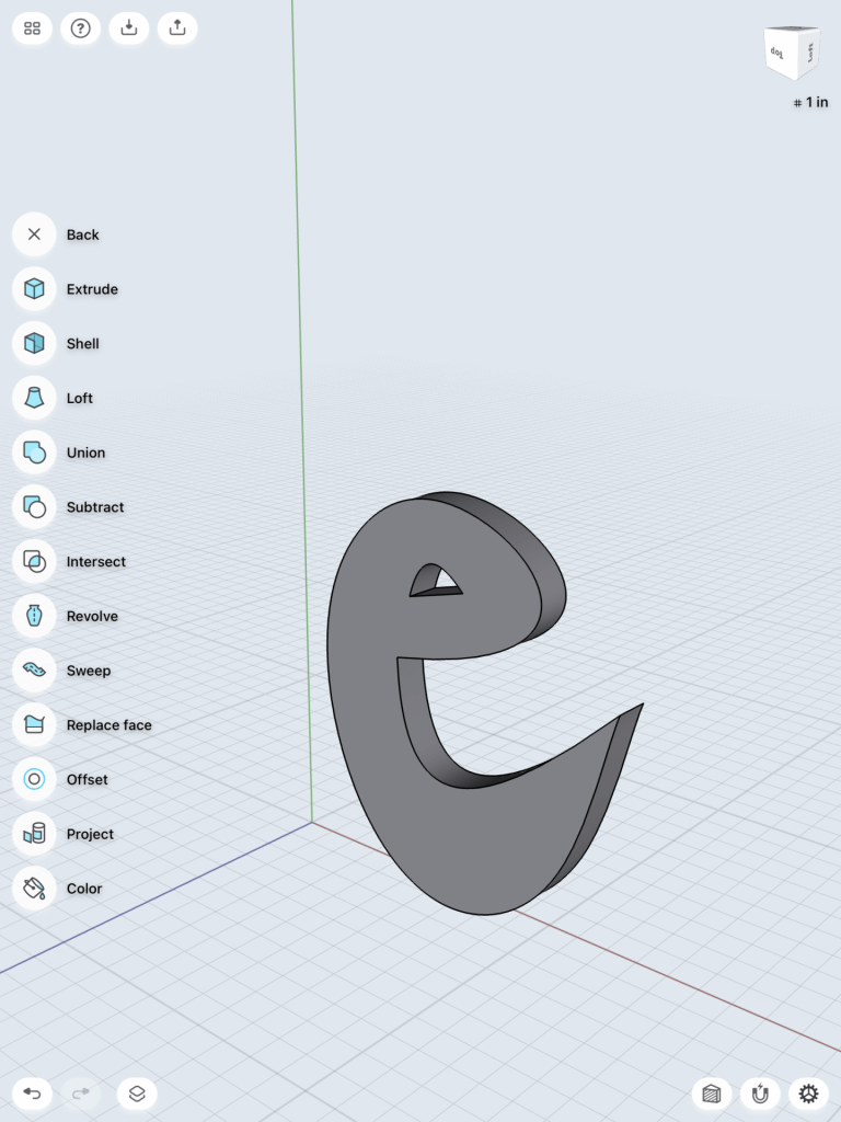
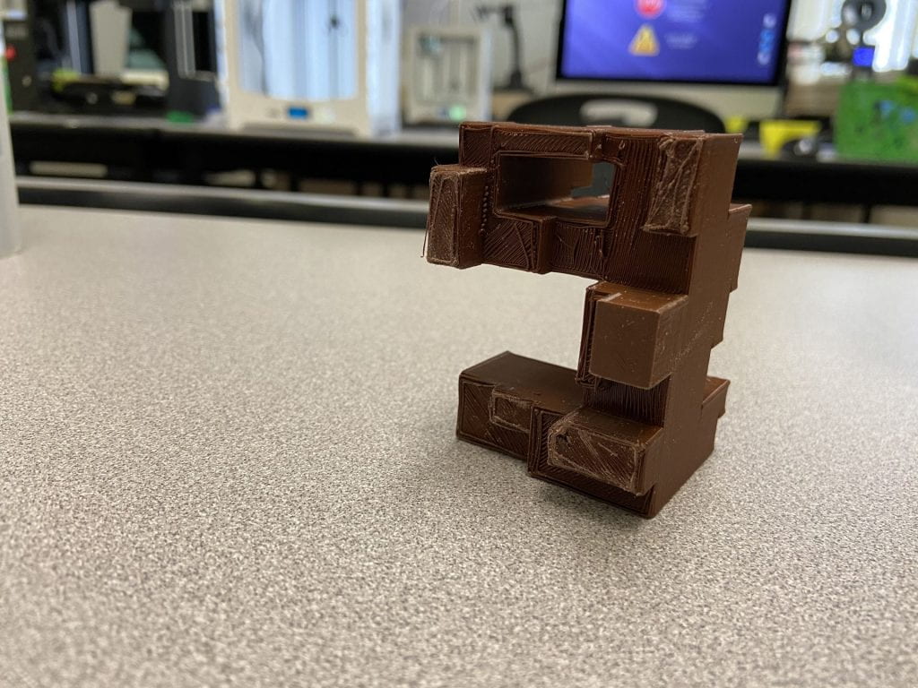
When I test printed my design for the first time, I was met with “spaghetti” from the printer. Upon investigating into this further, I looked to my design to see if anything had gone wrong in the original architecture. Lo and behold, I discovered that my squares in Shapr 3D were not united and in fact could not be united, as Shapr 3D does not allow shaped to connect to each other by one side as my design features. For this reason, I took back to the drawing board once again and created an entirely new model. This time, I created the basic outline of the lowercase letter “e,” raised the face of it to make a body, then drew lines throughout the letterform. With those lines, I created different sized shapes and took those individual faces and manipulated them to create the scattered architectural design I had originally thought of. This design worked phenomenally, and when printed, worked out well. I printed this design with a layer height of 0.3, though, which impacted the integrity of the design. Below are images of my third iteration and its iframe.


Final Prints
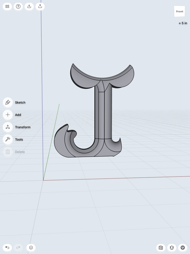
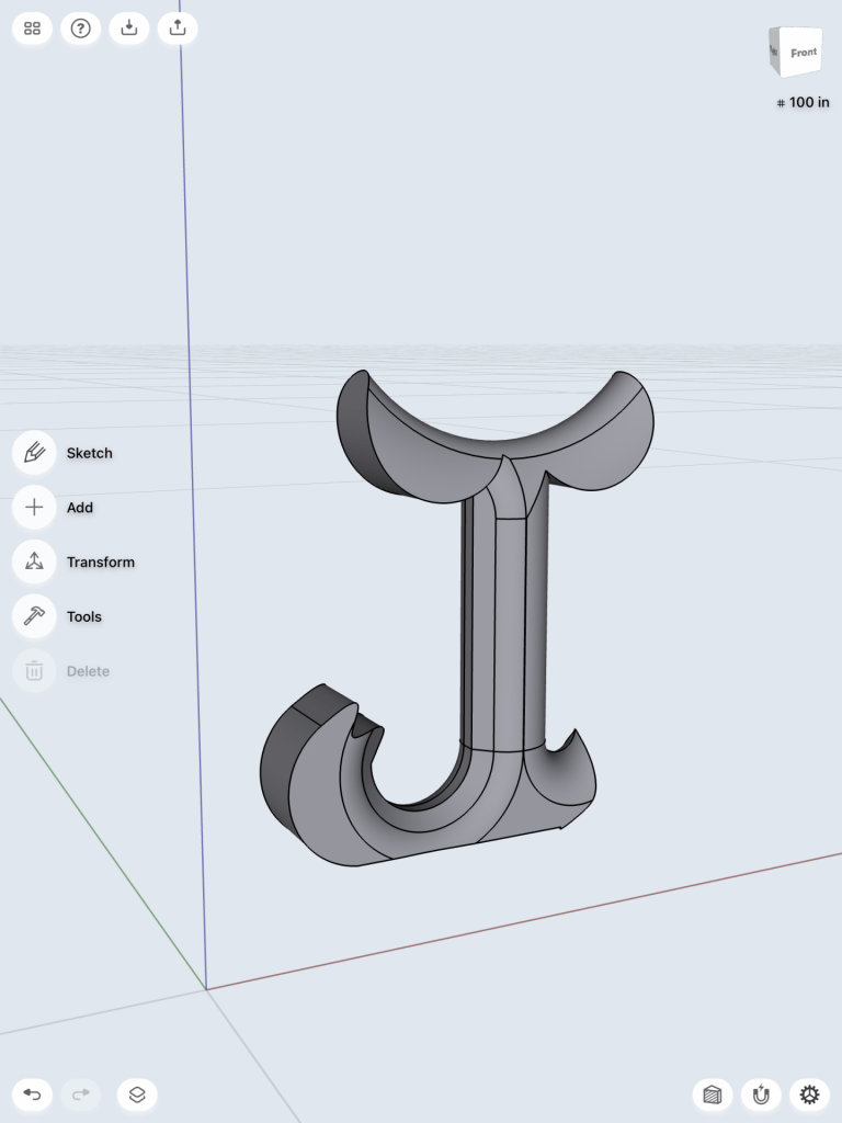
First Glyph: J
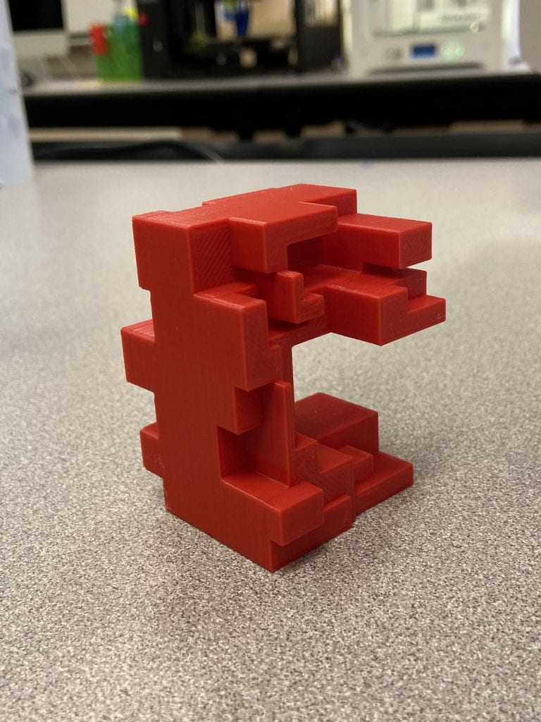
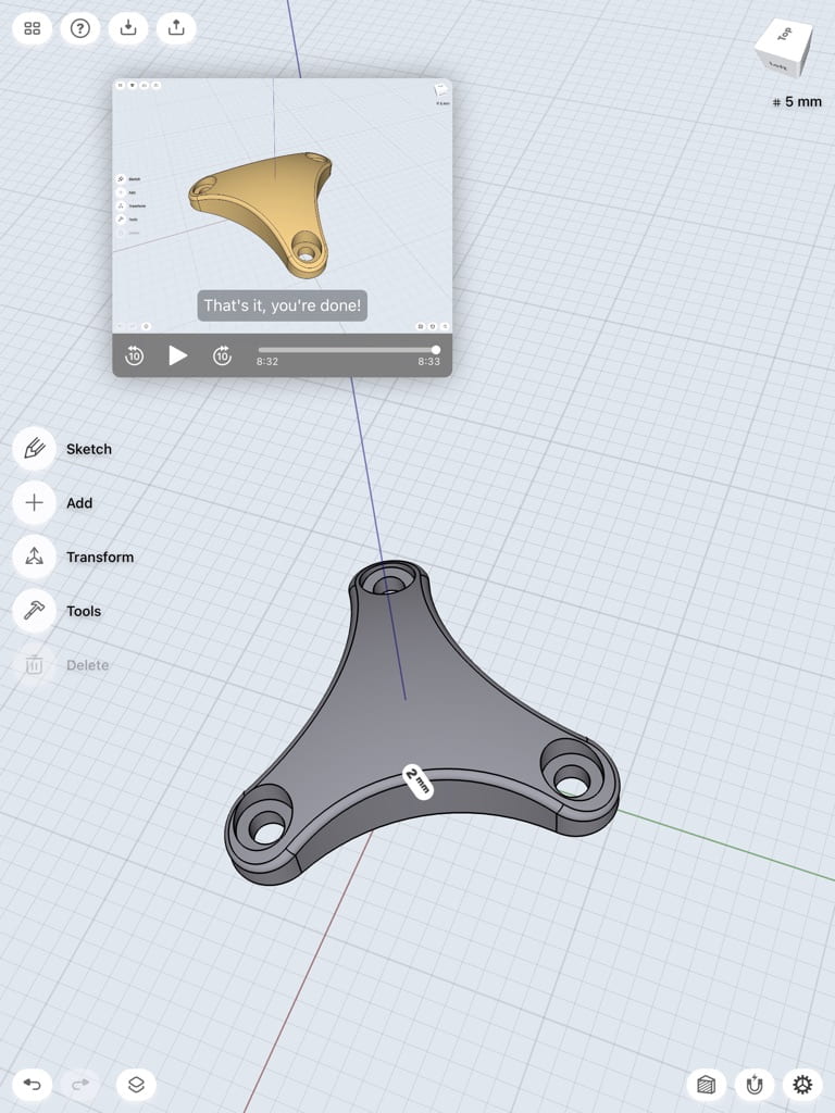
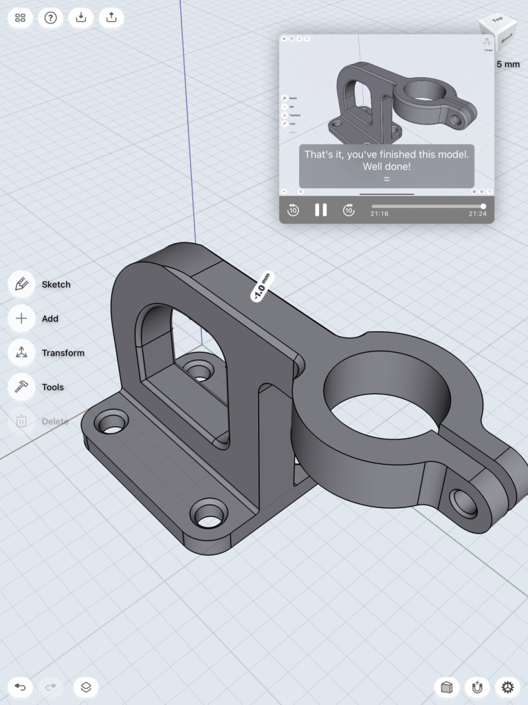
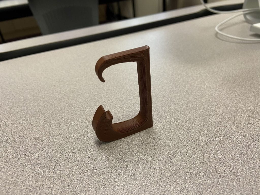
Something that I got as feedback for my design during our class time was that the “hat” of the capital J almost resembled an inappropriate figure, so with that new image in mind, I took back to the drawing board and reworked my design. I decided that the left-most half of the hat would work perfectly in terms of the print being understood as a “J” and take away the idea of it resembling something inappropriate. I also changed the shape of the half-hat to make it more fancy-looking, and this new design came to mind. It essentially has the same idea as my second iteration of the design on the bottom, but the top completely changed its aesthetic. I believe that the final design of my uppercase “J” glyph is perfect and resembles exactly the design that I had in mind even when brainstorming ideas at the beginning of this project. This is my final print because it is sleek, attractive, and well-constructed. It is able to stand on its own which completes one task I had for it, and it successfully portrayed the glyph, “J,” to be highly recognizable.
If I had the opportunity, I would enlarge the size, add a small hole in the back of it, and round the bottom to make it into a wall decoration for my room. Because I wanted to have this design stand upright and stay within the size constraints of the assignment, I could not pursue this, but I believe the final print works great for its intended purpose.


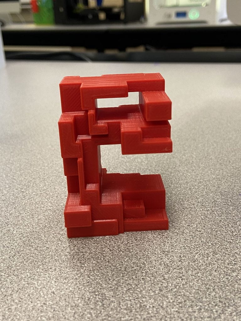
Second Glyph: e
After reworking my design in Shapr 3D, I was very pleased with how it turned out. Since I was just test printing it for my iteration, I had the layer height at 0.3 to save time and simply see if it would print correctly. I also did not add the appropriate supports, so I needed to adjust that as well to be suitable for a final submission. In my final print, I set the layer height at 0.15 and Infill density to 20% so that the print would come out as clean as possible. I added a skirt as the support in order to give it the appropriate formation integrity. These were the only changes needed in order to print a successful model of the glyph, “e.” I believe that my final print worked out tremendously; I am very pleased with the structure of the design itself and how it printed. I am very glad that I chose to start the design process over again from scratch after my third iteration came out as spaghetti; this allowed me to think creatively and solve the issue that I was having in the most effective way. Without that redesign, I am certain that I would not have a 3D print that turned out successfully. This is the final print because it is clean, the designs integrity is still intact, and it is a direct reflection of the concept I had originally created.
Overall, I am most proud of the creativity I encapsulated for this glyph. Primarily, I was concerned that I would not be able to think of a way to manipulate the letter “e” into something out of the box, but I believe just that. After researching letterforms as sculptures, I was inspired to make something that would have an interesting architectural aesthetic to it. If I ever had access to machinery that could accommodate this, I would enlarge this design into a much bigger print, so that it could act as an interactive sculpture. In addition, I would print other letters with the same design concept as my design of “e” and spell out a word. I am intrigued with the idea of seeing a structure and it looking random from most angles, but being legible from other angles.
Notice: This iframe for the letterform “e” is the same as the iframe from my third iteration, I simply changed printer settings in order to achieve my final print of this glyph.