Daniel Drecun’s Form|Function

The Thingiverse object that I chose was a cable organizer created by user @tjmck. It’s designed to hold larger cables such as ethernet or phone cords. I chose this design because it was something that I personally need, but I think I could improve upon the design. I’d want to make it more friendly for smaller wires.

To improve upon the original design, I’d want the object to be able to hold wires of any size without any external means. I created “clips” so that I could stick the wires in without them coming back out unless I lifted the clips.I didn’t like that it was just a circle and I’d want to be able to stick the organizer on a desk or something else so I can easily access the wires if I needed to so I created a base for it. I thought the waves would limit the amount of cables I could put in too much so I decided to keep the compartments in a line.


F|F Iterations

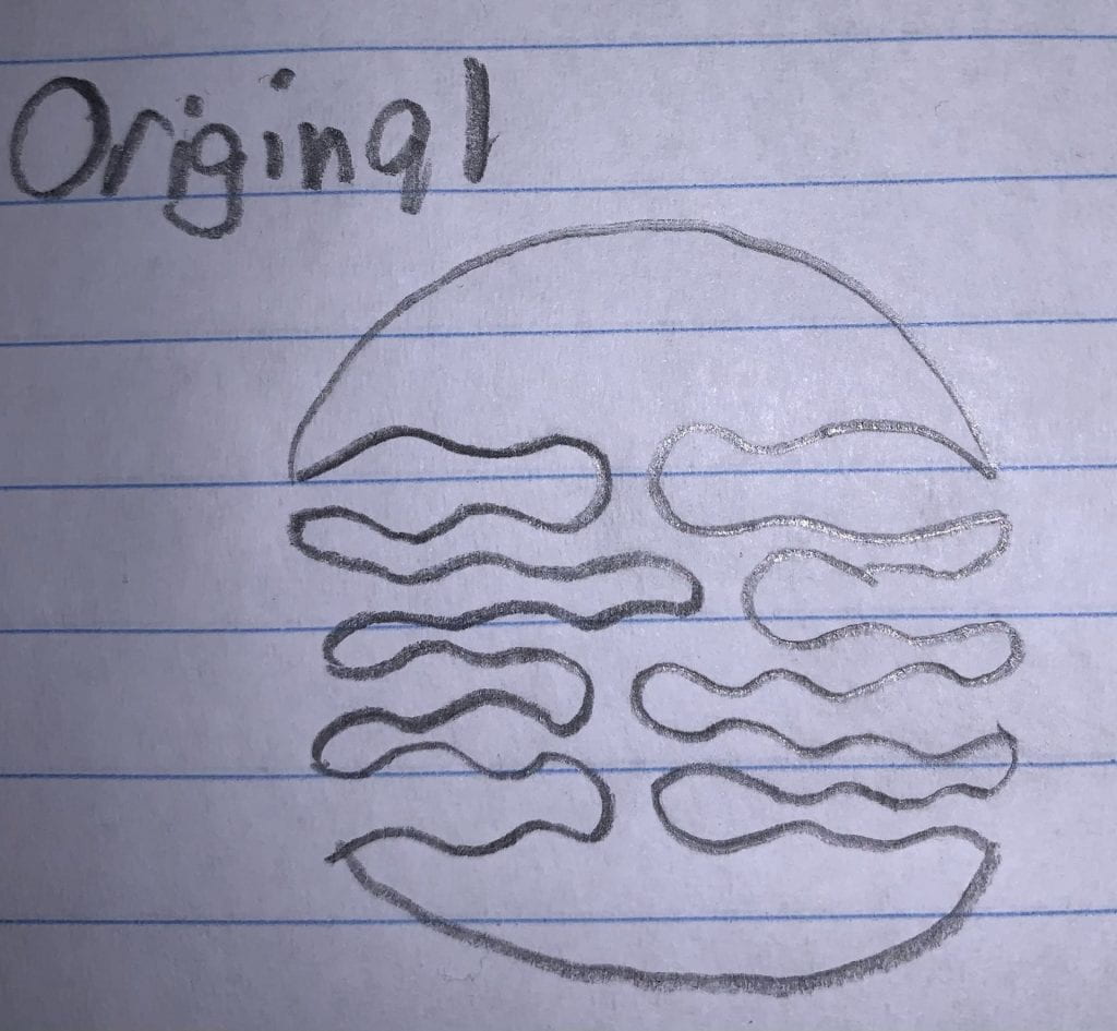
Original Object: This cable organizer, created by Thingiverse user @tjmck, is designed in a circle shape with wavy patterns on the inside with the intention on holding different size cables.

Below is a video of how the print is supposed to be used.


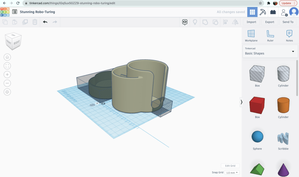
My First Iteration: I decided that since the original had trouble with keeping the wires in place and not having enough size variation for different cable thicknesses, I should try to address those issues. Below is what I came up with.

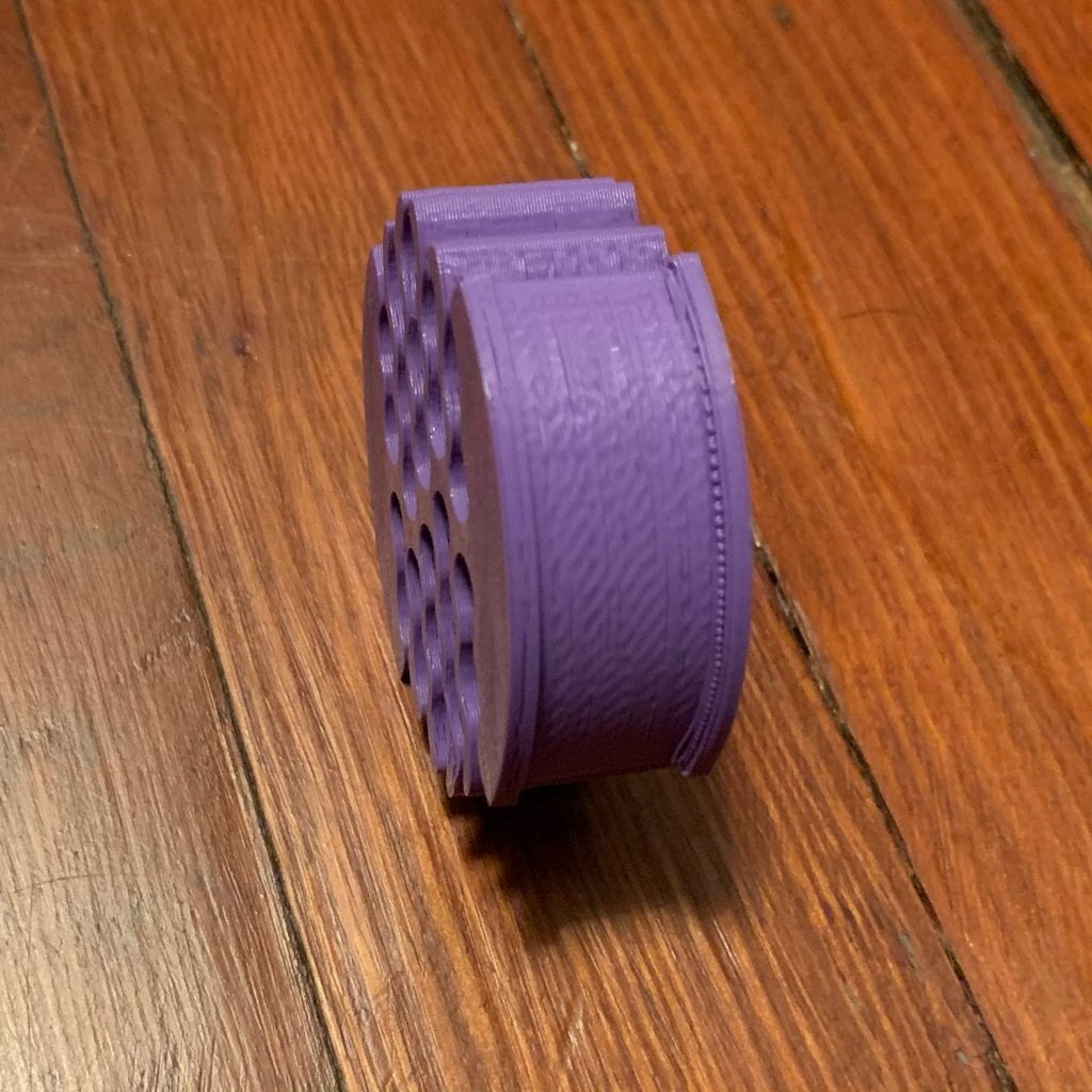
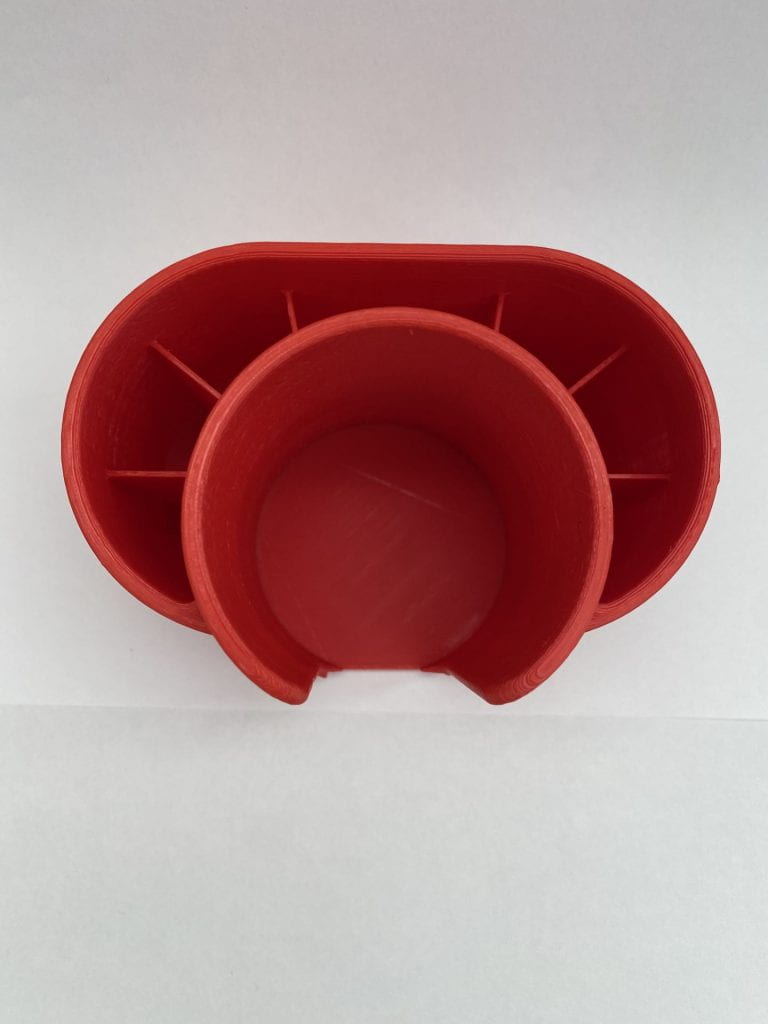
The intentions I had behind this design included slipping the wires underneath the wedges so that once the wire was in there, it wouldn’t move. I made the base flat so that way I could tape it down to a surface instead of leaving it hanging. I tried to give each of the spaces different sizes to allow for varied wire sizes. Below is what the print looked like in real life.

Printer Problem on Iteration One

Unfortunately something went wrong during the beginning of the print but it sorted itself out afterwards. I think if I had made a base it wouldn’t have came out so strange. I was surprised by the durability of the plastic when I was bending it to insert wires. I accomplished the goal of having the wires stay inside the organizer. I regret making so many compartments though, as it took away space that I could’ve used to make less of them but bigger. I didn’t accomplish my goal of being able to hold larger wires so I’ll try to improve that design again in the future.


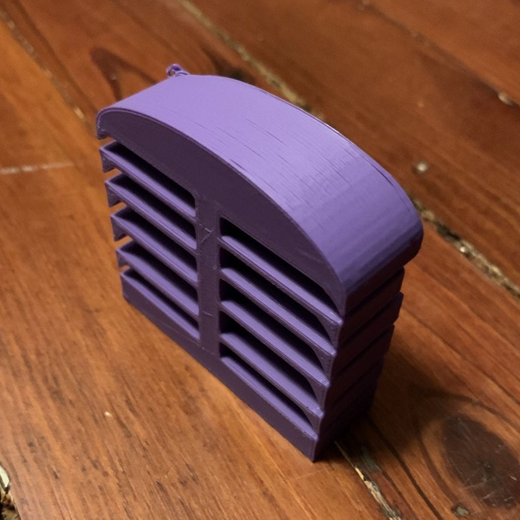
My Second and Final Iteration: Since the first iteration that I printed was affected by some printer issues, I used a different printer this time to avoid that happening again. I made some very slight changes to the first iteration. I deleted one of the wire compartments so that I could make space for compartments that would allow for thicker wires to be inserted. I also increased the infill density from 20% to 40% to make sure that it was stronger and wouldn’t snap if a wire was shoved in there.

This model did the job I wanted it to do perfectly. I unfortunately don’t have any wires thick enough to demonstrate the bottom portion, but the rest of the compartments work perfectly. The wires slip into the side with just a little effort and stay there unless they’re pulled out. Thanks to the wedge shapes, it’s easy to pull them out as well. My biggest concern with this entire build was that it would snap into pieces but after applying more force with my fingers than it would ever need to deal with, I’m confident that this is quite a strong bit of plastic, and I will definitely be using it next time I move my things around.

Jonathan Berrang’s Form|Function

F|F Research & Concept

Single Joy-Con Grip by 3DBotMaker on Thingiverse

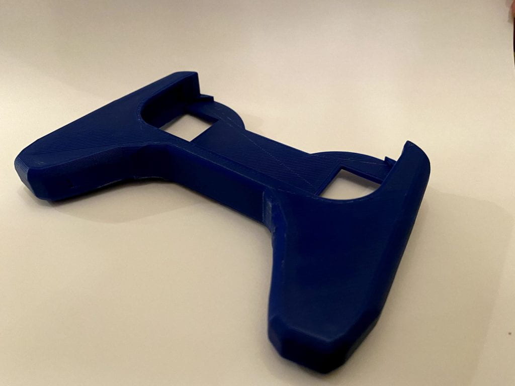
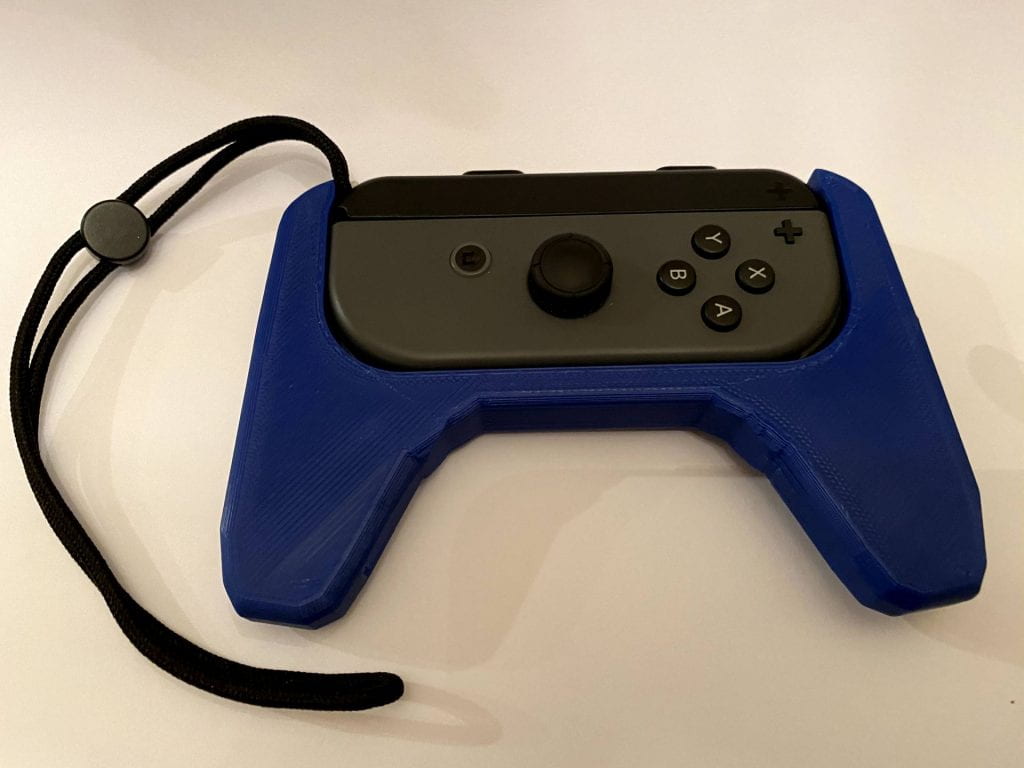
This Thingiverse object is a grip for a Nintendo Switch controller. These controllers are very small and somewhat uncomfortable to use on their own. The grip is designed to increase the size of the controller by giving your hands something bigger to hold onto. It is designed to make it easy to insert and remove the controller, while (hopefully) still holding it tightly in place. There are also holes in the back so that you can push the controller out when you’re done using it.

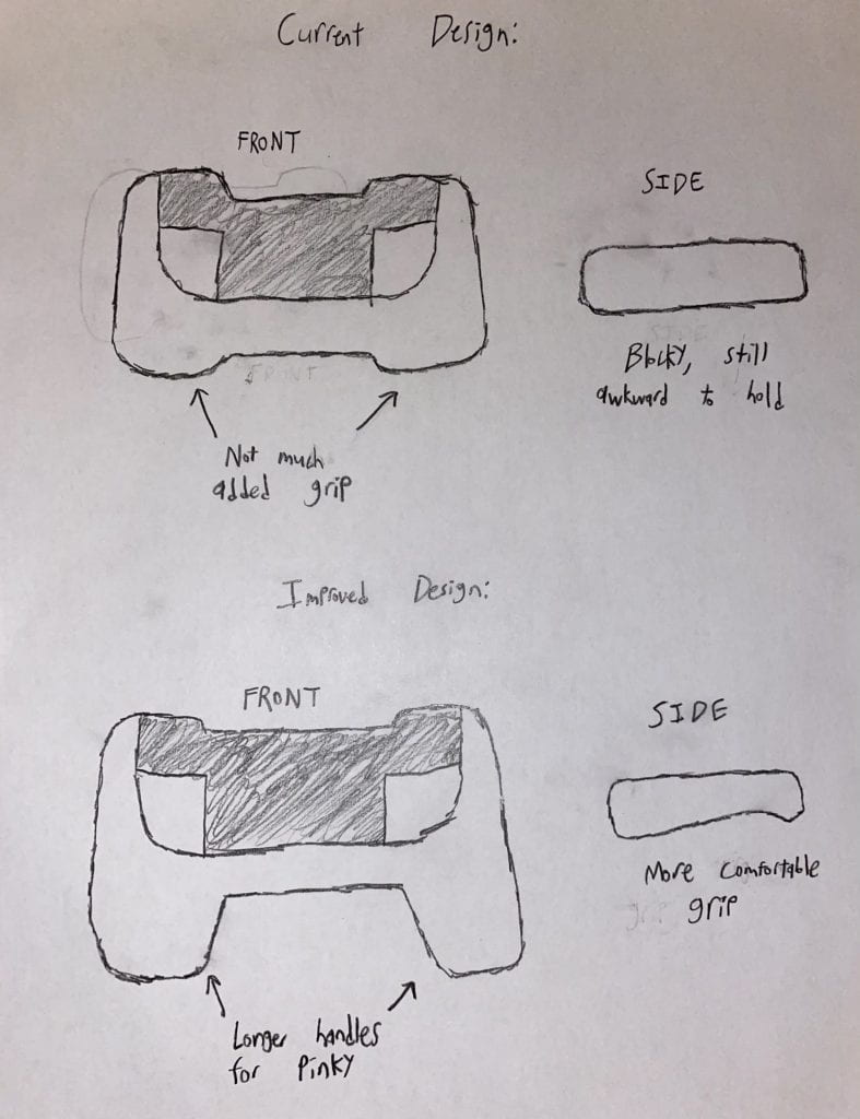
After some planning, I realized that I wanted to make some changes to the model. While I knew the grip would be helpful on its own, I wanted to take it a step further and make the handles longer, making it shaped more like a traditional controller. Another improvement I was originally planning to make was changing the back side so it would be easier to hold. On the original model, the grip is perfectly rectangular, so I considered making the back curved to give my fingers an easy place to grip.

F|F Iterations

Original Model

Single Joy-Con Grip by 3DBotMaker on Thingiverse

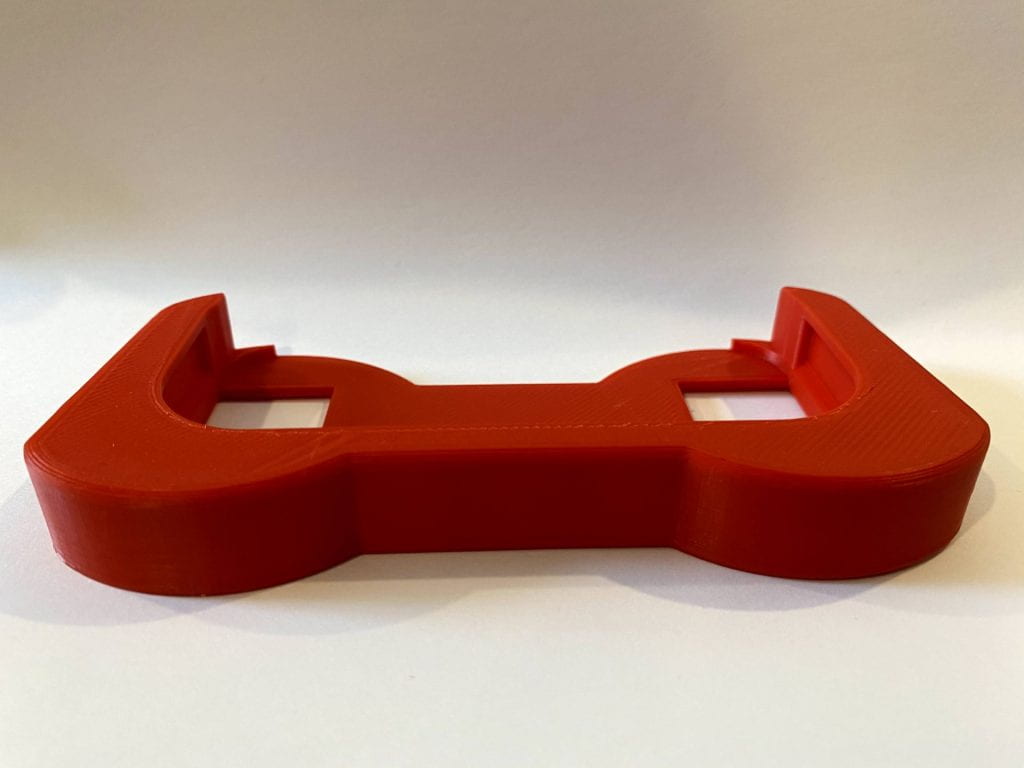
This is the printed base model from Thingiverse, with no modifications added.

Modifications

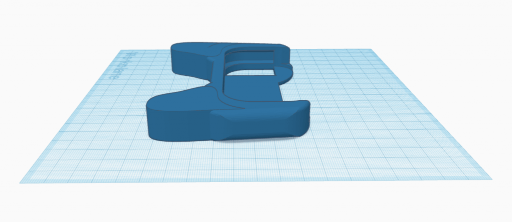
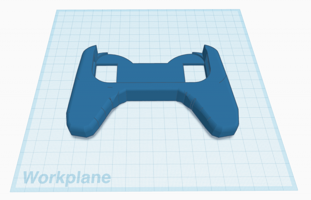
After seeing how the model looked in the physical world, I started to make some changes in Tinkercad. At first, I planned on extending the handles and making the back side curved. However, after testing the original print, I thought the straight back still felt pretty comfortable, so I just focused on making longer handles. For my first iteration, I simply added some rounded shapes in order to achieve this.

After working on it some more, I wanted to make sure that when printed, the handles would fit to my fingers more naturally, so I decided to replace these handles with custom extrusion shapes. It was a bit hard to integrate my additions smoothly because the original model includes rounded edges, but I tried my best to align it as well as possible.

The base model came with instructions to print with 10% infill and .25mm layer hight, so I used these settings to print both the original model and my remix. The second version ended up, structurally, as I expected, however the “layers” didn’t seem to be as smooth as the original print. The settings were exactly the same, so it may have been because I used a different printer model for the second version. After testing my remix, I found that the extended handles did make the controller more comfortable to hold as I intended, although they could have been even longer to fit my entire hand.

Final Iteration

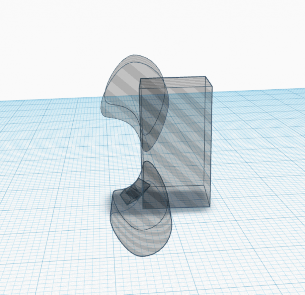
I then went back into Tinkercad and tried to figure out a way to make the handles match the original model better. The process was very tedious, but ended up accomplishing this by adding hole shapes around the handles, which “carved” the straight edges to be rounded.

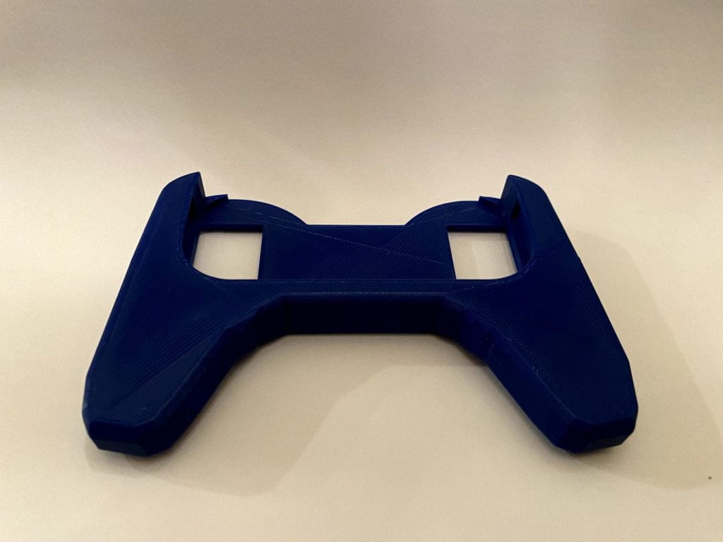
The final model and print ended up working out very well. As I was smoothing out the edges in Tinkercad, I was worried that it would come out blocky, but once I printed it it actually ended up being pretty smooth. Because I didn’t make any changes to the base model, the controller fits perfectly inside the grip. It is snug enough to stay in place while still being easy to insert and remove. The handles are now a good size, and the controller fits comfortably in my hands. Overall, this project was very challenging, but I am very happy with the way the final product turned out.

Megan Barton’s Form|Function Concept


F|F Research & Concept

The original Thingiverse object I choose, which is linked below the picture of the 3D print, is a remote control holder that was created by the user Niverson. The 3D model is designed to simply hold a Roku TV remote control and be attached to the wall using a screw or nail. I decided on this object from Thingiverse because I often find myself losing small objects like my tv remote and AirPods when I’m in my room and saw this as the perfect opportunity to adjust it to my own needs.

Improvements:

To improve this design I started by adding an extra pocket to hold other devices, such as AirPods. I also adjusted the hole for the nail to make it easier to hang up. Lastly, I decided to also scale the model up just a tad to make it more versatile and allow for it to hold other electronics or remotes that may be bigger.


3D View of my First Iterations:


F|F Iterations

Original Thingiverse created by Niverson:

This is the original design that the user Niverson on Thingiverse created with no modifications or adjustments.

Remixed Thingiverse:

This is my remixed version of Niversons design, I simply adjusted it so that the back wasn’t rounded that way it would fit better to the wall. I also adjusted the original design by adding a ledge so that it could hold more things, such as Airpods. Additionally, I set the infill to 25% instead of the original 10%, which seemed to help make it more sturdy and reliable than the initial print. Despite making my version more sturdy and better fixed to the wall, I didn’t scale it correctly which caused the ledge to be virtually useless since only very tiny things can fit in it. Overall, I learned a lot from this print including that I need to scale my designs and pay more attention to dimensions before printing.


3D View of Final Iterations:


Final Print:

After my first print with my original iterations, I realized that I was going to have to make some adjustments to the scale of the model. In order to do this, I found the dimensions of a Roku remote and Airpod Pro case online and then drew a few models to better visualize what adjustments I was going to have to make in Tinkercad. In the end, I also decided to add two extra millimeters throughout the whole design for some extra space in case you wanted to use it to hold more things. All in all, this project was a big challenge for me in that it pushed me to learn more about 3D printing and that you don’t always get it right on the first try.


Julianna Barnaba’s Form|Function

F|F Research & Concept

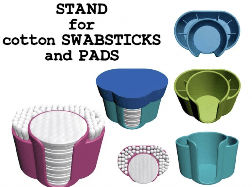
The object I would like to make to demonstrate form and function is this cotton swab and cotton pad container. The purpose of this is to effectively organize those items and either leave the out on your counter or be able to store them away or travel with them using the lid. It is perfectly fitted for the round pads and contains small compartments to fit in a bunch of swabs.

https://www.thingiverse.com/thing:4723700

Some personalizations I would like to make in order to make it more usable for me would be to lessen the amount of compartments. By making only 3 compartments it would give me more space to fit something other than just cotton swabs that may be bigger like makeup brushes. Another personalization I could make would be to make the base of it wider. The original design is just under 119 cm wide. If I made it 123cm I think that would be enough to give more space to fit other things, all while keeping the spot for the cotton pads the same size.

F|F Iterations

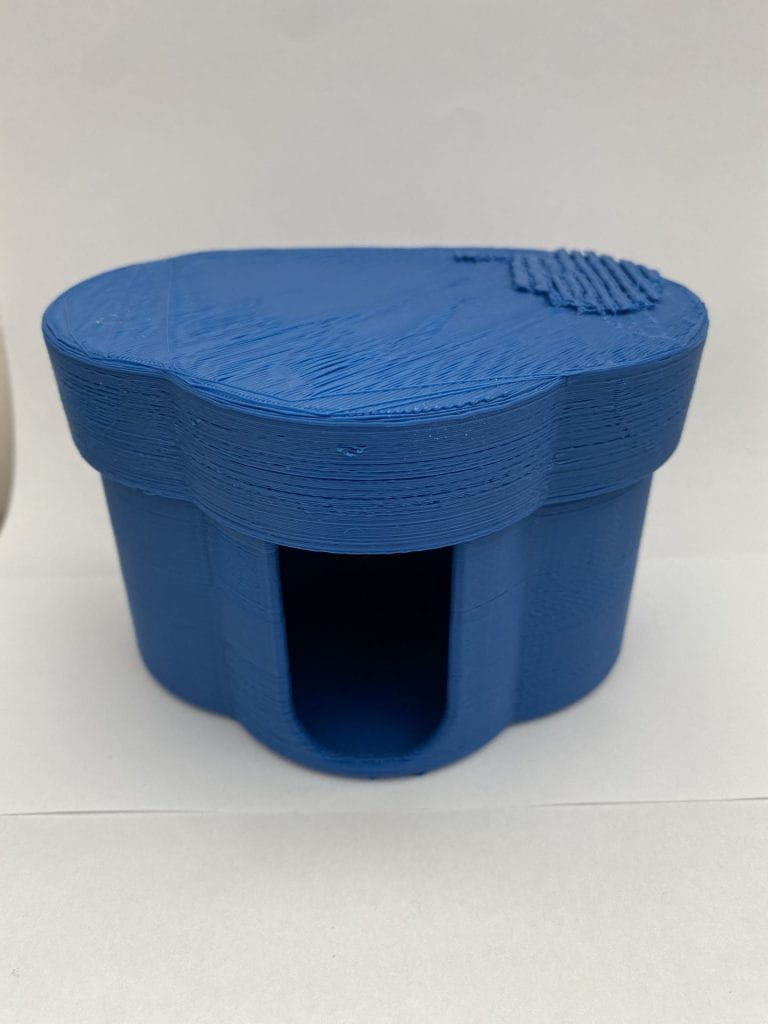
This is my original print of the un-altered cotton swab and q-tip holder by Syzguru11 on Thingiverse. This print took about 7 hours and came out great. In my sketches I mentioned wanting to get rid of some of the walls that section it off but after seeing this first print I decided to focus on just removing the lid and the lip at the bottom of the front opening.

After seeing the original print I decided I wanted to remove the small lip from the bottom of opening in the front. I thought this would be a good idea since having that there may make it more difficult when trying to get out the last cotton pad. Finally, I decided to remove the lid seeing as it was not very useful and for myself it did not seem to serve a purpose.

Here is my Tinkercad design with the removed lip using a box hole and the removed lid with a box hole over it as well.

If I had more time to test out more versions of this print I would try to take out some of the walls that make the compartments but when I tried to do that originally, I could not figure out how to properly cover the wall with a hole without messing up anything else in the process.

Here is where I finally was able to semi cover the walls the way I wanted to without creating a hole at the bottom or being destructive to any other part of the design except for the two walls. Unfortunately when I printed this the printer ran out of PLA and was not able to complete the Thing. From what I could tell I was able to remove most of the wall successfully.

As you can see the lip was removed but not in the best way. It was hard for me to tell how it would turn out on Tinkercad but obviously this still works and I think was a beneficial change.

Overall, the process of remixing and reworking this print was really fun and I learned a lot about Tinkercad. I wish that I had more time to reprint my last version without the walls but either way I think my final print was good enough and it has already been extremely useful!

Daniel Cymes’s Form|Function Research & Concept


Original Thingiverse object:

https://www.thingiverse.com/thing:3586659/files

The image above is a model of an engineering stencil ruler designed by @JojodaHobo. It allows individuals to plot straight lines on paper and trace other precise geometric shapes. It is an essential tool for engineers, architects, and individuals who simply want to add precision to their sketches. There is a multitude of shapes cut out of the filament, allowing creators to make a perfect circle or right triangle, among other designs. It is a simple and common object that is extremely useful to designers of all different backgrounds.

Personalizations and Improvements:

The image above represents how I envision modifying the existing object. Although I want the height and the length to stay the same, I would like to increase the ruler’s width from 1mm to 2mm. This would make the object much more sturdy and durable. I also would like to remove some of the original geometric stencil shapes, and replace them with shapes that are more tailored to my design tendencies. Overall, I was pleased with the majority of the original design elements, but my desired modifications will make this an even more practical tool.


Form|Function Iterations

Original Thingiverse Object:

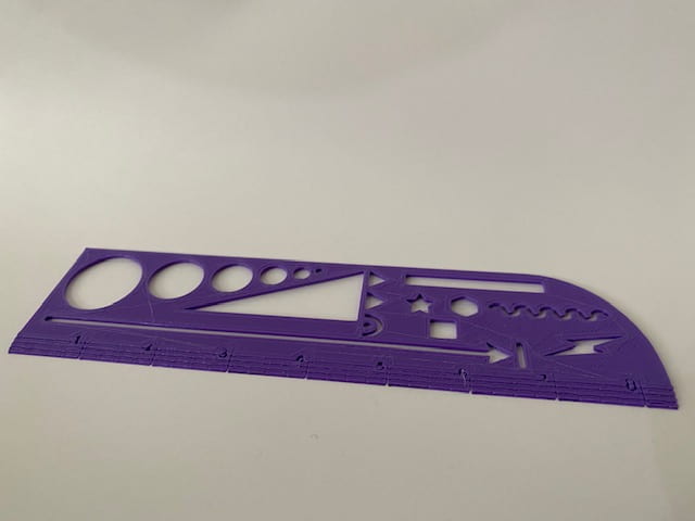
Pictured below is a 3D print of the original Thingiverse object, attributed to @JojodaHobo. This print contains no personal alterations or modifications. Because the ruler only has a thickness of 1mm, it is very flimsy.

Iteration Process:

At first, I was quite intimidated by the thought of adding my own modifications to this ruler. I was uncertain on how I would go about filling the stencil shapes that exist in the original design, in order to implement my personalized stencil shapes. Below is a time-lapse video that demonstrates how I designed my Tinkercad remix. The entirety of the process took roughly 45 minutes.

Posted below is a 3D view of my completed Tinkercad remix.

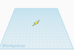
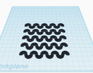
The pictures below are of Tinkercad designs that I incorporated into my iteration. The lightning bolt was designed by @blaise-miranda and the high contrast squiggles were designed by @Annie-Sullivan. I transferred both of the shapes into my workplace and then transformed them into holes, in order to create two separate stencils on the ruler.

Functionality:

In the video below, I demonstrate the functionality of the object that I remixed.

Overall I was very pleased with how my iteration turned out. By increasing the original ruler’s thickness from 1mm to 2mm, the durability was clearly improved. I also increased its personal functionality by adding personalized stencils that will provide me with greater design benefits.

I only ran into a few slight problems. When removing the base filament from the ruler, it made the primary straight edge a little jagged. Normally this would not be a problem, but because one of the sole benefits of using a ruler is having a smooth straight edge, it created a slight drawback. In order to overcome this inconvenience, I merely had to sand it down. The only other issue that I had was that the numbers and marks on the ruler showed up very faintly.

Iteration #2:

After spending a few days using the first iteration I created, I realized that the problems that I initially identified upon the completion of the print were going to require me to complete a second iteration. The two primary problems I had were these: it was a little too thick, which prevented me from using some of the stencils with a pen, and the straight edge was jagged because of the raft that was printed with it.

To solve these problems, I decided to decrease the height of the ruler from 2mm to 1.5mm and remove the raft from the print settings in Ultimaker Cura.

I also wanted to address the comments and critiques that I received from my classmates, which mainly emphasized the lack of numerical markers and measurement lines.

In the slideshow above, I demonstrate the modifications I made to my initial iteration. As stated above, the most significant changes I made include the addition of number shapes provided in Tinkercad, measurement lines made from rectangle blocks, and a decrease in height.

Although the height change made all of the stencils usable, while simultaneously maintaining its durability, I created a completely new problem in this iteration. Upon closer look, one can see that the rectangle boxes that I converted to holes, in order to create measurement lines, ended up creating divots in the ruler’s straight edge.

Final Iteration

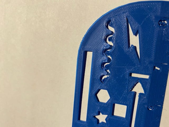
These pictures are of my final ruler iteration. Although I was able to eliminate the divots that were previously present, I ran into a new problem. As pictured below, the squiggle stencil did not print properly due to a printer malfunction.

Conclusion

After completing 3 different iterations of the ruler, I was still not able to make the perfect print. This was in part due to time constraints out of my control and printer inadequacies.

Overall I am not disappointed, as I was able to sand down the rugged edges of the first ruler that I printed to optimize its functionality. Although I cannot easily use all of its stencils and it has very faint measurement markings, it serves its main goal perfectly–allowing me to draw a straight line!

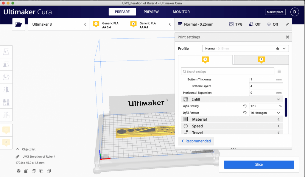
If my final iteration had not been messed up by the printer malfunction, it definitely would have been the best of all three iterations. Not only was the straight edge smooth, but it also had clear numerical markings and measurement lines. Below is a picture of the printer settings I used to print the ruler. Hopefully I can find time to fully ‘straighten’ any remains problems out.

Michaela Sakitis’s Form|Function

F|F Research & Concept

This image from Thingiverse is of a 3D printed bottle opener. It is used to manually open glass bottles with metal caps. The small size of this bottle opener makes it convenient to travel with, as it can be made to go onto a keychain, or can simply fit right into your pocket. The bottle opener has a unique feature with a hole for your finger so the opener can be easily maneuvered to remove the bottle cap. The other side of the opener has a hooked end that goes over the bottle cap and applies pressure on it for removal. The image above displays how your hand can fit into the bottle opener and how it is used.

https://www.thingiverse.com/thing:269463

Potential improvements I might make to this bottle opener would be to add a second hole for the middle finger. I think the addition of this hole will allow for more pressure to be used to open the bottle with even more ease. It also increase the stability you would have on the bottle when opening it. I increased the length of the bottle opener slightly to accommodate for the second hole. For a personalized touch, I would add a very small hole at the top of the bottle opener to allow for it to be placed on a keychain.

F|F Iterations

The creator of this model of a 3D bottle opener is Mark Manger.

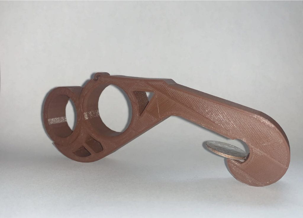
After printing the original model and testing its functionality alone, I found that my initial remix concept to add an additional finger hole made it more difficult to open a bottle rather than less. The curved open end that follows the first finger hole on the original model allows for more pressure to be exerted on the opener. That extra pressure is needed to force the cap off of the bottle. The length and infill of the remix needed to be altered more for the iteration to work properly. While the double finger hole might not have worked, I did add some additional features to the original bottle opener. I glued a coin onto the bottle opener end of the model to provide a better anchor to lift the edge of the bottle cap. I also added a keychain to the petite hole at the top of the bottle opener by expanding the hole slightly.

Final Print

For my final print of this model, I decided to re-do my original iterations with a few added changes. My original idea to add an extra finger hole was not successful at first. However, I altered the length of the bottle opener to be slightly longer and I fixed the positioning of the extra hole on Tinkercad. I downloaded the final remix as an STL file and I was able to print a working model with a larger infill of 30. These added alterations allowed my final print to function successfully. I glued a coin onto the end of the final print just like the original model.

Unda’s Form|Function Concept

F|F Research & Concept

3D Printed COVID Door Opener

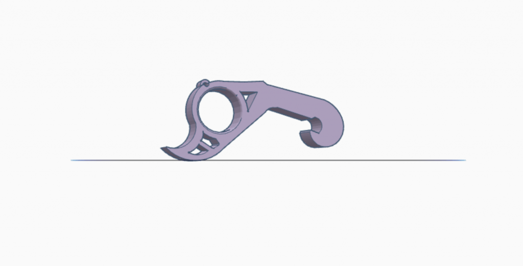
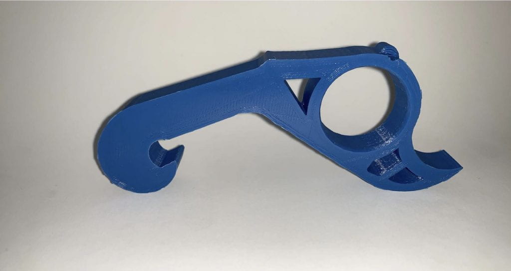
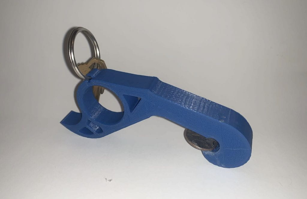
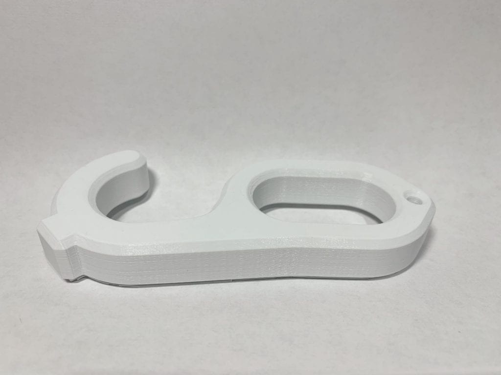
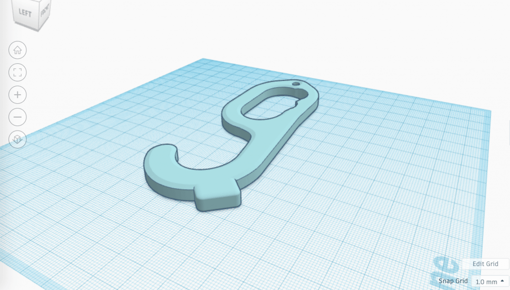
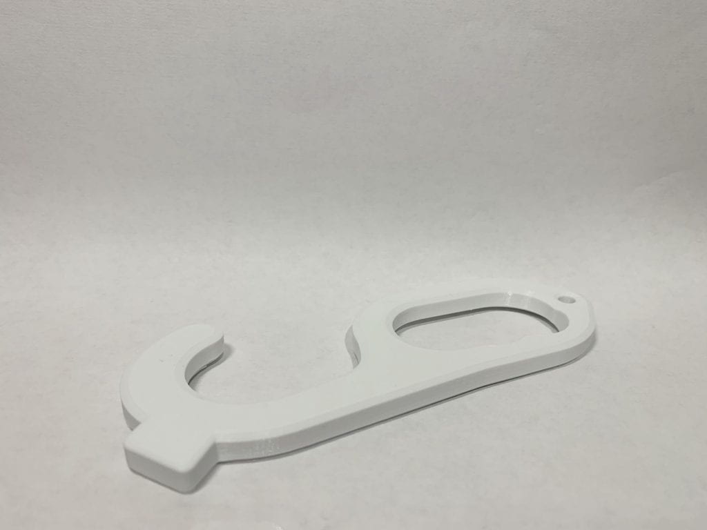
This is a model of a COVID resistant door opener. The main purpose of this object is to use this item as an alternative way to open doors without having to physically touch the surface of a door knob or lock. The angled hook is designed to be able to push up or down on a door handles in public spaces while the circular section of the object is to place your fingers through to allow you to pull open any doors or entrances. The square shaped fragment on the opposite end on the hook is used to push against objects you don’t want to make contact with like elevator buttons or doorbells. There is also a small hole at the end of the object to hang off of a keychain or lanyard.

Personalizations/Improvements

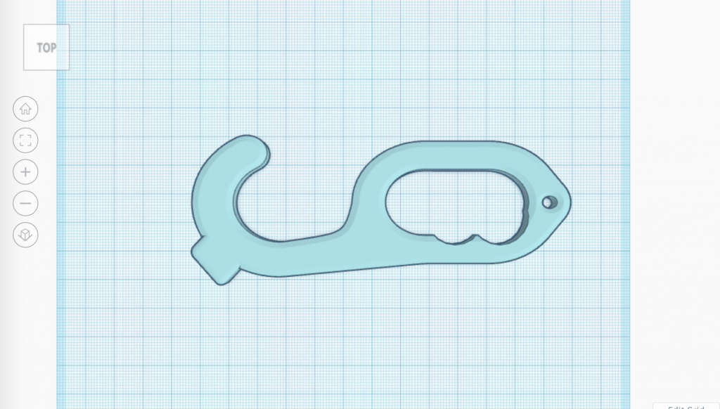
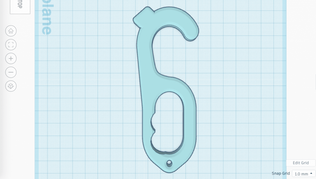
One personalization I made was to widen the hole used for a key chain or a key ring so that this object could fit into many different sized key chain holders. Another change was to add in little divided spaces for fingers so that the grip is more comfortable and doesn’t slip from the person’s grasp. I also added in a smaller hook so that it can be used to turn/twist smaller locks on doors. Overall the my main improvements would be to add on elements that make the object more comfortable and versatile to use.

F|F Iterations

Credit to: mr_walker on Thingiverse

Before seeing the physical 3D print of the door opener my iterations at first was to make the handle longer so that more fingers would comfortably fit in the hole, to add in finger dividers in the handle for a more comfortable grip, to make a smaller hook where the button pusher would be for unlocking doors, and to make a larger hole for more keychains to be able to fit in it. After finally printing out the door opener I found that the thickness of the object made it impossible for any keychain to fit through as I tired to fit it on my own key hook and was unable to do so. I also found that the thickness of the object made it too big to really hang on a keychain as well so I definitely wanted to change that. I saw that the button pusher on the opposite side of the hook was very small and was too short to successfully do its job. After trying out the door opener as well I found that the grip wasn’t as comfortable due to how thick it was. From all of these elements I also was able to come to the conclusion that the adding in another hook to unlock doors was unnecessary as well.

My final iterations that I made on the door opener had changed compared to my first draft of iterations. I first made the object thinner (7mm rather than 15mm), I pulled out the button pusher on the opposite side of the hook so that it was a lot longer than the original object, I slimmed down the object so that it was longer and less squished to make a little more room for fingers to fit in the handle, I also added in finger dividers for a better grip. After trying out the object again I found that slimming the door opener down and making it thinner made the object more efficient as it was easier to maintain as well as was effortless to keep on a keychain comfortably. Elongating the button pusher also made the aim more precise and unchallenging to spot. I also found that adding making the handle longer and adding in finger dividers made the grip much more snug and smooth to use.

F|F Final Print and Reflection

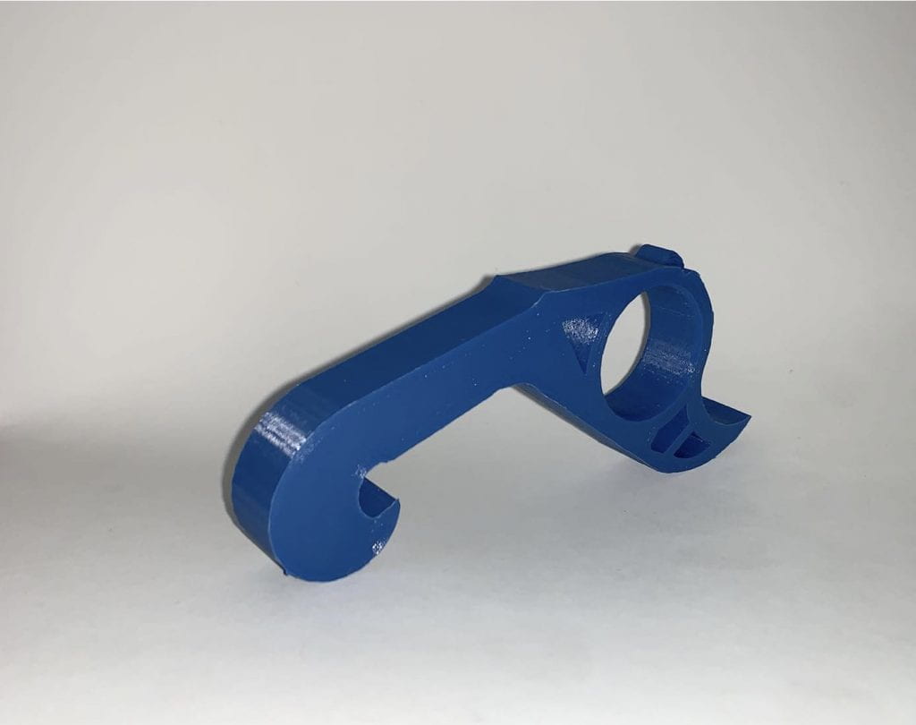
This is my F|F final print of the door opener made originally by mr_walker on Thingiverse. The remixes I finalized on this object was making the thickness of the object much thinner, creating finger dividers for a better grip, and making the button pusher longer as well as sharper for a more precise aim.

Before & After:

Reflection:

The overall process to reach this final print took a couple of trial and error prints before reaching the final remix of the object. Each print brought me closer to the final product so the process in total took some time but was exponentially improving after every step. Although the object was a very solid, well made door opener there were still small improvements that could be made to make it most ideal.

After making my first couple of iterations I was able to draw conclusions from those remixes and ultimately find the final changes that needed to be done to this object. I originally made the object thinner than the original (from 15mm to 7mm) but then found that the object was slightly too thin so for my final remix I made the thickness 8mm instead. The 8mm was a comfortable middle ground between the other two sizes. After using the original door opener I then printed the first remix with finger dividers for a more comfortable grip. After comparing the original that didn’t have finger dividers with the new remix I personally found that I preferred the object with the finger grip as it was more convenient for me to use. The last iteration I decided to add was to make the button pusher more angular so that it could hit smaller more precise button easily. I found that with the original object it was harder to get a concise aim at smaller buttons. The final step I took was changing the print settings when printing my final door opener. I changed the infill density from 20% to 40% and changed the infill pattern to tri-hexagon because both of these elements create a stronger product especially due to the fact that the door opener is thin.

Overall I’m very happy with the final product and can’t wait to hang it on my keychain.

Cole’s Form|Function

The original Thingiverse object

The image above is an original 3D print found on Thingiverse. It is designed to be stuck to the wall in order to hold a Roku remote in a convenient location. Theres a hole in the back for the the holder to be nailed into the wall. I chose this design because I always find myself losing my Roku remote so it’d be convenient to have a holster in my room. In addition, I thought this would be a beneficial yet simple creation for my first print.

Iteration Concept Sketch:

After looking into some changes and improvements I could possibly make I decided to extend the height of the holster. In one of the same images the creator provided the remote didn’t look very secure do to the front wall being too short. Next, I decided to remove the back nail hole and use stick on holders on the back of the holster to avoid damaging the wall with nail holes.

F|F Iterations

Roku remote holder designed by Niverson

My prints of the design:

After completing the print I realized the hight of the holder was a little short and it felt like the remote could potentially fall out so in my remix I will attempt to increase the height slightly to ensure I wont over lap the buttons. In addition, I was advised to switch 3D printers due to the prints coming out in poor quality.

My Remix:

After increasing the height and using a different printer I was much more satisfied with the effectiveness of the holder and the overall quality. The print was much less flimsy and the print came out much crispier. As for the height change, the remote feels much more stabilized and fits perfectly to my liking. Coincidentally when I switched from the Ultimaker 3 to the Ultimaker 2 extended+, the color of the print was purple fitting the colors of the Roku logo.

Video Demonstration of remote holder in use:

Before and After Iteration changes (use slider to move between before and after):

Final Reflection

After completing my final iteration I’m satisfied with the outcome. After putting the holder to use, I can confidently say that increasing the height also increased the stability of the holder. After doing some testing I decided to stick with the nail hole to ensure the holder stays completely secure to the wall which is definitely the smarter option in the long run. Lastly, I believe my changes improved the aesthetic of the holder as well, the final iteration looks sleek and better quality. Overall, I enjoyed working on this project and I believe my final print will become very helpful when keeping track of my remote.

Form | Function

F|F Research & Concept

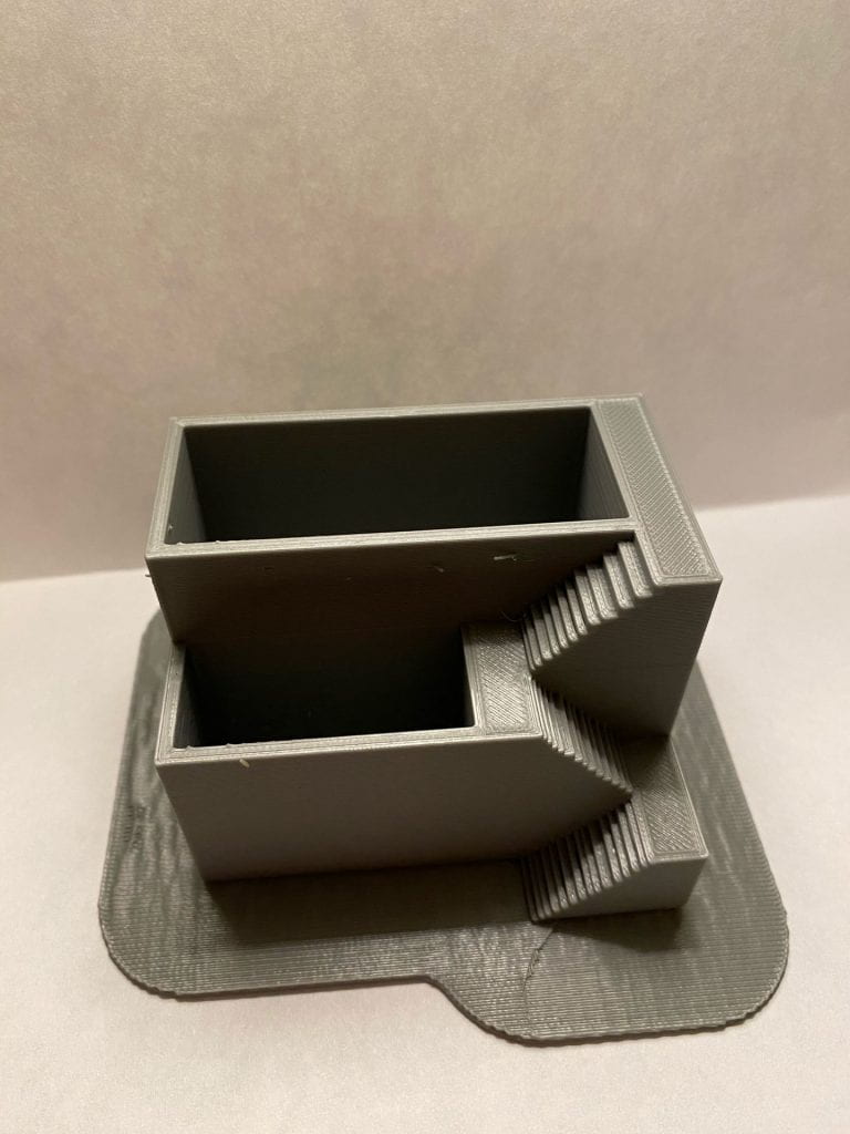
This is the original Thingiverse object!

https://www.thingiverse.com/thing:2183259

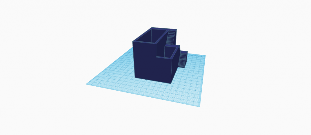
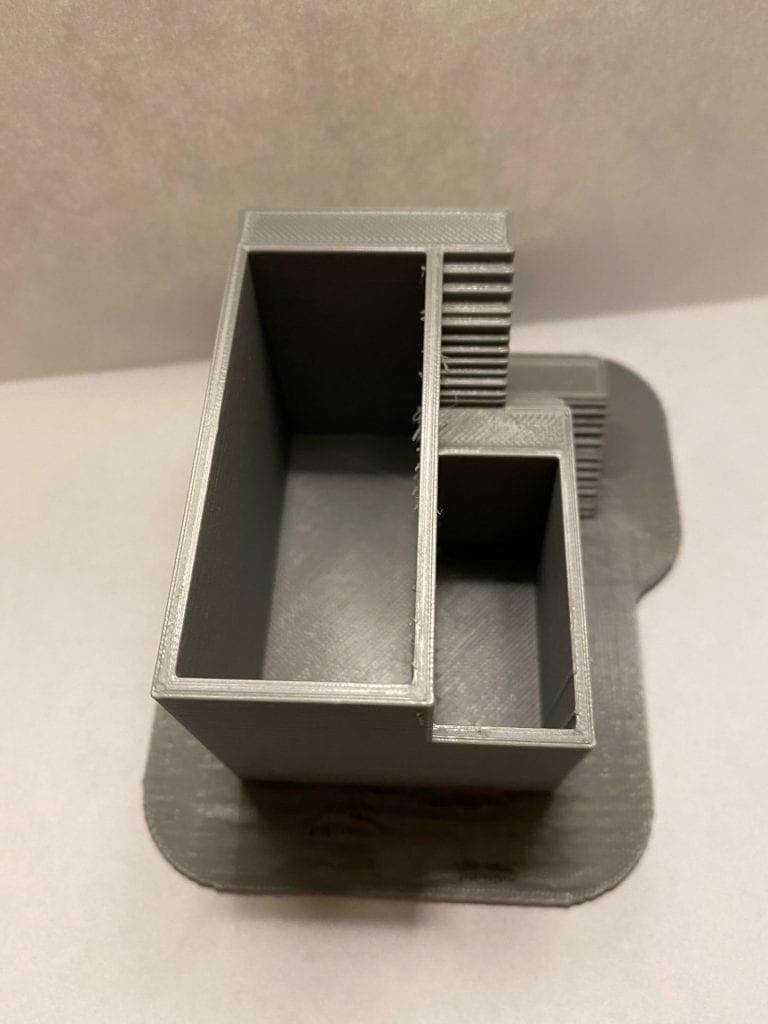
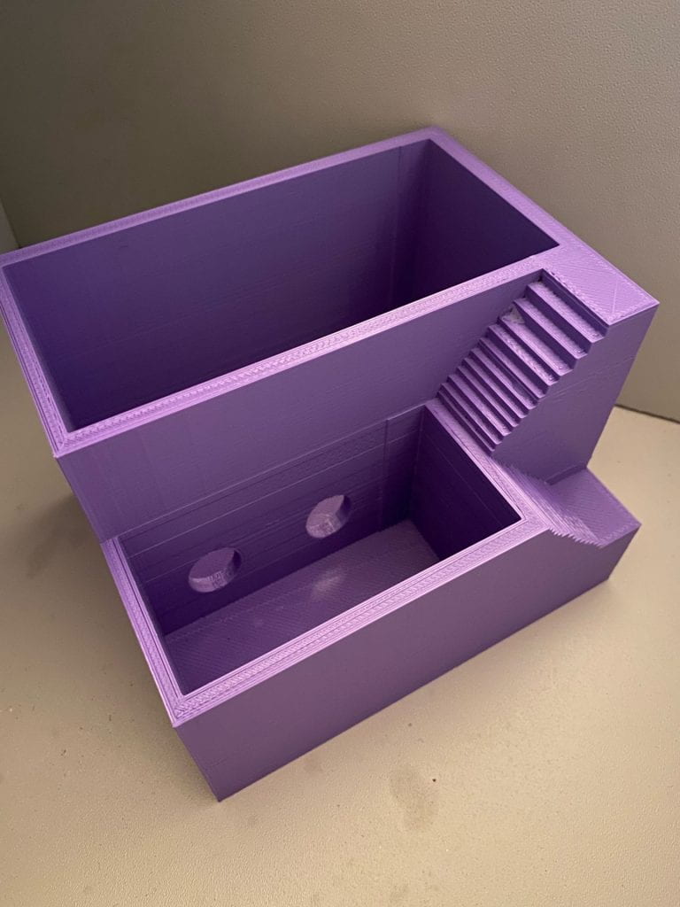
This is a 3D printed plant pot. The purpose of this object is to hold small plants such as flowers or succulents. There are two deep cut-outs that allow space for both the plant and the dirt that it requires in order to grow. The object includes mini stairs for an aesthetic look. This object also allows for the owner to place not one, but two different kinds of plants within the object, which would provide for a more aesthetically pleasing look.

Personalizations & Improvements

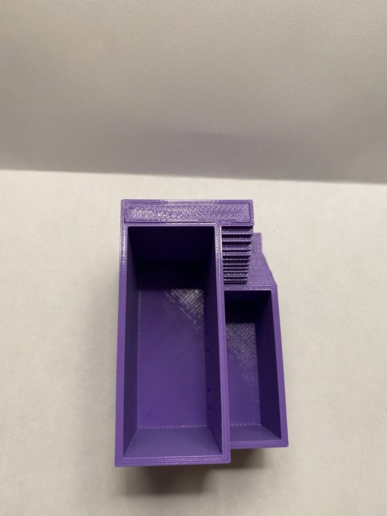
I really love the design of this object and I think that aesthetically it looks really good. One improvement that I think would really help would be the addition of small holes in the middle wall. This would allow for even distribution of water and allow for wiggle room, should you over water one of the plants. The small holes would give you the added luxury of only having to water one side. Another change I made was that I made the object 25% smaller. I thought that this would be beneficial in regards to printing time and it would make the object that much more versatile, you could put it in so many small places! Lastly, I made an aesthetic change, I thought the pot might look more cohesive and interesting if the first set of stairs went into the object itself.

F|F Iterations

Original Object by @AndresQuijas on Thingiverse

Tinkercad Iterations

3D Print Iterations

I found this process so exciting and interesting! I began with printing the original object, but when I put it in Cura it was going to take a day and a half to print. After talking with Dr. Hooker I decided to scale it down by 50% with a .2 layer height and 5% infill. With this, I was able to cut down the time it would take to print by a lot. After printing the first print, I realized that it came out with a bottom piece part attached to it. I wasn’t really too fond of the way it looked and also thought it would add to the print time. The next day when I went to print my object with iterations, I realized that the different printer I was using printed even faster! As it printed I watched and I found that the printer I switched to did not add that bottom piece, which I think works better for the object aesthetically.

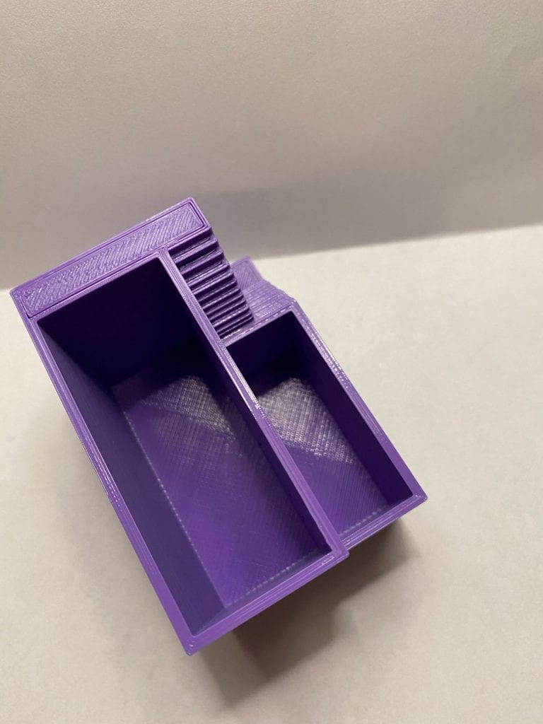
When I was adding iterations in Tinkercad I worried my iterations would be uneven, but eventually, I got it down. When I printed the second object, it came out perfect. I did end up making what I would call a “happy mistake”. When I printed the altered object, the holes weren’t completely hollow, but I actually liked the way it looked a lot better. I also think that it would function better for plants. This way the water can seep through slowly if you over water one side and it also makes the holes in the object more discrete. In addition to this, I really liked the way the object looked without the third set of stairs and the extension of the lower crevis.

F|F Final Print & Reflection

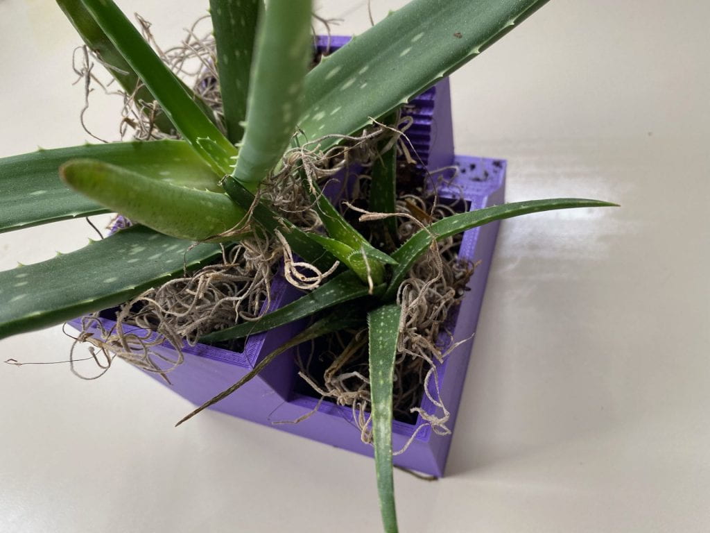
This is my final remix of AndresQuijas flower pot, more about my remix can be found on Thingiverse.

Reflection

Throughout the process of working on this project, I have been able to learn so much about 3D printing that I never knew before. I started out feeling discouraged when I realized that the specific flower pot I chose to print would take a day and a half to print. With help from Professor Hooker, I was able to adjust aspects of the print in order to get the printing time down. I started by adjusting the sizing by 50% with 0.2 layer height, and 5% infill. After printing the original in with those adjustments, I printed my iterations with them as well. I was content with the way my iterations came out and for my final print I wanted to make the print true to size, so I did. My final print is the actual size that the piece was supposed to be, so I was able to put actual plants in the print, which was so cool. I enjoyed seeing the print “come to life” and be put to real use. I watered the plants on one side and check the soil to see if the holes I put in were doing their job, and it worked! Through this project, I have learned that 3D printing is a big game of trial and error, so when I got to my last print and was satisfied with it, it was a really gratifying feeling.

Caroline McCracken’s Form|Function

Original design by colleeniebikini on Thingiverse.

This is the original model off of Thingiverse that I printed. Below, I will explain the flaws I found using this model.

https://www.youtube.com/watch?v=5cH_ipOZVkI
(the video file was too large to embed so I uploaded it to YouTube)

Below are my first iterations on Tinkercad & the print

In this first iteration, not only did I decide to make the model shorter and wider to open up the mouth, but I also printed it without a raft or a base of any kind which reduced my overall print time. I had no troubles with this since the object itself already has a relatively flat, stable base. However, I was still not pleased with the out come and found while my adjustments did not help with the issue of the narrow mouth- it did not totally solve the problem.

Second iteration on Tinkercad and prints:

After not being satisfied with my first iteration, I made another. I printed this one without any kind of base as well. This time around I kept the planter short and wide like my original idea, but just increased the overall size of the model. This seemed to be the sweet spot, and I finally printed a model that I was satisfied with. I am excited to use it soon!

This is my final addition to my print. I added a drainage tray to catch some of the water that comes out of the drainage hole in the planter after watering the plant. I didn’t print either of these with a base, and both turned out smooth with a nice finish thanks to their shape. Overall I didn’t run into many issues throughout the process, and achieved my goal of making the planter easier to use in the process of actually planting.

F|F Research and Concept

Above is the image of an original 3D print of a small hexagonal shaped planter. It is large enough to contain a singular small to medium sized plant and has a fun, geometric design. It has a drainage hole on the bottom to allow for proper watering of the plant. The original design narrows down at the opening of the planter, making potting a plant properly with the right amount of soil difficult.

Improvement Concepts

One improvement I wish to make upon the original planter design is to slightly shorten and widen the object. This will not only widen the base but the mouth as well, allowing for more ease when filling with soil and potting a plant.