Research & Concept
Letterforms:
Letterforms are unique in that they are identifiable by specific features that generally stay the same no matter the design. They can be written, design, or constructed into 2D, 3D, or 4D designs and all still be identifiable as the same letterform due to these characteristics.
First Glyph: “I”
The first glyph that I was assigned was the letter I. The letter consists of one vertical line with two connecting horizontal lines– one at the top and one at the bottom. After analyzing the letter I only had one potential 3D design idea, which was a simple block letter I. I decided to look for some inspiration and ended up finding the three designs below. These three images became the inspirations for my sketches for the first glyph “I”. In my sketches, I ended up using a simple block letter form for most of the I glyphs mixed with fun cutouts.
Inspiration
Second Glyph: “b “
The second glyph that I was assigned was the lowercase letter b. The letter consists of a line with a half circle attached to the right side of the line. I’m pretty familiar with the letter since my last name starts with a b, but I often only really write and look at the uppercase version of b. As I was examining the glyph I realized that there was plenty of potential to redesign the letterform into a 3D shape. After analyzing the letterform, I began to do some research to find inspiration for my potential designs. In my sketches, I ended up using a general bubbly type font base. The majority of my designs for b have soft edges with lots of curves. Though, I did design a few with a more box-like shape to give the design more of an edge.
Inspiration
Sketches
Iterations
First Glyph 3D Model:
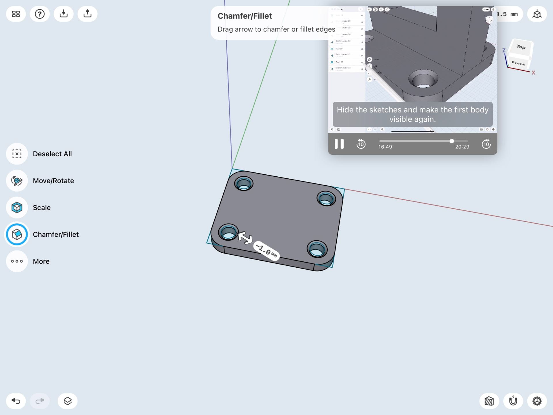
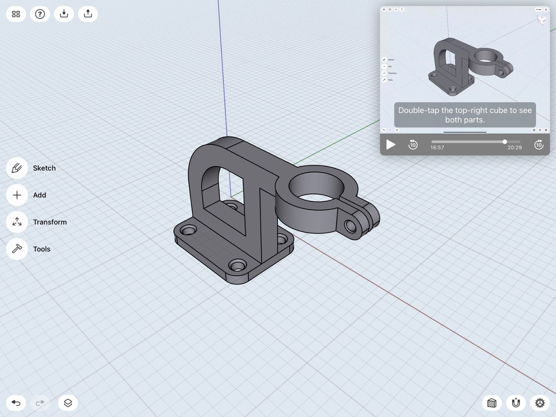
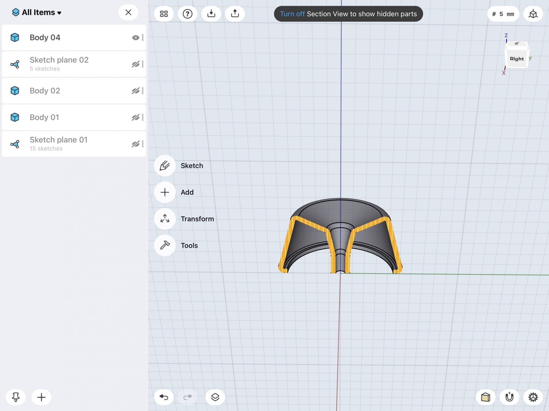
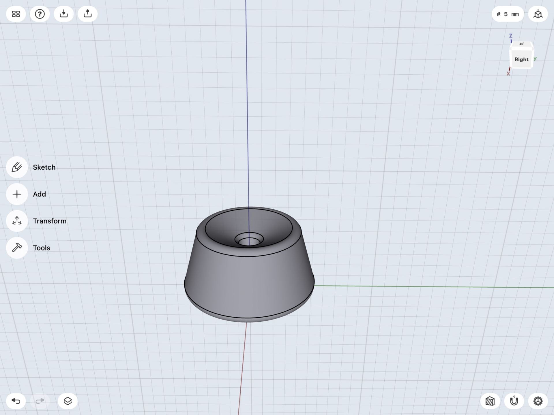
3D Designing Process:


For my first model, I decided to alter my original design by changing the cutout. This is because I didn’t like how dull and boring the initial design looked in Shapr3D. So, I began trying other forms of cutouts such as making the i bigger, moving it around, and finally cutting out a capitalized I. After making this adjustment I ended up really liked the way it looked. I feel like it is a lot more sophisticated looking and sleeker.
Second Glyph 3D Model:
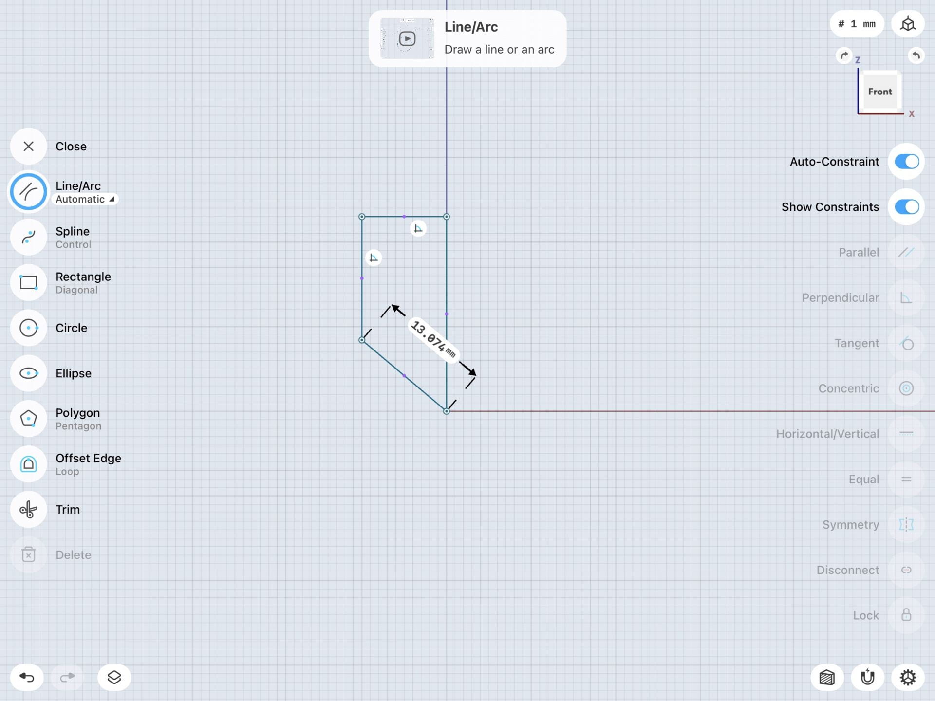
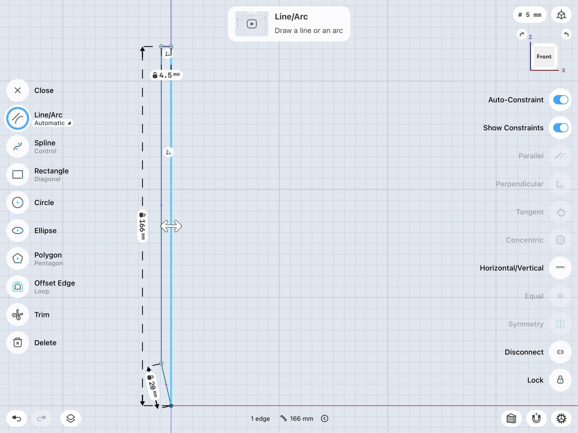
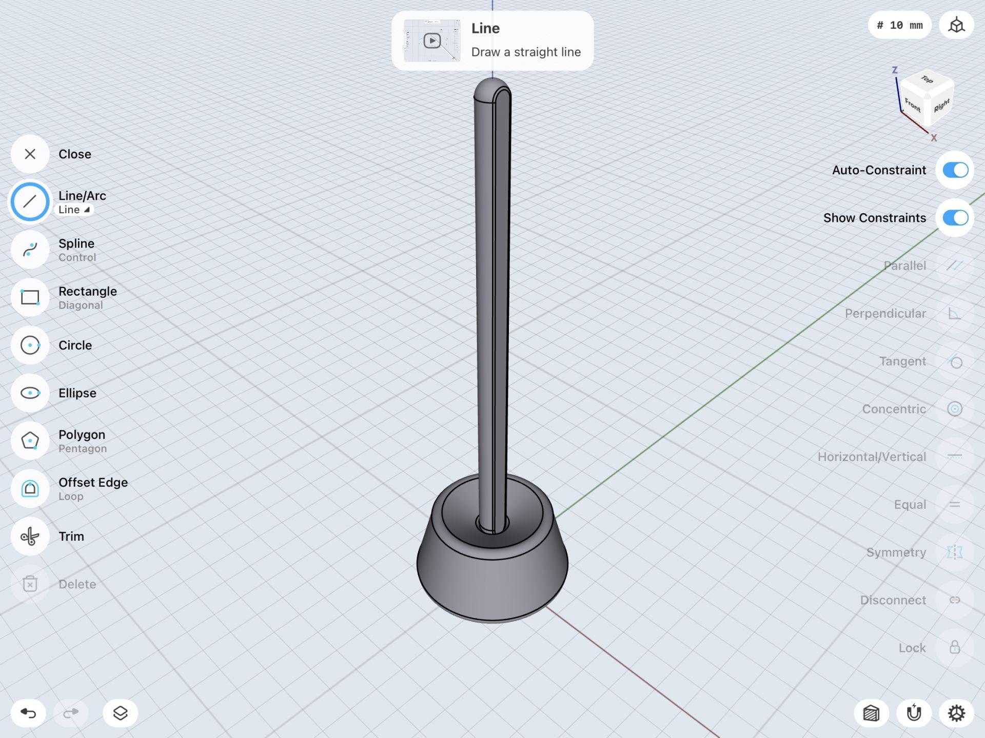
3D Designing Process:


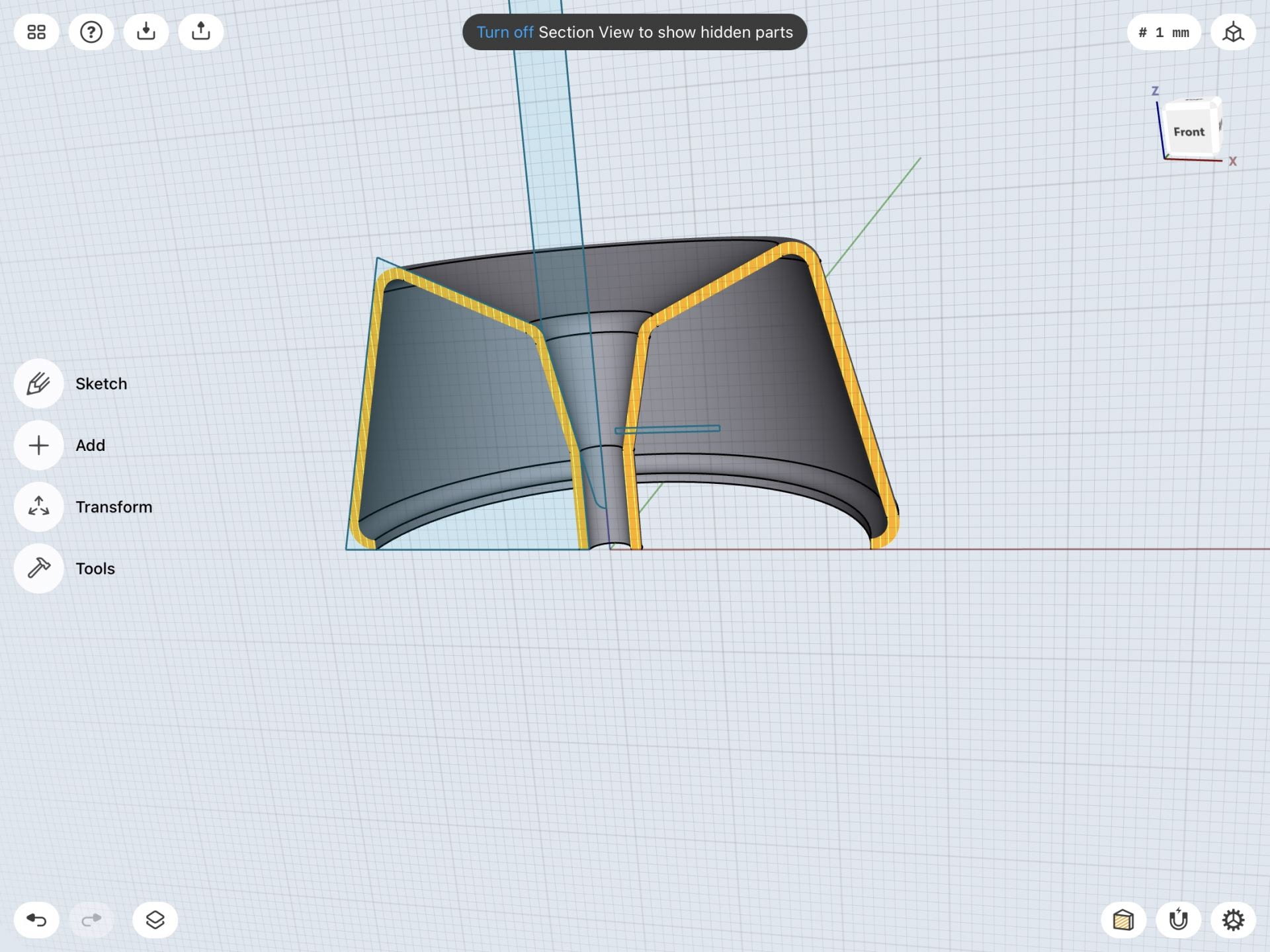
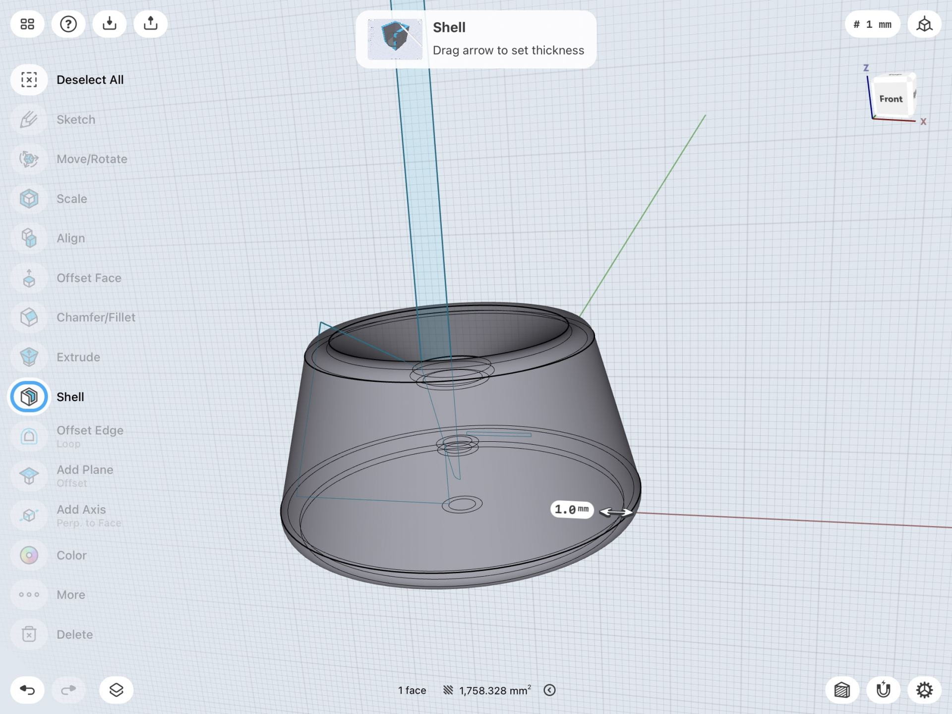
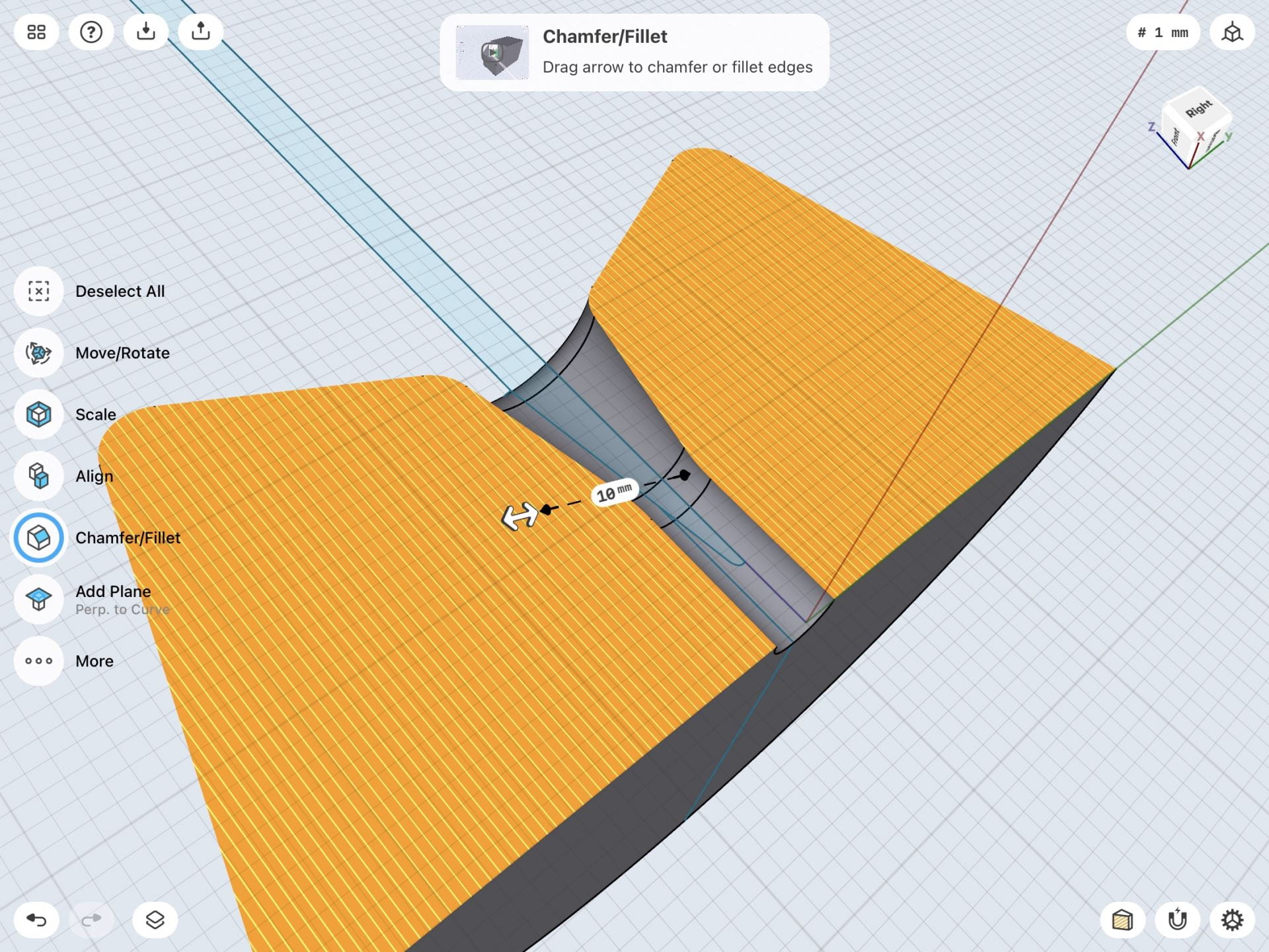
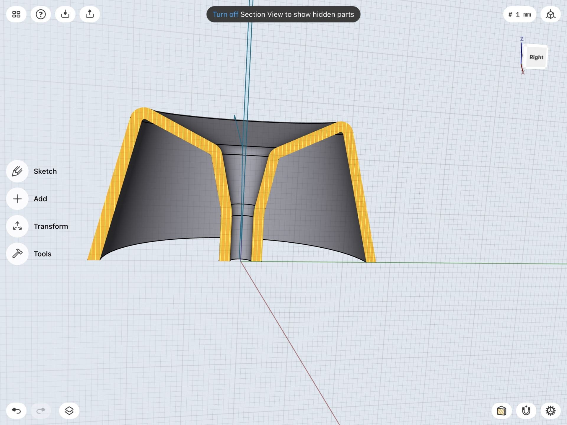
As for my second model, I didn’t end up making too many adjustments throughout the process. The main thing I did throughout this process was figuring out spacing and readjusting and making more lines. I did this until I got the swirling effect that I liked the best and thought looked the coolest.
Final Prints
First Glyph 3D Model & Print:
Second Glyph 3D Model & Print:
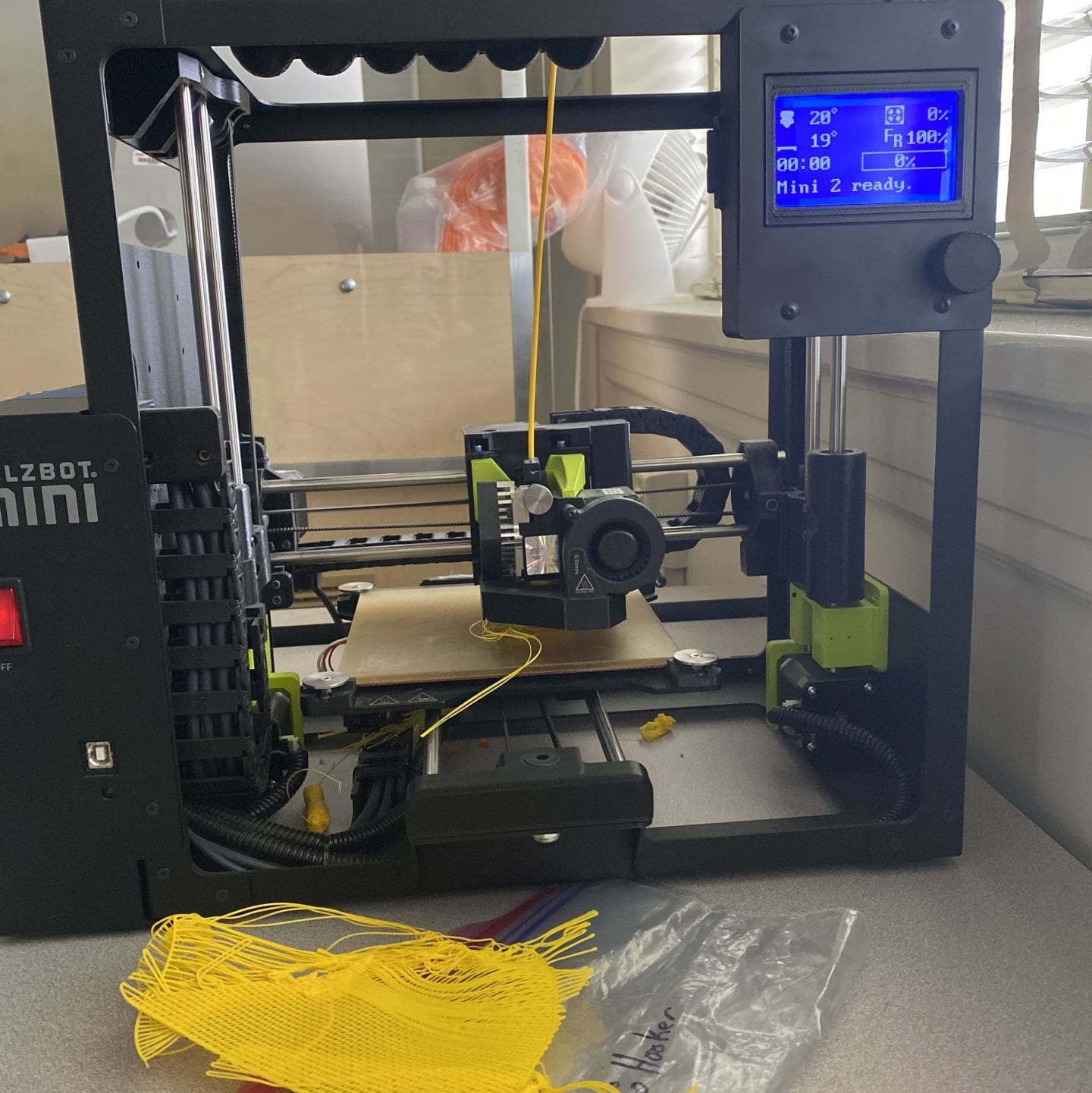
Pictured above are my final prints for this project. Overall, the printing process for these letters wasn’t too bad. For my first glyph, I only had to print it once after editing the original design and it turned out perfectly. I wasn’t as lucky with my second one though. I ended up having to print the “b” once and then make some slight adjustments. In the end, though they both turned out just the way I had imagined.


