Research & Concept
Letterforms and their various stylings possess just as much meaning as the words that they help form. They elicit varying moods while simultaneously setting the tone. Even though every letter in this collection, both ‘D’ and ‘V’, are written in a different style, one still immediately recognizes the familiar shape through association. One may even say that calligraphy is the art of type. Not only do letterforms allow us to communicate, but they also serve as creative outlets. Even though each letterform has its own distinct structure, designing them in various shapes, sizes, dimensions, and stylings can dramatically alter the message one wishes to convey.
First Glyph – ‘D’
The first glyph that I chose is the letter ‘D’, as it is the first letter of my initial. Interestingly, this letter has its roots in the Semitic alphabet, which spans back to the second millennium B.C. This letter is comprised of two unique strokes: a bar – the horizontal stroke in characters such as A, H, R, e, and f, and bowl – A curved stroke that creates an enclosed space within a character (the space is then called a counter). The capitalized version of the letter ‘D’ is very distinct from its lowercase ‘d’ counterpart. Most notably, the bowl stroke faces in the opposite direction compared to the capital letter. Pictured below are the sources of inspiration for three of my sketches.

Second Glyph – ‘V’
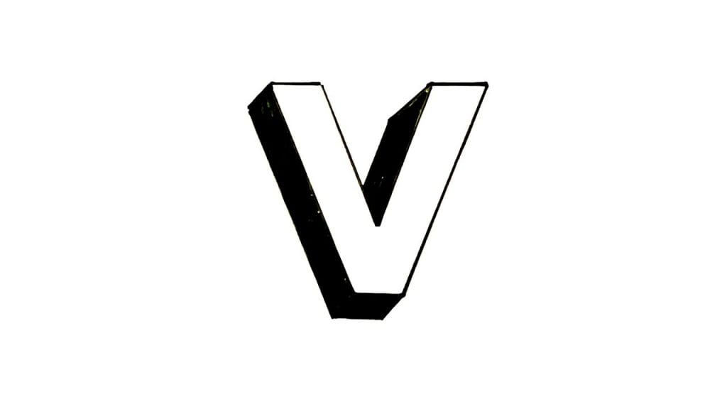
The second glyph that I chose is the letter ‘V’, as I like its simple symmetry in its most neutral form. This letter has its origins in the Semitic alphabet as well. It is generally comprised of two equidistant strokes that move away from each other from an origin point. It is not a very commonly utilized letter in the English language. There is not a lot of variation between its upper and lower-case forms, except for its height. Below are some pictures that inspired three of my designs. My last sketch in the series is a whimsical interpretation of the letter.

Iterations
For my first iteration of the ‘D’ glyph I decided to keep the design simple and familiar, in order to capture the true essence of the character. I hope to revisit Shapr3D in order to bring to life some of my other ideas. In the meantime, I definitely bit off more than I could chew in terms of my Shapr3D abilities. My end goal is to create a graffiti-style ‘D’ glyph. This iteration allowed me to gain more experience with the software, in order that I may explore different and more unique concepts in my upcoming iterations. I do really minimalistic design because the form of the object is very closely tied to its function. To create this glyph, I merely connected a series of lines and an arc, which I then offset from the edge, and drug 2mm towards the center. Finally, I extruded the 2D shape from the plane.
The second iteration of the ‘D’ glyph that I complete ended up being much more complex, although it does not directly correlate to any of the sketches that are pictured above. I decided to make this design more creative and add ‘wings’ to the top and bottom of the ‘D’. Not only does this make the design more dramatic, but it also resembles a ‘C’, which happens to be my last initial.
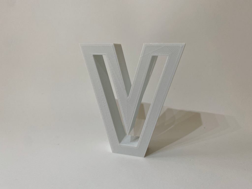
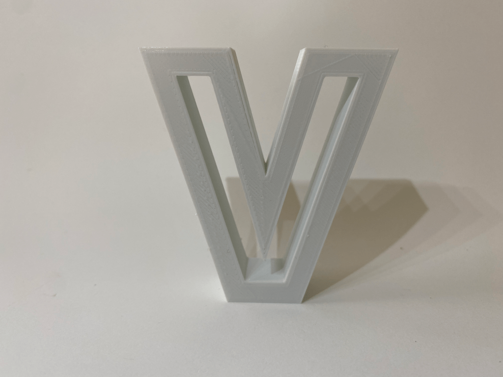
For my first iteration of the ‘V’ glyph I decided to use the first sketch in my ‘V’ letterform composite, but with a twist. I began by creating a standard ‘V’ shape by connecting multiple lines. I then offset the edges of the ‘V’ shape and drug them 1.5mm inwards. I then extruded the outside ‘V’ shape 3mm off the plane. Although this design does not leave much room for interpretation, I feel as though the hollow space on the inside of the ‘V’ draws the viewer in. I am hoping to create a few more iteration of the ‘V’ before conducting a final print.
Final Iterations & Prints
I was able to print out both the ‘D’ and ‘V’ letters with only one slight problem. Upon retrieving the second iteration of the letter ‘D’ from the printer, I realized that the three distinct parts that comprise the letter had not been unionized in Shapr3D. This meant that when I printed it out the two ‘wings’ were not grafted to the centerpiece. In order to overcome this challenge, I made the following iteration that is pictured below.
To achieve this shape, I merely used Shapr3D to decreased the extrusion height of the small ‘D’ and drug it backwards into the stem of the larger ‘D’. I then unionized the two shapes together and then exported the .STL file into Tinkercad.
Below are pictures of the finished products!
Here are the links to Tinkercad models:
D:
https://www.tinkercad.com/things/k2rUtEnLQEX
V:


