Dimensional Letterforms
Jump to: Research | Concepts | Iterations | Final Reflection

Twenty-six forms that represent sounds combined can create words with meaning that develop story. The visual depiction of these iconic symbols can be as simple as the scribbles of a preschooler to structural objects as seen in Lo Siento’s 4D alphabet.


Research
OOOOOooooooo
Both capital and lowercase letter “O”s are the same form and structure. When thinking in three dimensions, I immediately think of spheres, donuts, and targets. Taking this glyph further than extruding the surface to make a three-dimensional form is a goal.
- Vectorstock-circle-spherical-design-element-vector
- laundry-amazon
- www.notimeforflashcards.com
- Isamu Noguchi’s Skyviewing Sculpture in Red Square at Western Washington University
- Torus-istockphoto
Lowercase h
Or is it a chair? The stem and leg of this glyph brings ideas of architecture and furniture design. But when looking into the visual vocabulary of the lowercase “h”, I discovered how to draw a bird or to craft a house. I do love a good Old English form too.
- Chair + h SandroJalabadze-Dribble
- www.drawinghowtodraw.com
- www.notimeforflashcards.com
- logodix.com/chair
- Old English printableletters.org
Lowercase g
The lowercase “g” is the glyph to understand what a typeface can do for you. It’s form is versatile and unique with an ear, bowl, sometimes loop, other variants are tails. It is an obsession, just as the ampersand, to most type geeks. So much character can be derived from one character.
- https://qz.com “Can you recognize the letter “G”?” by Thu-Huong Ha & David Yanofsky
- free-printable-gothic-calligraphy-lowercase-letters-gothic-calligraphy-lowercase-G
- G. Ogaki Poster display typeface by Aron Jancso
- commons.wikimedia.org/wiki/File:G-samples
- The italic ampersand from Baskerville and the g from Newzald.
Concepts
The beginning of letterform exploration in two dimension…


Iterations
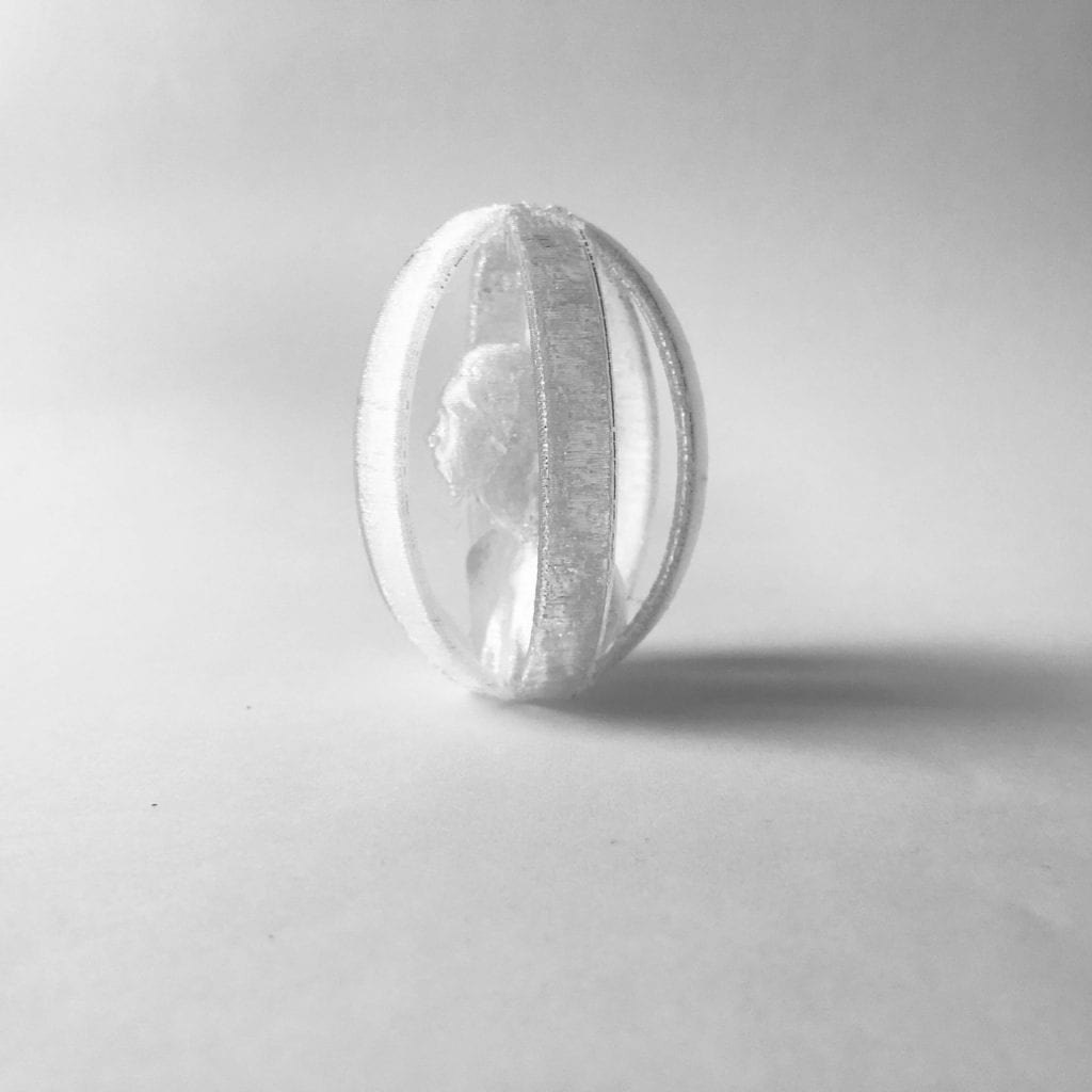
I wanted to tackle the patterned torus for the letter “O” but unfortunately time ran short so I had to settle for my oldest child, Oscar, being encased in multiple O’s. It was my first attempt at bringing in a 3D scanned model into Shapr3D and the program handled it well.
My next letterform is the lowercase “h”, fashioned after a modernist chair. It was fairly quick although a couple of the edges could be rounded better.
The letterform that took the most trial and error was the lowercase “g”. This glyph has so much character, I wanted to try and sculpture a two-story version in the round.
Test Prints
After modeling each letterform in Shapr3D, I test printed each on my Jellybox printer to get a sense of form but also how the models worked together. Each model took approximately 1 1/2 hours to print.
The C‘h’air felt more like a loveseat rather than a chair with the 65mm 50mm dimensions. So I’ll reduce the width to 35mm for the final print (as seen in the 3D view below).


The caged Oscar test print results were better than expected. The top connections of the multiple O’s need to thicken, but overall the bust and curves held up well.
The sculptural lowercase ‘g’ is still a work in progress, but I was successful in creating the top sphere with ear and the bottom tail. I’d like to refine the connection between the two stories. The 3D view is at low resolution since Tinkercad couldn’t handle a model with more than 300,000 triangles in the mesh. Initial print 100%, coarse preset with raft and supports. The ball of the ear snapped off when removing supports and still need to remove more support material underneath the top story and in between the tail.
Final Prints & Reflection
Deadlines always push the limits to what we can achieve. I attempted to print my final letterforms at home so the class could use the 3SPACE lab, but unfortunately, my Jellybox said no. With a thermal runaway error midway through the prints, I had to go into the lab.

But I would say my printing issues at home were kismet. For the first time all term, being in the lab provided that in-between time with students. It felt good to have those teachable moments again (just as much for me as them). I thoroughly enjoyed this special topics class, and I hope I can dive into the 3D relm with students another time.
Below are the final prints of my three letters: lowercase h, O/o, and lowercase g. Not sure why it took me this long to realize I chose the letterforms for “hog”. As for printing, I would like to try my c‘h’air standing upright since the side on the plate didn’t keep it’s soft edge, and my lowercase ‘g’ has been printed on its side and upright with neither keeping it’s ear. The flattening of the bottom does help it stand better, but I’m not quite satisfied with how to finish it since the supports are difficult to reach or roughs up a beautifully pristine sphere. The caged O needed a little egg top and flattening of the bottom. Overall the 360° view of the letters are where I want them to be.


