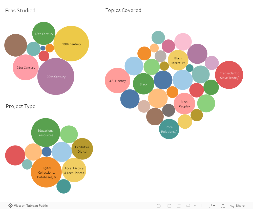
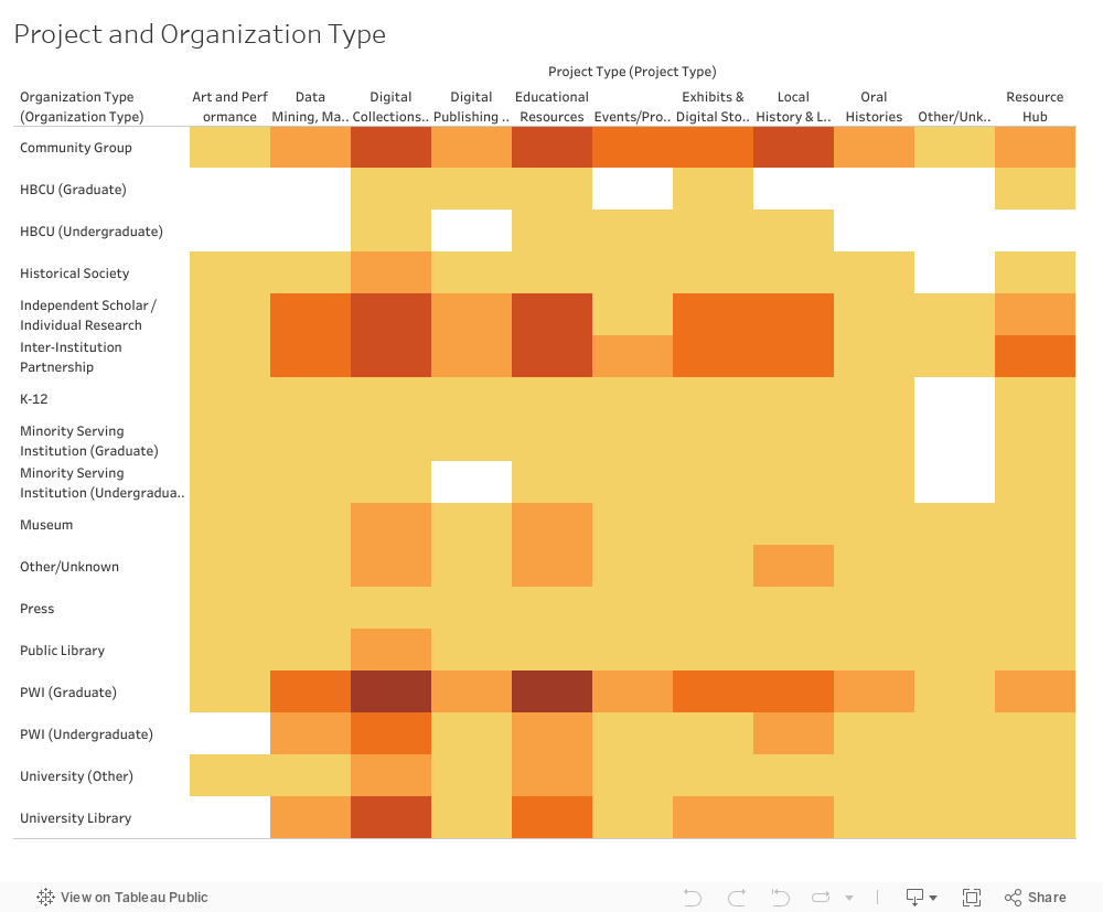
Data Visualizations
One of our long-term goals is to provide deeper analyses of the Black digital and public humanities and allow for a clearer understanding of patterns, gaps, or other areas of study in these fields. The sample visualizations below were created as a demonstration of future possibilities for representing and analyzing these relationships.
The first three sample visualizations explore Topics Covered, Eras Studied, and Project Type. The bubble maps illustrate the frequency at which topics and eras are covered or project types are used. Hover over the chart to see what each segment represents and the number of items in that category. The fourth visualization is a table that shows how much overlap exists between Project Type and Organization Type. The darker the color, the more overlap there is.