The Trafficking In Person report is a annual narrative report, containing information from 187 countries, usually over 400 pages long.
Researchers spend a lot of time to manually extract information/data points from the TIP reports to analyze changes over the years.
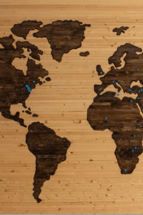
We want to create a interactive map that sort and organize important data points from the TIP reports
Week 2
Create a interactive map that sort and organize data.
The map will show changes over time and connections between different countries.
Clicking on a country will show specific data points for that country.
The map will help researchers in their work to analyze the reasons behind the changes in the data points
Week 3
A interactive map is a good way of visualize information, we will focus on the most valuable data points and then expand.
Important data points that can be extracted from the TIP reports are Source, Transit and Destination countries.
By showing the way human trafficking victims are being transported, we will save the analysts extensive hours of research.
More important data points that we found is: Number of prosecutions, Number of arrests, Programs for victim recovery, Children forced to labor, Police with special training, Businesses that support Human Trafficking, Governments that have special investigation offices
Week 4
Visualization is not our most important work, there is many amazing projects that does great interactive maps, we want to help minimize the time spent on manually extracting the data points from the TIP report.
Creating a program that extract the data points into a excel sheet that can be used by researchers, analytics and other project groups.
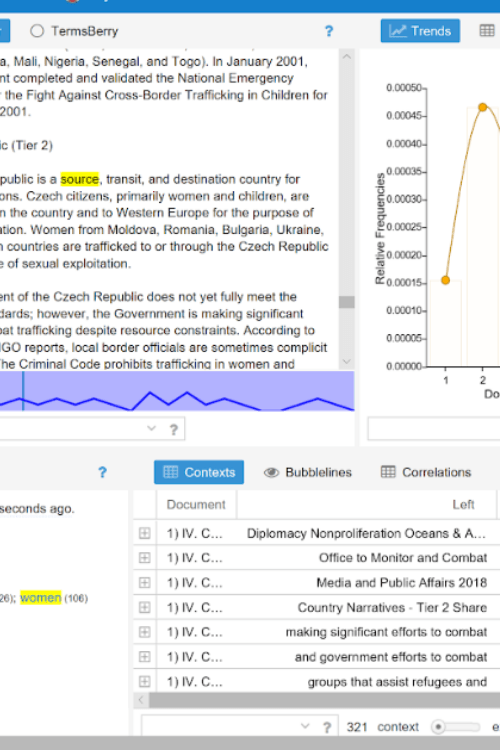
The program shall search the TIP reports for the words “Source”, “Transit” and “Destination” and collect the Countries that goes in for every category
We are currently also researching the idea of collecting “Number of Prosecution”, “Number of Convictions” and “Number of Victims”.
Week 5
We came a cross a crossroad this week.
The research of numbers of tools to extract data points showed a lot more problems than expected.
Even though we would love to create a big program by our self’s, it is not a realistic plan with the limited time we have.
We found organizations with the resources to create the type of program we are looking for.
Building a bridge between the State Department and one of the organizations we found is a good possibility.
Week 6
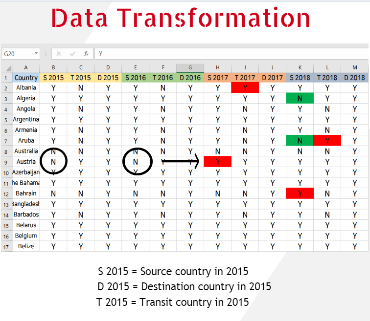
A program that extract “Source”, “Transit” and “Destination” for each Country was created.
The excel sheet show the year, country name and a simple Y(Yes)/N(No) for Source, Transit and Destination.
If a country changes from one year to another that column will be marked, green for a positive change, and red for a negative change.
Example: Austria was Not a source country 2016, but in 2017 it was. That is a negative change and therefor the column is marked red.
Researchers can now both collect this data points easier and spot dramatic changes of the countries.
By spotting the changes, it is easier to navigate the TIP reports to analyze why the country changed.
Week 7
Luminous is a program that extract “Source”, “Transit” and “Destination” for each Country.
The excel sheet show the year, country name and a simple Y(Yes)/N(No) for Source, Transit and Destination.
If a country changes from one year to another that column will be marked, green for a positive change, and red for a negative change.
By spotting the changes, it is easier to navigate the TIP reports to analyze why the country changed.
Our conclusion is that a cooperation with a organisation that specializes in building these type of programs should be made, to optimize the time spent on reading the TIP reports for the researchers.